
Before laying down a stroke, there's a number of things you need to think about. Well, actually you shouldn't have to think about them, it should just go automatically.
Note that this mainly goes for realistic styles. A brushstroke should also look efficient and consistent with the rest of the painting and your color scheme choice. You might also have an idea or style which disallows certain colors or textures and puts priority on other things. However, even in a powerpuff girls illustration there's simplified elements of realistic rendering. Don't hide behind "it's not apart of my style so I'm not gonna learn it".
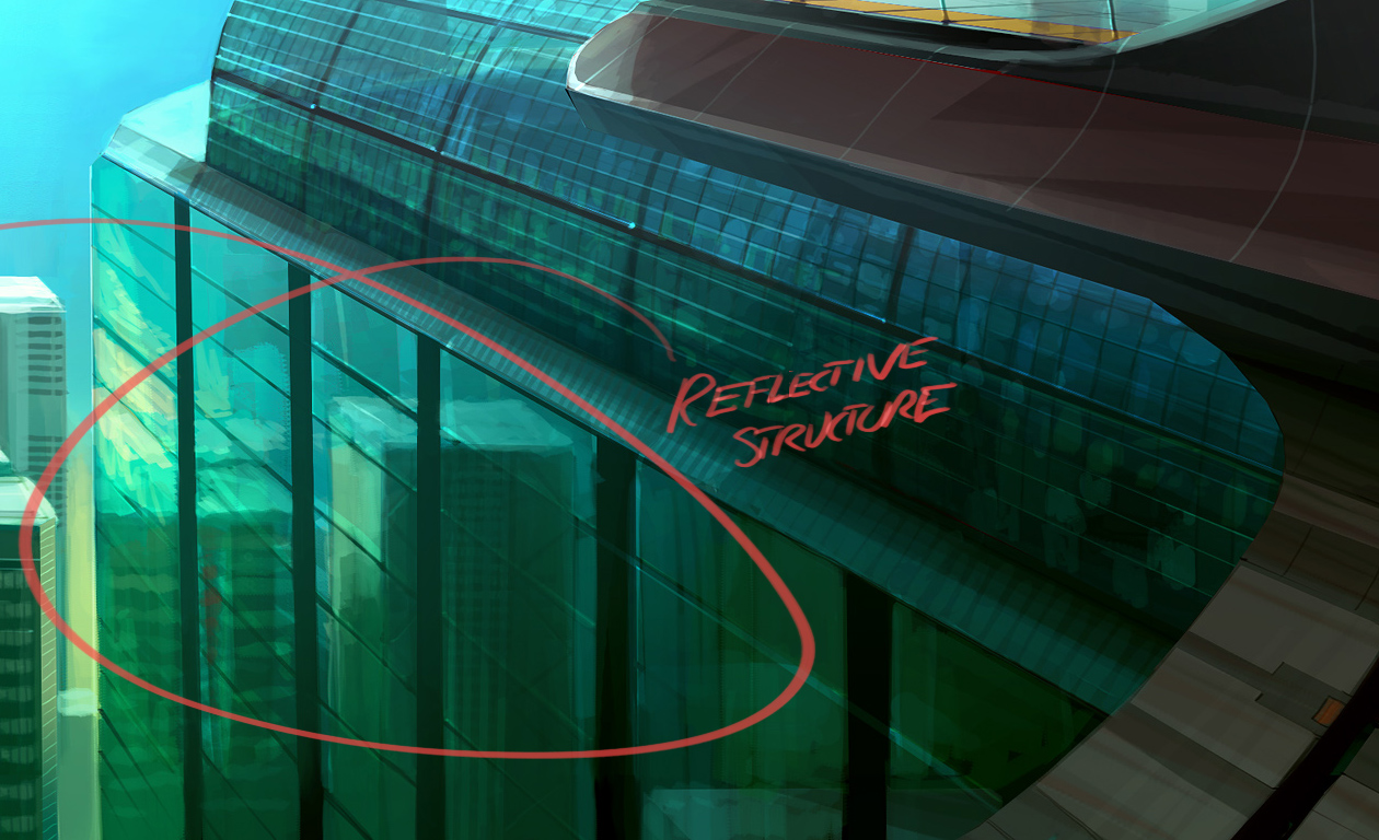
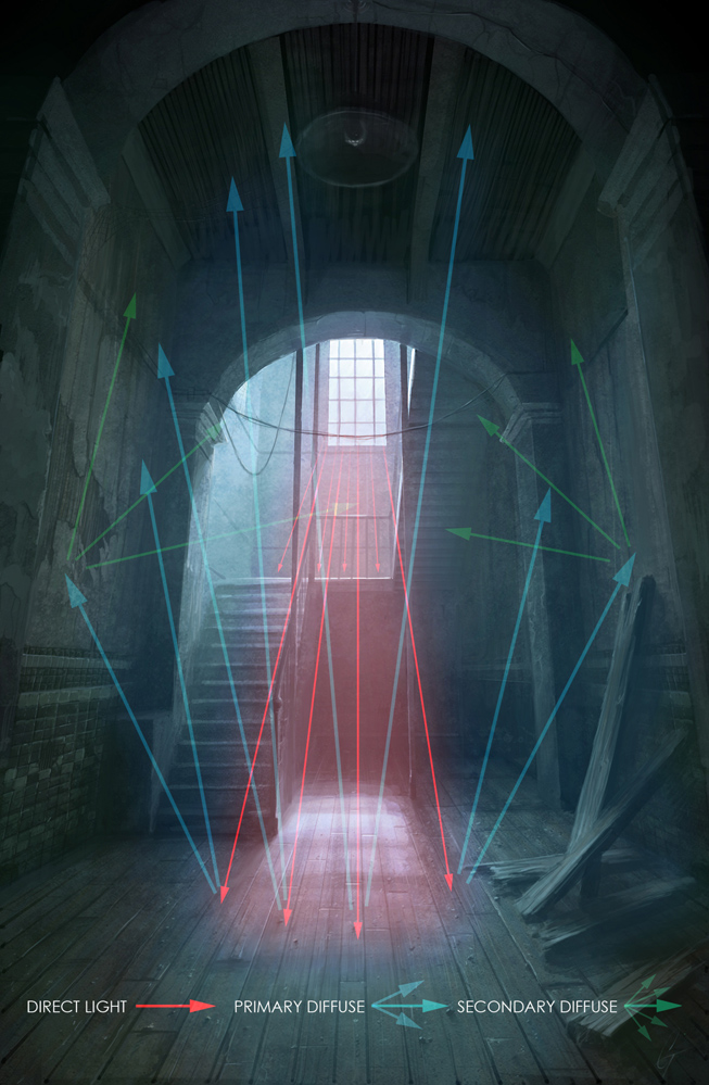
There's really just one kind of light. It bounces. You can only see the light (photon) if it enters your eye. Light does two important things when it hits a surface. First, a part of it is absorbed. This is how colors are made. A red apple reflects mostly red wavelengths, the rest are absorbed and turned into heat or something. That's why black stuff get so hot in the sun. Anyways, the reflected light bounce away differently depending on the surface. If the surface is bumpy it will bounce away sort of randomly, like a tennis ball that hits rocky terrain. If the surface is smooth it will bounce away in a predictable path. A mirror is very smooth so the light comes back undistorted, so we can see our reflection.
Note that all surfaces have speculars, because speculars is just reflected light. It's just more broken up/diluted on dull surfaces.

 Depending on where the eye/beholder is, it'll see different light and different specular spots on a curved surface such as this. A puddle isn't curved (other than the edges because of surface tension) so you'll only get a shiny reflection from a certain point of view. Point speculars can only appear in an environment where there's a point light source, like a sun, lightbulb or small window.
Photo - Speculars do exist on cloth, diluted and subtle. I stretched out my shirt sleeve with two fingers to get a flat surface between the two marked dots (I moved the camera and not the sleeve).
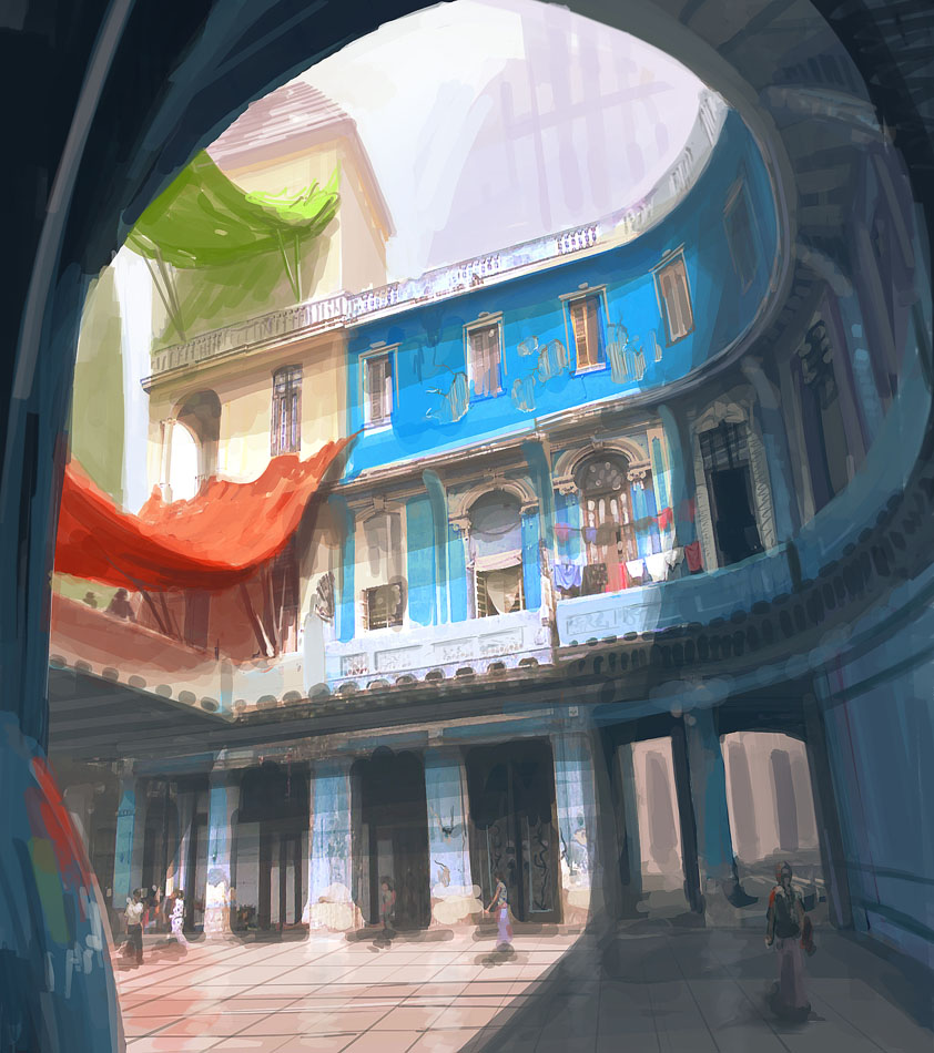
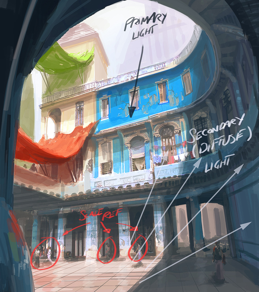
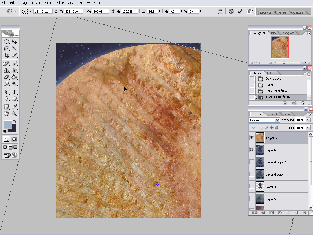
Here on earth we have lots of stuff around us that the light can bounce off, so things here are more or less lit from all angles. For example we have the sky which is like a dome shaped blue light source. Then theres the ground, walls and other surfaces. In space there's basically just one light source, the sun. This is why the moon just has a lit and shadowed side, and looks kind of flat. If you looks carefully however, you can see earthlight on the shadow side of the moon, but it's very weak. Then there's starlight, which I guess is even weaker.
When light hits a surface and bounces, it also change color. If it hits another surface of the same color it bounced off, it will make that surface look even more saturated.


(Too orange to be some sort of skintone anyways.)
The sunlight is much stronger than the skylight, which is in turn much stronger than indoor light. Our eyes adapt automatically after a while, and we can also adapt by squinting or just focusing on an object. Because we do this without thinking about it, it's hard to understand that our eyes are actually kind of limited. This limitation becomes even more obvious with cameras. If you take a picture indoors, the windows will become overexposed (bright). You might try to adjust the exposure levels to the window light, but then the indoor environment will become underexposed. This can be used to your advantage. By for example putting a character or object in the foreground where it's darker, you can make the silhouette read well against a well lit room.
The exposure to light can also make parts of a body look very bright or dark, not skin tone color at all. When the shadow is dark and the lit side is overexposed, the only place for the color to go is on the edge between them.
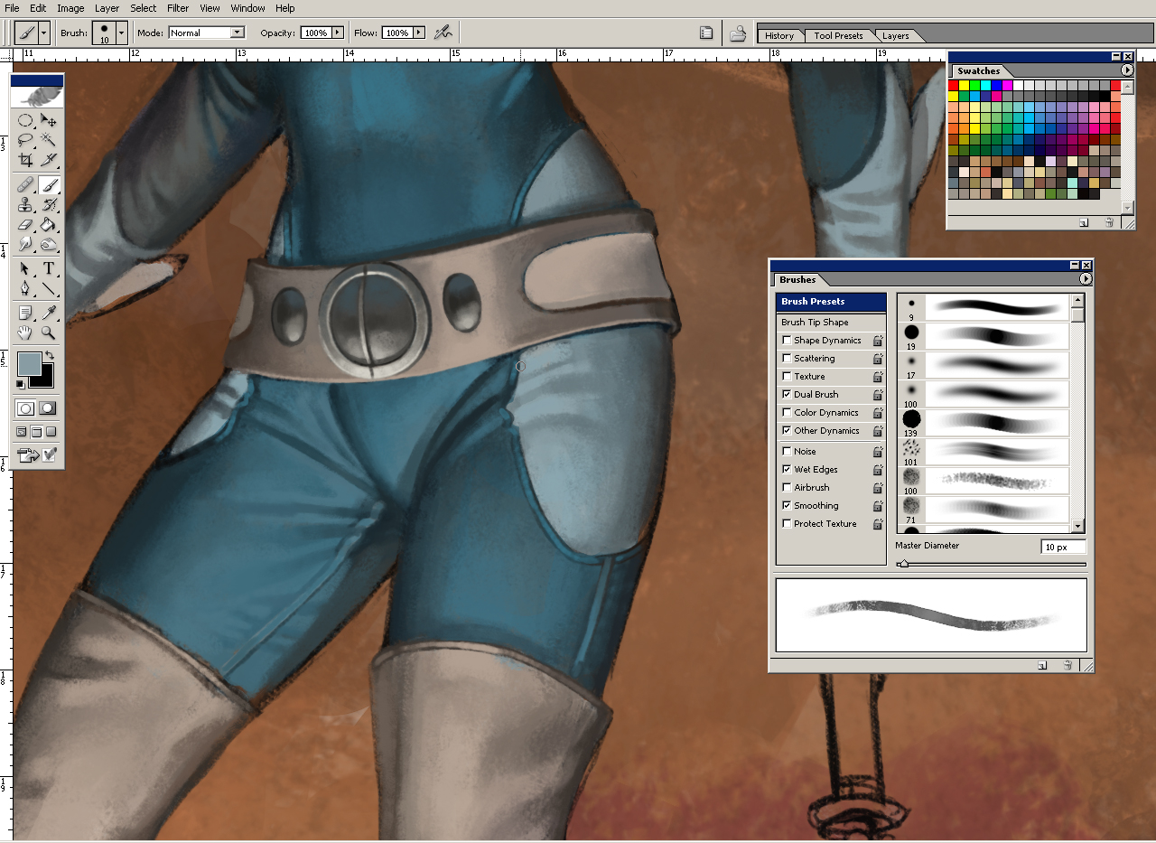
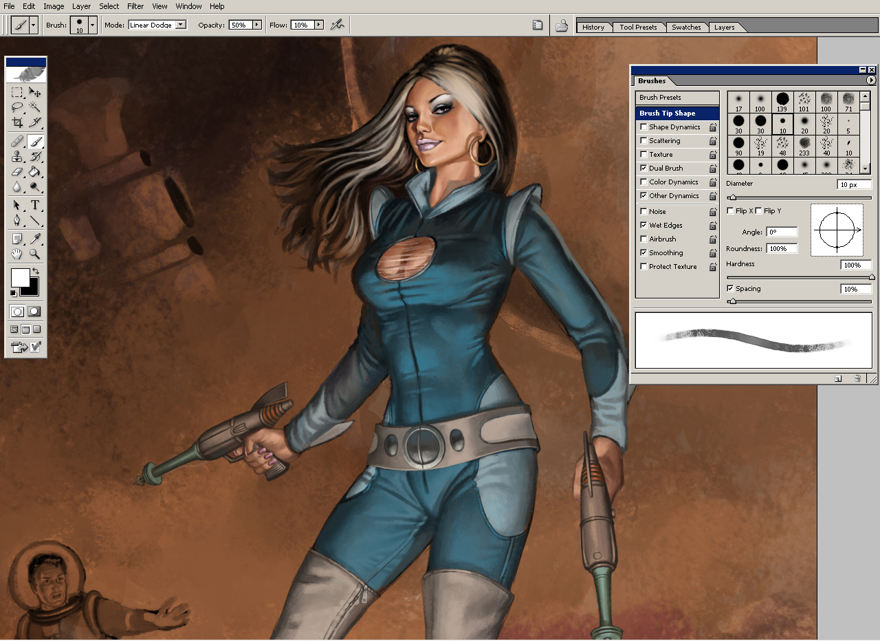
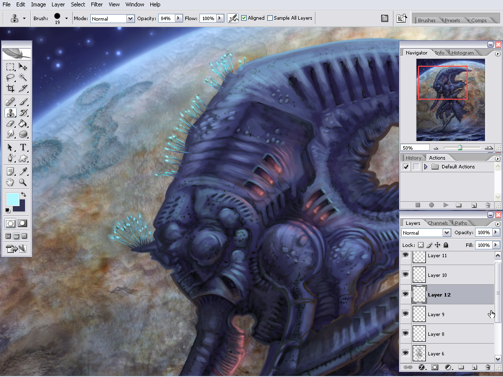
Here's an example of various materials and how i render them.

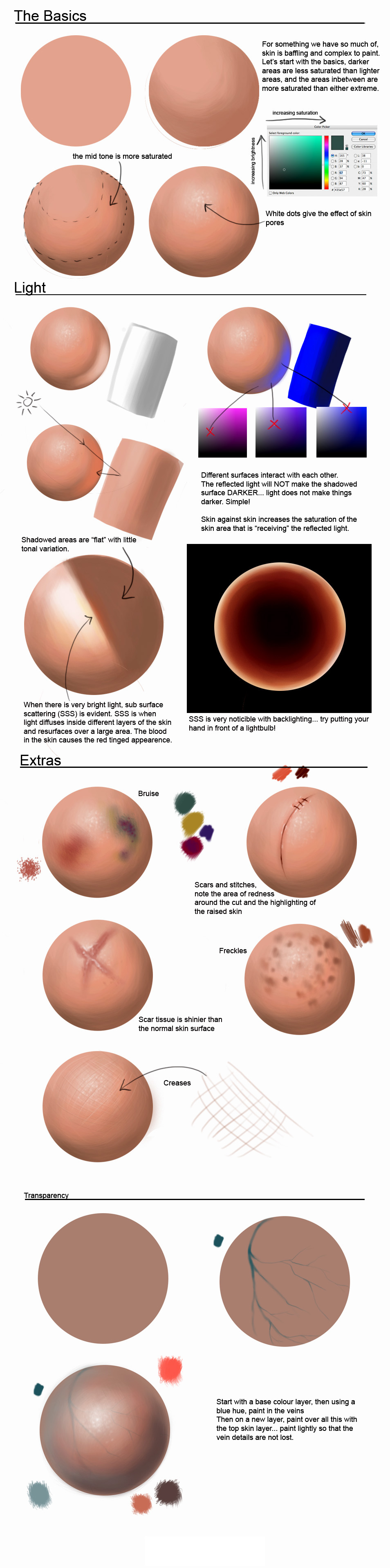
Shadows are quite flat and generally less saturated than the lit side. It's easier to notice ambient light in the shadows. Shadows get blury over distance, this is called diffraction.

(Shadows don't add (multiply) with just ONE lightsource that is...)
Consider the environment. The light is stronger outside, and the skin color tend to be less saturated due to the sky blue ambient light and sky blue speculars. Sometimes the skin color become shifted towards purple because of the sky blue being mixed in. This is especially true if the subject is standing in a shadow.
Indoors (no windows, only light bulbs) the light is warmer and allows skin saturation to be amped up to oranges and reds.
The shadow color of the skin can sometimes wander off to greens, especially if the room have green components, like wallpaper, plants, furniture.
In a white room or a bathroom the skin tones would be quite pale, closer to local colors and less contrasted (shadow/light) due to lots of ambience.
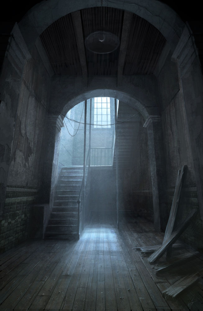
A room with a single strong light source will probably result in near black shadows.
...so, the type of environment your character is placed in very much affects how you should render it.
The human body has a lot of different hues. Parts covered by cloth gets less tan. Mons pubis, the hip bone area and the chest is quite pale. The shoulders and lower arms gets a little extra tan. The inside of the lower arm is often pale however. The kneecaps and elbows have a little darker skin. The face also has a lot of hues, such as rosy cheeks, males might have grey or almost green jaws because of stubble. The best way to learn the hues of the human body is to make studies of course. Don't forget that animals, monsters and objects also have hues. If you paint everything with the same hue and saturation it will look boring.
Some hues are due to ambient and reflected light. The shoulders and surfaces pointing up can get a blue hue because of the sky reflecting.
 Saturated gradients -
The gradients between the shadow and light is not just an in-between color of the shadow color and light color. If the shadow and light is just blended, it will look very lifeless. If you look at pictures you will see that the gradients is saturated. It's especially easy to notice if you remove that saturation.
Saturated gradients -
The gradients between the shadow and light is not just an in-between color of the shadow color and light color. If the shadow and light is just blended, it will look very lifeless. If you look at pictures you will see that the gradients is saturated. It's especially easy to notice if you remove that saturation.
 Sub-surface scattering -
Strong light can penetrate the surface of some materials and bounce around, then exit again. This will increase the saturation and make the surface look illuminated from the inside. In the case with human skin, we sometimes see it on hard edges between light and shadow.
Sub-surface scattering -
Strong light can penetrate the surface of some materials and bounce around, then exit again. This will increase the saturation and make the surface look illuminated from the inside. In the case with human skin, we sometimes see it on hard edges between light and shadow.
Photo - Leafs are gloss on the top side which means there can sometimes be a sky blue specular here. The light shining thru the leaf makes the bottom side more saturated, this is also true for ears and fingers, which can turn super red when heavily backlit.
Photo - Sub-surface scattering on the fingertips. The light on the left side of the thumb is probably light reflected off the index finger.
Photo - Note that the edge only appear if the light is overexposed. It does not appear as pronounced on the thumb.
Colors and values are relative. By using various tricks it's possible to trick the viewer into thinking a color is really another color, or a value is darker than it is. Unfortunately, the artist is also tricked into using too much colors or values than is needed.
A hard edge between two values will be much more obvious than a soft one. You'll have to know when to use which. Sometimes your choice of values is very limited, such as when you're working in the shadow. By using hard edges you can describe a lot more detail with less values available. However, using gradients is very useful for changing value without the viewer noticing. The 'fake flat' illustration looks flat, but is actually a gradient. The square is the same color as the left side of the 'flat' rectangle.

Colors with the same value are relative in terms of hue instead. A common mistake is to draw one detail too saturated, then something else nearby looks grey, so to compensate you increase saturation on that detail too, and as a result the whole painting end up too saturated.

It's easy to get carried away and go over the top with highlights. This makes it hard to see what color the subject is. Instead you should use shadows to describe the volume of the subject.

Work with larger brushes and remove unnecessary brushstrokes. See the bad and better example below. I really didn't do much on the second one. It's actually simplified. It's surprising how much a little flattening here and there can do. I did spend some extra time on the face though. A bad face can ruin everything. Image is from reference.


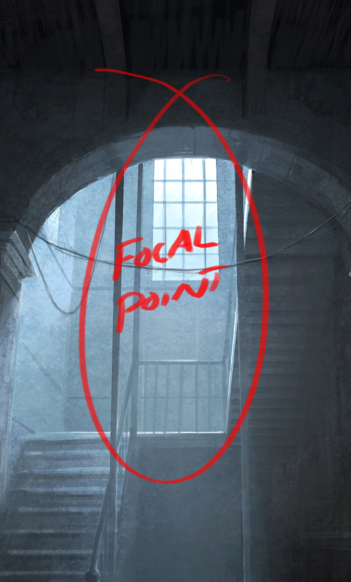
A painting is a hierarchy of important and less important details. If you're doing a pin-up the main figure and silhouette is the most important. In comics they often use a fat outline around the silhouette, whilst the less and less important details get thinner and thinner lines. When painting you do the same thing, but with brushstrokes instead! You use differences in hue, saturation, value, edges, sharpness, detail and composition to lead the viewer's eye towards the focus point of the painting.
If you use the same rendering everywhere on the painting it will look flat. You can lead the eye toward important spots, but once the eye is there it needs something interesting to keep it there, like proper details. The amount of details on a spot should be proportional to the amount of time the eye stays there.

Attempt to isolate some of the techniques you can use to attract the eye.
Here's an example I made: (A) Important forms | (B) Textue | (C) Both
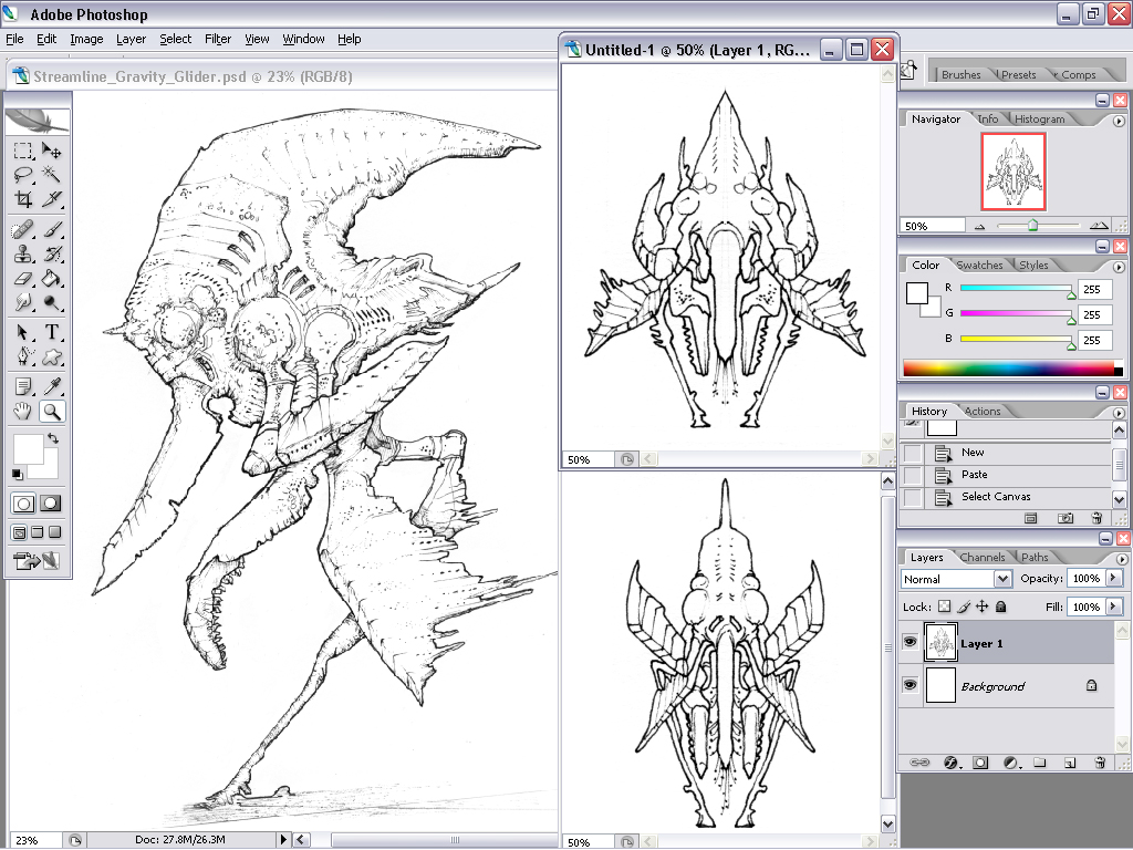
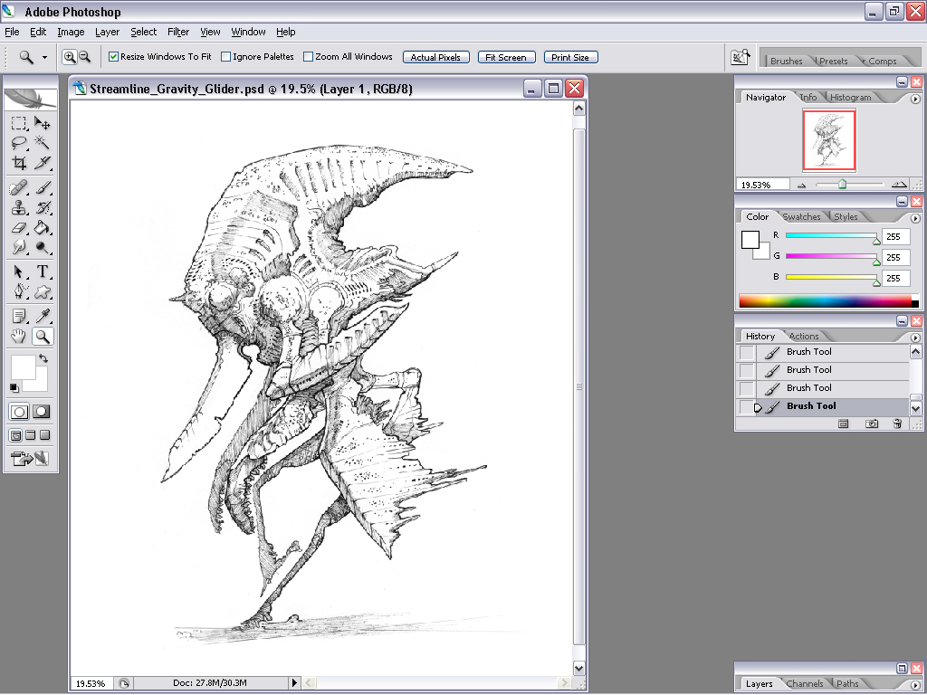
It can be very dangerous to get excited about rendering details, especially at an early stage. You can not render details the same way in the shadow as in the light. On the second one (B) I just rendered all the details to demonstrate how it can look if you just scribble down all the detail without thinking about the important forms (A). (C) is still a bit confusing but that's more of a construction issue. Side views can only get you so far, and the anatomy is pretty odd which makes it harder to read.

A is the form without detail, B is the detail and C is both. Be careful not to do too much B, the form has to read!
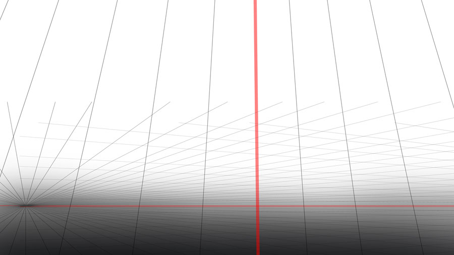
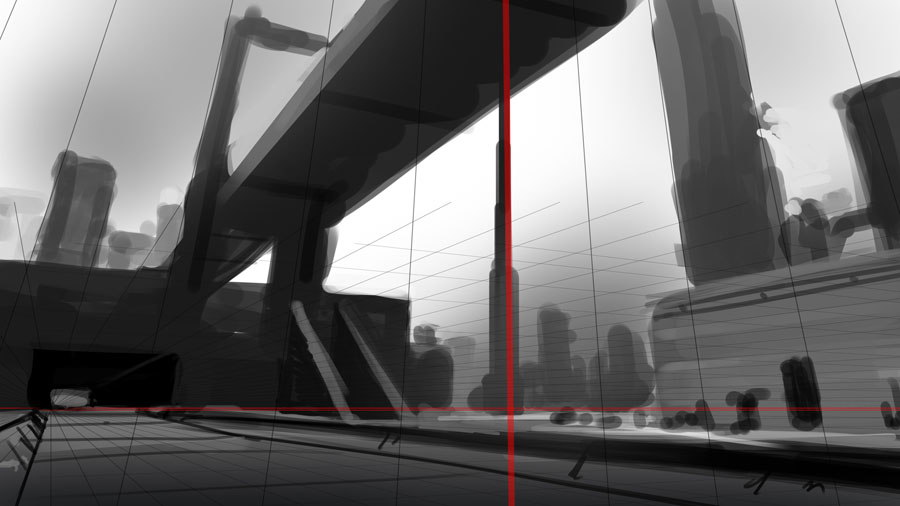
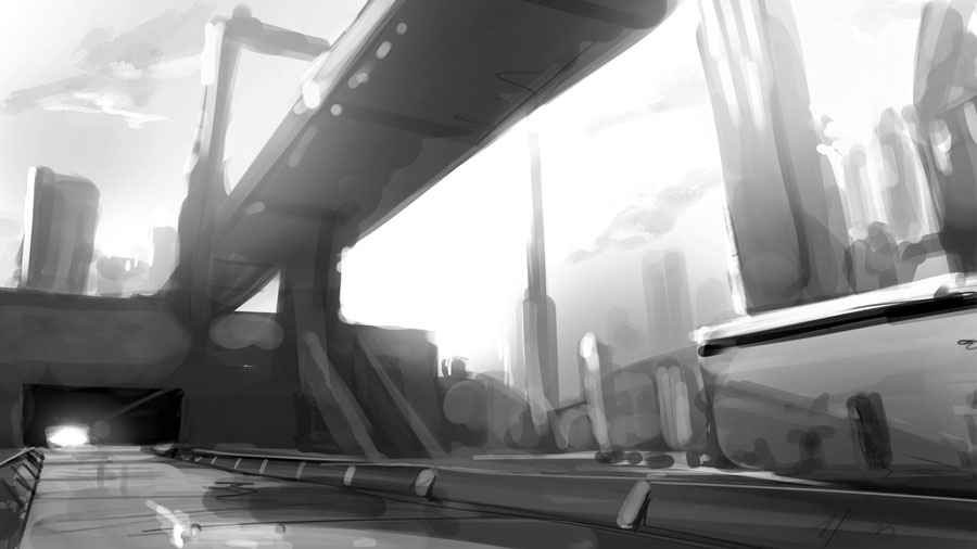
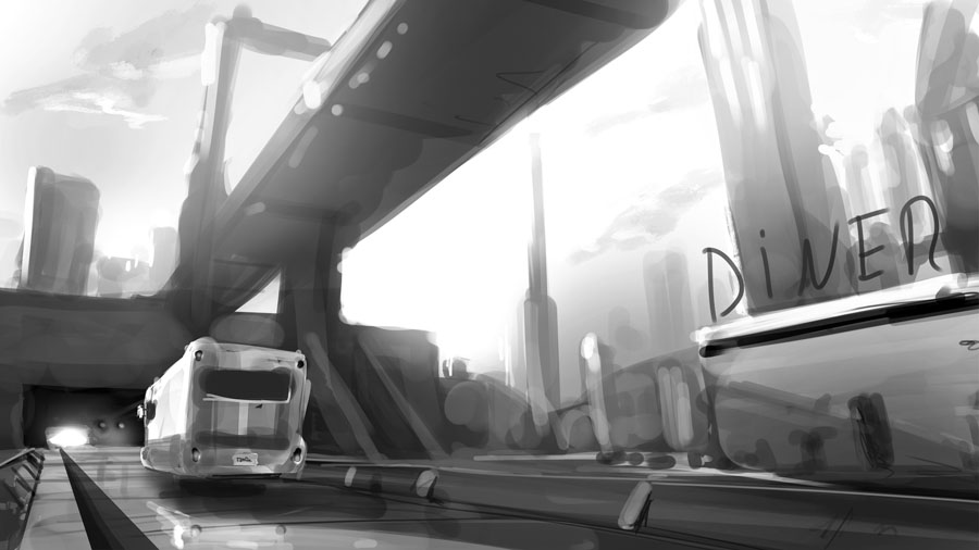
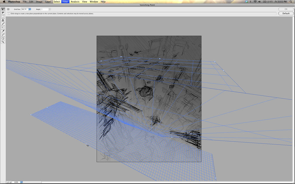
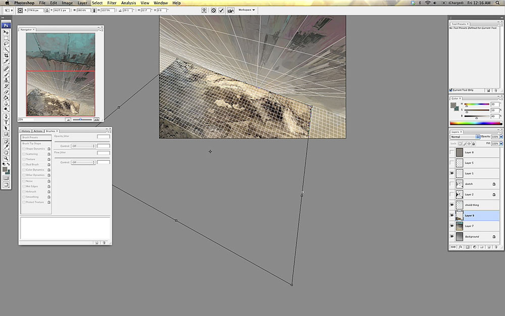
I'm not going to have a long perspective tutorial here. Instead I'm just going to mention how much easier it gets if you make a few guide lines to align the figure/environment after as you draw.

If you're reluctant to do environments just because perspective is tedious to set up, you can use a simple 2 point perspective and just guess in the details. It's surprising how much easier it is to align things correctly with a few guide lines (for me anyways). It doesn't have to be perfect to appear correct. There's a risk that your designs will suffer if you can't improvise quickly and have to consult the ruler every other stroke. First draw a horizon line, then radiate lines from both ends in a random manner, then just crop and sketch away.

Here's a few quick freehand lines helping me to align the shoulders and stuff. When drawing people, it can help to align stuff after a 'spine'.
Exaggerate - One great thing about art is that you can exaggerate things, like hips and boobs. Haha, no, actually I'm serious. It's a good thing if important curves are more pronounced.
Simplify - The advantage art holds over photos is simplification. In a photo you'll get distracting details. When drawing, you can remove objects that aren't relevant to the scene. Wrinkles and minor protrusions can be removed to get a better line flow. A common mistake I see is when someone has drawn all the abs (belly muscles) with an overly amount of crosshatching. It's better to leave out lines, especially if you're going to color, because then the contrast between different color fields can work as lines.
Harmonize - Another word for this is 'swooshyness'. Unlike the above things it has to do with the relation between details and how lines intersect and take over ofter another. Try having a few swooshy lines that you align several parts after.
Stylize - When going for a style it's important to be consistent. You can turn curves into hard edges, or you can go for sweeping sinus lines. I prefer a combo where I turn a curve into a hard edge at a certain threshold.
Line weight - With a few exceptions, I'm not a big fan of fixed line width. Here I'll attempt to devise some general guidelines for when and how to vary line width.
Also, you do not always need to draw a line. Sometimes it you can just hint the ends of it, and the eye will fill the rest in. Examples are places where skin is pushed together, like the mouth, buttocks, pushup boobs etc. It's good to make the line a little thicker where there's a gap. Examples are places where clothing stretch over gaps between muscles or... cleavages.
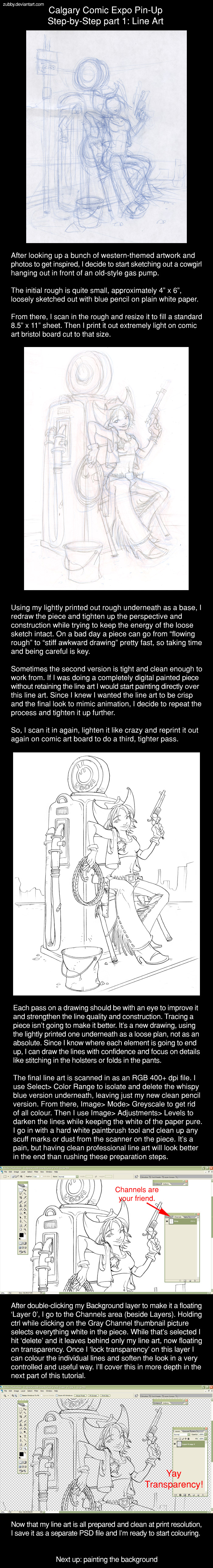
Finally, here are a few illustrations. The first one is Photoshop (5.5) + Wacom tablet and there is no line quality to speak of, but I hope you get the idea. Second one is an inked thing from a few years ago.

When painting, subractive edges which are remnants from the line art or construction stage can be harmful. You can separate shapes with other means than black lines, such as different value, or a bright line. Here's an illustration of a few possible solutions and what they convey.

A line art image might go several stages of refinenement where previous, rougher stages, are constantly faded and painted over. Final stage not completed here.

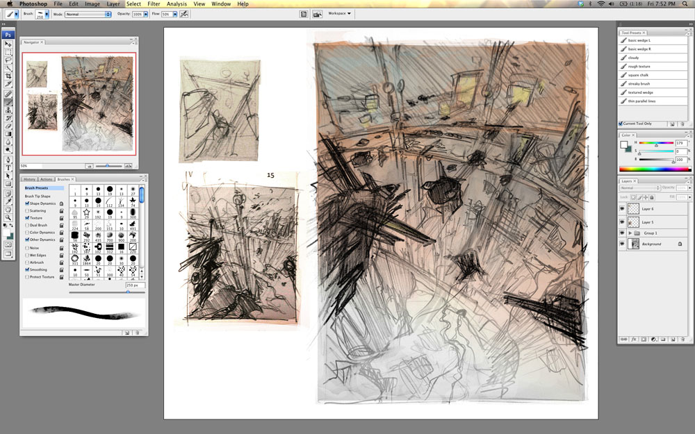
I didn't start making studies until just some years ago, and that I regret. You won't stumble upon the right lines with guesses and wild scribbling. Using reference will only get you so far. In order to be loose and fast you need to be able to draw without having to think about the general construction of things (such as basic anatomy). This way you can concentrate on the actual design and detailing.
Construct your drawings/paintings. Don't march around with the pen doing detail by detail. Always check the general proportions and don't get caught by details too early. Place marks where the important features are. These well be like landmarks you align after.
Try to learn one thing at a time. You can't learn juggling while also practicing 400m hurdles. If you want to learn how to handle the medium/tool, try making studies of easy stuff like fruits. If you want to learn human faces, use a medium you know so you won't have to struggle with that as well. If there's several things you can't handle then you won't see what it is you're doing wrong. Quantity is also important. I wouldn't recommend making anatomy studies with tedious woodcarving tools for example.
Lineart - Pencil studies doesn't have to be more than a few quick pencil thumbnails on a paper. I spend a few hours on studies when I do them, and I put about 10-30 on each sheet (A4). I only do a couple of studies a month, but I certainly notice improvement each time. Just imagine what would happen if you did them several times a week for years.
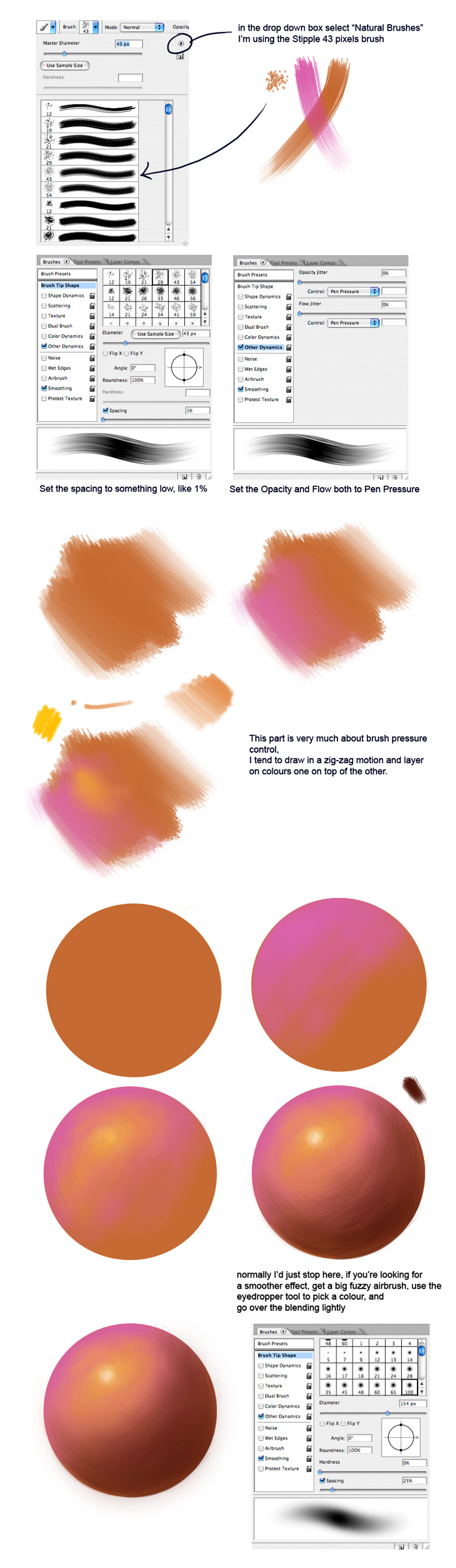
Painted - When I do digital studies I use Photoshop and mostly a picture from the net. I duplicate the window and clear the new one. Then I start placing the larger color masses on their approximate positions. After that I gradually increase the details and value/color accuracy as good as I can. When it looks close to the original, at a distance or with the eyes squinted, it's finished. I always work with the largest possible brush allowed to render a given detail. I don't color pick from the original, but I do keep the windows in the same size so I can see if I misplace anything. If you want to increase the difficulty (and reward) you can always try to draw in in a window with different size, and mirrored, or paint something from still life.
Statue study: 1 | 2 - First one is OC (Open Canvas), second is PS (PhotoShop).
1a -> 1b | 2 - Here I tried to be as economical as possible. Second one isn't a study but an example of a cleanup, which isn't necessary for studies.
1 |
2 - These are made from reference. I took the liberty to add some line art and style.
1 - One of my first studies.
Study everything! You need to build a large library of shapes and things in your head to be able to draw intuitively. This takes about a lifetime or more to do, so you better start now!
Human anatomy - One of the most important things you need to know. Even monsters have traces of human anatomy.
Gestures & styles - You need to be diverse and get fresh ideas. Learning some different styles can be a good idea.
Environments - Putting your character in an environment really brings it alive. This is something I definitely need to learn myself.
Fetch an animal book - ...and draw some animals. A good way to design a monster is to morph different animals into one.
Machinery - You also need to practice drawing machinery. It can be useful when designing robots and planet-smashing vengeance-crazed battle droids.
Classical still life objects - Or basically anything. Good for learning how to draw and paint in general, because of the simple shapes. You won't have too struggle much the shapes and can concentrate more on the materials.
Analyze what you're doing wrong. It's easy to get blind from staring at the image too much (which you must do to be able to work of course). Try flipping the images, look at it upside down, through a mirror (I use a CD), and zoom in and out (or back away). Don't sit and nibble too close to the paper or zoomed in. You can also make a 'New view' (PS).
You must also accept that just because you have worked on something for a while doesn't mean it's worth anything. You must be ready to sacrifice the time you spent on something if it looks wonky. Even if you're happy with the detail you might have to rework it (Kill your darling). Sometimes it's not the the detail you're concentrating on that's wrong, but something relative too it, like the value of the background or the perspective of another detail.
Very generally speaking, certain apects of a painting are more important than other.
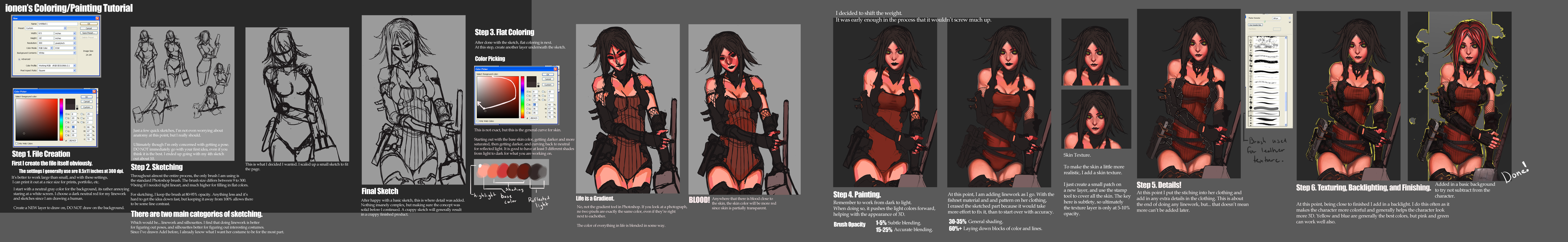


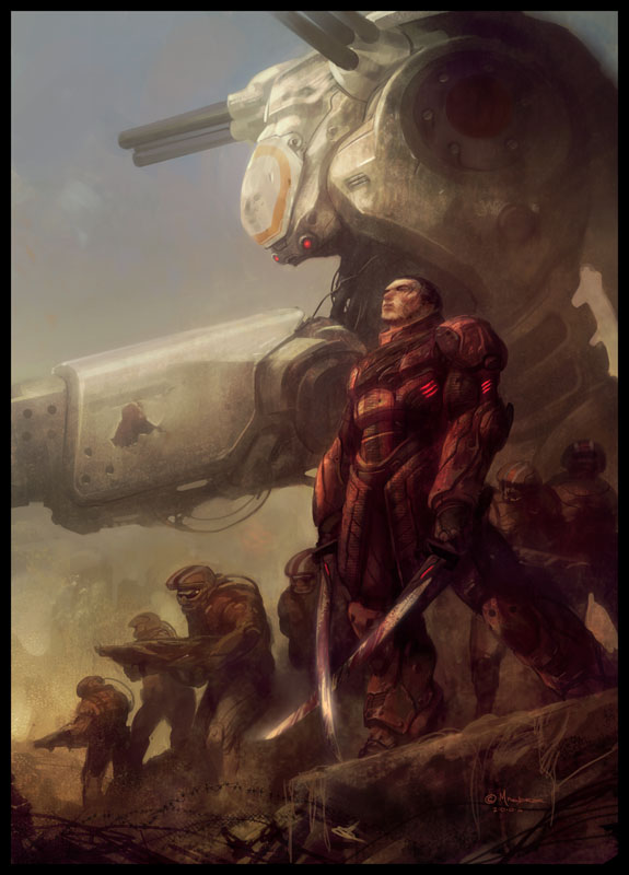
Step 2: Color thumbnail stage to explore color combinations
Using one of the black and white thumbnails, I experiment with a wide range of color compositions to see which color scheme will fit the mood. Since the Evil Dead story is more earthly then high tech, I choose a warm color scheme with reds, yellows and greens.

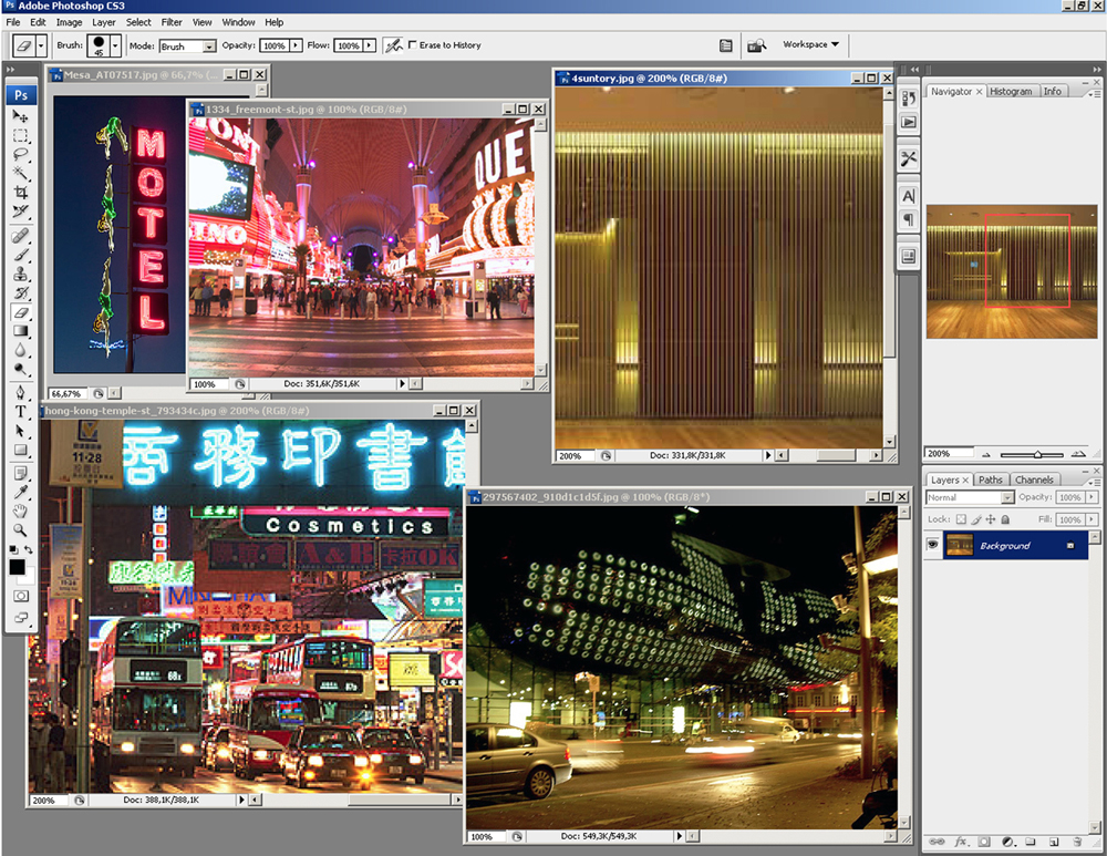
Step 3: Take photograph reference to get details
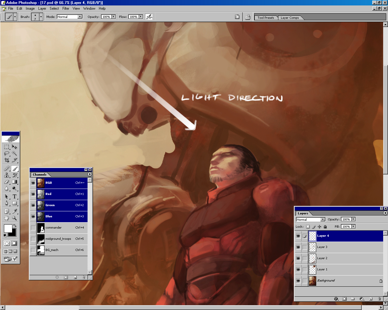
Using artist friends to pose for the characters, I do a photo shoot with props to get necessary reference for the body, hands and legs. Even though I love to paint most things out of my head, it is helpful to have great reference to fall back on especially when you have a tight deadline. One good point to remember when shooting reference is to have an assistant help work the lights while you work on the camera. I have the assistant move the lights around the model so I can see what the light and shadow shapes are doing. I'll photograph a lot of variations of light direction and poses. When I compose the final painting I pull from the best photo information to design my shadows.
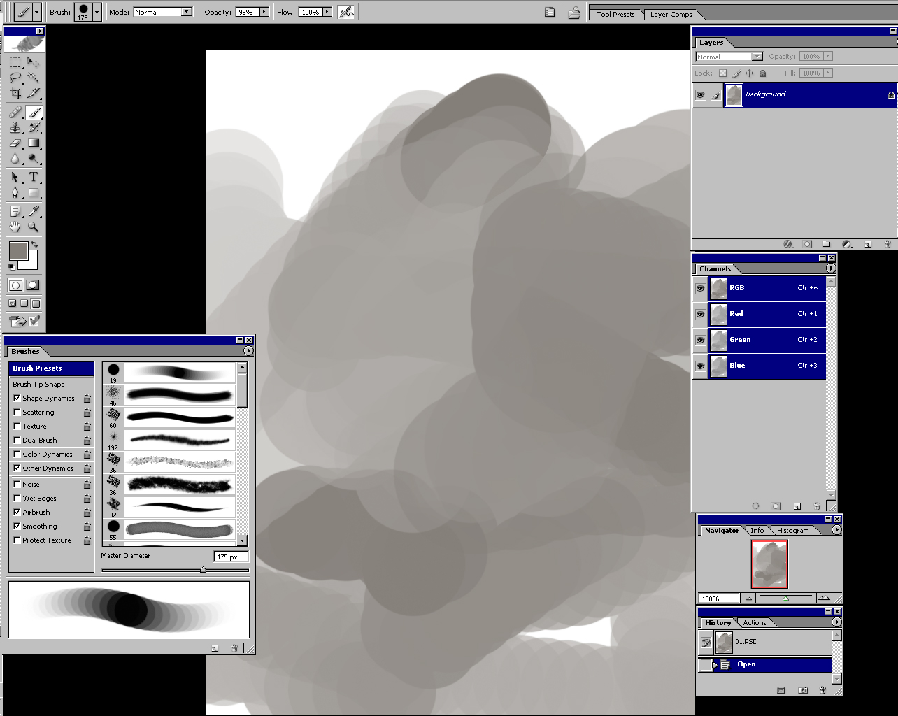
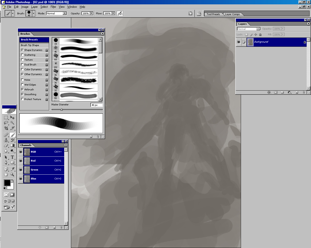
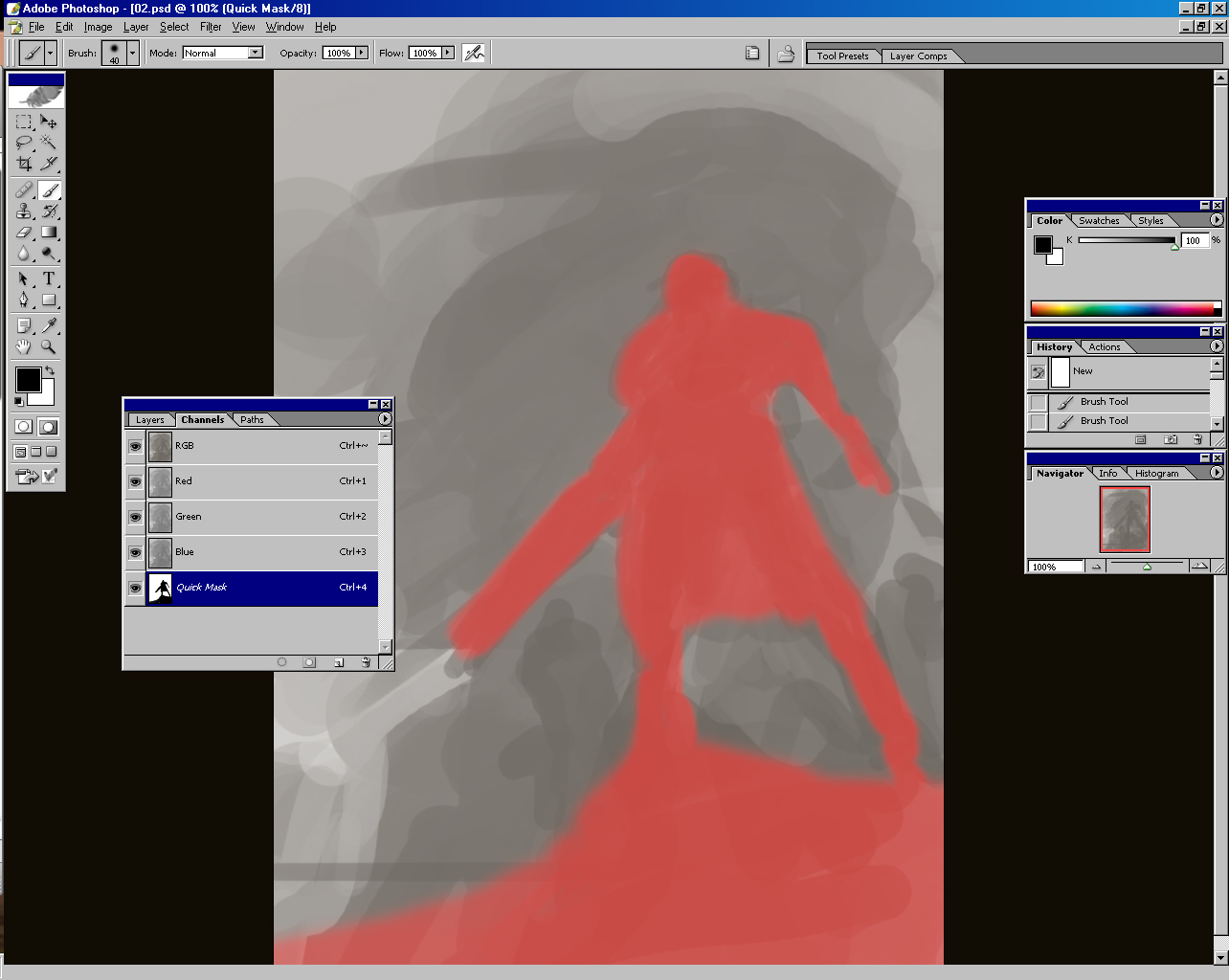
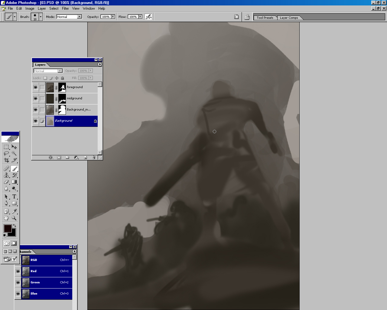
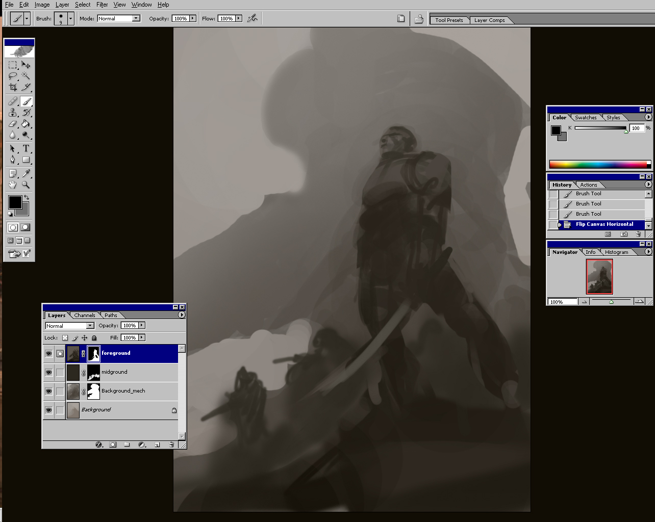
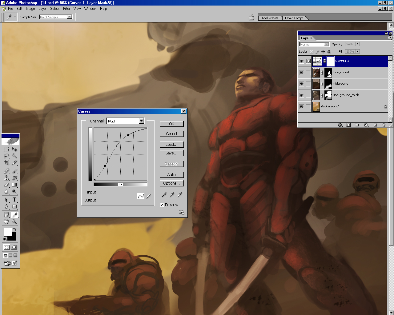
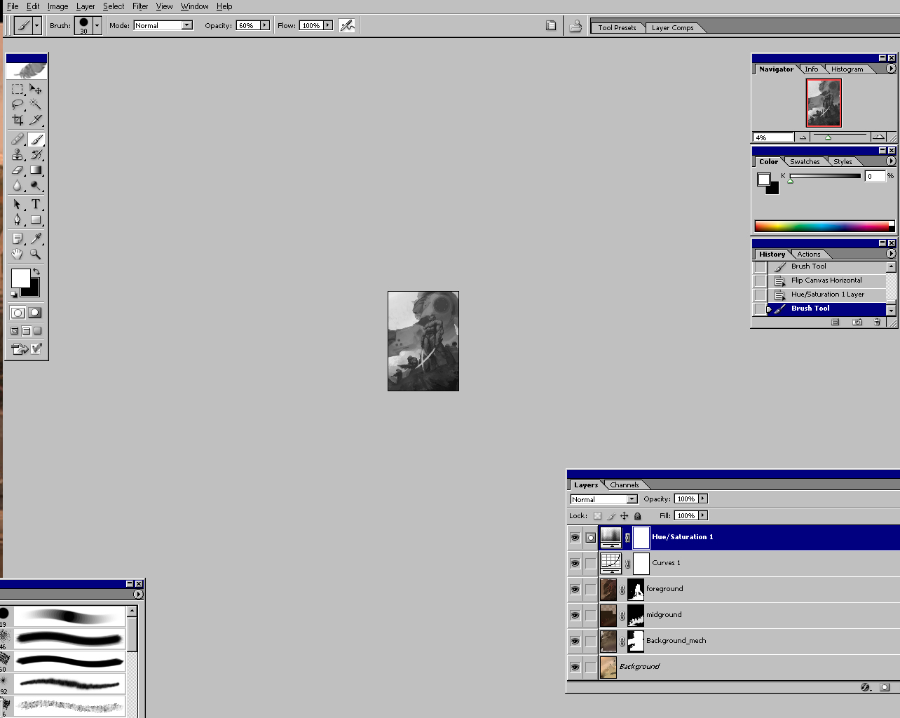
 Step 5: Under painting to establish the base light and dark structure
Since I had illustrated the cover of the game box, I had previously painted faces of the characters that I could use to get a start without having to paint them from scratch. I took my favorite value study, enlarged it to working size, and pasted these details in place.
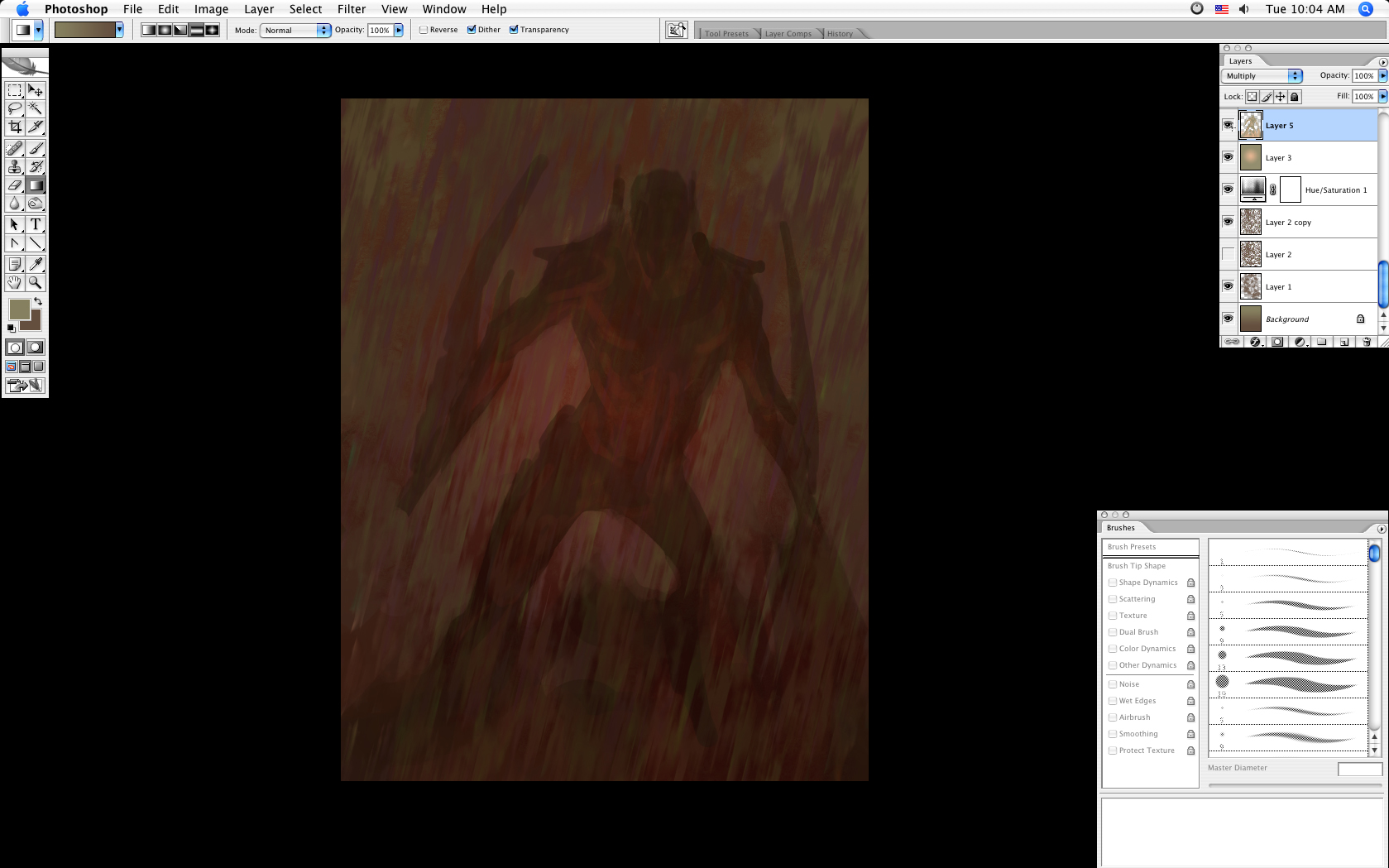
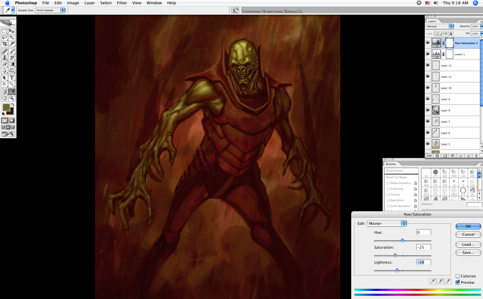
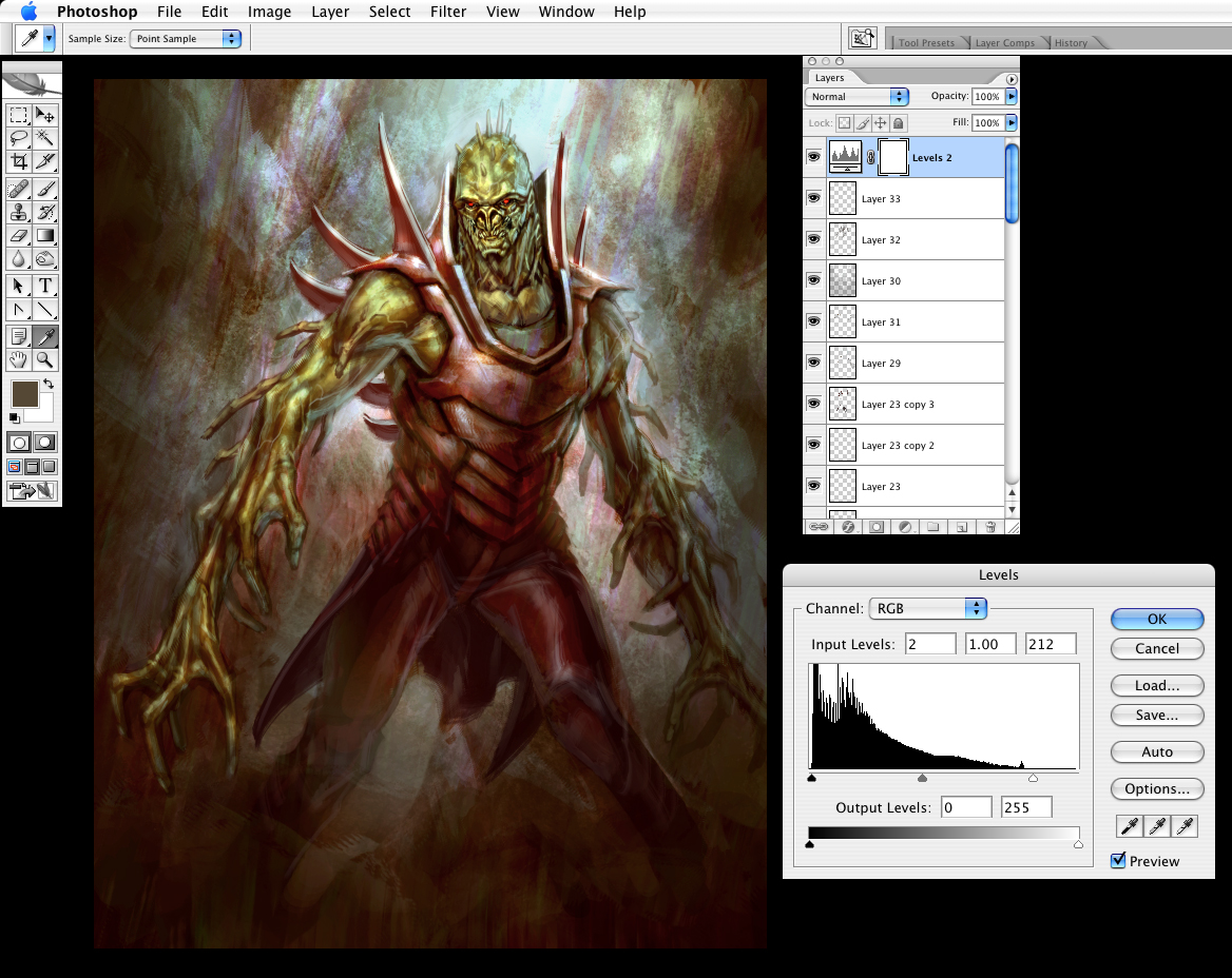
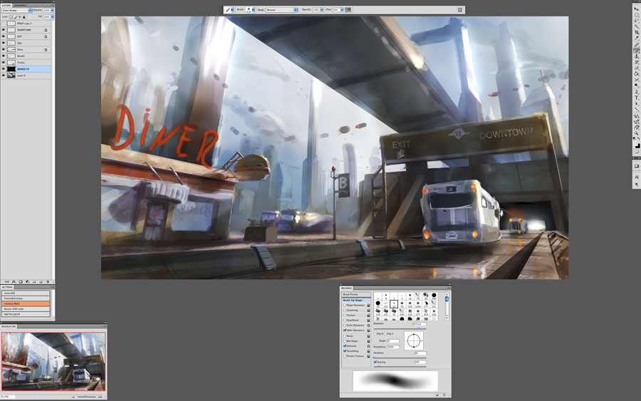
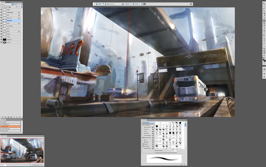
Now I block in the base structure of all the main elements in sepia tone to mimic my traditional oil painting technique. Basically at this stage, you block in all the light and shadow shapes in sepia tone as a value foundation for the painting. The main Photoshop brush I use is a chalk brush with an 'opacity jitter' brush setting. It gives me the feel of an oil brush.
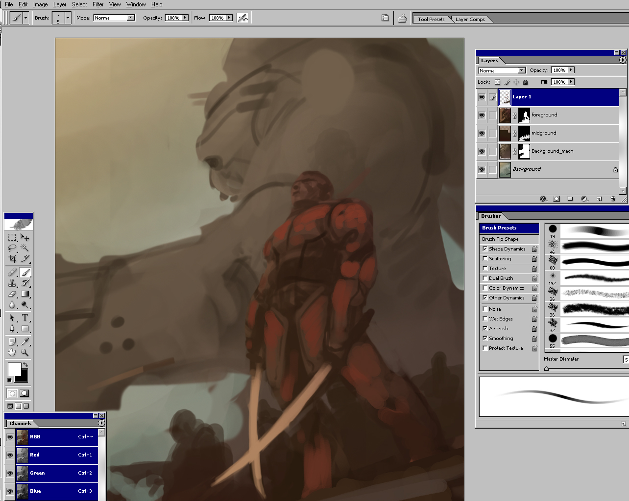
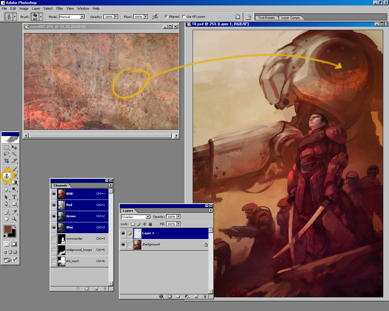
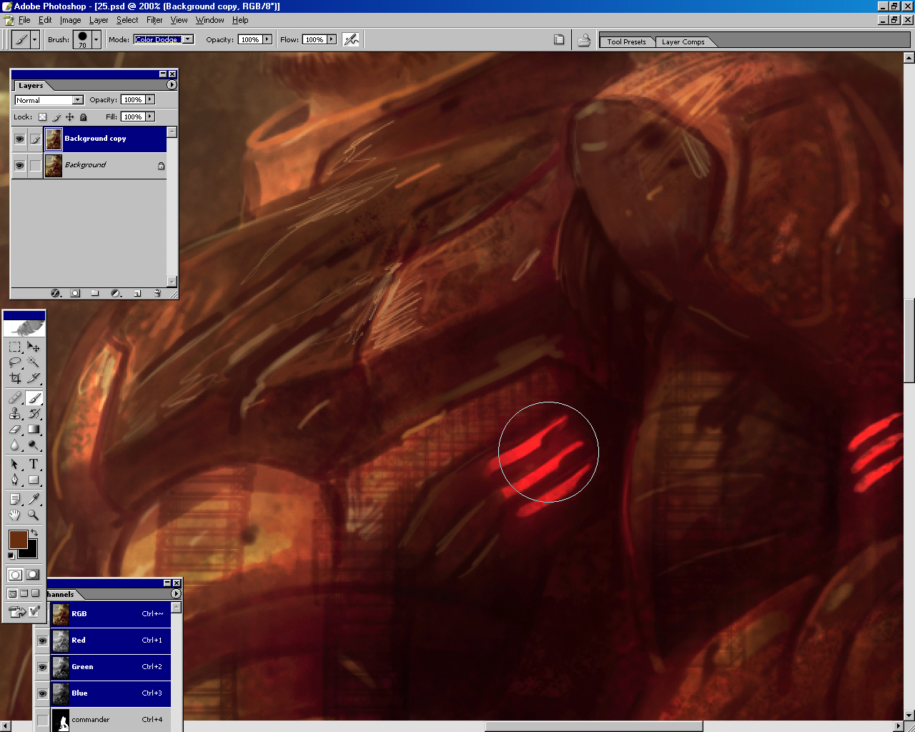
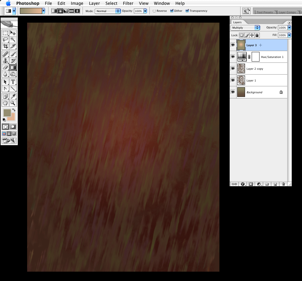
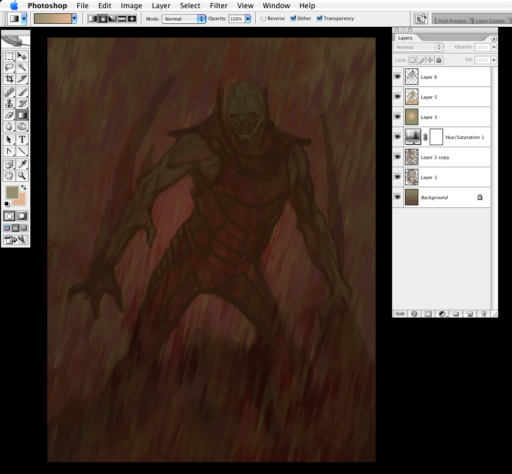
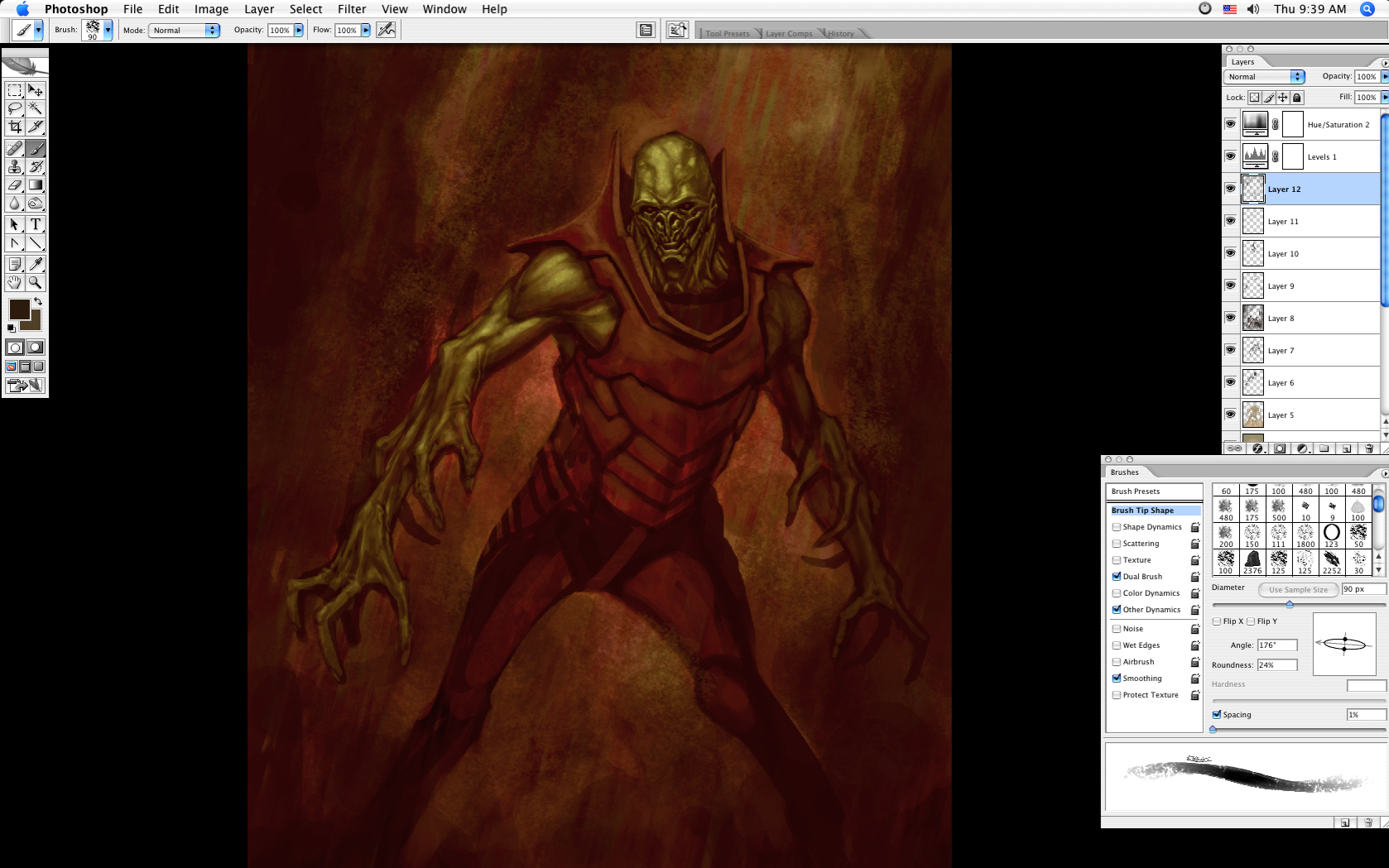
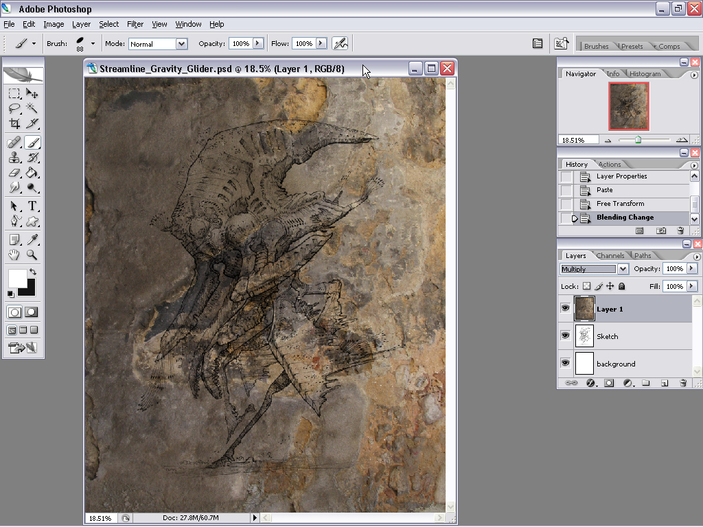
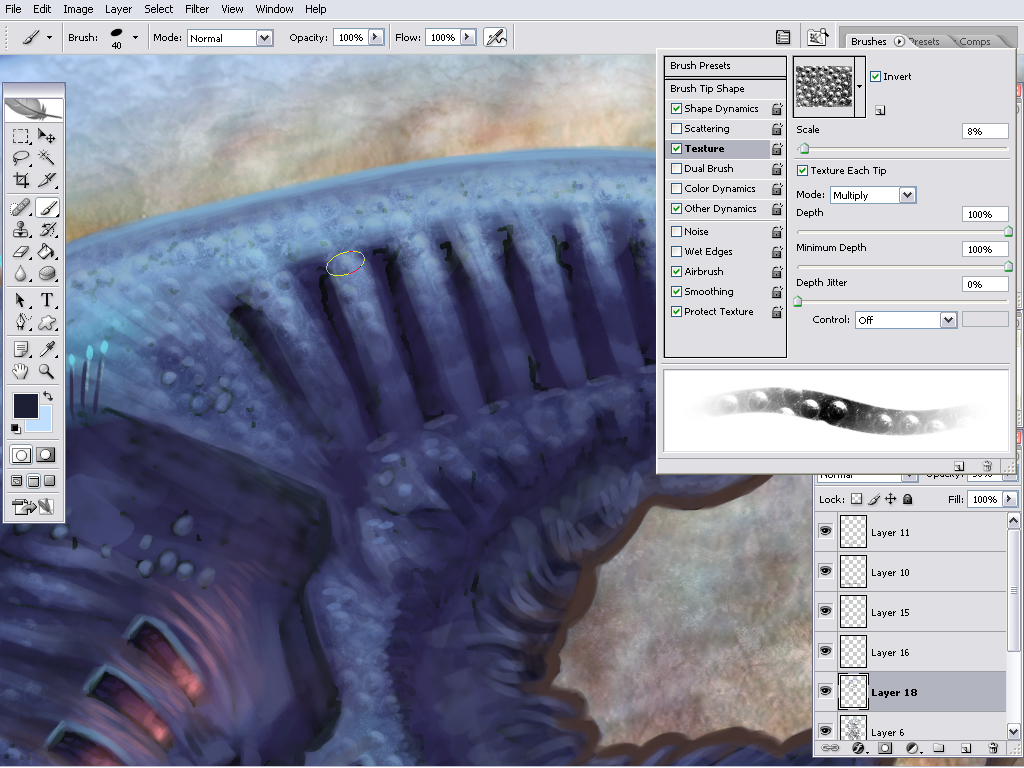
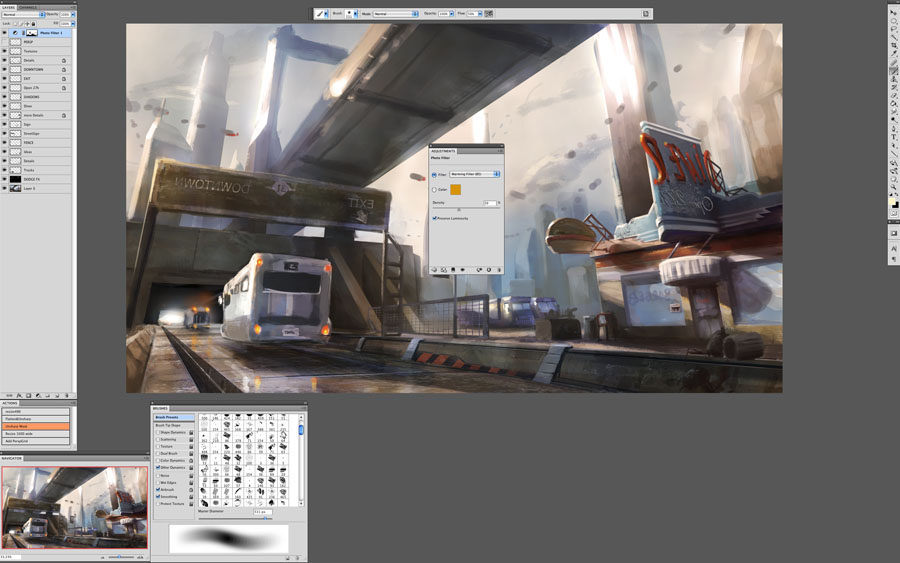
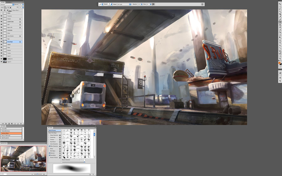
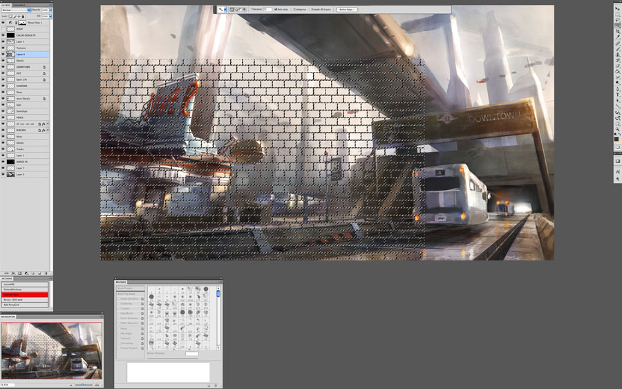
Step 6: Apply texture to break up digital look
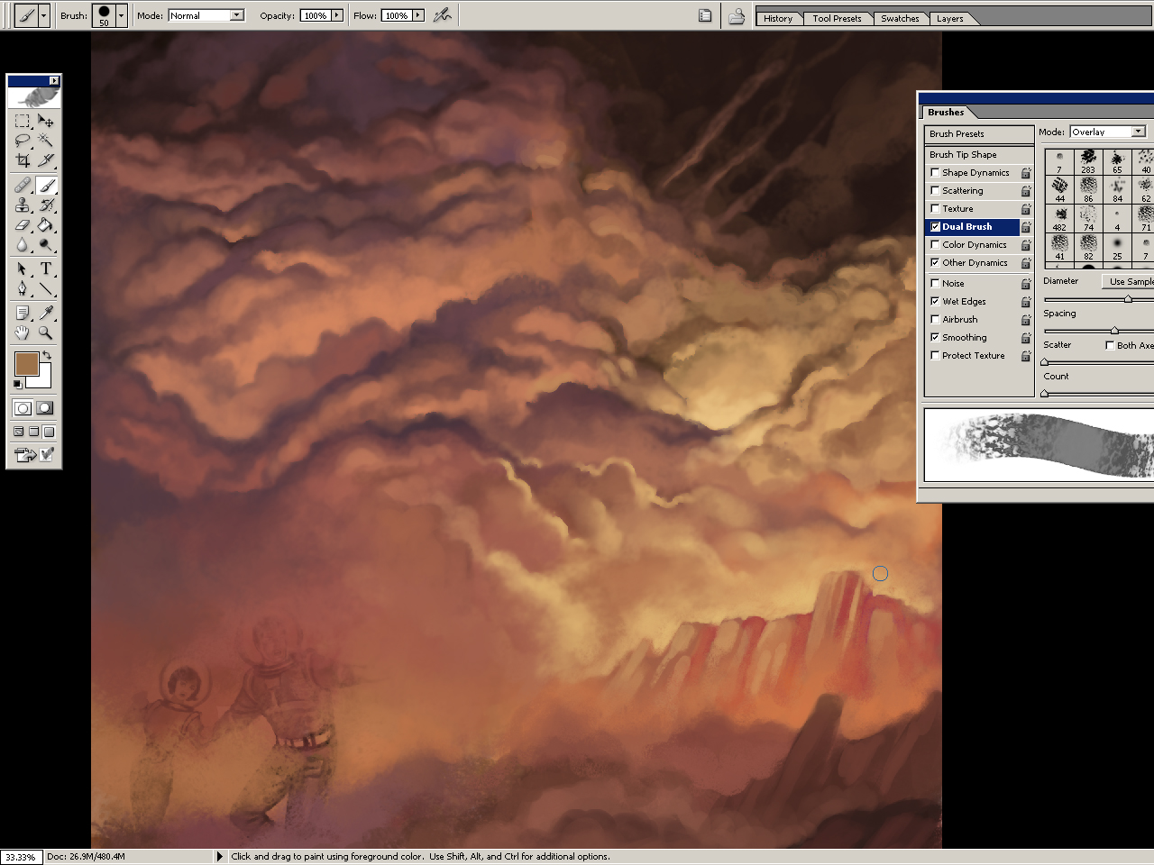
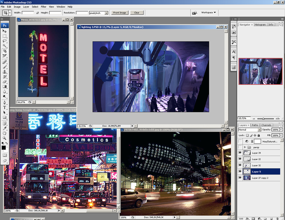
At this stage I apply lots of texture information on top of the image to get lots of cool atmosphere and "texture stuff". It breaks up the smooth clean digital look and starts to make the piece have more of an oil painting look. One way to do this is to load a texture into your brush using the texture settings. The texture I used was an old stained concrete wall I photographed on vacation. Place the texture on a separate layer above everything else, and set the layer setting to 'overlay' or 'hard light' then adjust the opacity to taste. Then I apply a layer mask to the layer, and paint into the layer mask to break up the opacity more randomly.


To make textures using a more traditional method, I use illustration board, canvas or watercolor paper. Sometimes I gesso it first with a stiff brush to get directional brush strokes in the gesso. After putting a wash of a dark color on the board, I tilt the board while it is wet to get drips and random texture. If you sprinkle salt onto the board while it is wet you can get some wild texture. That's an old watercolor technique. The outcome is a texture with drips and cool happy accidents. After it's dry, scan it in, and use it as a grayscale texture.

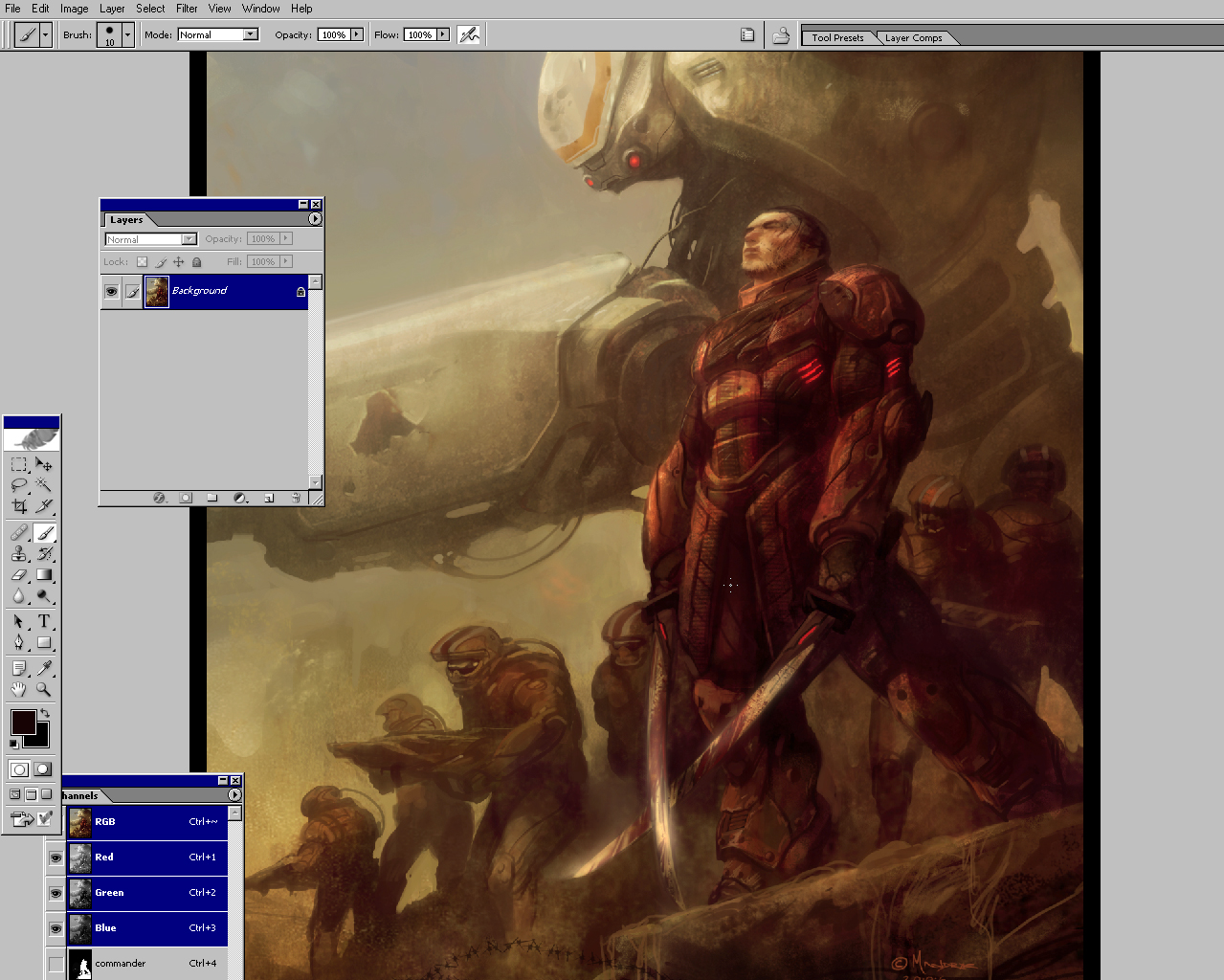
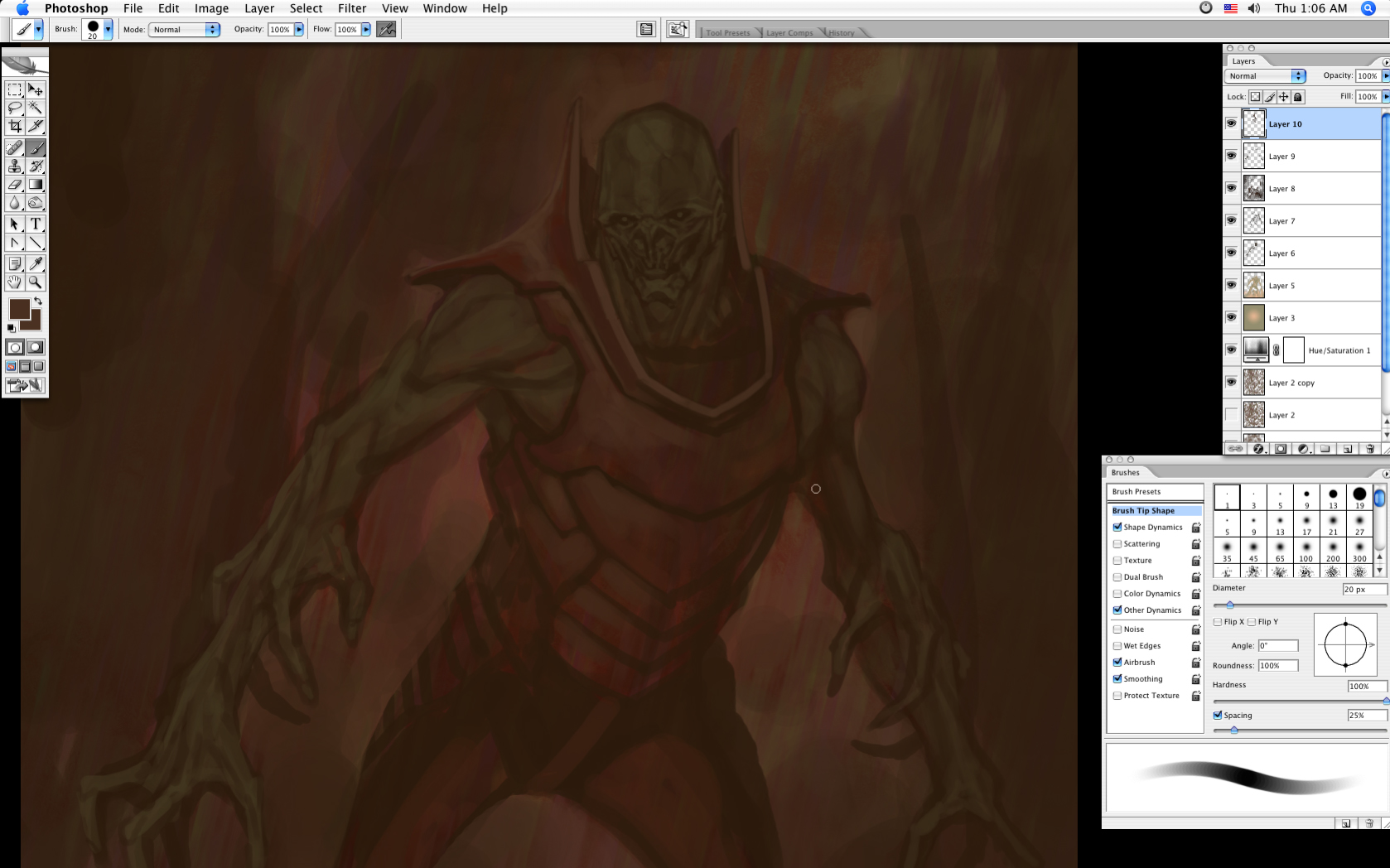
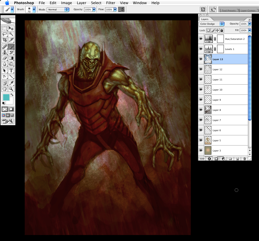
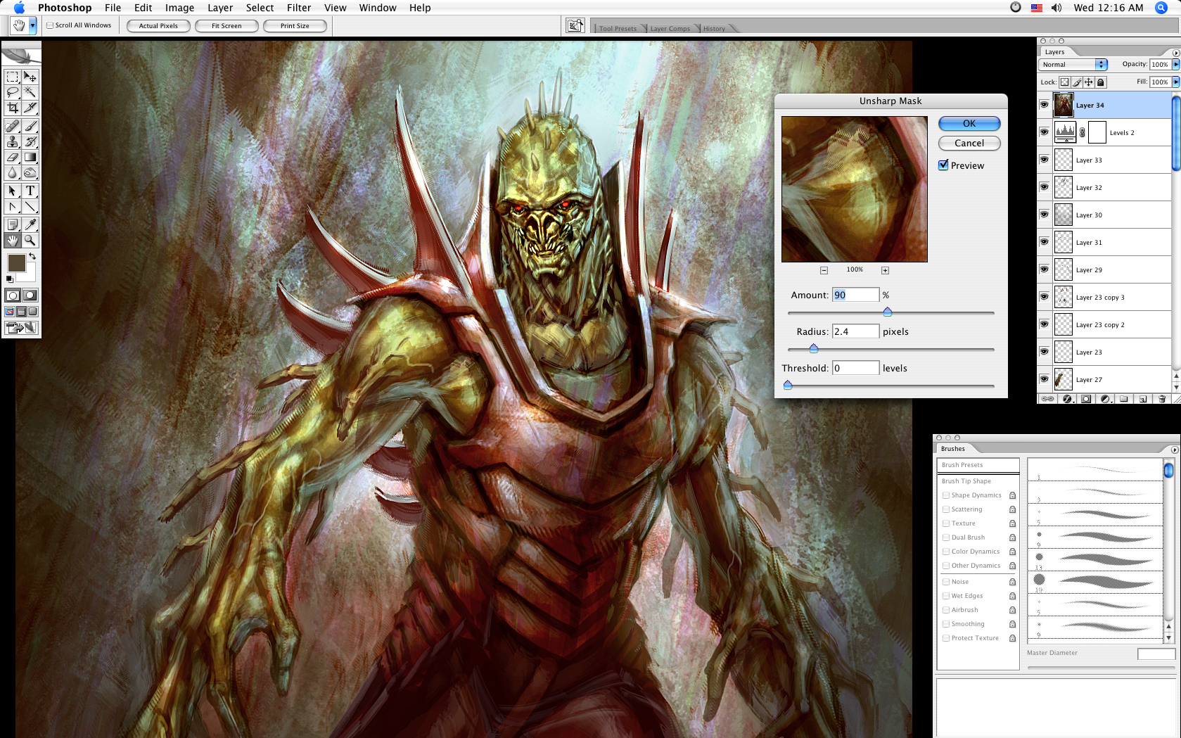
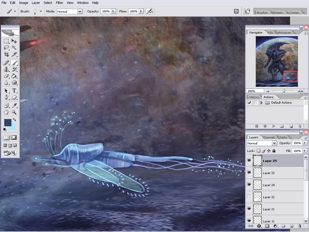
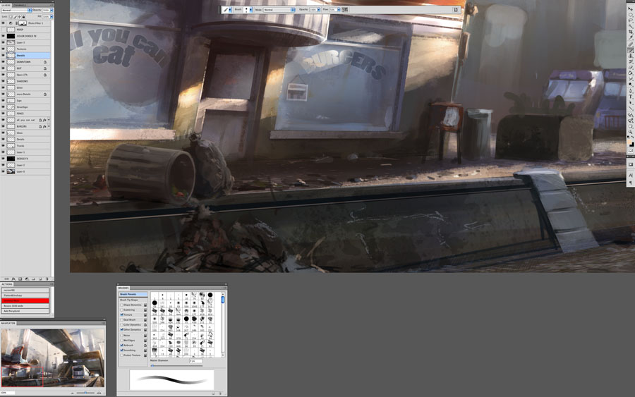
Step 8: Start building up details
It's time to start bringing out the highlight shapes, adding ghoul faces, refining character body parts, etc.

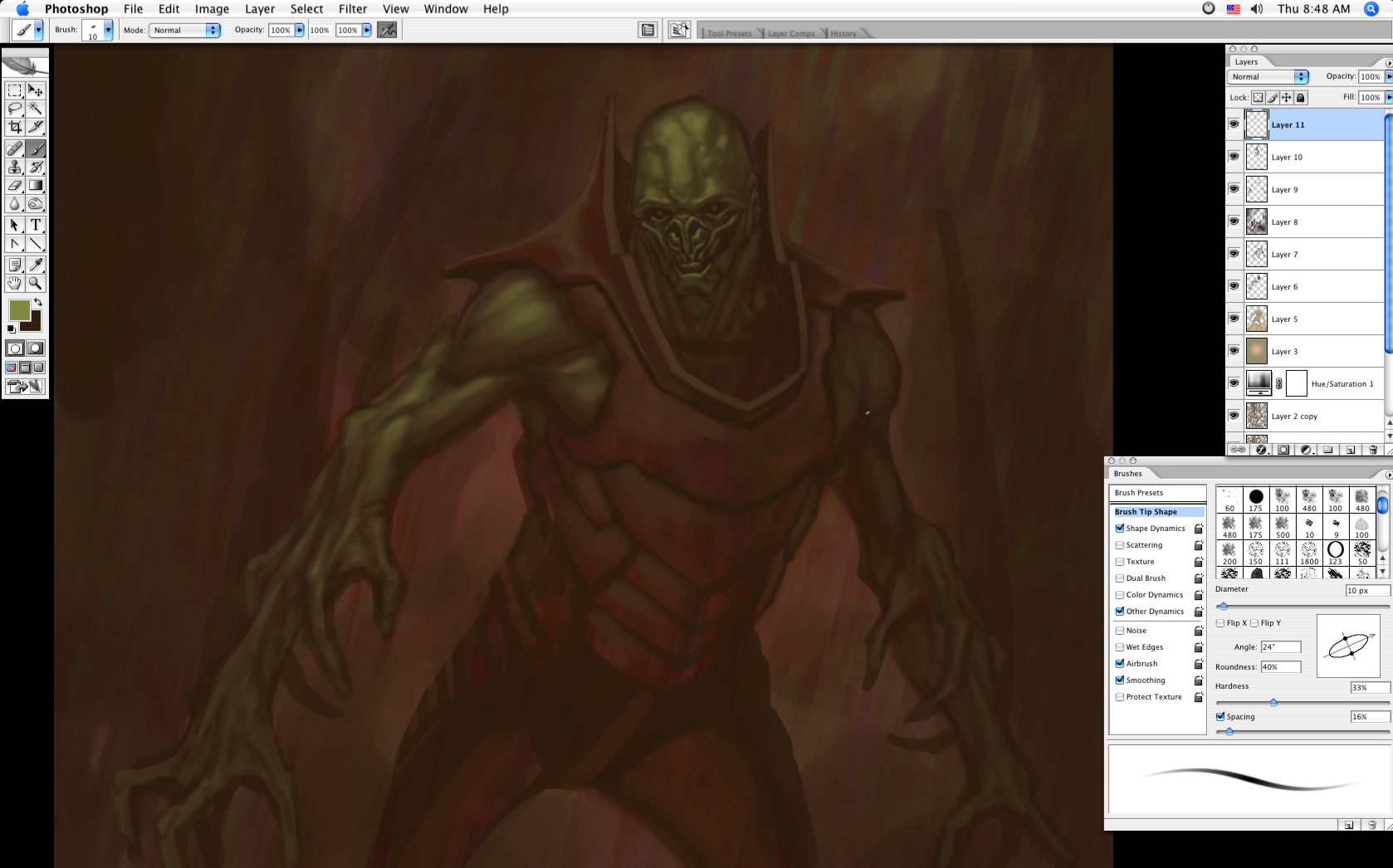
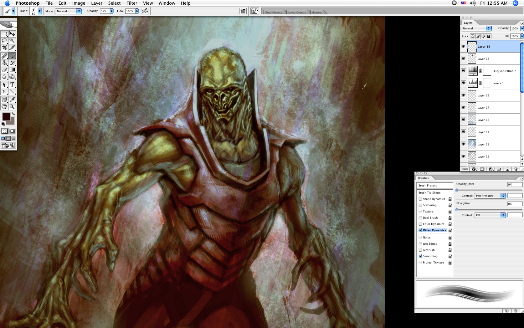
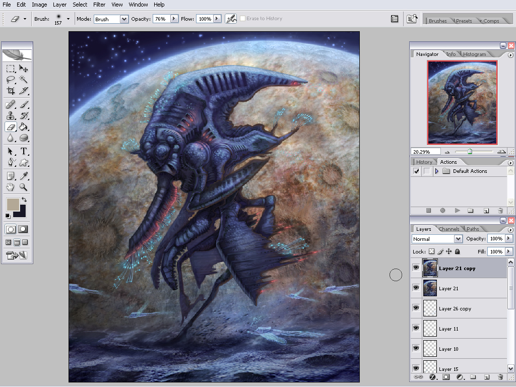
Step 9: Add highlights and refine details
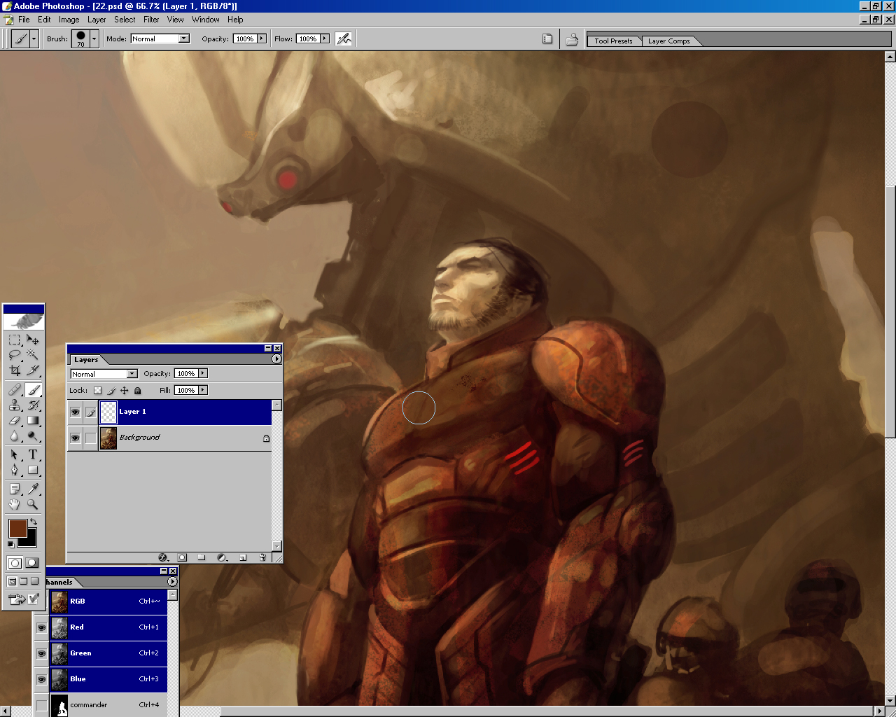
The painting is now nearing completion. I focus on pushing the contrast of colors and values around the main character's head and chest by adding highlights. Since this area of the painting is the focal point, I put my strongest value and color contrasts here. I've also added some splatters and grit. At this point my focus is pushing the quality of the details in the areas in which I want your eye to focus. I try to stay out of the shadows and do most of my work in the highlight areas. This allows the shadows to blend more together and breathe.

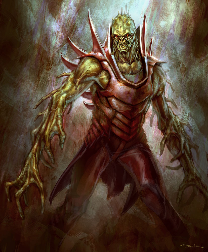
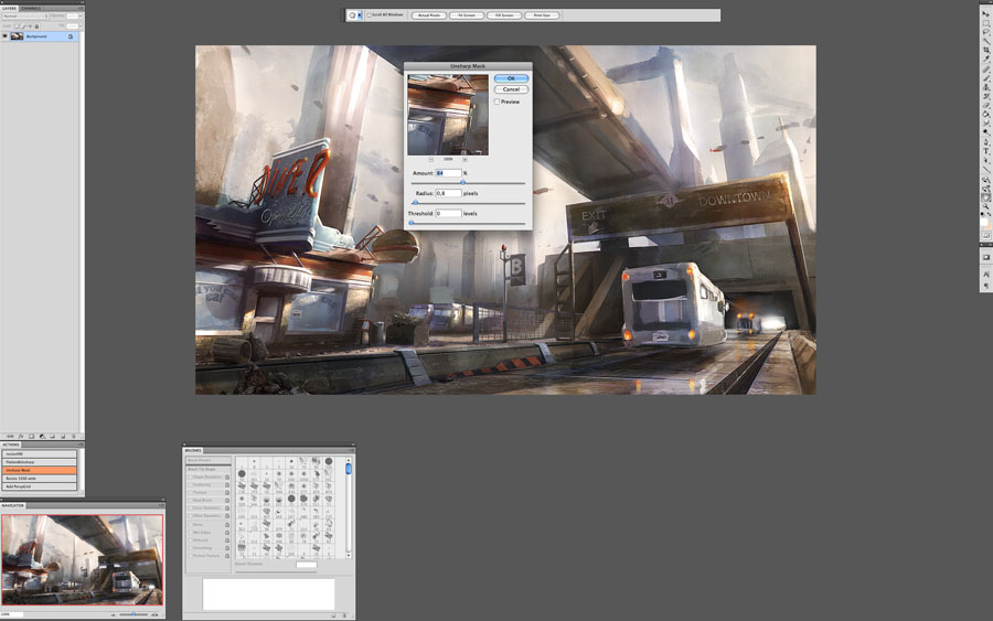
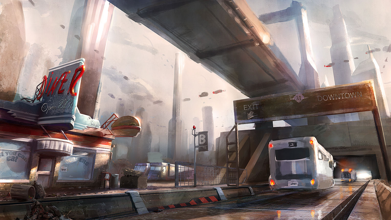
Step 10: Add final details and color adjustments
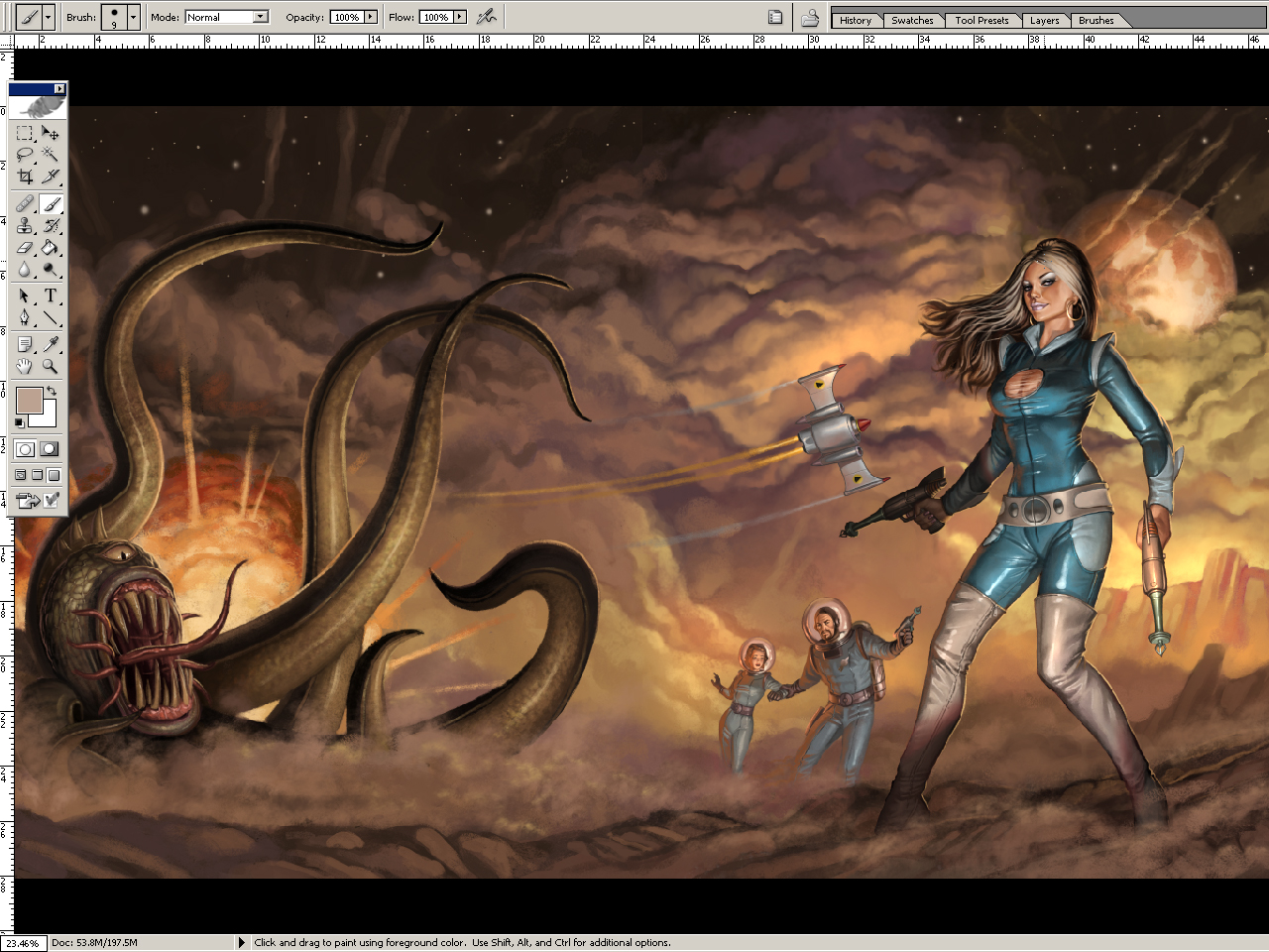
In the final stage I add the last little highlights and push the saturation of the color to give more drama to the scene. Even up to the end of the painting, I am still refining details such as the smoke out of the shotgun and the body parts. In all, this painting took me about 40 to 60 hours to complete.
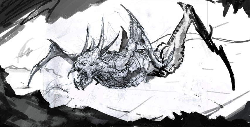
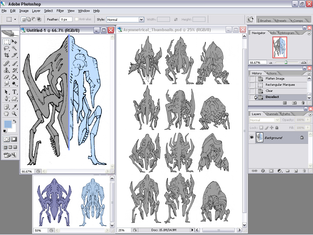
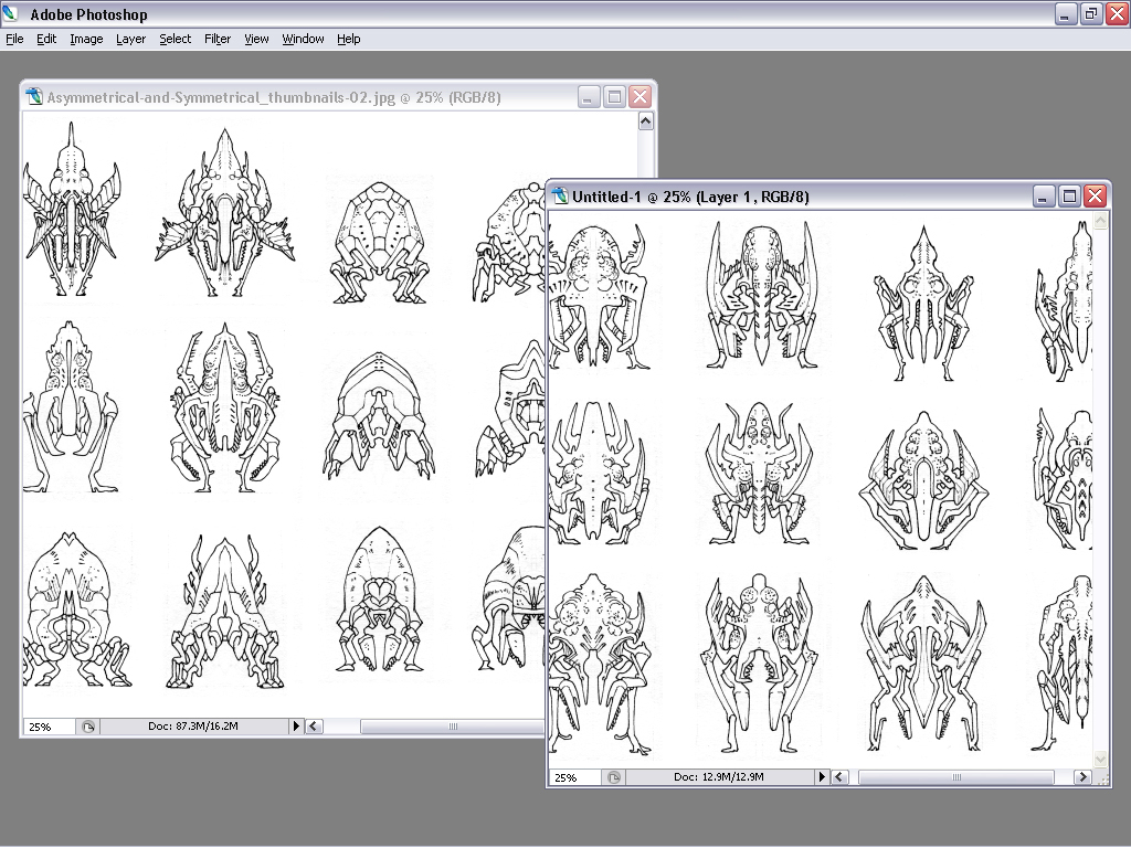
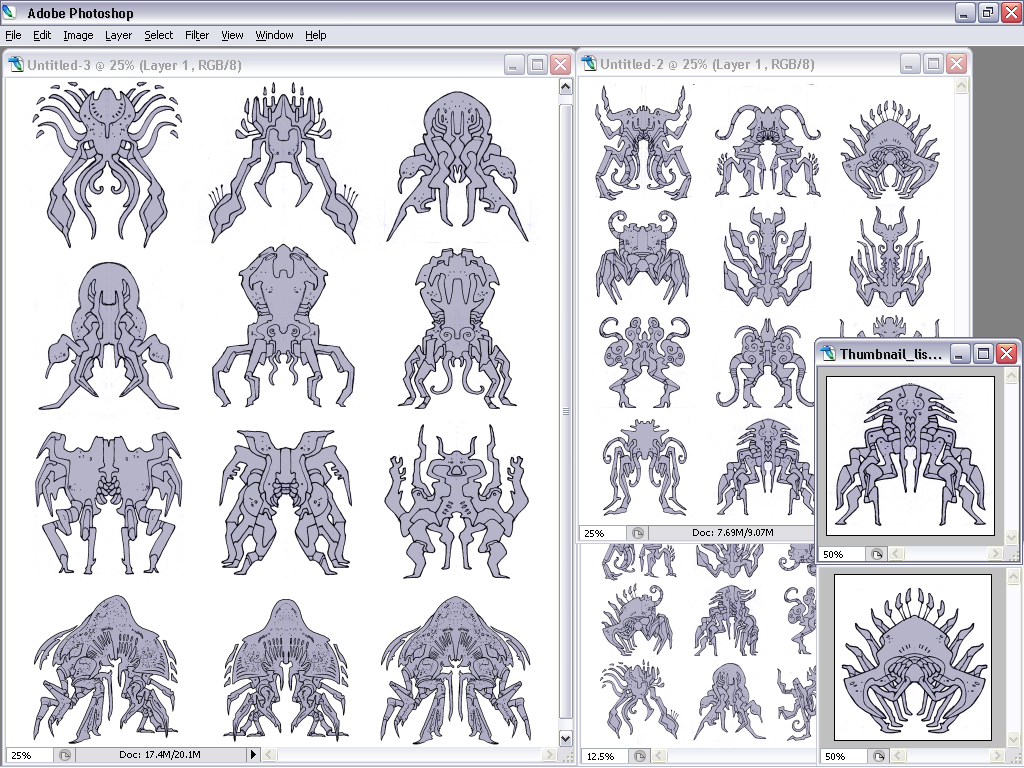
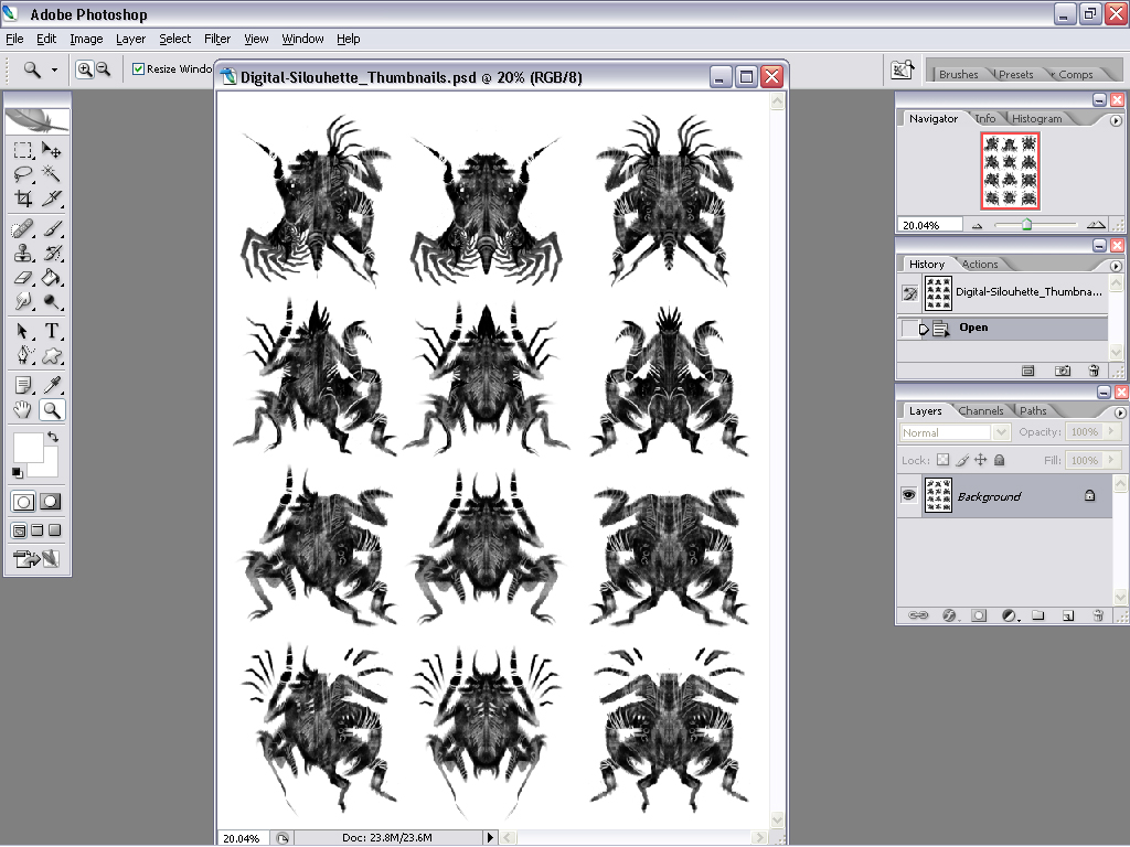
Begin with exploration sketches.
Move on to researching lighting and reference photos.
Refine the shapes and forms, further define the textures, glows, shadows, highlights and final surface details.

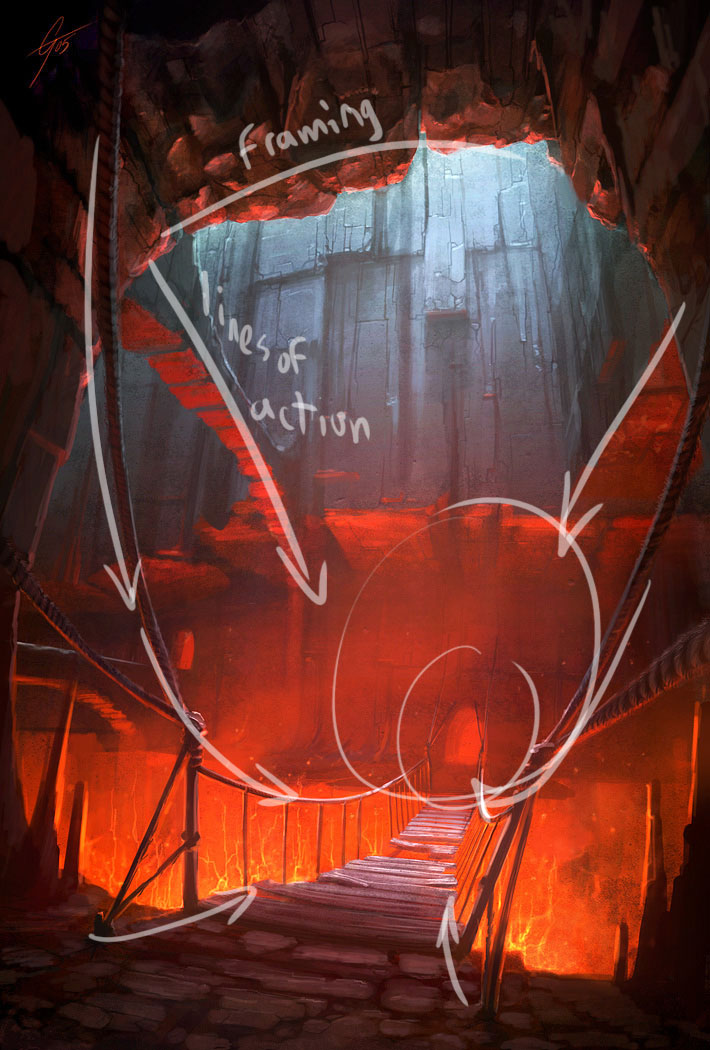
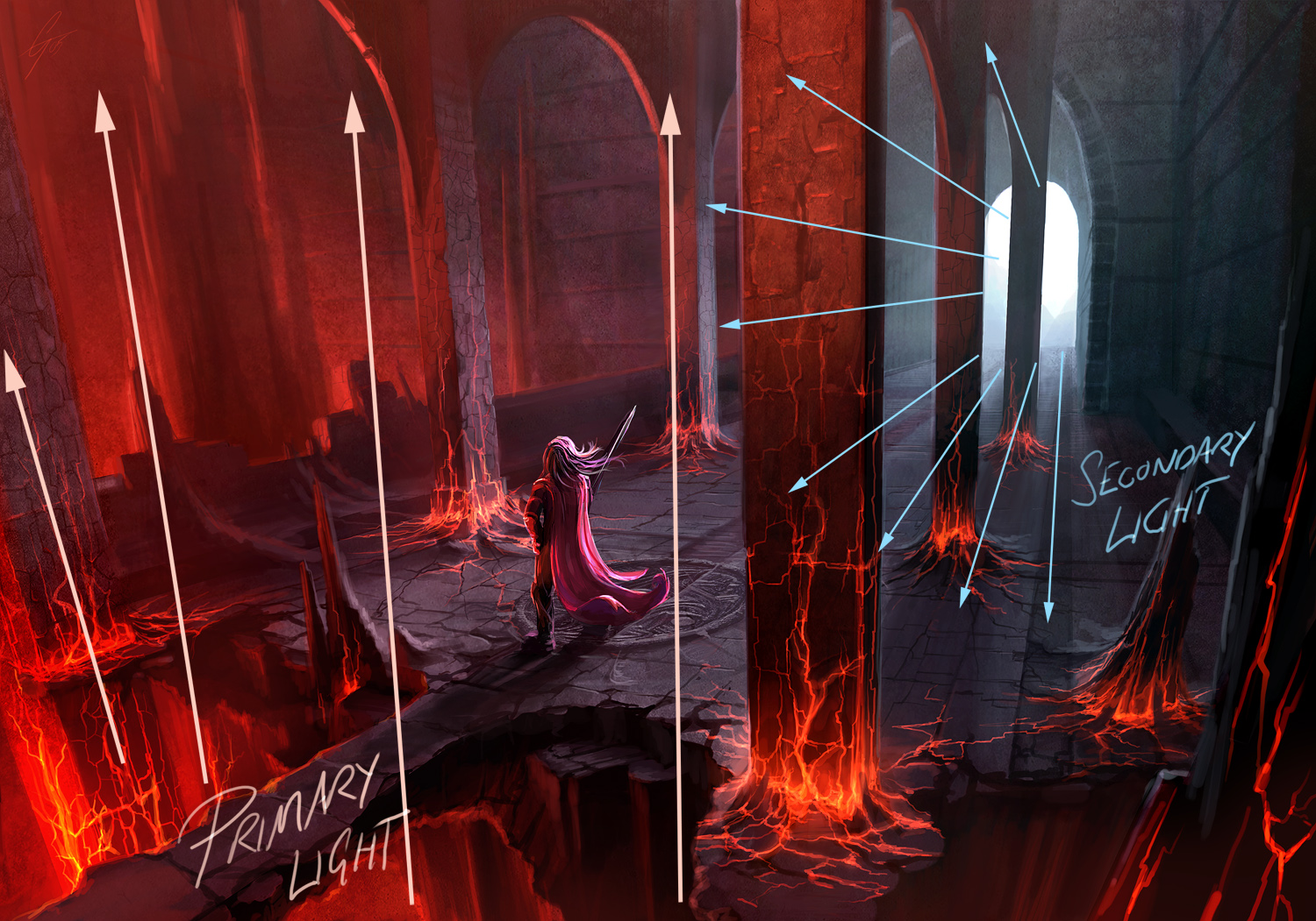
Composition
Subject Placement
Rule of Thirds
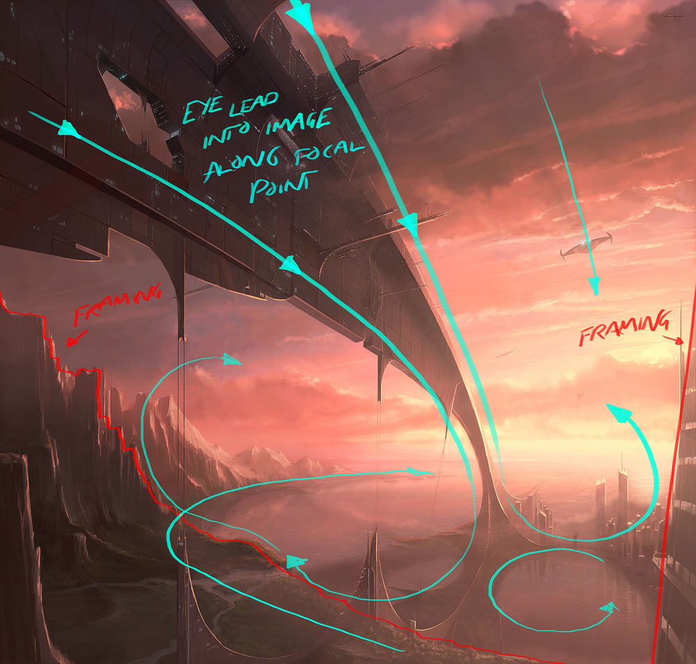
Lines That Lead The Eyes
Open Space
Focal Point
Balance
Natural Frames
Contrast
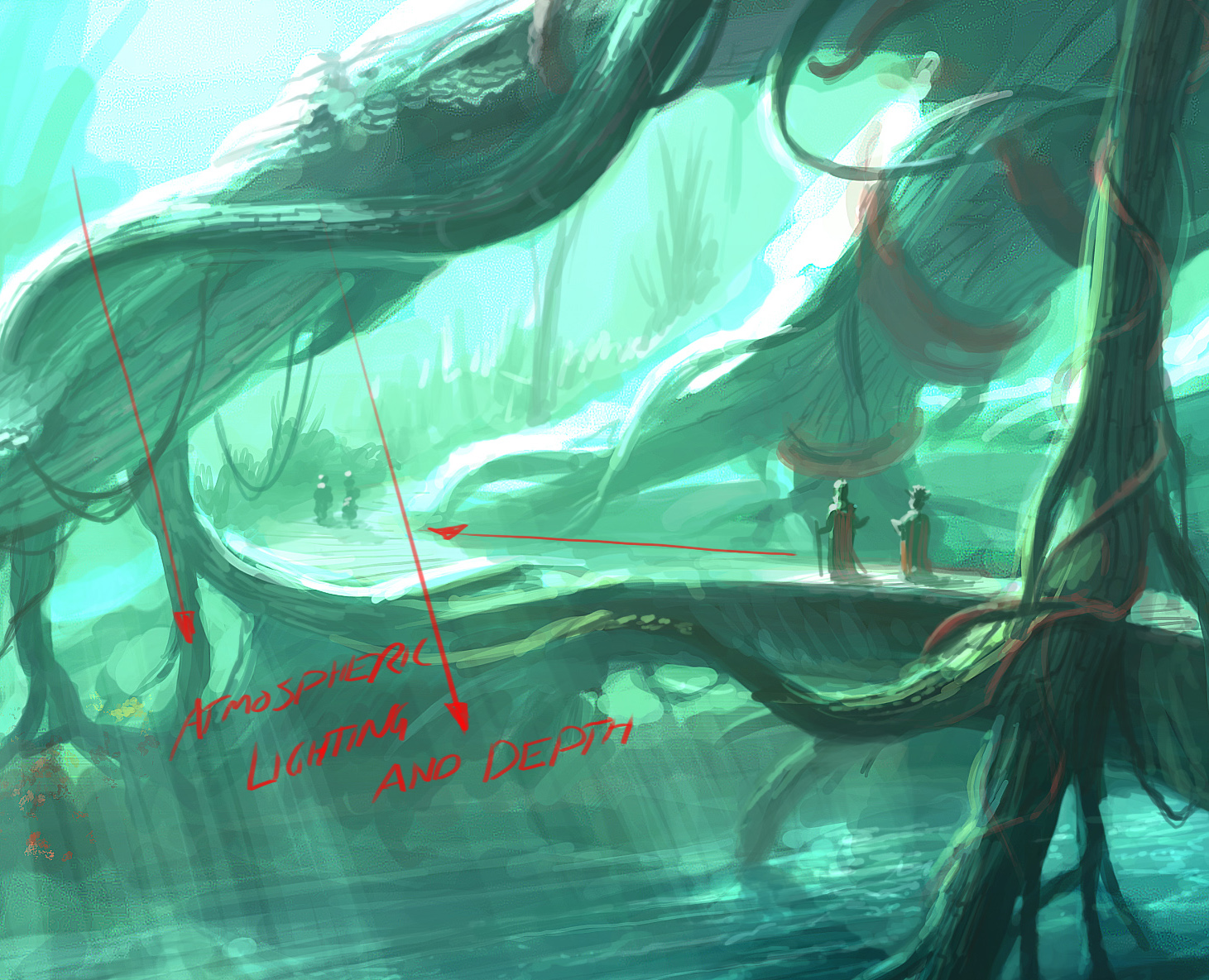
Lighting
Depth & Spacing
Samples of these elemnts put into practice:

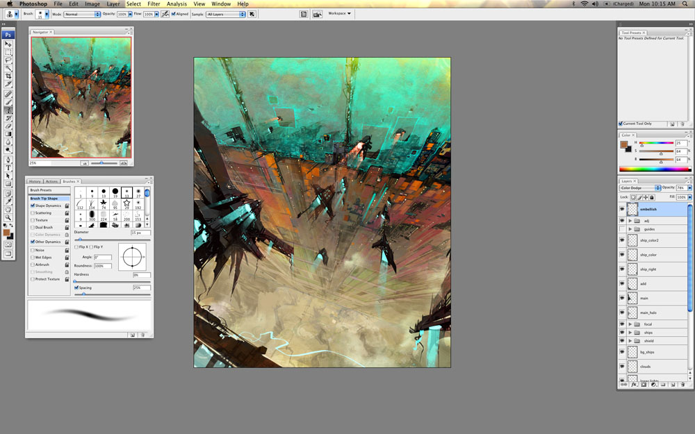
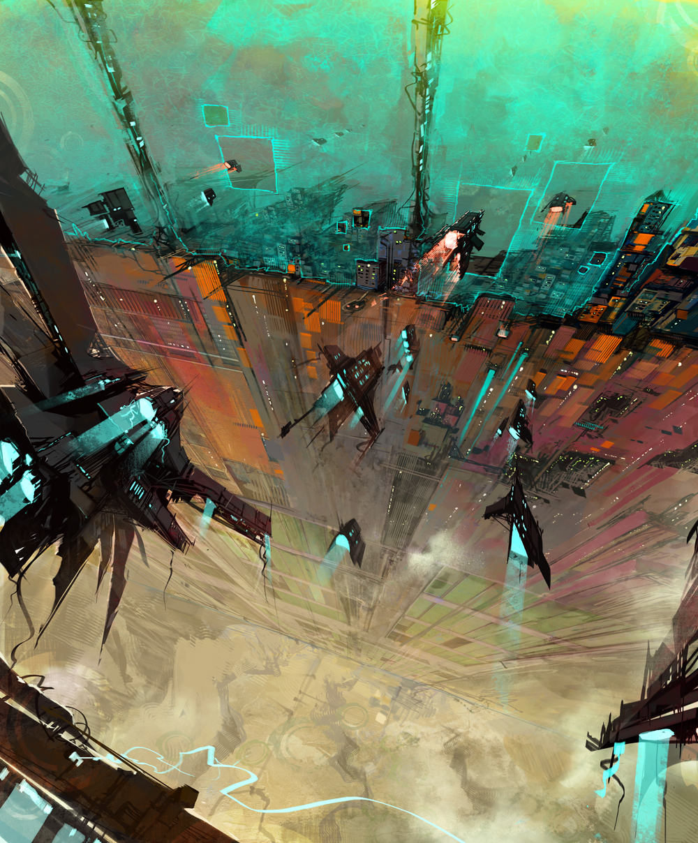
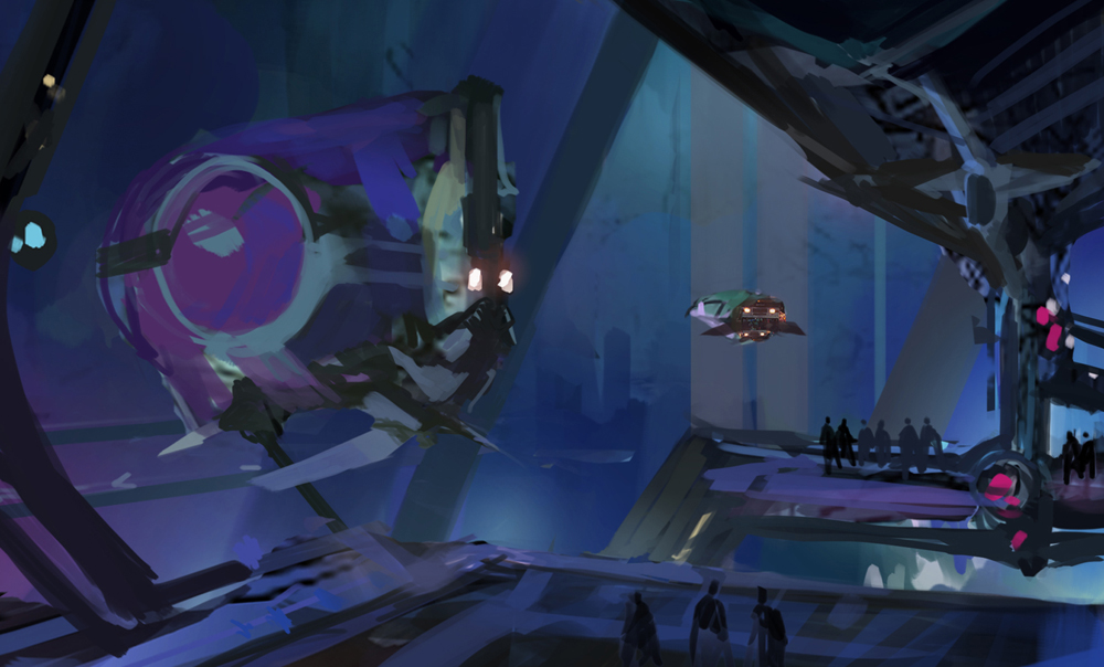
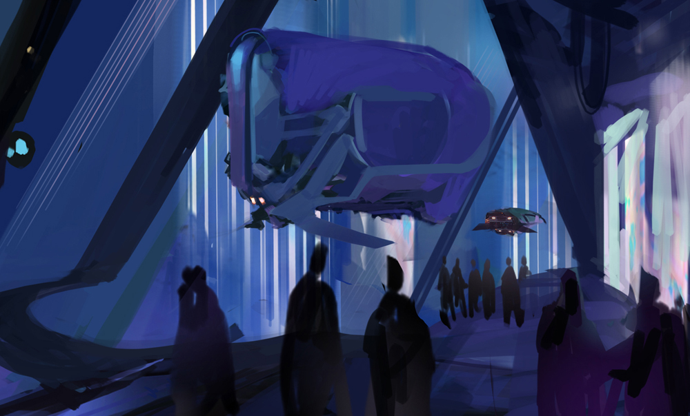
Step by Step Process for various Fantasy Art Paintings and Concept Design
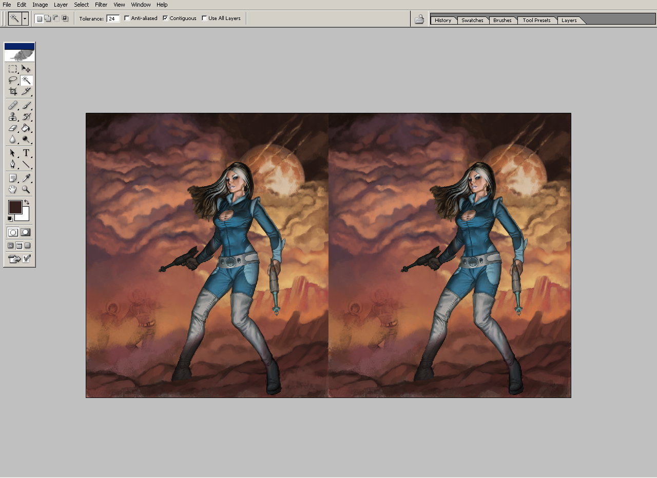
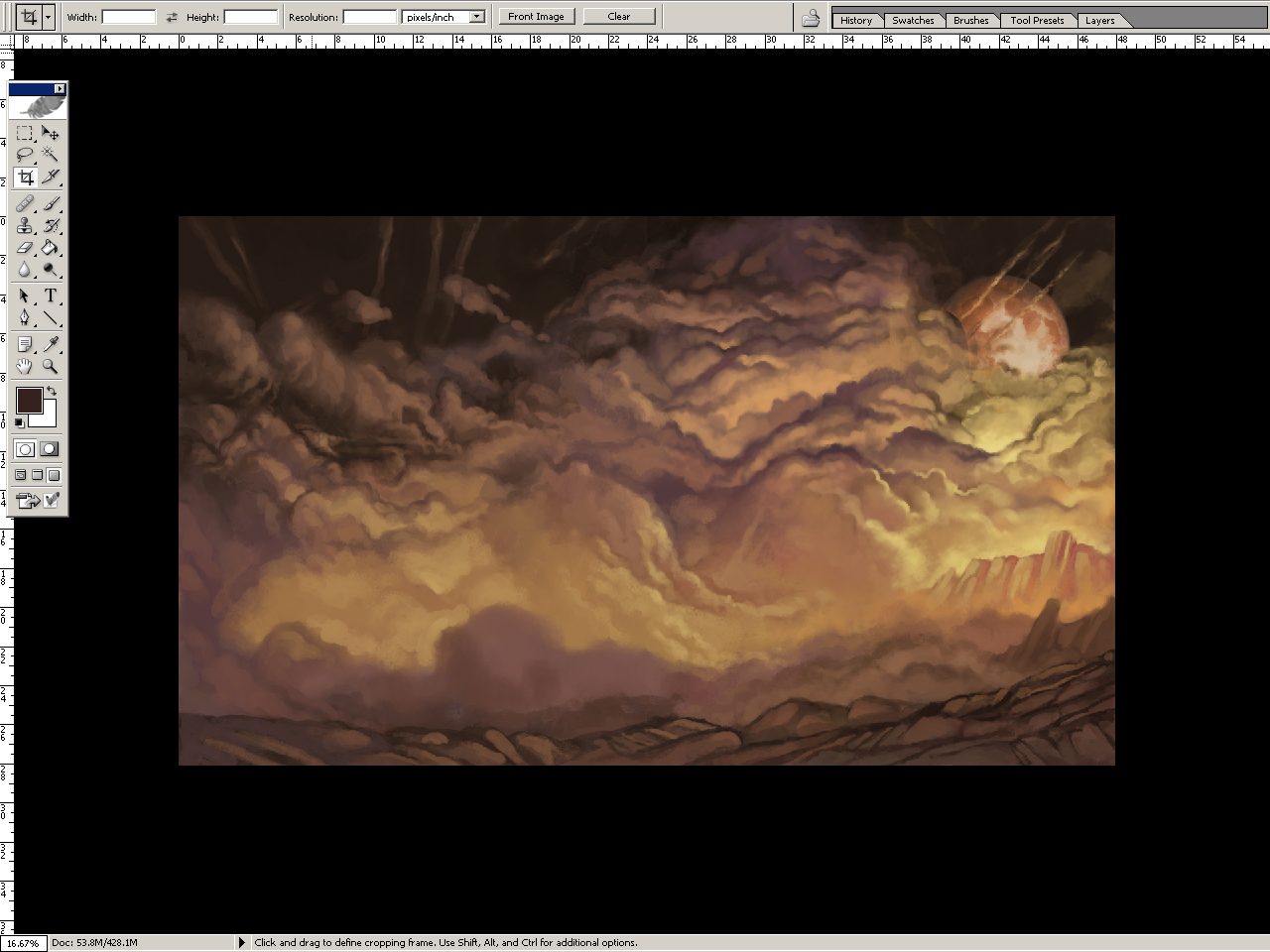
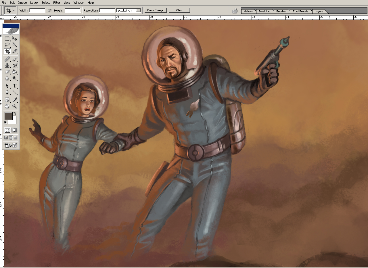
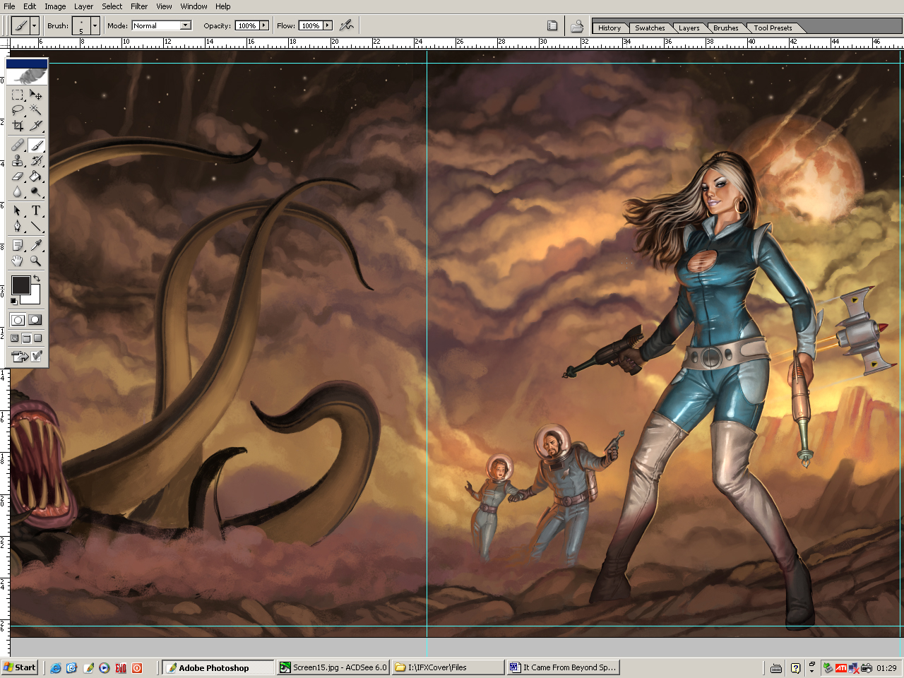
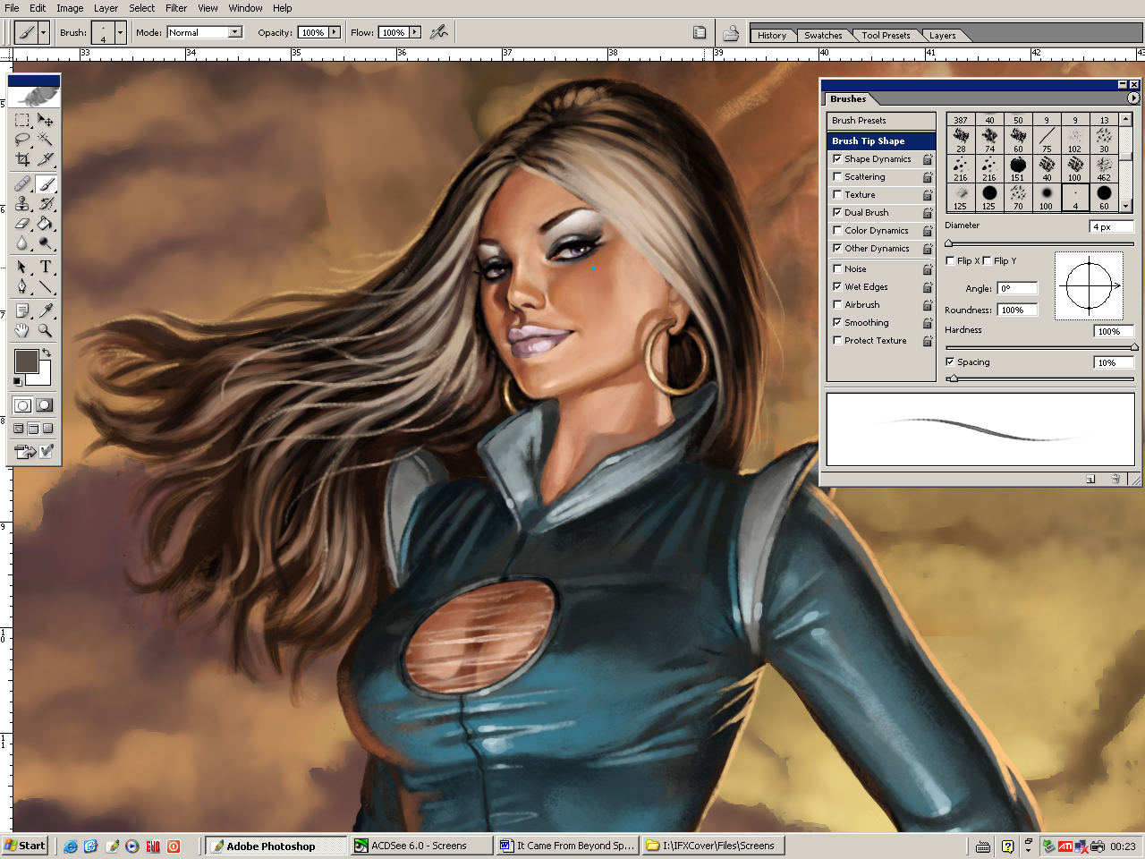
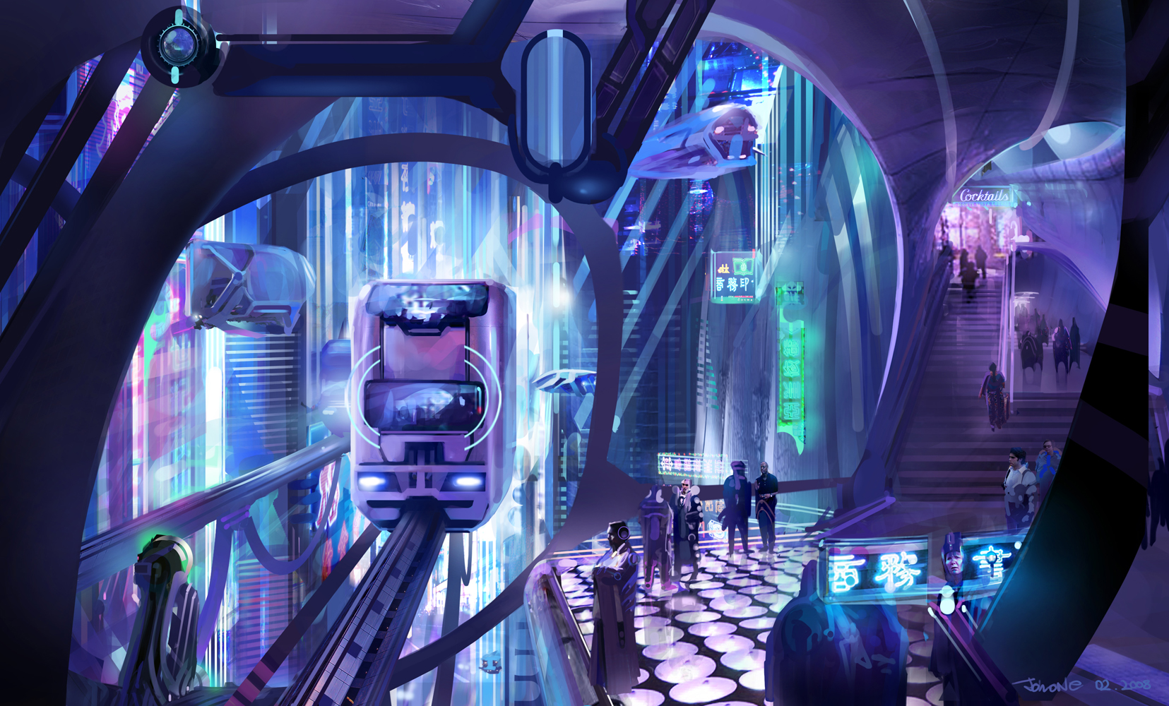
Beyond Space (Pulp Sci-Fi Magazine Cover)
Fantasy/Sci-Fi (Digital Illustration)


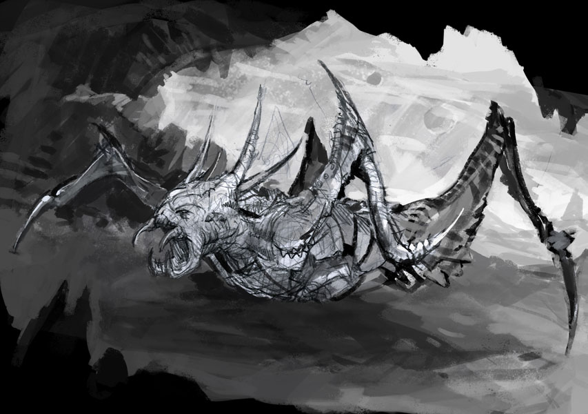
Creature Concept Art 1
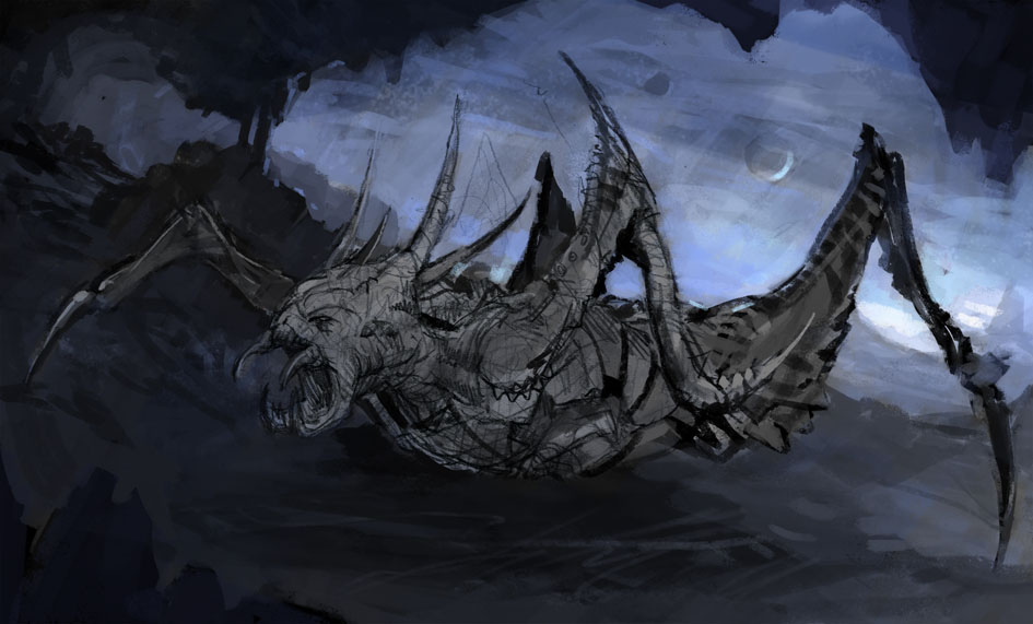
Creature Concept Art 2
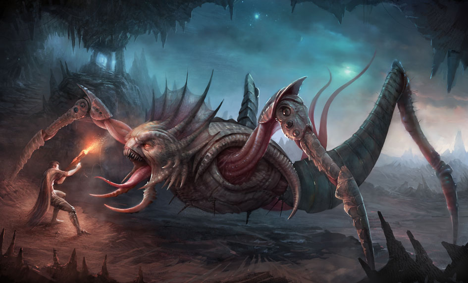
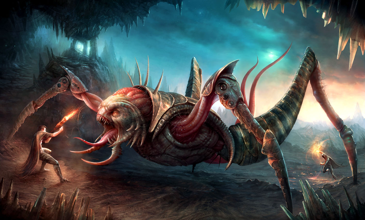
Creature Concept Art 3
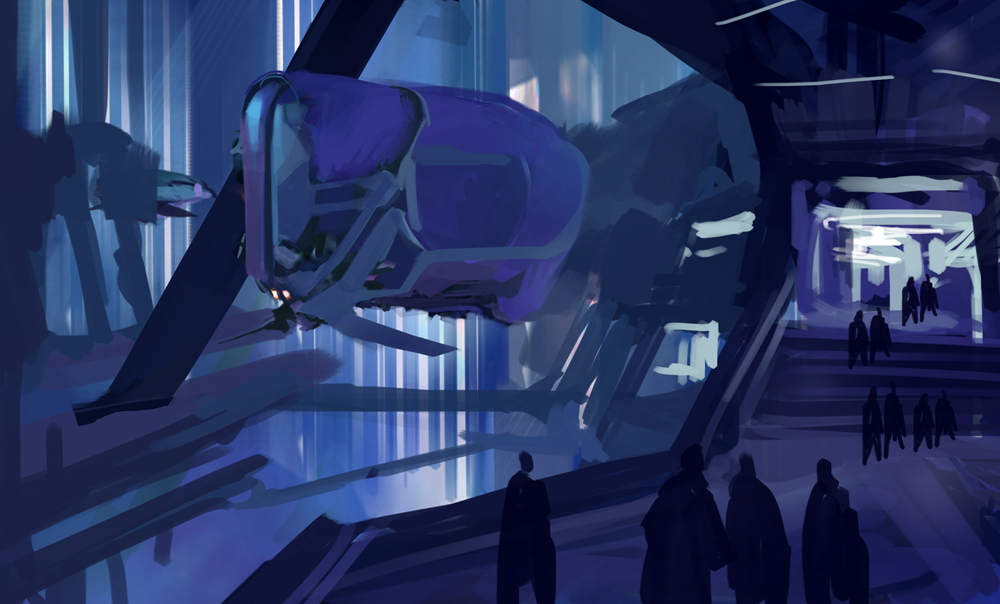
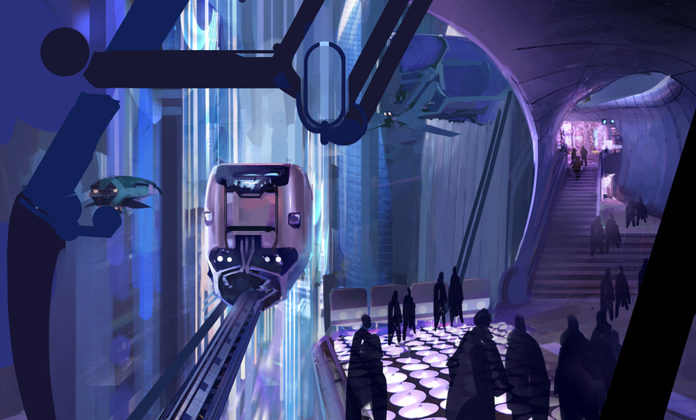
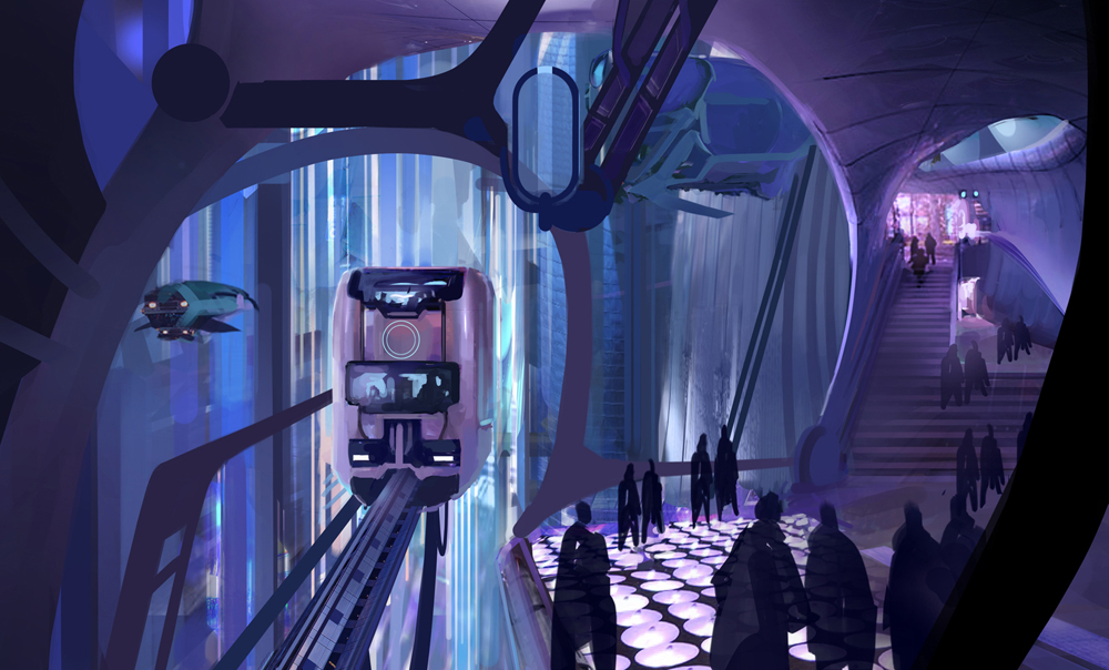
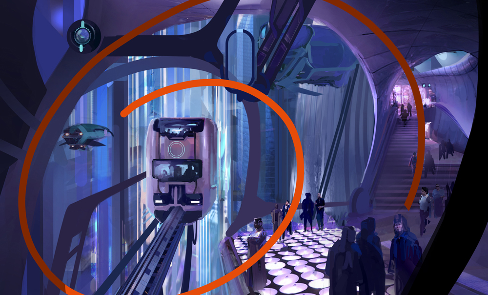
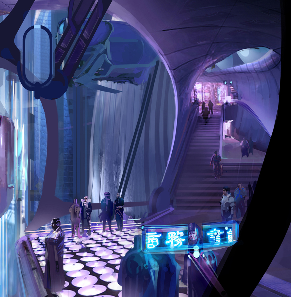
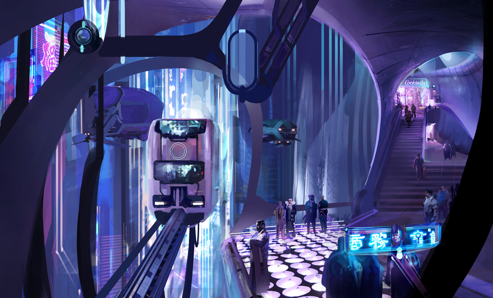
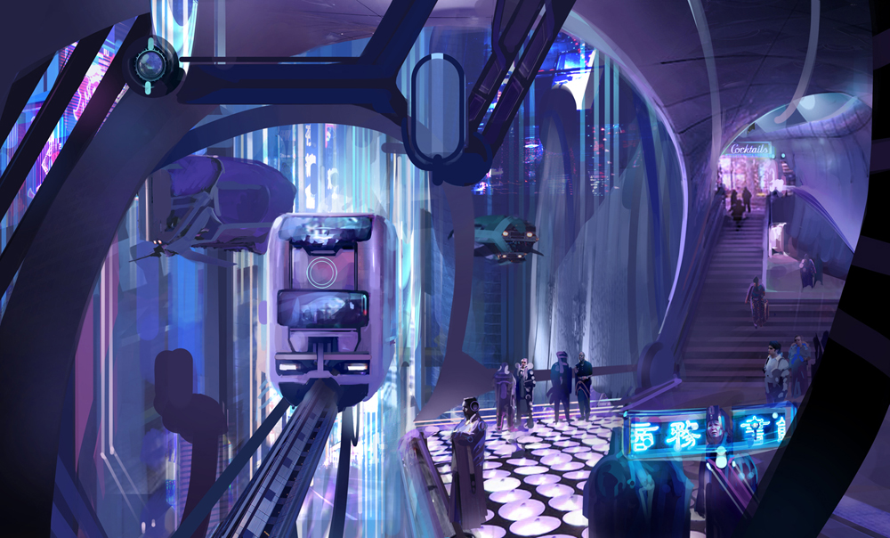
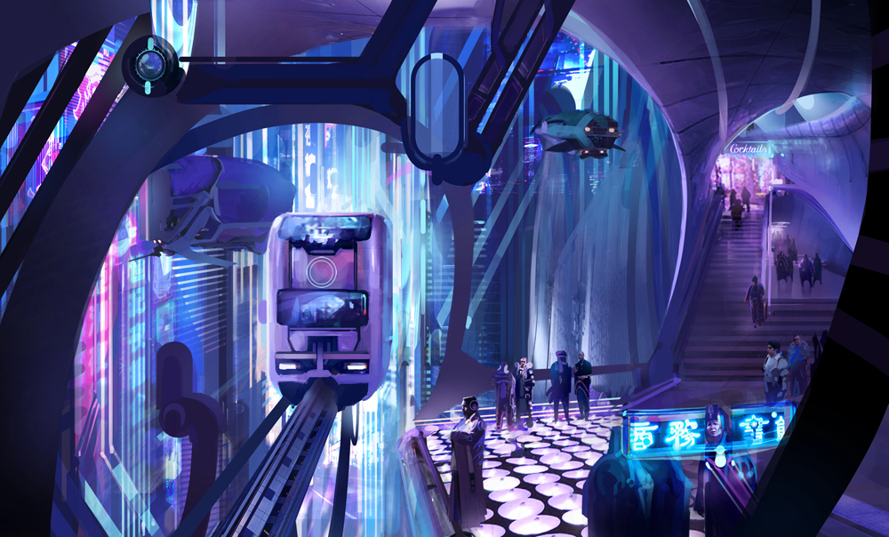
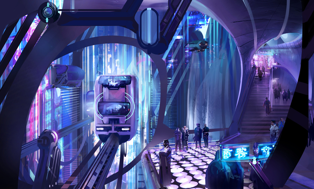
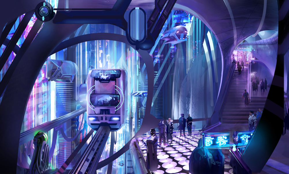
Environment Design 1
Environment Design 2


Environment Design 3

To learn more about these same principles applied to comics,
illustration, animation storyboarding / background art, visit these links...
John K's Composition For Animation Artists:
Composition 1: Framing
Composition 2: Intersection
Composition 3: Clear Staging
Composition 4: Staging Groups of Characters
Composition 5: Negative vs Positive Space
Composition 6: Asymetricality
Composition 7: Poses Working Together
Composition 8: Form vs. Detail, Lettering, Reference
Composition 9: Study Other Artists
Composition 10: Contrasts
Composition 11: Organic Shapes
Composition 12: Contrasts in Texture and Spacing
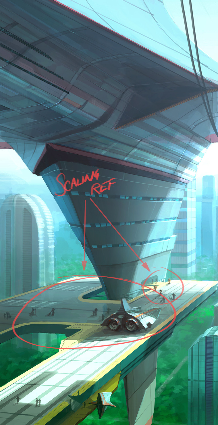
Composition 13: Scale
Composition 14: Form Over Detail
Composition 15: Form in Clouds
Composition 16: Flair
Composition 17: Reference and Inspiration
Composition 18: Scene Planning For TV Part One
Composition 19: Scene Planning For TV Part Two
Composition 20: More Inspiring BG Layouts