Click here to see this webiste in inversed colors (black on white).
What is the key to success in visual storytelling? A willingness to collaborate, the flexibility to evolve, and an understanding of the basic rules of cinematography.
Why Learn How to Storyboard?
> A story artist is like a mini-director
- In control of creative content
- Visualizing (and improving) the idea or script
- Lots of responsibility, but lots of freedom
> A good story artist is always in demand
- Story is the one discipline that is still not being outsourced
- Job security & career path for growth with many diverse projects
- Whether it's freelance or contract work, storyboards are
ALWAYS needed to bring the concept or screenplay to the next phase.
> Storyboard artists are some of the highest paid artists in the industry
- Why? Because you are near the top of the creative food chain
- Commercials, advertising, interactive media, motion graphics,
pre-viz for special FX, 2D or 3D animated feature films,
televisions series, music videos, and video games;
all require storyboards of some sort to visualize a
script or idea, to help uncover any potential problems
and to help the client / producer / director visualize the end product.
The Function of Storyboards
Staging: The positioning of characters in each scene for maximum emotional content and clear readability of actions. In Animation it refers to the purpose of directing the audience's attention, and make it clear what is of greatest importance in a scene; what is happening, and what is about to happen. This can be done by various means, such as the placement of a character in the frame, the use of light and shadow, and the angle & position of the camera. In live-action this is refered to as 'Blocking'.
Storytelling: Each panel's sketch clearly communicates to an audience the important ideas expressed through the action of each scene. This is all compromised of different types of shots, framing / editing principles, and scene transitions, and how they are used by filmmakers to help tell a story. These depict many elements like the poses and expressions of the characters, as well as how the scenes will cut and how close (or far) the camera is to the subject.
Tips on how to use of the basic tools of Line, Shape, Space, and Motion to express clear visual language in your storyboards:
Storyboarding Usage
1. Film / Television / Video Games The storyboard is essentially a large comic strip of the film or some section of the film produced beforehand to help directors, cinematographers, video game cinematic director and advertising clients to visualize the scenes and find potential problems before they occur.
2. Animatics: In animation and special effects work, the storyboarding stage is followed by a mock-up called "animatics" (also known as leica reels or story reels) to give a better idea of how the scene will look and feel with motion and timing. All the panels get strung together in a slideshow with the voice actors saying their lines in conjunction to the scenes. This is how you plan out the length of ever shot and sequence and ultimately time out the length of the entire episode or film.
3. Interactive Media / Advertising / Business: Storyboards were adapted from the film industry to business for planning ad campaigns, commercials, workflow proposals or other projects intended to convince or compel an audience to action, and to pitch a concept to the client. Storyboarding is even used in the fields of web development, software development and instructional design to present and describe interactive events as well the display of flowcharts, audio elements and motion graphics.
But the most important reason is for yourself. Whatever animated thing you are about to create or develop, storyboarding it first will always help you to PLAN YOUR WORK, which is vital to figuring out the staging and acting for all your characters and layouts and how the camera will frame these elements.
Introduction to visual storytelling:
Planning is probably the step most often missed by students, and at the same time, it is probably the most essential tool in your entire animation toolbox, especially in the first few years of your animation life. You
should never sit down in front of your computer, animation disc, puppet, or camera setup, until you know exactly what poses you are planning to use, when you are planning to use them, and why.
Before you begin any shot, it's so important to study references, work out your thumbnails, and make your timing and acting
decisions on paper. This may seem like an "extra" step to some of you, but believe me, it will save you time in the long run and your
work will look so much stronger than it would have otherwise.
All the shots I've ever worked on that turned out great, are also the ones I spent the most time planning out. The shots where I got cocky and thought "Aw,
I know how to animate that, I'll just sit down and do it" are all without exception, the shots that ended up being just "okay," but
never as good as they could have been. I'll always regret missing the opportunity I had to make those shots special, but at least they
taught me an invaluable lesson: Planning Comes First, ALWAYS!
Terminology
Storyoboard Tests and Exercisesbr>
"The Incredibles" Practice Retro-boarding
Play and pause on each shot from the provided clip, and draw what you see,
indicate any camera moves, changes in poses and expressions, recreate the poses,
framing and subject placement for every shot. 50-60 panels.
Keep it rough and simple, imagine you are reverse-engineering the sequence as you break down these shots to storyboard them. Think about the pacing and editing, why the shots are framed the way they are, where the negative space is, when and why does it go to close-ups, and where is the main focal point in each shot.
As you go, illustrate the compositional elements used to direct and lead the storytelling.
Think about how the camera was used to draw out your initial emotional response and visual language to the scene.
What software you use, doesn't matter, the standard in the industry is both Storyboard Pro and Photoshop. Whether you're working in-house at a studio or freelancing from home, ask the client/supervisor/director which they prefer. If they have no preference, you can use which ever tools you would like.
Storyboard Pro and Photoshop are quick and easy to learn with lots of tutorials on YouTube showing you how to use them.
Usually Storyboard Artists only have a short amount of time to capture their subject, they operte under fast deadlines, and so should you. At first, your drawings should be really loose because you're trying to capture the gesture and energy of your supposed model/actor/character.
So with that being said, your first pass should first focus on the overall performance other than how detailed the drawings look. This means, create a short hand of your character!
With simpler shapes and more gestural lines, you can focus on things like squash and stretch, its easier to exaggerate your drawings; making your drawings bolder. You'll notice that you feel more confident in animating something like a stick man over something with a lot of design beauty. So the thing to be loose and simple in your first approach.
Once you feel that your performance is solid, then you can add another pass on top of those roughs where you can finally tie down your drawings with a bit more detailed
I know these aren't the best examples since they don't really showcase an acting/performance choice, but this shows the first 'thumbnail' pass, rough shapes and forms, then the second pass, which adds in all the missing poses and refines the character's volumes and proportions better. Remember, the faster the action and the more stuff going on, the more poses you need to choregraph and plot out the action.
Don't forget, you're creating reference for layout and animation, you're goal isn't to do pretty pictures, it's to make solid camera-placement choices, strong acting and staging choices, plan out the shots that communicates the story and caoptures the scripts intentions in the best way.
Animators will take your work, use it for reference and take it to the next stage. You need to provide as much clear information as possible.
Since TV animation tends to have smaller budgets than feature animation, we are often times limited in the kind of animation we can do in terms of backgrounds. Here are a couple workarounds I have to show movement in a background.
The first is a tracking shot into cam where our Character is running without gaining away or from cam (but they could if you wanted) The foreground is the ground plane which is just a simple looping set of lines. The BG is actually a static image that would slowly drift down towards the horizon line imitating movement away from the background.
The second is also a tracking shot where the character is more in profile. This one requires some soft focus and low detail background drawings (usually not a lot, maybe 3 looping images. I only used 2 here but the theory holds.
The last one only requires a single background layout, but we use the camera to imitate action as it pulls out over a static image.
Using a static background you can also imitate a camera tilt to change perspectives. This is a background using somewhat simple perspective to take an eye level shot and turn it into an upshot.
Using this background, character A can run towards eye level cam, leap and come down closer to cam and kick character B, then stand up in an upshot.
This is really basic cinematography and the basics can help make a board really work and saves the background designers from having to do too many bgs in a short amount of time.
Tips from the 'Adventure Time' Storyboard Director:
Watch some helpful viewing material on film theory and visual language:
The Importance of Thumbnailing
Professional/experienced storyboard artists can do about 30 clean panels per day. This is because they do a lot of play-outs and run-throughs; where they do quick and dirty roughs like this to see how the sequence works. It's actually quite normal to be able to rough out 200 panels in an 8 hour shift.
This little rough thumbnail is 27 panels, and it's not actually staged very well, but it was done in 15 minutes.
Something like this is what any storyboard artist would turn in for their thumbnail/rough pass to be reviewed by a the director or storyboard supervisor. Then they will receive notes on how to make it better. They'll redo whatever he/she asks for, and then comes the clean up pass... which is a different animal, and can take a bit longer, in the clean-up pass you refine the posing and acting, placing the characters on-style and on-model, add in more BG details, add in some secondary poses and camera information.
But still, just to get to the clean stage, it's important to be fast, to be an efficient storyboard artist you need to burn through the really rough passes... so you CAN get all your thumbnails done, get feedback and approvals, and do the revisions asked, and still have plenty of time to spend doing clean up.
The most crucial thing to keep in mind: It's more important to tell the story, than to draw a pretty picture.
Clarity in your staging and posing is key.
Composition in your shots can be improved with simple methods like this:
Thumbnail Tips:
Pay attention to the axis line to maintain screen continuity from shot to shot.
You may have characters actively cross over the axis line in order to have them change which side of the screen they are on.
Carefully plan when to make insert shots - those close-ups that will allow the viewer to see what the characters sees, often happens in this story when they look down to read the book title. Type out the dialogue under the panels.
Storyboarding Advice:
Visual Storytelling 101:
Visual Subtext:
Cinematic Motion - Screen Position/Direction:
Action Directing with Genndy Tartakovsky:
Using Scale & Framing as a Visual Storytelling Tool:
What storyboard artists can learn from comics:
'The Fisherman' by Paul Cohen
A storyboard artist is a sprinkle of fine artist, a dash of filmmaker, and a smidgen of writer all kneaded into one crispy bread loaf. A key ingredient in the mix is the filmmaker part, and for that we need to understand the visual language of film. The film language makes direct reference to a camera when discussing shots and visual storytelling. The concept of a camera is what determines the point of view of the story.
Think of yourself as being part of the story and being able to view the events through your personal camera lens. As a storyboard artist, we look through the camera lens of our minds and capture what we see in a drawn image. In the beginning, these camera and cinema concepts may seem overly technical, but once you understand the principles behind film language, it unlocks all of the excitement and challenges of a storytelling project.
Being a storyboard artist in animation is particularly challenging; you become all of the following >> cinematographer, illustrator, character designer, prop designer, backgrounds designer, actor, and editor... all rolled into one.
Storyboard a Chase scene, where there is a simple beginning, middle and end, and a clear goal for the characters. Try to keep the action short, tight, and to the point (50-100 panels). Pay attention to stageline and camera mechanics. Keep it very loose and rough, thumbnails only, but all the action is must be clear.
BEFORE YOU BOARD:
Think of your action and how the characters drive the story.
Identify your characters and their role in the scene.
PROTAGONIST - who is our sympathetic lead... who are we rooting for to win?
What is that character's goal?
Will the chaser win or lose?
ANTAGONIST - who is working against our sympathetic lead?
What is this character's goal and how is this want in conflict with your protagonist's want.
- For simplicity, please try to keep the primary action of the scene between two characters (or two character groups, as seen in Bullet).
- It can be a chase on horseback, skiing, cars, bikes, airplanes, or a foot chase.
- Work rough... try to make your staging clear and readable, always focus on compositional design and big shapes rather than detail, imagine what the animatic would look like, fast cutting + fast moving.
- Remember to number your drawings and if possible write out the premise of the scenes (under the panels) so I can quickly troubleshoot spots where I may get lost in the action. Very rough, simple shapes and forms, strong lines of action, lots of movement, no dialogue.
Have fun... This is the type of work Board Artist's kill for. See this classic Gumball episode's chase scene.
Applying these theories to your storyboarding; there are two things that stand out to me as being extremely crucial in that video -- CLARITY and FOCAL POINT. In every Indy clip used in that video, all the shots are easy to read, and have only one primary element the audience need to focus on.
Think like a camera person:
Become very, very, very familiar with the basics, and how to use them:
Tips on illustrating camera setups and camera mechanics:
Sample Thumbnails from 'Legend of Korra':
Since you're only working with loose roughs, clear staging and silhouettes are super important.
To make the chase scene dynamic, one suggestion
would be to incorporate a few tilted angles:
Keep the continuity for your screen direction and keep
the flow going for when you do change screen direction.
You may change the direction of the action if you transition
smoothly by moving the camera, having the character
change course, or cut away to something new or different,
then cut back to show your subject's new direction.
The genius in simplicity of James Cameron's action scenes:
Tips for staging and cutting for action-comedy:
OBJECTIVE:
You must think like a filmmaker: How to use the camera to create emotional context for the audience.
Pay attention to the '180 Rule', and notice when they brake the rule, then ask yourself "why?"
Seek out inspiration from the very strong and deliberate shot compositions made in these beautiful short films:
Notice the many striking compositional design elements created in these films, all created to display some stylish hand-drawn cinematography for strong visual storytelling and emotional impact.
Appropriate use of negative space and line of action in your poses is important.
Sketches by Kitty Fung:
Tips on how to use super simple shapes & forms in your techniques on posing, acting, and body language:
Composition Guide:
Cinematography Analysis:
How a Live-Action Director Blocks a Scene:
Strong storyboarding skills to inspire you:
Thoughts on Camera Moves:
Language of Film Editing:
Thoughts on Editing Animated Films:
Quiet Cinematography:
The Purpose of Various Lenses:
The Four Cs of Storyboarding
Camera Characters Composition Clarity
1. Camera - Defining the angle of the camera relative to the subject you're focusing on. The angle of the camera helps establish the viewer's emotional relationship with the person of interest. What type of shot to use, which point of view are your showing, and when to cut to a new angle, always let the shots tell the story; wide, medium, close-up. What is the framing of the shot, what angle to use, and how long to stay on the shot. Maintian continuity from shot to shot; be aware of your stageline, always have good reason as to when and how to move the camera through the shot.
2. Characters - You should always strive to create characters that are original, entertaining, appealing, and that the audience can empathize with...meaning that they like the characters and are willing to root for them to get what they want. Then the audience will care when your characters end up in conflict. If you can illustrate what your characters are thinking, through body language, facial expressions, actions and acting, it will (hopefully) carry on right through to final animation. The storyboard artist begins the first step in convincing the audience that these animated characters actually have a brain in their heads, that they are living creatures with thoughts and feelings.
3. Composition What is the key to success in visual storytelling? A willingness to collaborate, the flexibility to evolve, and an understanding of the basic rules of cinematography. Staging the characters in each scene for maximum emotional content and clear readability of actions. In Animation it refers to the purpose of directing the audience's attention, and making it clear what is of greatest importance in a scene; what is happening, and what is about to happen. This can be done by various means, such as the pose and position of the characters and objects in the frame, the use of light and shadow, and the angle & placement of the camera. You must always be mindful of the three basic elements of cinematography: Placement of characters and objects within the frame; Movement of characters and objects within a fixed frame; Movement of the frame itself.
4. Clarity - This one is the most important aspect in the process of visualizing a script or idea, because you are working within a very small box, in both the length of your film or episode and working within your production schedule. If you're given a script/story to a short film or television episode, you may not have much say in how to develop the characters, personalities and conflicts within the plot. So you must seek out the script writer's intentions and visualize the script as best as you can. One thing is always for certain, clarity is of the utmost importance when interpreting and illustrating the story, because you don't have time to explain a lot. If you're trying to make a film about an exotic planet where all the rules are different from Earth, by the time you've acclimated the viewer to your world and explained all the rules, your film is over.
Clarity is tougher than most people realize, all professional storyboard artists and animation directors have a hard time with this. It's easy, once you've thought through your idea, to think that your drawings are explaining what's inside your head, but the viewer doesn't have the benefit of hearing your thoughts. The drawings (and eventually, the animation) have to carry it all. That's a very tough limitation, and you need to keep your "objective eye" in check, so that you can step back and look at your work fresh eyes once in a while, the way your audience will see it.
Bonus "C" - Conflict - This is the heart of all storytelling. Without conflict you don't really have a plot. In general, the bigger the conflict, the more that is at stake in your story. The bigger the odds against your characters, the more interesting the story. So if you have characters that the audience is actually rooting for, and conflict that seems almost insurmountable that they have to resolve to get what they want, then you have a great story. An engaging story is one that ends by resolving the conflict in an unexpected way that the audience doesn't see coming. Conflict is the deep inner core to all relatable stories, you must do your part to elaborate, spotlignt, and exemplify the conflict within this visual storytelling process.
Throw in the other main principles of animation filmmaking; Personality, Appeal, and Entertaiment, and you've got the primary elements that all visual stories strive to have.
There are hundreds of ways to stage your charatcers during conversations, here's a few suggestions:
Awesome Editing Concepts to know:
Storyboarding Tutorials from the Pros:
A storyboard artist works to help determine the tone of any animation, using the main conflict as their jumping off point. In this video below you will see Kris Pearn storyboard a scene, starting with the initial idea, to the finished storyboarded sequence. Seen here, Kris talks about how he manipulates the tone by considering the camera angle, its movements, the composition, and using dynamic cuts. As a storyboard artist, he explains that he is always thinking about how the audience will feel watching it, and how he can make the audience experience empathy for the character.
Simple strategies to keep in mind:
The Art of Framing:
Advice from Visual Storytellers who work on animated films:
Helpful viewing material on film theory and visual language:
Stop-motion short film, finished animation and storyboard comparison:
Story Timing + Characterization + Aesthetics
Story Timing - In visual storytelling, the timing of ideas and actions is important to the audience's understanding of the story at any point in time.
It is important that the animatic be timed to stay either slightly ahead of the audience's understanding of what's going on with the story, or slightly behind. It makes the story much more interesting than staying even with the audience. If the action is too far ahead, the audience will be confused; if the action is too far behind, the audience, will get bored; in either case, their attention will wander.
Action timed to be slightly ahead of the audience adds an element of suspense and surprise; it keeps them guessing about what will happen next. An example of this is at the beginning of Luxor Jr. Dad is on-screen, alone and still; the audience believes they are looking at a plain inanimate lamp. Unexpectedly, a ball comes rolling in from off-screen. At this point, both Dad and the audience are confused. The audience's interest is in what is to come next.
When the action is timed to be slightly behind the audience, a story point is revealed to the audience before it is known to the character. The entertainment comes in seeing the character discover what the audience already knows. Another application of this is with a dim-witted character who is always behind; the audience figures it out before he does.
Be mindful of when to cut. Each cut must be motivated to so so and must feel natural.
Characterization - The act of bringing to life and expressing the personality of a character.
This is done through the exposition of thought processes, mannerisms, actions, dialogue, timing and physical appearance. We must know the character that we place in this context, who they are, how they are specific and unique in their actions and personality. Determine what will give the action character and identification with an audience. When actions are motivated by the character's thought process, then a personality will come through, not just a generic action. Discover the right kinds of action for the character and act them out, feel them. Don't allow actions to appear routine.
Aesthetic - The composition of the shot can create an
emotional/psychological response in the audience:
> Staging: Placement of the camera
> Exaggeration: Silhouettes / Line of Action / Body Language
> Appeal: Character Design / Environment Design
> Posing: Focusing on strong, clear poses that are
both aesthetically pleasing and tell the story.
Notice how some simple shading can make the characters pop out from the background:
Keep these elements in mind when designing your shots.
The position and posture of the characters in the scene can greatly effect the composition, in addition, it can help to place the characters within the situation, and improve the staging, making them part of their environment and the story.
Some ways to strengthen the pose of the character is to create a nice silhouette, this is the overall shape of a pose. This shape should read clearly even if the pose were filled in black you would still be able to tell what the character is doing.
The one thing that will always bring your poses to life is the line of action, that imaginary line that dictates the expressive body language and how the body will move. You can sometimes think of it as the back bone of a character. This line should always be used in setting up a pose, as you can see in the sample below, you can even get a wide range of emotions with no faces using only their bodies. When all else fails, get up and see how your body bends and shapes when trying to act out emotions.
Read more about the importance of the Line of Action here.
Storyboard Skills to Build Up
As a new storyboard artist, there are countless stories to tell, and countless different ways production pipelines are developed in television, film, and video games, each requiring its own particular set of resources: people and outlooks, research and ethics, standards and innovations. It's in your best interest to have a strong foundation to build on. This is what I think it should look like:
1. An understanding of the role. The Story Artist supports the episode/film's vision by acting as a proxy for the director, showrunner, and screenwriter. Your responsibility is to make smart decisions on their behalf, so make sure you learn something about all of these roles. As the person first synthesizing a scene into a cinematic form, it's up to you to prove the potential of the material.
2. A sensitivity to dramatic material. Before anything, you have to be able to recognize and assess ideas. Your job is to turn these ideas into drama. You need to be able to access the emotions and concepts that animate the material. As a steward of the scene, it falls on you to find ways to take advantage of the scene's particular opportunities and challenges. At Pixar we called this 'plussing': the amplification and elevation of ideas.
3. Mastery of storytelling craft. Storytelling is construction. Acquire an intimate knowledge of story structure, dramatic theory, visual language, thematic elaboration, and the development of character. Learn frameworks, find exceptions, analyze what you like and what you hate, and build your capacity to fix scenes and stories that aren't working. I can't emphasize this enough: learn how to construct a scene, as this will be the bulk of your work. Essentially, you're learning a language, so focus on the basics. As Steven King says, "Words create sentences; sentences create paragraphs; sometimes paragraphs quicken and begin to breathe. That's the goal: to bring scenes to life and make us feel something."
4. Good collaborator-ship. Success in the role relies on moving easily between leadership and follower-ship: you need to be able to work autonomously, share ownership, and also follow direction. The Story Artist is a translator, taking ideas in one form and remaking them in another. But remember that you won't just be using drawings: be a well rounded communicator, and build your capacity for explanation, negotiation, argumentation, and proposal; be prepared to make presentations and appeals, share a vision, and thoughtfully critique. Be a great listener, a good giver of feedback, and take orders and criticisms gracefully. Be accountable to your collaborators. Stand for the right things, show up, set reasonable expectations, tell the truth, ‘yes, and', stand up for your vision, be kind, and ask questions.
5. Mastery of drawing and cinematography. Always always always storyboard with being the thought of being a camera person first and foremost. Drawing is difficult enough to master on its own, but for the story artist, it's just a tool, a language for articulating a vision, for expressing cinematic ideas clearly. Your facility in drawing will, to some extent, determine how well you can sell a scene, but no amount of technical skill can make up for flawed content choices: storytelling comes first. Cinema is an artistic medium, so in addition to drawing, go deep on film, and develop an expansive appreciation of all the arts (and culture, history, yourself); remember that you're also bringing your knowledge, experience, taste, and personal perspective to the table.
6. Take pleasure in the work. It's a privilege to tell stories with collaborators, and I hope that your experience is a good one, and that you can enjoy it for all that it's worth. If you're able to make work that you're proud of- work that represents the best of your taste, knowledge, and ability; work that makes the most of what you've got; work that you like, and that you're excited about sharing with others; work that gets to the heart of what's important to you in life - then you're probably doing a few things right.
Tips for Making a Storyboard Portfolio:
A storyboard artist isn’t being hired to come up with their own ideas, a storyboard artist is hired to translate other people’s stories into visuals that convey their vision well to other people they are working with. I would say that it’s even better if you don’t have original stories in your storyboard portfolio — how would anyone judge whether you were portraying a story well into boards if they didn’t know the story? My suggestion would be to take well-known stories and use them as portfolio storyboards — that way anyone who sees them can not just evaluate how pretty your boards are, but how well you tell a story they are already familiar with.
Reverse Storyboarding - It's the number one best way to practice & improve your storyboarding skills:
Watch a movie that you really like the art or composition of, and whenever the camera angle, viewpoint, or characters actions/interactions change noticeably, pause the movie and draw a little sketch of what you see. It doesn't have to be gorgeous. This is just for you. Get down the layout of the composition, the placement and gestures of characters, or the lighting or color that is used to make that particular moment in time express that particular moment in the story.
You don't have to pay anyone to teach you to do this. You are paying yourself forward. Your future art self will thank you for taking the time now to study masterfully created compositions, gestures, light/shadow, and settings/scenery. Think of how much your own compositions, gestures, use of light and shadow, and settings and scenery will improve!
The two main skill sets in becoming a storyboard artist are Draftsmanship and Cinematography.
Here's vital information to have as you enter the field of
Storyboarding for Televison Animation: Deadlines & Timelines
Storyboard Artist, Emma Coats wrote this:
Here's a mix of things learned from directors & coworkers at Pixar,
listening to writers & directors talk about their craft,
and via trial and error in the making of my own films.
#1: You admire a character for trying more than for their successes.
#2: You gotta keep in mind what’s interesting to you as an audience, not what’s fun to do as a writer. They can be very different.
#3: Trying for theme is important, but you won’t see what the story is actually about til you’re at the end of it. Now rewrite.
#4: Once upon a time there was ___. Every day, ___. One day ___. Because of that, ___. Because of that, ___. Until finally ___.
#5: Simplify. Focus. Combine characters. Hop over detours. You’ll feel like you’re losing valuable stuff but it sets you free.
#6: What is your character good at, comfortable with? Throw the polar opposite at them. Challenge them. How do they deal?
#7: Come up with your ending before you figure out your middle. Seriously. Endings are hard, get yours working up front.
#8: Finish your story, let go even if it’s not perfect. In an ideal world you have both, but move on. Do better next time.
#9: When you’re stuck, make a list of what WOULDN’T happen next. Lots of times the material to get you unstuck will show up.
#10: Pull apart the stories you like. What you like in them is a part of you; you’ve got to recognize it before you can use it.
#11: Putting it on paper lets you start fixing it. If it stays in your head, a perfect idea, you’ll never share it with anyone.
#12: Discount the 1st thing that comes to mind. And the 2nd, 3rd, 4th, 5th – get the obvious out of the way. Surprise yourself.
#13: Give your characters opinions. Passive/malleable might seem likable to you as you write, but it’s poison to the audience.
#14: Why must you tell THIS story? What’s the belief burning within you that your story feeds off of? That’s the heart of it.
#15: If you were your character, in this situation, how would you feel? Honesty lends credibility to unbelievable situations.
#16: What are the stakes? Give us reason to root for the character. What happens if they don’t succeed? Stack the odds against.
#17: No work is ever wasted. If it’s not working, let go and move on - it’ll come back around to be useful later.
#18: You have to know yourself: the difference between doing your best & fussing. Story is testing, not refining.
#19: Coincidences to get characters into trouble are great; coincidences to get them out of it are cheating.
#20: Exercise: take the building blocks of a movie you dislike. How d'you rearrange them into what you DO like?
#21: You gotta identify with your situation/characters, can’t just write ‘cool’. What would make YOU act that way?
#22: What’s the essence of your story? Most economical telling of it? If you know that, you can build out from there.
Storyboard Essentials
1. Can I clearly see what is going on?
2. Is the camera angle motivated by the story point?
3. Number of characters in the scene, do they all need to be here)?
4. Can I tell where I've been, where I am, and where I'm going?
5. Has the staging become too obvious?
Often I find that the point of the story is being lost simply by unclear staging. To the left is an example of a scene in which a boy is showing his mom he got an F on a paper at school. The boy is giving excuses at this point in the story and fearful of his mom's reaction. Though the staging is interesting the focus has been put on the mom. This is a great opportunity for some acting on the boy but it's missed and most likely will have a long paragraph worth of dialog assigned to this single panel. Many times I will see a panel like this with both the boy's and the mom's dialog set to it. No matter if you are creating the dialog or it's coming from a script, you need to look for opportunities for acting where you can give the audience a chance to know your character. To the right is an alternate staging for the same scene. It gives the boy a chance to act and it's easy to tell right away what the scene is about. I would probably add several panels of acting in this same staging. Now you don't always have to be so blatant as this but it works. The best would be a combination of the two shots presented here. Start with the boy and cut to the mom's reaction. Even better would be to have the boy turn away from the mom in the shot where we see the mom. This could give him some good acting where he is making outlandish excuses that we know are lies. Then the mom could call him on it. Some board artist also tend to misinterpret things like Over-The-Shoulder (OTS) shots, thinking in means the foreground character has their back to the camera and the character in the background is facing the camera. It really just means that one character is in the foreground(possibly partially cut off by the edge of the field) and the other in the background (or other action is in the background). Try to think of alternate ways to stage a scene so it's clear. Sometimes even simple straight on flat staging will make the scene clearer and actually more interesting. Especially if you've been doing more dynamic shots one after the other.
One of the ways you can change the mood of a scene is simply by changing the angle of the camera. In this post I have presented the same basic scene from 3 slightly different camera angles. I purposefully kept the camera on the same side of the character to help show how the change can effect the feeling of the scene. To begin with I have a level camera to the character. Here you get the feeling the lady is remembering something or someone. A scene like this often is accompanied by a camera move either in or out depending upon the point in the story that it appears. Next I have a low camera angle that give a more heroic or dramatic feeling. With this type of camera angle give the character a sense of accomplishment. Either that they will be able to overcome or have already have triumphed. It's basically putting the character on a pedestal. It harkens back to the age of Kings and Queens standing on their balconies looking down upon the peasants. Of course this camera angle can be pushed to the point that a character appears taller than they are. Even old propaganda posters used images of people from low angles. Accompanied with harsh shadows can make it even feel sinister. Often you will see films in which a character that is in a desperate situation use low camera angles with harsh shadows. The opposite of this is the downshot or high camera angle. It gives a sense of bewilderment or loss. That perhaps the character didn't get what they were after. Like the first example you will often find a shot like this accompanied with a camera move out. It can also be pushed to give a stronger feeling. A downshot also helps to give scale and place the characters into their world. In many live action movies a crane is used to bring the camera to this angle. No matter how you use these angles it's always good to keep in mind that the angle should not feel out of place. I find it is always best for you audience to not be so aware of the camera. This included camera moves.
The Story Artist's Tool Belt
Staging
A little bit of planning can make a big difference. This scene (from "The Mighty B" animated series) was staged with the second panel in mind. Knowing that Mary-Frances was going to enter the scene and admire Bessie's pile of work, plenty of room was left in that first panel to make room for this character to enter from off screen.
Boards by Sherm Cohen
One of the best bits of advice I ever received was, "stage a scene based on the widest action." It's usually not necessary to zoom in super close on the characters... it's nice to leave some breathing room. This allows for nice negative shapes around the characters, and allows you to draw the key players and props with easily-readable silhouettes.
The Pose
When posing characters in your storyboard panels, two main aspects must always be considered:
Silhouette - The overall shape of a pose, which should read clearly even when the pose is blacked in without its internal details.
Line of Action - This helps your poses "read". It makes them clear and understandable and gives them a distinct non-ambiguous direction.
The use of negative space & overlapping shapes when posing characters:
Avoid parallels! This occurs when different elements of the body are at the same angles - See figure A. To remedy this, try to place variety in these angles - figure B. Both within the character's pose and the angles betwen different characters on screen as well.
Avoid twinning:
The Line of Action
The position and posture of the characters in the scene can greatly effect the staging and composition, in addition, it can help to place the characters within the situation, making them part of their environment and the story.
Some ways to strengthen the pose of the character is to create a nice silhouette, this is the overall shape of a pose. This shape should read clearly even if the pose were filled in black you would still be able to tell what the character is doing.
Another method is to create a strong line of action through your character. This helps your poses "read", it makes them clear and understandable and gives them a distinct non-ambiguous direction.
This is an important factor in storyboarding - characters should rarely be standing straight up and down. No one in real life does it either, even army kids don't stand completely up and down, their backs are slightly arched. Another important part to drawing any character is to observe what real people do and how they use thier bodies to act out certains emotions. Watching movies, etc. is a good start. Watching the Simpsons is a good reference point because it's all about real life acting. You wouldn't think it but Homer moves more like a real human than you think.
Most people jump into the details too quickly. They want to get the facial expression and details of the face before establishing the body. Fill up some pages of thumbnail sketches portraying as many expressions as possible. The body language should always come first, the face just backs it up.
The one thing that will always bring your drawings to life is the 'line of action' or the imaginary line that dictates how the body will move. You can also think of it as the back bone of a character. This line should always be used in setting up a pose, as you can see in the pic below, I get a wide range of emotions with no faces using only their bodies. When all else fails, get up and see how your body bends and shapes when trying to act out emotions.
Most storyboard artists and animators follow this method as a basic principle for planning out the acting and motion of the animated characters - their attitude and behaviors become expressed through their physical body.
Body language and posture can add enormously to the mood, expression, and context of your character. Check out the poses of these characters and notice how well the action line, postures, and gestures harmonize with the facial expressions:
You can also create dynamic compositions that help to tell the story by using action/reaction poses. One character causing the action, the other character(s) react or follow the action. By using Opposing Poses like in some of the examples shown below, you can have characters curved or directed on an arc, other characters have straighter poses, but still aimed on an angle. This kind of dynamic posing sure beats the hell out of characters standing straight up and down all the time.
Screen captures from Mickey's Christmas Carol - study the lines of action and how they affect the composition:
No one explains it better than Preston Blair:
Look at these thumbnails by David Gemmill, observe the dynamic poses and silouettes he creates within each drawing.
The Close-Up
When the emotion or the reaction of the character is especially important , it's time to cut to a close-up. A close-up can best be defined as a head-and-shoulders shot There's no real room for the character to move, so the audience can focus on the expressions and emotions of the characters. The way characters act and react is always very important to understanding the story.
A common mistake of less experienced storyboard artists is framing their shots too tightly. Even a close-up should have a bit of breathing room, unless it is the rare occasion of an extreme close-up. This also has to do with pacing... it's best to save those high-impact shots were the moments in the story that have the greatest impact. If a storyboard artist were to fill their board from start to finish with lots of crazy angles, fancy camera moves and extreme close-ups, it would leave no room for the artist to show any real impact when it's really needed. It's all about contrast.
The Pan
This term is short for "Panorama Shot," a camera move in which we move the viewer from left to right, or right to left, or vertically or diagonally.
Here are samples of various camera move combinations and how to display them in your boards.
The Cut
The general principle to use is to always try and get as close as possible to show whatever is most important at that moment, while still leaving enough room for any actions that might occur in that scene.
That may mean that the shot is very wide -- for example: if I need to show somebody driving a car around the corner, the shot needs to be wide enough to see all of that action. If I'm trying to show a guy sitting in a restaurant drinking a cup of coffee, I would want the framing to include just the guy, the table, and the cup of coffee.
Cut from Gerald talking on a radio microphone to the broadcast tower, spreading his message across town.
It's all about how important the specific action is to a scene. If the man at the coffee shop is putting a couple of creams in his coffee, there is no need to make a special emphasis on that action; so I would not cut in closer on him pouring in the cream. But... if somebody was putting poison into his coffee cup, that's a perfect time to cut in on that action for emphasis.
Cut from Grandpa sitting in car to a close-up of him turning on the radio
The Rule of Thirds
In simple terms, the Rules of Thirds states that there are certain "hotspots" - areas of intensity that exist within any given image, and if one were to align the subject within the range of influence of these hotspots, it will make for a more energetic and interesting composition. The image above illustrates the rule; the 4 "hotspots" where the red lines intersect, and where Morgan Freeman stands. The intensity of the shot is further increased by a small depth of view and the dynamic, diagonal lines that the fluroscent lights form.
Director David Fincher's Se7en ( shot by the brilliant cinematographer Darius Khondji, who also worked on The City of Lost Children, Alien Resurrection, Panic Room, and many more ) is an excellent film to illustrate The Rule of Thirds because of the huge number of still shots that was used in the film. Composition played an enormously important role here in creating tension and interest in the shots when the camera was locked down.
Example 2 : Gwyneth Paltrow lit by a soft rim light and composed within the hotspots. Her frame is supported by the various vertical lines formed by the 2 pillars and the windows in the background.
Example 3 : Brad Pitt framed within the intersecting lines, his pose furthered strengthened by the energetic vertical and horizontal lines formed by his posture.
If chance permits, take a closer look at the film and you will discover that the Rules of Thirds is used again, again and again throughout the entire movie:
Hundreds of other films and television series have been using this principle for decades, always watch for the subject placement in the frame. Of course, I'm not suggesting that if one should start applying the rule that he or she will instantaneous achieve breathtaking, beautiful results; as always it is a case of careful observation as well as a combination of other equally important ingredients like lighting, colour, framing, perspective, space, balance, depth, and leading lines that truly bring out the full effect, no doubt what David Fincher and Darius Khondji did this when shooting Se7en.
This basic principle is applied in illustration, animation, graphic design including movie poster / book cover designs... just about everything, including photography.
Too many points of interest in one section of your
image can leave it feeling too heavy or complicated
in that section of the shot and other parts feeling empty.
Triangular Composition
Triangular Composition occurs when the placement of the subjects (or group of elements themselves) form the shape of a triangle. Sometimes to create depth, othertimes to break up the image for variety in spacing and positioning, and often to create a connection or relationship between the different subjects.
Many films use this method to display information on screen in a clear and efficent way which also helps to develop the characters and stories when used properly.
In the film Rebel Without a Cause, notice how well the director, production designer, costume designer and cinematographer told the audience who the film was clearly about with in the first few minutes. Sure there's dialogue and each character has the intro in Edward's office but the visuals reinforced the whole thing. Here's how;
First up, before we see Natalie Wood, clearly she and the doll James Dean doesn't want to give up share the strongest notes of color. The bond between them is reinforced visual before the story unreels.
Natalie stands out among the rest of the girls because of the strong red note. Right away Nicholas Ray wants us to know who's important. Remember, the audience is getting a lot of information in a short period of time. He has to be really obvious and say, "this girl is the one you should look at". Good art direction is clear art direction. Also look at the deep focus in this scene, from the officer on duty in the far right corner, to the hall on the left.
The three main characters end up in the police station on the same night. Their lives will become increasingly intertwined as the story progress but for now they're unaware of that. The dynamic triangle of the composition keeps the eye moving even though the characters themselves are not engaged with each other.
As Dean starts to interact with Sal, he moves in forming a smaller compositional triangle. The three mains are still unaware of what's to come but the director wants us to know the movie will be about them.
Then as we cut into Platt's office and hear Natalie's story, Dean moves off. The main characters still the dominant visual even though they themselves are unaware of the events to follow.
More samples of using various shapes, colors and lighting to achieve a focus point through composition:
The Fundamentals
There are three main aspects you must keep in mind when storyboarding:
#1. Be Careful of Theater Staging:
There are no "right" or "wrongs" with storyboarding, only methods that work better than others. Figure out what you want to convey in a scene, and find the best way to present those ideas to your audience.
#2. Maintaining Screen Side:
This is a simple theory of cutting that can easily help create a sense of continuity within a sequence and/or exchange. The idea is not exclusive to 1 character interacting with another. The same principle can be used between 2 different groups of characters, or even a character and an object.
It can be the guy and his TV.
The dog and a tree.
The child and the moon.
#3. Maintaining Screen Direction:
As long as you continue to establish any new screen spacing or direction, the sequence should maintain a certain level of continuity that will allow the audience to follow along quite easily.
Always remember, sometimes the information you withhold from the audiene can create some nice comedic effects when you finally reveal that information to them.
Take a look at these rough boards from The Iron Giant, you can see the artistic differences between various storyboard artists, but the compositions are clear and dynamic everytime.
e
Maintaining Screen Side and Screen Direction are all a part of...
The 180 Rule
Always draw a map for yourself to keep track of the characters positions within the environment and in relation to the camera.
If you have two characters talking, draw an imaginary line between them. Now the rule states that you need to keep the camera on one side of that line and never cross over to the other side.
You can put the camera anywhere you want as long as you don't cross the line to the other side of the two characters. This way, no matter what shots you have, you can cut them together in any order and the green character will always stay on the right side of the frame and the blue character will always stay on the left.
If you break this rule and shoot one shot from the other side of the line, the characters will be flopped: the blue guy is now on the right and the green guy is on the left.
This can confuse the audience because, for example, if the characters look similar, they may start to get the two people mixed up. Or they may think that the characters switched places between cuts, or they may think it's a time jump to a different location at a later time or something. It can cause unnecessary confusion in the audience's mind, and we always want to avoid that.
The problem becomes even more apparent when you're doing a scene where people are in action. For example, when a character is running, you want to consider the path they're traveling along as the line that you don't want to cross. Obviously, if you shoot from the other side the line, the character will look like he's going the opposite direction.
If you start to cut these two different shots together you will create a lot of confusion: did the character turn around and start running back the other way? Or is it two characters running towards each other and they're going to collide?
That's why you'll notice that - especially in animated movies - a destination is always kept to one side of the screen or the other and the character is always traveling that way.
Summary:
Research is Everything
ALWAYS find references from great artists and filmmakers with strong compositional style. This can be a photographer, movie director, concept artist, video game cinematic director, illustrator, painter, environment designer, or anyone, even graphic designers and movie poster designers often have effective and strong sense of composition in their work.
Examples:
Pascal Campion
Christian Berger
Silvia Mogni
George Steinmetz
Josef Hoflehner
David Holland
Bruno Delbonnel
Chris Sisarich
Signs to Know if You’re Reading a Strong Script
GOOD SIGN: On the first read, the script flows like a great novel you can’t put down. Meaning, you just sit back and enjoy it from beginning to end. You see it all clearly in your head. Like a little movie is playing in your mind and it flows smoothly. LOVE that.
BAD SIGN: On the first read, you do the ‘flip-back’. Meaning, as you read, you pause mid-page and ‘flip-back’ to a previous page because you think you missed something. If I’ve done a couple of ‘flip-backs’, I know I could be in for a frustrating ride.
GOOD SIGN: As you read, you can always envision where everyone is and the possibilities of how the action could be staged.
BAD SIGN: You’re already worried that you don’t know how you’re going to stage this. You’re saying to yourself, “Where are they?” and wonder how the characters are going to do what is written.
GOOD SIGN: Even if it’s the first script you’ve read of a series, you get a good feel for the characters’ personalities. You may not have read the show bible or any director’s notes yet, but you still really ‘get it’.
BAD SIGN: The script is all action with no ‘character’ showing through. Or too much witty dialogue and not enough visuals.
They’re running around doing a bunch of ‘stuff’, but they seem like puppets. Like it could be any character doing this…and that’s not good for a cartoon (or any story for that matter).
GOOD SIGN: You easily envision ways to take what is written and expand on it. Make it funnier, better. And guess what? That’s the storyboard artist’s job. This is by no means an insult to the writing…this is just the next step.
BAD SIGN: You feel you have to fix the script. There may be some gaps in action or logic, and you have to fix it visually without changing the dialogue (because you usually never can). There’s a difference between enhancing and repairing…and ya gotta do what ya gotta do.
GOOD SIGN: When you finish reading, you’re enthused to get started on this one. You have some good ideas and visuals in your head to make it even more entertaining. That’s a good feeling.
BAD SIGN: You feel confused by the story and dread getting started. Maybe you’ve made some screwed-up faces while reading (or is that just me?). This is worst case-scenario of course. No one wants their script to be viewed like this!
Retro-Boarding
One of the best exercises for learning all about cutting and staging film is to draw thumbnails while watching a section of a film.
View this clip.
Play and pause on each shot, and draw what you see, indicate any camera moves, changes in poses and expressions, recreate the posture, framing and subject placement for every shot. Keep it rough and simple, imagine you are reverse-engineering the sequence as you break down these shots to storyboard them. Think about the pacing and editing, why the shots are framed the way they are, where the negative space is, when and why does it go to close-ups, and where is the main focal point in each shot.
So whenever I "step through" a sequence or section of a film. I usually have a reason why I've picked that particular clip, and it usually relates to something I'm working on, or I found the clip or sequence to have some striking compositions or nice editing techniques.
I'll draw a small thumbnail to represent each scene. If it's a short scene I'll usually pick a "key" frame from the scene - an image that best describes what the scene is about. Or is it's a long scene, I'll draw more images - whatever is necessary to get the idea of what the director has done with the staging and the camera work (if there is any).
Studying film this way forces you to really grasp what is happening in minute detail. Having to "transcribe" what is happening onto paper forces you to really notice every little thing about each scene, and you can learn a lot more about filmmaking than you can if you spent the same amount of time just watching films.
I found this Assassin's Creed trailer, I was hoping to get some inspiration for staging dramatic action as well as some inspiration in composing shots for a widescreen format.
I think in animation we tend (at least I know I do) to think of shots that start, then an action begins, that action finishes and then you cut to the next shot where the next action begins. That way of thinking can be beneficial for animators because it gives them a scene with an entire action in it. It can be frustrating for animators to try and divide the same action over several different scenes. But I like how in this clip, the actions begin in one scene and then finish in the next shot (or the one after that), or that sometimes you never see the action actually finish, you move onto the next beat when it's clear that a beat is over. I like that, and when I was boarding my most recent assignment I tried to do that more. It creates more excitement, if you do it right. Then the rhythm of the cuts can be surprising and unexpected instead of plodding and predictable. But you have to do it judiciously.
Also the camera never stops moving in this clip, which can add a lot of excitement to a scene when it's done with restraint and reason, to compliment the action that's happening. Too many times people just move the camera to move it and the effect becomes tedious or makes you seasick. But I liked the restraint in this clip and I thought the camera was always moving in a way that added to the impact of each moment.
One more thing: for the most part, Ezio (The Assassin) and his nemesis are placed in the center of the screen which gives them a place of power. In scenes where Ezio is not in the center, you don't see his face, or only parts of him, and he's usually bigger onscreen than anybody else. All of these things are great devices to make a character look powerful on screen.
Don't worry about doing perfect sketches. They're just for you, and it's just a learning tool. But don't just scribble them out, either, put enough into them that you are actually getting enough down that you are seeing the patterns and getting down how the staging and cutting is working. Be precise, but don't spend too much time on each individual drawing. You want to do them fast enough that you can see the cutting patterns over several scenes, and if you spend an hour making each sketch perfect, you won't ever get the feel of how several scenes are linking together in a row.
Do this exercise for yourself every week, choose a 2-4 minute clip from any TV show and movie. Pick good filmmakers, of course, and pick good scenes. At least in the beginning, stick with filmmakers that are known for preparing in advance and being meticulous about controlling what you see on screen. I would suggest directors like Hitchcock, Spielberg, Lucas, Kurosawa, James Cameron, etc. I spent many hours thumbnailing sections of "Raiders of the Lost Ark" when I was first learning about boarding. The truck chase is a particular favorite of mine because there are many changes of screen direction at the beginning that are handled well.
Here's some of my boards for the Assassin's Creed trailer.
The important thing is to get something out of it and learn!
And one more piece of advice...if don't think your drawing skills aren't very good; and you absolutely don't want to try to draw your way through a scene, try watching the clip without sound. This will allow you to focus on the visuals and concentrate on the cutting and staging without the distraction of the audio.
Here's an anyalysis of the opening to my all-time favorite, Blade Runner:
Just like for film, a lot can be learned from studying well staged works of photography and illustration.
Observe the principles of clear compositional design through examples by various comic strips artists & painters:
People who are good at composition have to exercise a lot of self-control. Instead
of starting a picture with small details, they instead have to plan a big
visual statement that reads clearly and simply.
The overall image above is broken into 4 basic shapes. Then each major shape is
again broken into subdivisions.
Then the next level.
Someone with less control would get all absorbed in the details early on. Maybe he'd
start by drawing a bunch of individual leaves and hope they ad up to an overall
tree shape. Or he might do a wild pose of the character - with all the limbs
sticking out in every direction, and no overall silhouette.
Good storyboard artists have to have this kind of self-control - to avoid getting lured into the details too early. Artists often struggle with composition, because they want to get right to the character first.
Here's another example. The characters look great, but they fit perfectly into a much
simpler framework, which helps them read well.
The characters and BG frame the skywriting plane in the backdrop.
Ranger Smith, Cindy and Baba Looey act as one form, that in turn fits into the bush
shape behind them. They together are well separated from Yogi, who is the focus
of the picture. Boo Boo looks up at Yogi and is framed by the bushes behind
him. If all the characters were evenly spaced and the same size, the picture
would be confusing and wouldn't draw your attention to anything in particular.
You can see this definitive arrangement of shapes in all of Eisenberg's comics.
Look at the staging breakdown of these two children's book illustrations.
The main difference to me between that Flintstone staging and the Bambi staging is that one is merely functional and the other is planned artistically. In the Bambi picture, the whole layout is not only clear and easy to read, but the staging itself has been turned into part of the visual pleasure. It's so well thought out and artistically managed. It's logical and creative at the same time. The artist worked from the outside in to make an overall compositional statement where every level of sub forms and details agree with the big picture and follow its plan and physics.
The Flintstone picture on the other hand, while it's still very appealing, it looks like there wasn't as much planning involved, except to cram all the elements into it and line them up next to each other where they at least don't bump into each other.
Bambi and Thumper are each clearly framed by the BG elements, and those elements flow around the whole composition. The sub forms in the background are being pulled along and held together by opposing forces. The whole layout design is one force. Gravity is pulling the trees and snow down. The structure of the tree branches holds together the radiating pine needles and the clumps of snow.
Each clump of needles or snow all are following the same basic forces.
When you finally get down to the tiniest details, they too follow the physics of the larger forms. You could take any part of this image and break it down. You'll find the same logic everywhere and artist Mel Shaw always puts a lot of thought into his illustrations.
Knowing all this doesn't make it an easier to draw good compositions. I envy the people who have the knack for it - Jim Smith, Frank Frazetta, N.C. Wyeth, Hank Ketcham, Owen Fitzgerald, Jack Kirby, Will Eisener, George Clark, Milt Gross and a lot of the old school Disney layout artists. I wish it came naturally to me, I still have to think about the composition and draw a few different version first before it starts to look well-balanced.
The most important part of an image is the overall composition and graphic statement. You should be able instantly to see what's going on in the big picture. None of the details should distract from it. You need to be able to see clearly:
- The lines of action
- The focal point
- The negative shapes that help us clearly see the whole image
- The relative positions of the characters and their emotional relationships to what each is doing.
If the big picture (the composition) doesn't make an obvious statement or read clearly, then every other step of the detailing will just make it worse.
Great illustrators like N.C. Wyeth use these exact same principles; only apply them
on more complex levels with more complex drawing:
You
can still see the big shapes dominating the compositions, and the details being
subservient to them through many levels.
Frank
Frazetta has beautiful intricate details in his work, but his images also are
stunning simple compositions. The whole image is a design. He became a master
at composition and hierarchy - so much so that his work is almost a caricature
of artistic control. Everything in his images fits so perfectly together that
it's almost unnatural - even though he is using guidance from a great
observation of nature.
The
differences between Frazetta and good animation cartoonists are in individual
skill and style, not so much in fundamentals. Frazetta can draw much better
than most cartoonists (or anybody else). He also can control more levels of complex
detail, and difficult elaborate structures - like anatomy.
Acting for Storyboarding
People can't hide their true emotions when they say one thing but feel another. Sometimes a little micro expression will come out as to how they truly feel. you can play with the subtlety in the corners of the mouth and the eyebrows.
As a story artist, you want to be able to communicate what the character is feeling. A lot of times it's the opposite of what he is saying. You can use body language to show this. For example watch the way people point their feet. If you walk up to two people and they point their feet towards you, they want you to join their group. If not, they want you to leave. A person will usually point their foot off in the direction they want to go in as well. Watch people talking. If one person is late for a meeting, he will point his foot off in that direction.
Line of action, silhouette, negative space, contrast. All these basics define a pose visually. The eye is attracted by complexity and contrast. If we want to bring the attention on one spot, we need to make that spot interesting. Of course, lighting and composition are important, but as a story artist, you need to use our character to focus the attention in a certain direction.
If we have an empty space and put in an object in it, we will look at it right away because it is in contrast with the emptiness. If everyone on a scene is in black, the one in white will be spotted right away. This is the same with animation and live action film. Complex shapes attract the eye, so having a profile and more curve on a side of the character, gives him more strength and a direction to express an idea, or support another one.
Watch this clip.
Pay attention to the right hand and the face, which make a complex shape with a nice contrast to the background. Look at the other hand, bright with light on it over a dark costume. The whole pose is a perfect silhouette.
Observe some samples of Toby Shelton's Storyboards from cut scenes of HTTYD:
Every character is drawn with a specific expression that reveals their character, and advances the story.
Once you've determined and drawn out the 'content' of your shot; the angle, the framing, the placement of all things - make a quick check for three things that will help the quality of your posing and positioning of your characters: Spacing - Gesture - Construction
When planning your shots, remember the fundamentals of composition:
Basic Shapes
Framing
Overlapping Forms
Clear Staging
Negative / Positive Space
Avoid the Center
Opposing Forces
Staging in Groups
Hierarchy / Visual Balance
Form Over Detail
There is much you can learn from studying the many styles of composition practiced by master comicbook/comic strip artists and illustrators...
The Main Principles:
The purpose of all composition in comics, storyboarding, graphic design, illustration, or filmmaking is to achieve clarity in the visual layout and presentation of the static or moving image.
look at TV commercials for inspiration as how to tell a thirty-second story clearly and effeciently. Great commercials are made with a ton of economy, discipline and smart choices. Also, many times they start in a very familiar situation so that the audience gets oriented quickly and knows exactly where we are....then you can take a leap into "the fantastic", if that's what you want to do, or turn the everyday on it's head for comedic effect.
These four Chef-Boy-Ar-Dee commercials are good examples for Clarity.
Let's analyze the importance STORYBOARDING a short film or commercial.
I boiled story down to three "C's". The first "C" is "CLARITY".
This one is particularly important for a storyboard artist in the process of visualizing a script or idea because you are working within a very small box, in both the length of your film and your "production schedule". When making a short film clarity is of the utmost importance because you don't have time to explain a lot. If you're trying to make a film about an exotic planet where all the rules are different from Earth, by the time you've acclimated the viewer to your world and explained all the rules, your film is over.
So I always suggest that short film directors look at TV commercials for inspiration as how to tell a thirty-second story clearly and effeciently. Great commercials are made with a ton of economy, discipline and smart choices. Also, many times they start in a very familiar situation so that the audience gets oriented quickly and knows exactly where we are....then you can take a leap into "the fantastic", if that's what you want to do, or turn the everyday on it's head for comedic effect.
Clarity is tougher than most people realize I think, even professional storyboard artists and film directors have a hard time with this. It's easy, once you've thought through your idea, to think that your drawings are explaining what's inside your head, but the viewer doesn't have the benefit of hearing your thoughts. The drawings (and eventually, the animation) have to carry it all. That's a very tough limitation, and you need to keep your "objective eye" in check, so that you can step back and look at your work once in a while and see it the way fresh eyes will see it. Or find someone you trust and bounce it off them once in a while.
Okay, the next two "C's" are CHARACTER and CONFLICT. You've probably heard all this before, but it's all vitally important, and it's basically what the directors, writers and story artists spend all their time talking about in the story room while they craft movies at Disney, DreamWorks and Pixar.
Basically, the "CHARACTERS" part means that you should always strive to create characters that are original, entertaining, appealing, and that the audience can empathize with...meaning that they like the characters and are willing to root for them to get what they want. Then the audience will care when your characters end up in....
...CONFLICT, which of course is the heart of all storytelling. Without conflict you don't really have a story. In general, the bigger the conflict, the more that is at stake in your movie, the bigger the odds against your characters, the more interesting the story.
So if you have characters that the audience is actually rooting for, and conflict that seems almost insurmountable that they have to resolve to get what they want, then you have a great story.
Also, one last thing: a great story is one that ends by resolving the conflict in an unexpected way that the audience doesn't see coming. But I don't know how to make that idea start with a "C" so piss off.
The main point here, start small, someday... write then storyboard a short 30 sec film, storyboard several times, several different ways. Cut these images together in sequence. You'll see what huge challenge it can be to clearly and accurately tell the story in an effecient and entertaining way.
Here is a pitch Exit 73 Studios created for Nickelodeon that was ultimately turned down, but it gives you a glimpse into their pre-production process. The entire storyboard/animatic phase is done completely in Flash, so we are left with very little guess work in the layout stage. The scratch audio and music in house.
Observe the simple use of various angles and framing techniques in this storyboard:
Animator Hank Ketcham created Dennis the Menace, he began the comic strip in the 50s and there was always great staging and thoughtful designs.
Traditional animators often talk about "economy of line"; describing as much as possible with the fewest lines, since every line has to be drawn over and over again. The same can be said for storyboard artists, it takes years of practice to become very effecient with your pencil or stylus pen, to visually display a layout of a shot, the weight of a pose, the emotion in a posture, the basic shapes and forms that make up the clear and effective composition of a scene with as few lines as possible.
Applying Contrast and Tone Specifically to Storyboarding
Contrast is useful in all aspects of your work, but when it comes to storyboarding it shines brighter than ever. Storyboarding is all about telling a story with one image and leading the viewer's eye to exactly what's important. It is normally just one part of a sequence, but an essential bit that the viewer absolutely needs to see in order to fully grasp the story being told. It may linger for a split second or much longer, depending on where in the story a certain board falls.
Here then contrast through simple tone can do wonders. It can transform a line drawing with a lot going on into a simple composition that everyone knows the focus of instantly. Take a look at this amazing storyboard panel by Michael Lester who works over at Dreamworks:
There's a HUGE amount going on in this subway car, with a large cast of characters, but thanks to tone and contrast your eyes are drawn immediately to the most important aspect (the dog in the hat) and then allowed the freedom to look over all the happy riders around him. The darker tone for the dog also plays nicely into the sad pose he's taking. (Truth be told we could study this image all day for a treasure trove of artistic goodness, but let's get back on topic for now.)
Behold, like a magic trick, what happens when we remove the simple tonal contrast!
Suddenly you notice a whole lot more lines than the partially filled piece. Where exactly are you supposed to look? Is the focus the large cat to the left? Perhaps the laughing character? Maybe the story is following the child to the right, off on his first subway ride? Eventually you might make note that the dog character has a nice aura of negative space (not touching any other characters) so it may be the story is about him. Without the tone, though, getting to that point takes a lot of thinking and a long time. Time storyboard artists need to keep moving along quickly.
While it helps to use tone as shadow, you don't need to know advanced lighting techniques to add this aspect to your drawings. Simple blocking of three or four tones is enough to do the trick. Things you want to draw the eye to should have the highest level of contrast, while the areas that you'd like to fade into the background should blend in with less contrast. As an exercise, try adding in these five tones to a line drawing you've done (or add them to another artist's line drawings just to practice).
Bill Peet's storyboards for the 1952 Disney short "Susie The Little Blue Coupe":
Shot Progression
Take a look at progression number one, six shots of a couple talking in a restaurant. It's a basic progression that starts far away and neutral and ends up in an extreme close up featuring one character. The script may start out with some chit chat between the characters, and intensify to where in panel six the woman makes an important statement (ie: "I'm pregnant," or "I'm leaving you", or even "oh crap-- I left the oven on" etc). For all intents and purposes, this is correct. The shots slowly intensify to a visual climax.
Now look at progression 2; same six shots, but they've been jumbled around. For the script we're using in progression one, this would be considered wrong. The shots are all over the place. Sure the woman could say "I'm leaving you " in the close up in panel six, but what impact will it have after the extreme close up in panel one? How is it building intensity if we're going to a wide neutral shot, then close up , then out to medium shots?
Now the tricky part. With a different script, the second progression could work. Say the woman gets a phone call (before this scene) from the man and he says "Sally, the money's gone; meet me at the cafe".
With that intro, the script for progression two may go like this:
panel one: (woman) "what do you mean the money's gone?"
panel two: (man)(looking around nervously and whispering) " I don't know, the suitcase was empty"
panel three: (man) "we've got to find that money"
panel four: (woman) "all right but being here is making me nervous, they could be following us"
panel five: (man) " what do you think we should do?"
panel six: (woman) "we need to get out of town"
The most important bit is the woman's reaction to the money being gone and the ECU opens the scene with a punch. The second biggest bit is "we need to get out of town", so that gets a close up in panel six although not as big as panel one. The lines of them talking about being scared of being followed are in wider shots to emphasize the people around them and that they're in a public space.
This is a simple way to illustrate that a progression like number one, (although visually solid) isn't always the right one. When you are storyboarding, keep in mind that your shot progression will depend on what is happening in your scene. Make sure your shots best emphasize what's transpiring in the story.
Thumbnails
We use thumbnails to work through our ideas. To get past our first ideas (remember - your first idea is always the worst and most
cliched idea. The first idea you think of is probably the first and most obvious idea that the audience will think of too!), and get on
to the ideas that count. The later ideas will be the good ones. They'll be the most inventive ideas, and the most original. But to reach
those ideas, you'll first have to work through the cliched ideas, right?
Thumbnails are, without a doubt, the fastest way to do that.
The quickest road to a great idea, then, is through thumbnails!
When you get a new scene, sit down and start doodling. Maybe it's just poses. Maybe it's working out full actions. Either way,
you're quickly discovering what will work and what won't, and it's all on paper. Quick and dirty - that's the way to do it. Even use stick-man for your characters. Many of the best animators do their thumbnails with what is essentially a stick-man.
As long as you can see where the
character's hips are, the angle of the hips, the angle of the shoulders, angle of the head, the position of the limbs, and the placement within the frame - that's ALL you need to know at this point, and you shouldn't be worrying about any other details yet, generally speaking.
Remember - They are SUPPOSED to look rough. They are not meant to be pretty pictures. Don't spend or waste a lot of time making each thumbnail
look like a piece of art. Don't waste time shading it in, drawing all the little details, etc. They're meant to be fast and sloppy. The entire
point of doing thumbnails is that it saves you time.
How does it save you time? Well, if you do thumbnails as part of your planning process, then you can work through all of your ideas
BEFORE sitting down in front of the computer, and it's inarguably much faster to doodle a little stick-man doing a pose than it is to
pose him out in the computer.
So, the first rule is to stay rough, and the first *use* of thumbnails is to discover the best ideas for your shot.
The second use of thumbnails is to get fast feedback.
You can save yourself days of work (and a great deal of frustration) if you run your thumbnails past your lead or your director before
diving into the actual scene. Nothing is more frustrating than spending 3 days blocking in something that you think is great only
to find out, once the director gets a look at it, that you're doing something he doesn't like at all. It's always a great idea to run your
thumbnails past them first, so you can save yourself the headache (and heartache!) of hearing the dreaded "start over" words from
your director.
Here's a
few quick methods for producing fast and dirty thumbnails.
1.Keep
the area you have to draw small. It allows you to draw much
faster. The pictures become more like doodles than works of art.
Remember the point is to get an idea of how things will look on
screen. Ridley Scott (Blade Runner, Alien, Gladiator) is
famous for his Ridleygrams - rough, almost indecipherable sketches
that outline what he has in mind.
2.Copy up a set of storyboard sheets so you don't have to spend
all night drawing screen boxes.
3.Sketch in pencil so you can make changes easily, then use markers for photocopying. Feel free to use any medium you are happy with -
professional storyboard artists use everything from magic markers to
charcoal.
4.
Scribble down short notes about what's happening in shot and what characters are saying.
5.
An overhead plan view of the location of the camera, actors and props can be helpful if you know the environment you are going to be
working on.
6.Number your shots so that they can be quickly referred to on
the shot list, during editing, or when you are pitching the boards to someone.
Drawing
storyboards is an excellent way to keep motivated, to show you're
organized and to let everyone else know what's going on in your head.
In Live-Action, storyboards
aren't there to constrain you. Just like the script they are there
to back you up during shooting. If everything starts flowing on set let
it happen. In the real situation you may see a new angle - go ahead,
shoot it. Get the shots you need by checking your storyboard and give
yourself the time and freedom to experiment.
In animation, a good way to thumbnail out some ideas is by doing a 'Beat Board'.
Beat Boards are sketches for the storyboard artist made to help them with gags, posing, stage direction elements and in some cases even art direction & layout.
Usually these are sketches that help to explore ideas about how to plan out certain shots.
Beat boards by Bill Wray:
Storyboards can be very detailed or very simple, they can have lots of panels for every shot to map out and choreograph the movement, or they can be very general - made to only capture the angle and composition of the shot.
One of the ways I like to study, is by printing out a picture I like. I then take the time and trace over it. Now at first this might sound like a big waste of time but it isn't. Sometimes the mind seems to trick us into thinking a certain line or shape is different than exactly what you see in front of you. We sometimes see what we want to. So with having the added sense of feeling, of going over the same lines that are there, you are able to see and feel the shape, length, direction, thickness, rhythm of each line. You will start to feel the design. You are adding another sense while studying.
It's kind of like what a blind person would do when they touch things. They are using the sense of touch to see. Well when I trace over a picture, I get that added help of seeing by feeling the drawing as well. My drawing skills grew when I started doing this. So don't be embarrassed to trace over things, you will learn a lot.
Animation Master Glen Keane, once said "if you are drawing a blank, or are having a hard time drawing a certain thing, then it is because you have not studied it enough". You can only draw what you know. Sadly there is no magical dust (believe me I have tried searching for the stuff) that will make you a better artist. The fruit of great art comes from the roots of studying, observation, and hard work.
So for people like me that have a hard time drawing hands this is the type of (great) artwork I would printout, trace, study, and observe.
Do this for all aspects of art that you have difficulty with.
Plants, buildings, mountain landscapes, people's feet, cars, whatever it may be... find references, trace over it over and over again, this will increase your draftsmanship skills and thus make you a storyboard artist.
>>>>
For every Pixar movie, a color script is created, which is essentially a rough look at the color keys, palettes, and tones for the entire film. A color script gives you a good look at how the color arcs in a film relate to the story. Lou Romano created the color script for Pixar's Up. It's done after the screenplay and designs are complete and it's an overview of the entire movie.
"The Incredibles" Color Script:
Basic Staging Principles
Always be aware of what your staging is saying about your character - does the staging reflect their emotions and their role in the story? The right staging can turn an everyday idea into a compelling and emotional sequence.
See this example from independant animator, Patrick Smith: I drew this layout the other day, and it just didn't sit right with me. I was happy with the drawing, but it didn't help move the characters and the story forward. At this point in the film, the masked men have elevated themselves to predator, and have become a menacing, horrifying force that are gorging themselves on the helpless "little dudes".So I redrew the layout to express this feeling. I placed the little guys lower in the frame, and I launched the masked man up high - utilizing a low camera angle - a classic and cliche way to make a character more powerful (just look at all the low shots of Darth Vader). A bonus to the scene now is that I can show some really frightened expressions on the little guys.The re-staging of this shot even influenced the style of drawing... I drew the masked man in the improved version with a lot more insidiousness and evil... whereas the previous version, the masked man comes off as a bit too cartoonish, and the overall composition improved as well. I suppose this is just a reminder to push yourself at every level... you just never know how you can improve your shot, so experiment with angles and depth.
Check out this short sequence by Megan Nicole,
Straight-forward and effective body language and expressions,
with simple shot compositions that help to tell the story.
So, as we all know, staging a character (or building, or vehicle, or anything else) in an upshot will tend to make them look big and powerful. Characters like Darth Vader or Syndrome are often shown in upshots to make them look menacing and larger-than-life.
The pics above display a nice interchange of upshot to downshot that illustrates the powerful/powerless principle.
The higher a character is in the frame, the more powerful they tend to feel. And the lower in frame that they are, the more powerless they tend to feel.
Up shots tend to make the character seem bigger, more menacing, more powerful. Down shots tend to make the character look weaker, less threatening, and powerless. The larger the character is within the frame, the more powerful they seem.
Techniques for achieving clarity in your boards:
"Clean" Boards
One of the questions often asked by storyboarding students is "How clean does a cleaned-up storyboard have to be?"
The two drawings above (drawn by Sherm Cohen) show the difference between the cleaned-up storyboard drawing (drawn with 3B pencil on standard storyboard paper) and the rough drawing (done in ball-point pen on a Post-It note).
It's usually fine to let some of the construction lines show through on the finals. You can't quite see it with these scans, but there are faint sketch lines visible on all the clean-up drawings shown here.
These storyboard drawings are from a Burger King commercial in 2005. BK was giving out SpongeBob watches, and this was the commercial promoting them.
For the examples above, the rough was drawn with a Pitt brush-marker on Post-It note, then finished with 3B pencil.
Here's a tiny Post-it thumbnail (above) followed by marker rough, followed by the final storyboard drawing.
As usual, the drawing with the most life is the rough. It's hard to keep that energy when you clean it up, but that's the eternal challenge!
The clean-ups shown here are actually cleaner than what you would usually draw for storyboards. Since these were done for an advertising campaign, storyboard artist Sherm Cohen had to make sure that they looked as close to "finished art" as possible because they were being looked at by non-animation people. This is to demonstrate the extremes of roughs to clean-ups.
This is a good example of not drawing lots of detail until you know that the shot works. There's no way I'm going to waste my time drawing all those falling Krabby Patties until the final drawing (below).
Click on any of these drawings to see a BIG full-sized scan!
You'll see in some of these drawings that there's visible construction lines on the characters and perspective lines going through the background. These are more than acceptable in any storyboard clean-up.
Recap - Terms for basic shots:
Storyboards are a bit different than all other forms of illustration. Draw LOTS of poses, keep the sketches as 'clean roughs', but not too rough, but they don't need to be clean, but you can use tone to connect elements together, to add simple light and shadow, or help create a center of attention.
Observe the use of 'Basic Shapes' in the art of staging your characters
Observe the clear staging practiced by Chuck Jones in "Baby Bugs Bunny" (1954)
Always search for and study great composition!
Study the works of the Godfather of Storyboarding - Bill Peet, here are samples of his Children's Book Illustrations:
Observe the power of the pyramid.
We all know about "poses" and "lines of action" and their massive importance in storybaording, but another aspect you should include in your thought process is the idea of creating solid shapes.
There is a very common shape that we all use often - the curve. Its nice to contrast between backwards and forwards curves in our poses, and also straights against curves. These are still lines (but not necessarily "lines of action"). One particular shape that you will notice in many great photographs, illustrations, paintings, comics and animation over and over again to help define strong poses and dynamic forms - is the pyramid.
Look at these samples, and see where the triangular shapes can be found everywhere, and how they can create dynamic forms and intersecting lines to show power, weight, balance, stability, or elegance, while adding angles and contrast to any opposing forces within the image.
The Power of Postures
Dave Gibbons (the artist behind "Watchmen") once said: "I don't use action lines to describe what is happening in the frame; I use blood and posture to tell the viewer what is happening".
Posture is a powerful tool for artists, especially here when we're talking about static, sequential art. Posture can tell you all you need to know about what a figure is about to do, what it has just done or what has just happened to it (which obviously is more of a challenge in still drawings than, say, in animation).
The "language of posture" is a universal one - when an artist gets the pose just right, we all know exactly what the figure is doing. So it's clearly hard-wired into our brains. Why, then, is it so hard to learn how to draw figures so that their poses and posture impart their meanings clearly? Perhaps it is the endless combinations of expressions and body postures that make it such a challenging puzzle.
Chuck Jones poses:
These are just tiny examples of how posture can illustrate what is happening within a static drawing and how a character might be feeling... here are some more examples of the excellent use "posture"
"Hellboy" by Mike Mignola
The other part of it (the "blood" part of Dave Gibbons quote), isn't quite as important, any other kind of fluid or solid objects can be used to indicate movement within a static drawing (as well as to help tell the story). Just like posture, it can tell us what just happened, or what is happening right in the moment of the image.
The possibilities are limitless: if a character is smoking, the smoke from their cigarette could show us the path they traveled within the frame. If a character is bleeding, the trail of blood he leaves can show us the path he took. Clothes and hair can also help show us what direction the figure came from and how fast they are moving. These and many other examples can be experimented with to help your posture and other secondary factors to help the action of the shot when storyboarding.
Space & Form
Having a form lay flat against the ground plane (or come into contact with it) can definitely describe the space of your drawing without much else being necessary. A figure laying against the flat ground will tell you a lot about the space by the way the parts of the body overlap one another and move away from the viewer in perspective. Here, the way the body hits the flat ground and the way it squashes against the flat form of the floor gives a solid feeling to the space and feels like there's definitely some depth to the scene. Plus, having the Dad overlap Dennis is helpful to sell what's in front of what (see the last post to read more about overlapping objects to create space).
Similarly to this, you can achieve a nice feeling of space by simply having your character's feet planted firmly in perspective. This can convey a very convincing sense of space when it is done right.
Obviously the same thing applies to anything which is firmly planted on the ground plane and is drawn with perspective that looks convincing. Or even an object that's up in the air.
Just planting different areas in your picture at different heights can be effective. Putting the planes that are further away higher up in the frame is the simplest way to get a sense of space in your drawing.
We all think of having forms shrink as they head off towards the horizon, but don't forget you can give your drawing perspective that recedes in the vertical plane, instead of the horizontal, when appropriate.
The blank areas don't always have to be white; they can be black silhouettes instead, of course. They could even be areas of grey tone as well.
Obviously this is a useful design principle: to balance complex areas against empty areas. It would be meaningless to put one complicated pattern next to another, or to put an empty space next to another. The two types of areas only mean something when balanced by each other for contrast.
Return of the Jedi:
Samples of art by Nicholas Kole, see how the shapes, forms, colors and lighting create appealing compositions.
Observe Mark Kennedy's Storyboards for Tangled:
How and When to Cut
Motivating the camera is a simple technique of using visual cues to set up a cut or camera-move and in doing so, ease the audience into a new shot or new information.
Use a character's eye line to motivate a cut. It helps ease the audience through the cut and into new information. (While also putting us directly in the character's shoes.)
The idea is to create as much continuity within the sequence as possible, making everything clear and easy to follow.
So as per the above sequence, ways to motivate the camera;
- Using a Character's eyeline/P.O.V.
- Having a character move on screen and adjusting the camera accordingly.
- Having a character exit frame.
There are many other ways, for instance;
--- Having a character enter frame.
Ultimately what it comes down to, specifically for 'cutting', is the fact that a 'cut' is not natural, it doesn't happen in real life (unless you take really long blinks). Obviously we have seen enough film/television that we are accustomed to 'cutting', nevertheless, anything you can do to smooth out the transition will only help create and maintain the continuity of your sequence.
These examples revolve around motivating the camera, and explores more "what they are saying visually".
These examples are all slight variations of the same scene, each exploring a different approach in regards to the progression of information that is revealed to the audience, and consequently the effect it has on them. Ultimately, it all depend on what the script calls for or what is necessary of the scene to determine which of the following (if any) would be suitable.
The most important thing to take away from this concept of 'motivating the camera', is just to try and be conscious of the decisions you are making in your storyboards. Try to understand what you are actually saying visually, what information you are revealing to the audience, when is this information os being revealed, and what effect it will have on them. Thinking about these things as you board can really help enhance a sequence and 'sell' an idea in the storyboard stage.
Below is a step-by-step progression of a draw-over from an old storyboard assignment.
1. Original Panel From Student Sequence:
Conceptually it is good. -She has clearly established a screen relationship between the two characters (left and right). -Indicated an environment (the mountain range in the background). My main note is to push it even further! Take the concept of this shot and push it to find a more interesting and compelling composition.
2. Draw Your Grids:
I started my redraw with a horizon line and laying down a grid. Laying down your grids (on the ground, walls and sky) will help clarify the depth of your shot, and can also be used as a guide for incorporating mid/foreground elements (illustrated in step 5).
3. Push The Depth:
In the original panel there is a lot of empty space around the characters, not particularly interesting or dynamic visually. I drew over the characters, using my grid as a guide, and tried to push the depth.
By pushing the depth, bringing one character closer and pushing one further away, you can create a much more engaging composition as well as utilizing the real estate of the panel more effectively.
4. Use The Background To Enhance The Composition:
You can use background elements to enhance a composition and help direct the eye.
The important information in the panel is the characters, so everything else in the composition should support that. Keeping that in mind, we can use mountain ranges in the distance to help lead the eye to our character.
5. Populate The Mid-Ground
Put some junk in the mid-ground.
Populating the mid-ground can help in a few ways: -Further help define the environment. -Help push the depth by incorporating visual depth cues such as over-lapping objects and size relativity (objects get smaller as they recede).
6. A Little Shading Goes A Long Way
In the original panel the shading wasn't particularly adding anything to the composition. A simple way to approach shading is by thinking about it in terms of foreground, mid-ground and background.
I did a quick shade pass over the panel using each object's relative position in the composition (how closer/far away it is from us) and shaded accordingly. We can also use shadows to help direct the eye, much like background elements, by having them point towards important information.
Below is an animated gif of the progression so you can see how being conscious of these principles while you are boarding can really help enhance your work. You may need to click on it to see it animate.
With storyboarding it is just a matter of getting sequences under your belt. The more you board, the better you get, plain and simple. It takes time for these principles to become second nature, don't get discouraged if you don't see them immediately taking effect. The important thing with these concepts is to be aware of them, how they work, and how they can affect your boards. Over time everything will fall into place.
Staging & Posing Review
Push your poses, express the body language, create clear silouettes.
Composition is all about leading the viewers eyes to where you want them to look.
Visual clarity in storyboarding begins the process of creating a layout on which to build what will be the final moving images on screen.
Cut Scene from 'Megamind' Storyboards by Toby Shelton:
Cut Scenes from 'Tangled' Storyboards by Toby Shelton:
Be entertained by the storyboard art of Michael Lester:
The Worse Day Ever
I have to let you go Scampers. Pa thinks you're too wild and dangerous...
He doesn't understand. You were just barking at that mean ol' grizzly bear.
< sniff > I love you Scampers. I'll never forget you.
< sniff sniff > Goodbye...
No Scampers! No! Don't follow me!
Stay! You can't come back!
Dangit Scampers! Get outta here!
Run away!
Go on!!! Git!
< thump >
Please go Scampers! Please understand!
You have to leave!
< STAB >
!!!!!!!!!!!!!!!!!!!!!!!!!
SCAMPERS! NOOOO!!!!
< CLAMP!!! >
AAAAAHHHHHHHHRRRRGGGHHHHH!!!!!
UUUNNGGHHHH!!!!
HUH!??!
GGGGGGGGGRRRRRRRRRRRR!!!!!!!!!!!!!!!!!
AAAAAHHHHHHHH!!!!!!!!!!!!!!!!!
GGGGGGRRRRRRRROOOWLLLLLLLL!!!!! GRRRRRR!!!!!!
GGGGGGRRRRRRRRRR!!!!!!
I just heard Fox canceled Arrested Development.
-end
Netflix
AAARGGHH!! I'M SO BORED!
Wait a sec! I think that movie I love starts streaming today on Netflix!
Yep! Here it is! Awesome!
Hey Honey! What's the password for our Netflix account?
The password is the date of our wedding anniversary.
I...
-end
Conveying light and shading in your boards can be very important to amplify the mood of the scene, creating strong compositions, and allows you to direct the viewers attention in dramatic ways.
The light and dark patterns don't always have to make absolute sense, when it comes to giving form and depth to objects, you can fake them (to a certain extent) to get the results you want.
Observe the effects of lighting in these Scooby-Doo Digital Storyboards by Anson Jew:
Study these rough layouts from The Iron Giant, notice the lighting guides with 3D arrows and how the shapes of shadows and highlights are blocked in to form the focal points with tones and contrast:
Storyboards for Live-Action Commercials by Antonio Santamaria:
2D Animated Short Film Storyboards by Sandro Cleuzo:
Visual Vocabulary by Marcos Mateu-Mestre
Mateu-Mestre, Marcos. Framed Ink: Design Studio Press, 2010, Print.
Remember:
Composition in the art of film is never static; it is a process of continuous change created by the control of its three basic elements:
1. Placement of people and objects within the frame:
-Large foreground objects can attract or divert attention depending on how they are used.
-A full-face CU in sharp focus in the foreground will divert attention from a soft focus full figure in the background.
-A figure in soft focus in the foreground can occupy more than half the frame and yet attract less attention than a smaller figure in the background.
-The extended image; the overlapping of person and objects with the margin of the frame, can also be used to enlarge the audiences perception.
2. Movement of people and objects within a fixed frame:
-Whenever there is movement within a frame, the composition changes. The motion picture is a constant flow of ever changing images. The composition of the cinematic image must be considered in a different way to photography.
3. Movement of the frame itself:
-Perhaps the most important basic element of cinematic composition is the ability of the frame itself to move.
-The mobility of the camera enables the filmmaker to change his vantage point in an instant. It allows action. Even more importantly, it enables the filmmaker to change the character of the image as the action evolves by simply moving the camera in, out and around the players.
-Few filmmakers have ever used composition to its full potential. The concept of the ever-changing image seems difficult to execute because it involves the three basic elements of composition, all of which must be controlled simultaneously. The filmmaker, unlike the photographer and the theater director, creates his visual compositions in a flexible, ever changing arena.
-It is through the arrangement and control of all visual elements that the filmmaker can control the thoughts and emotions of the audience. A scene comprised of elements that are just there, permits the audiences' attention to wander and lapse.
The important factor is 'relationship'. The relationship of all elements on screen, their scale and proximity and placement relative to each other within the frame, all effect the composition.
Observe this study of shot compositions from the first Indiana Jones movie:
Here' a look back at the work of cinematographer Douglas Slocombe, who shot the first three Indiana Jones films.
By the time of "Raiders of the Lost Ark," (1981), Slocombe was a veteran cinematographer, with a rich and varied filmmography in both the United States and in England, and both in black and white and color, and was nominated for three Academy Awards (including "Raiders").
His photography gave "Raiders" a classic feel, visually paying homage to the matinee thrillers of the 1930's, while also raising the level of quality and aesthetics of 1980's blockbuster filmmaking. The collaboration between director Steven Spielberg and Slocombe is the reason why "Raiders" remains, to this day, one of the best looking action movies of all time.
Director Steven Spielberg and Douglas Slocombe, on location for "Raiders of the Lost Ark."
Shadows & Silhouettes -
Eyes -
Here are a sample of images from "Raiders" where Slocombe and Spielberg focus on characters' eyes.
Foregrounds and Backgrounds -
Here is a sampling of images from "Raiders," where Spielberg and Slocombe frame objects of varying depths in the frame. In these shots, the filmmakers are telling a story from multiple depths, as well as filling the screen from left to right.
Here's a few more shots - notice the angles, perspectives, spacing between characters & objects and overlapping elements -
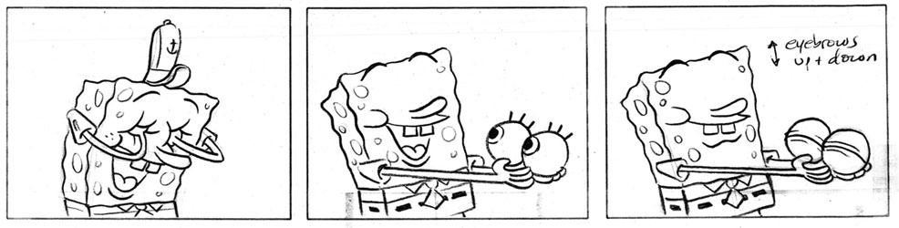
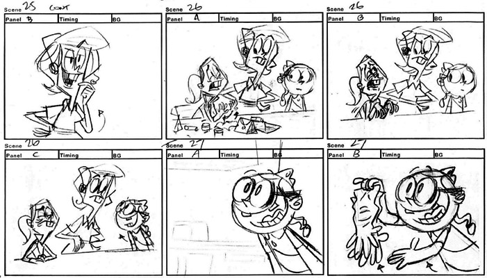
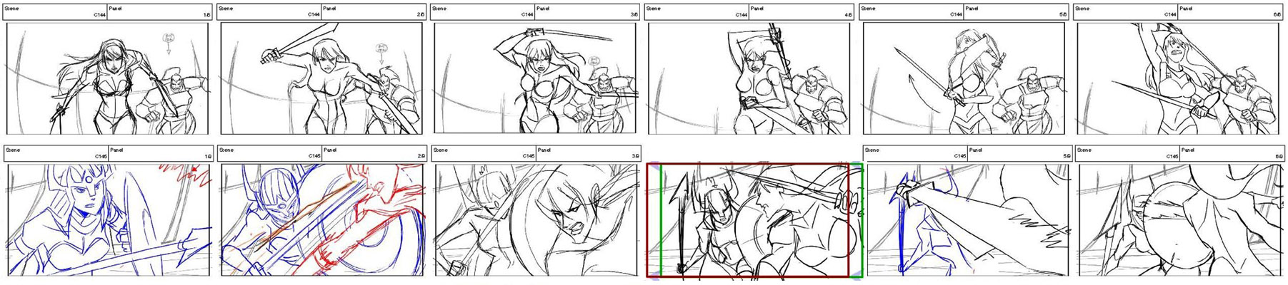
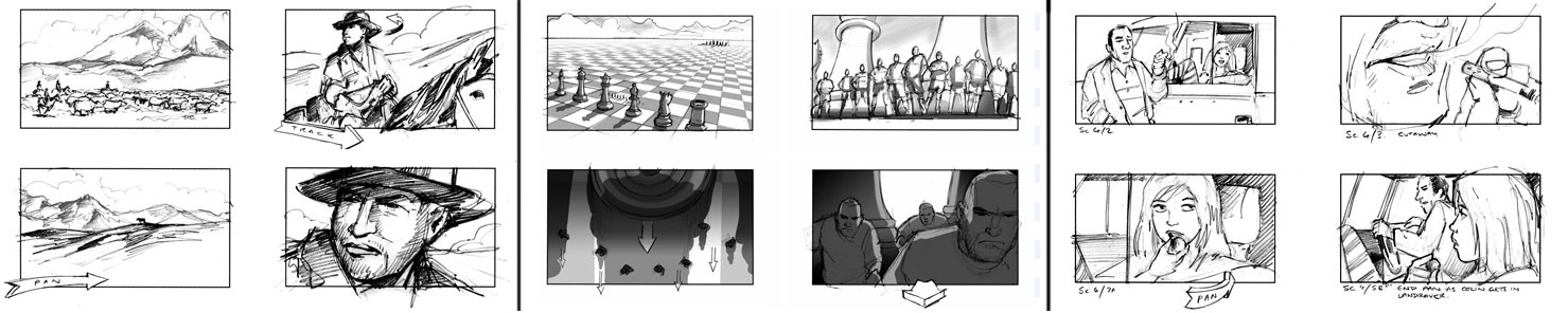
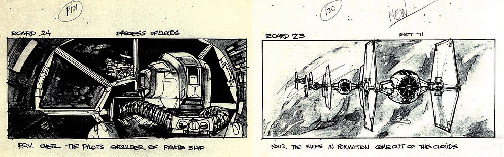
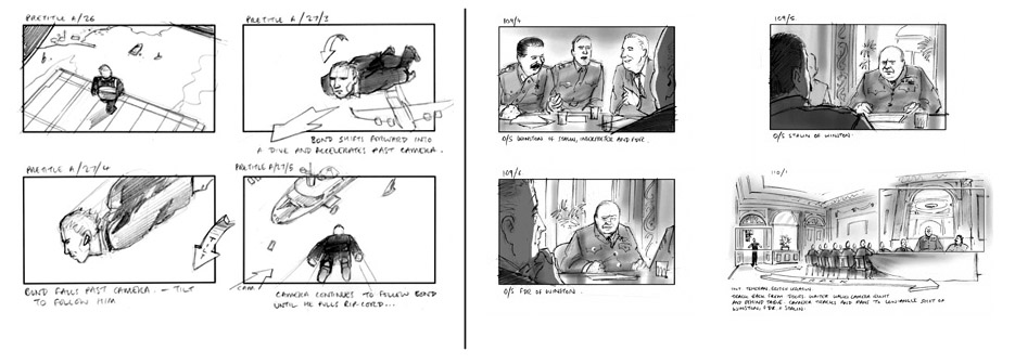
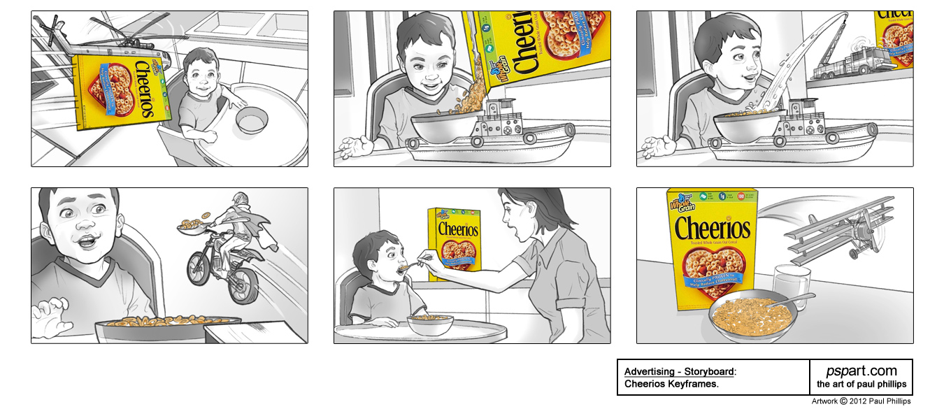
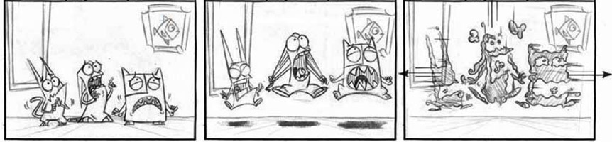
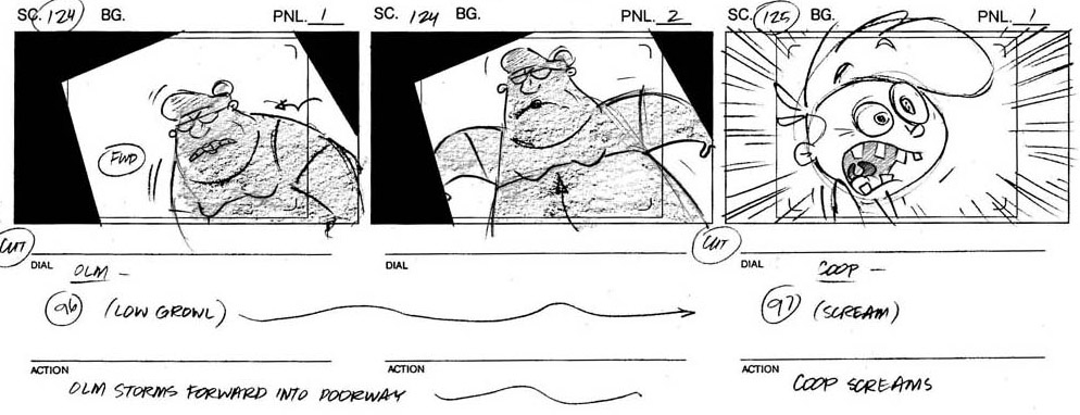
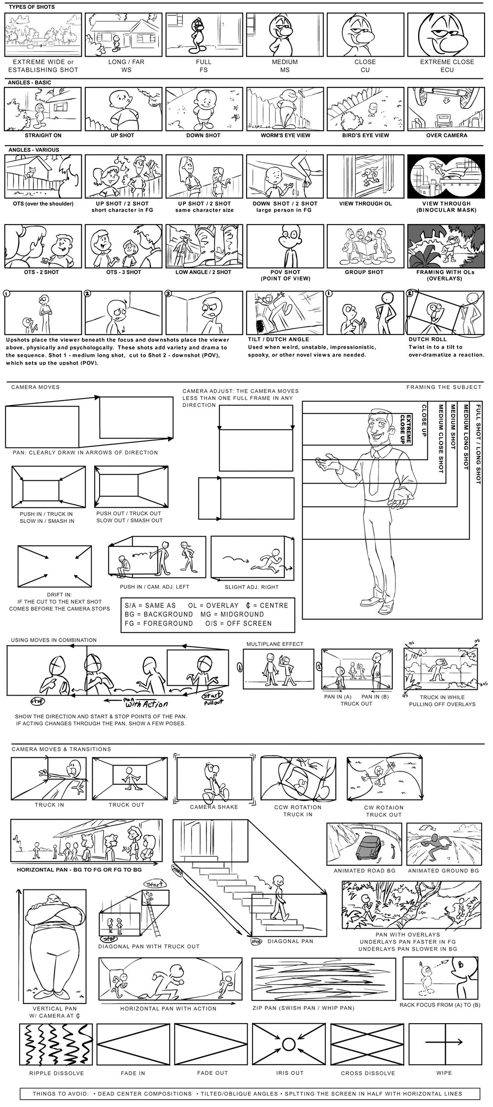
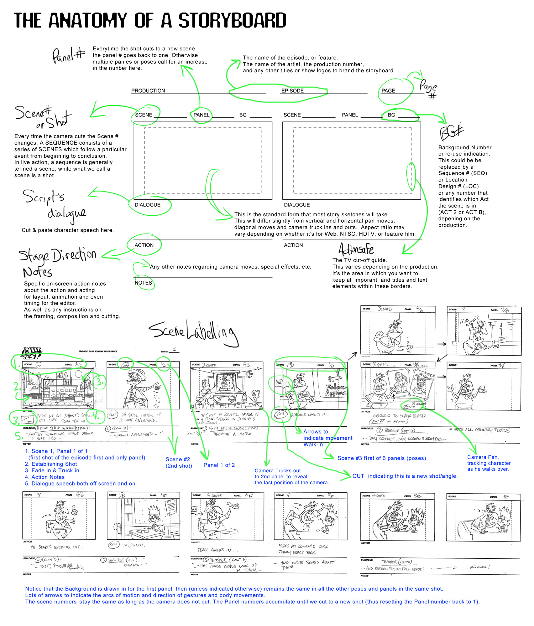
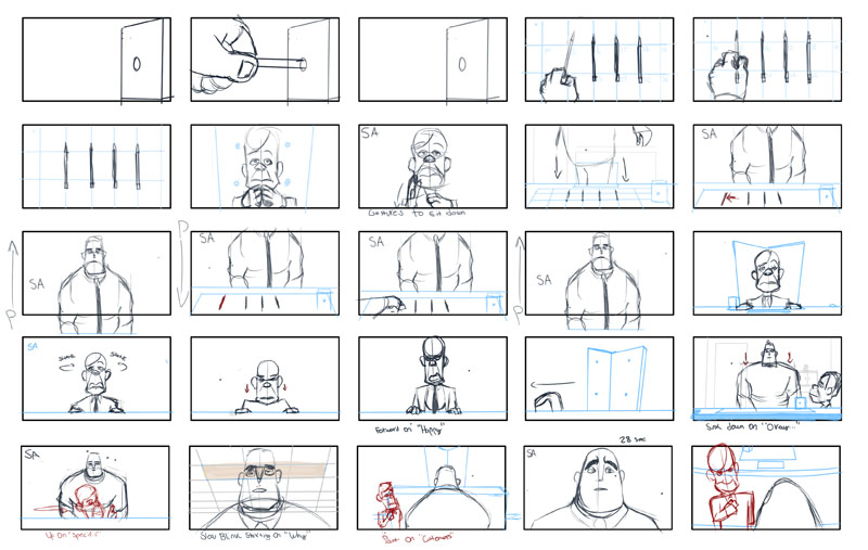
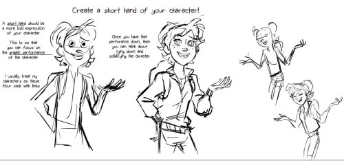
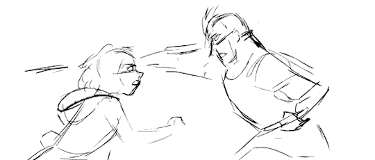
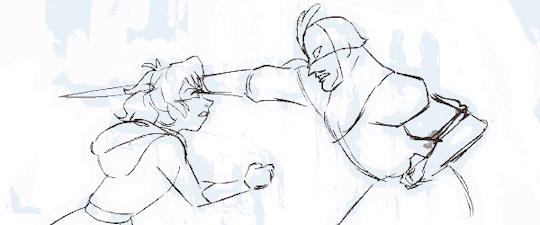
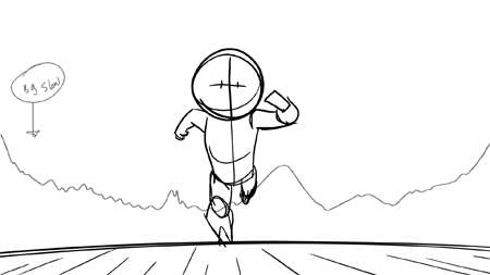
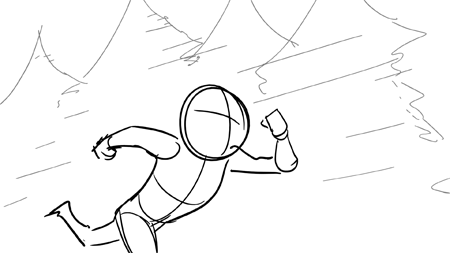
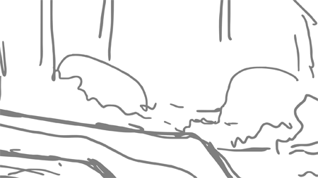
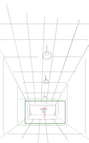
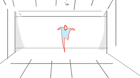
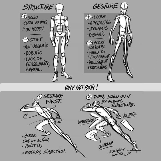
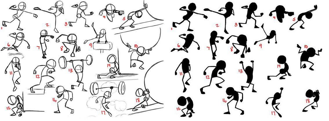
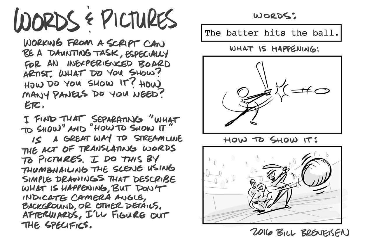
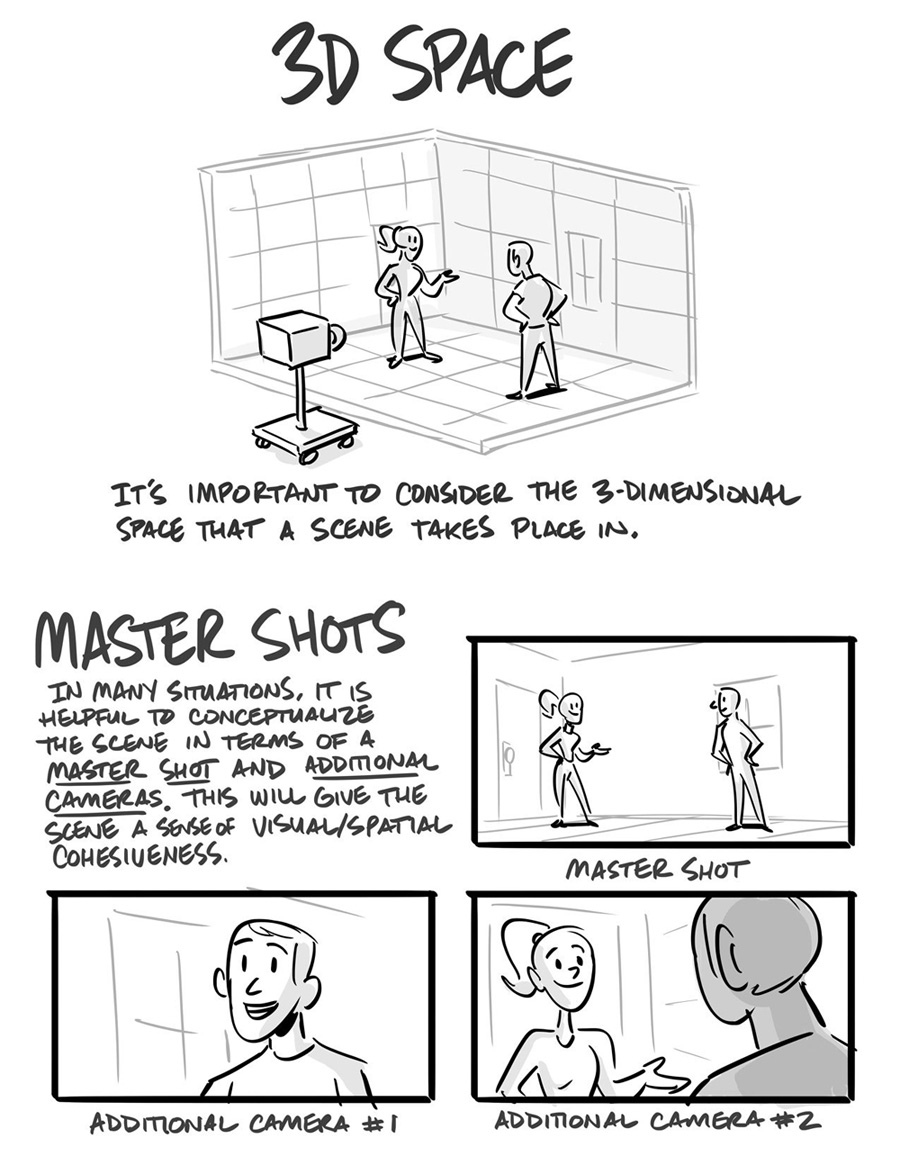
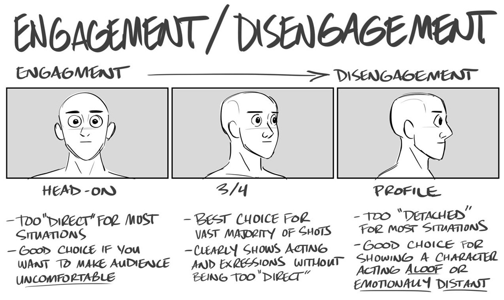
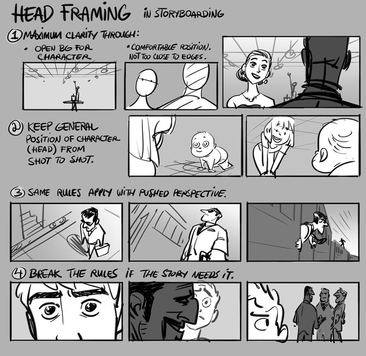
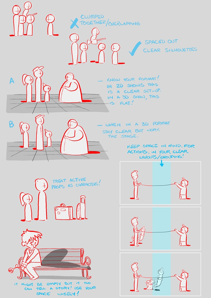
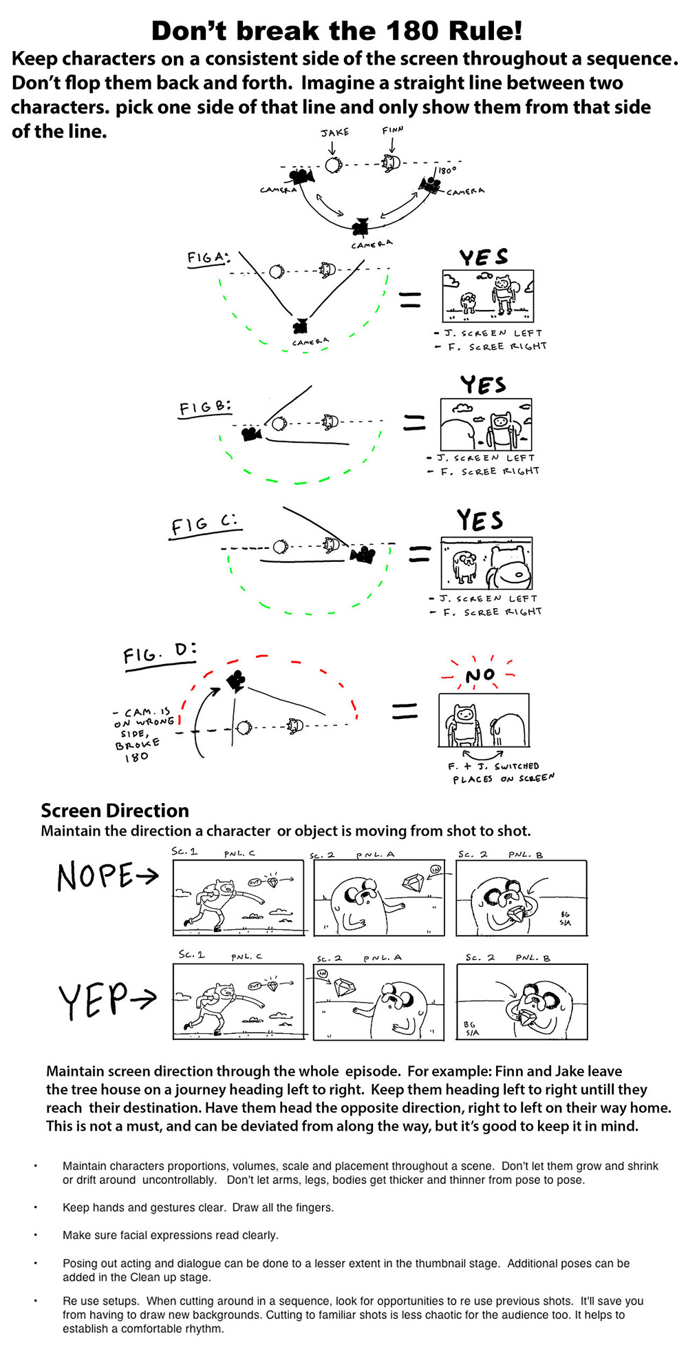
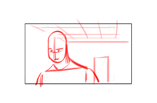
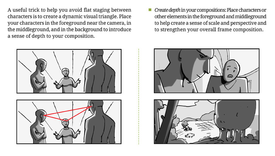
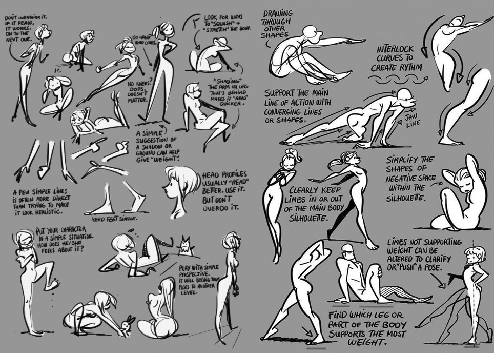
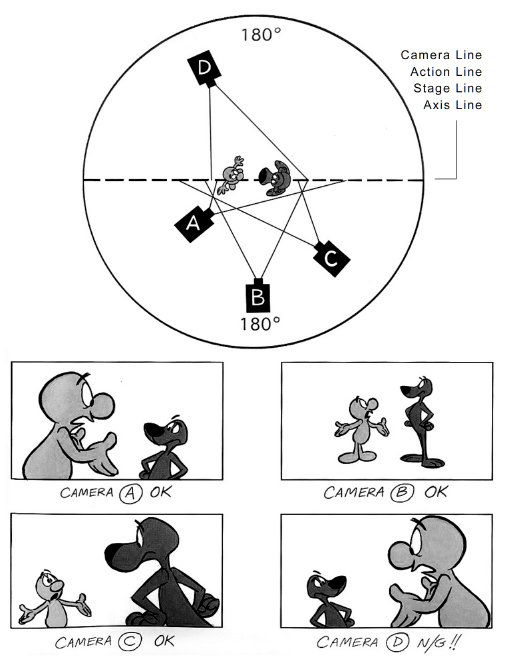
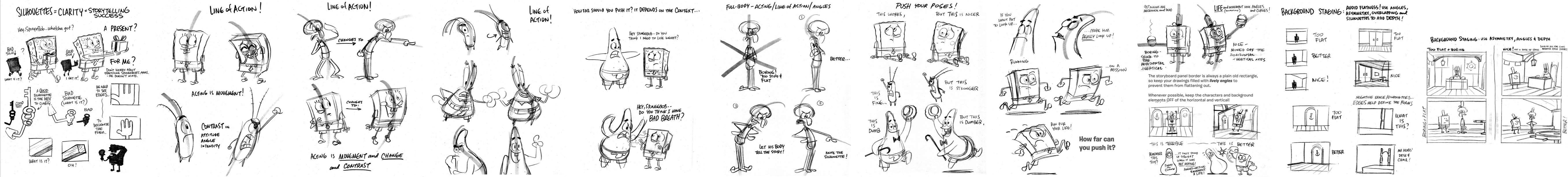
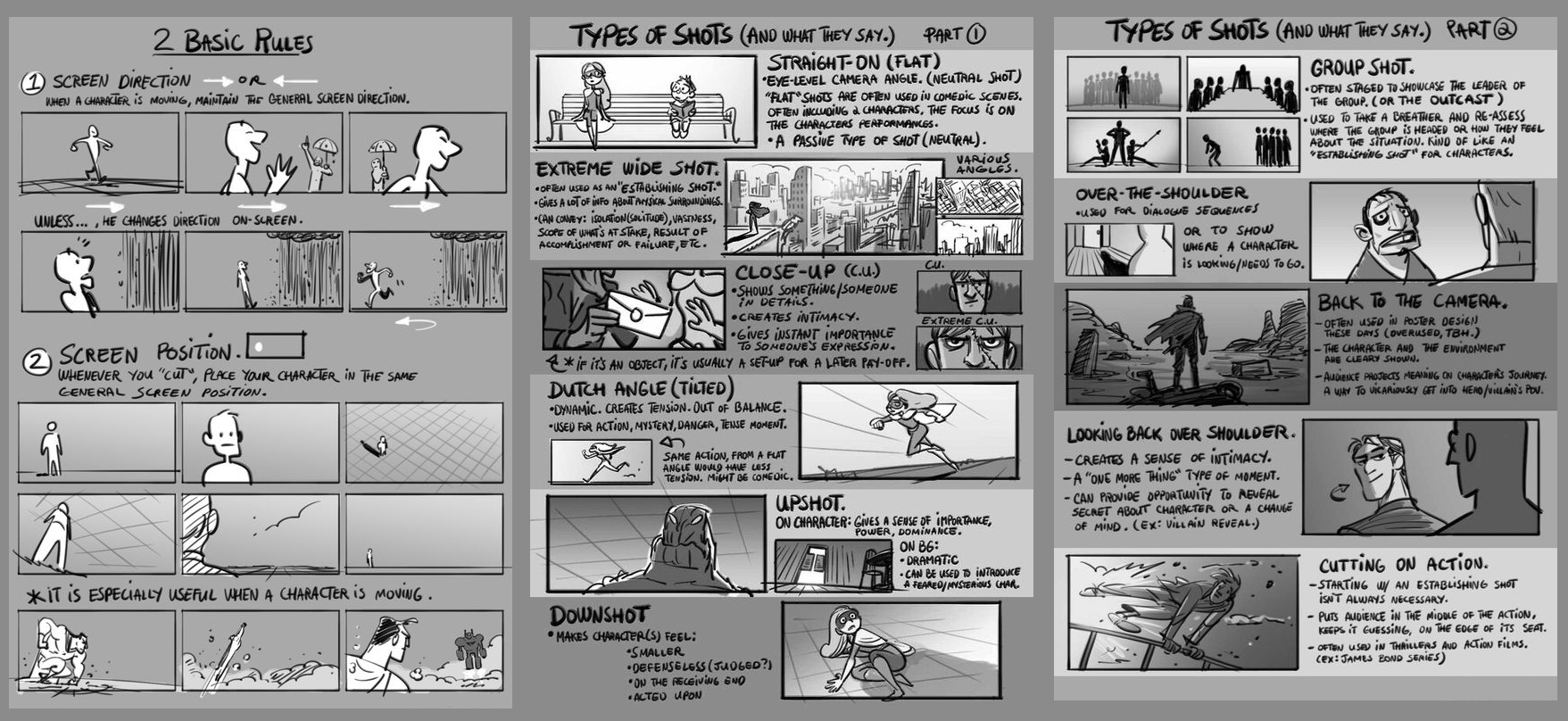
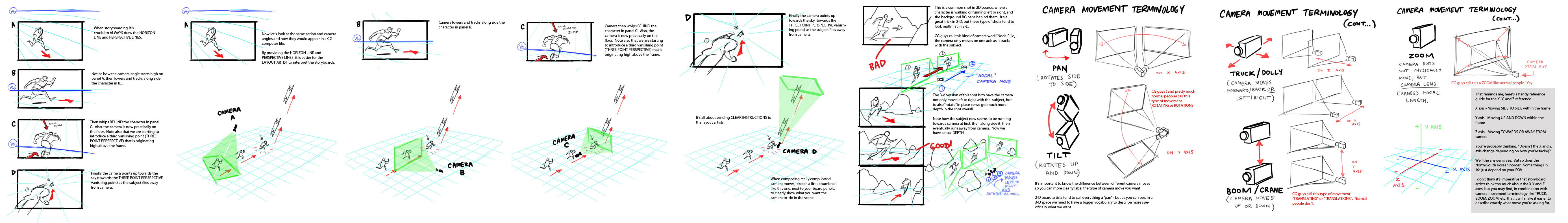
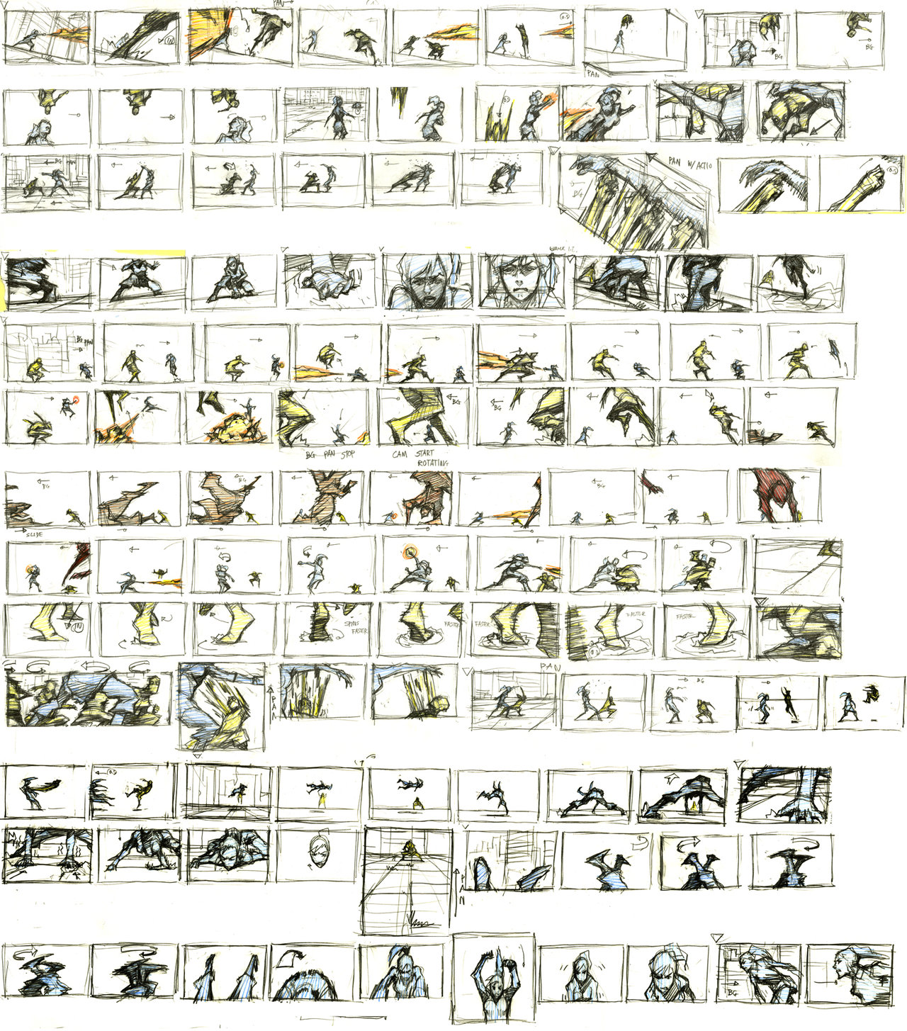
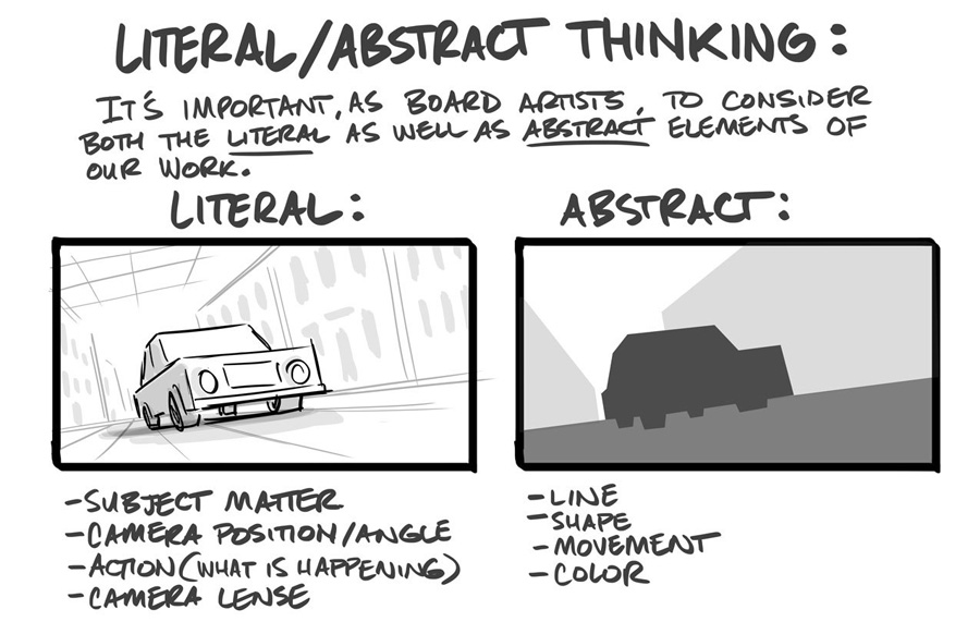
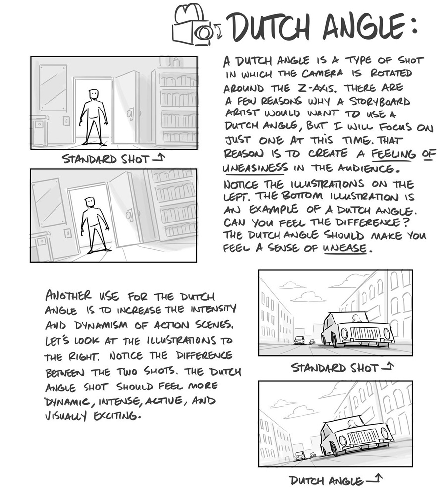

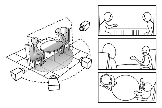
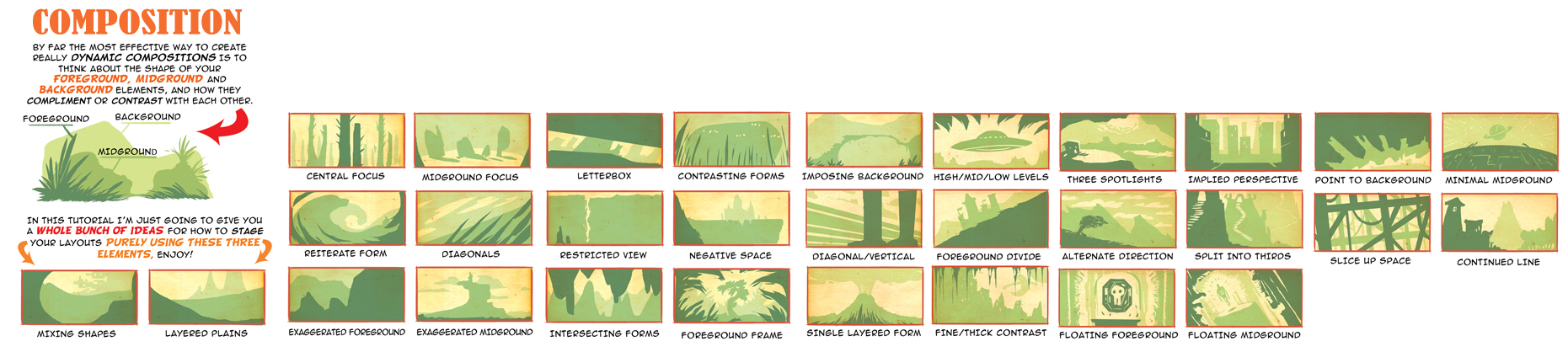
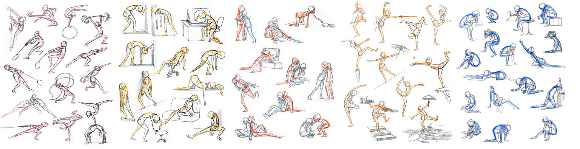
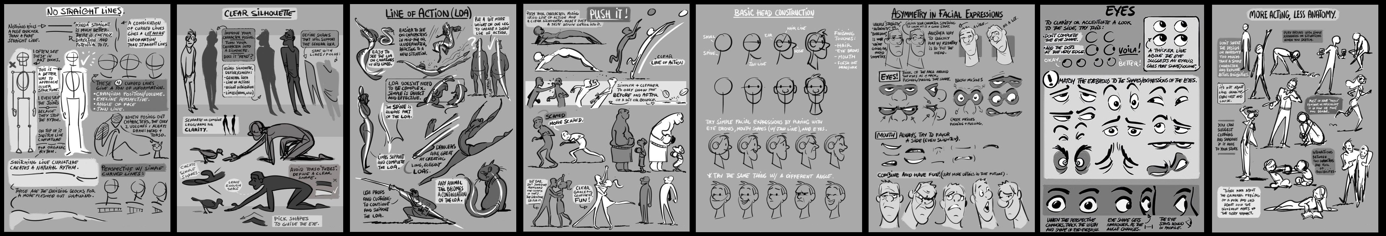
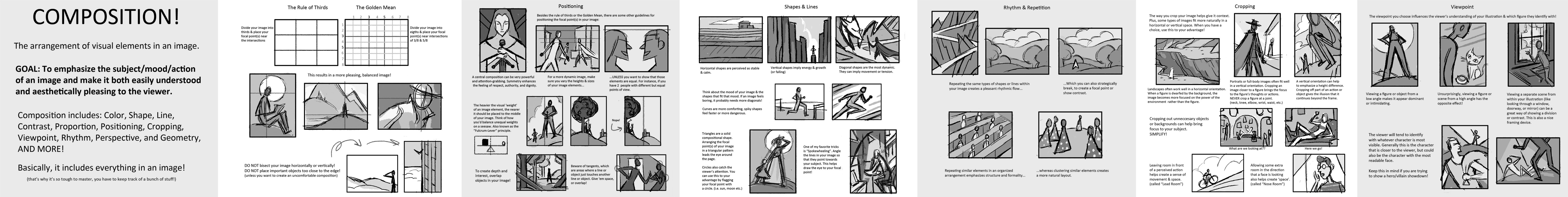
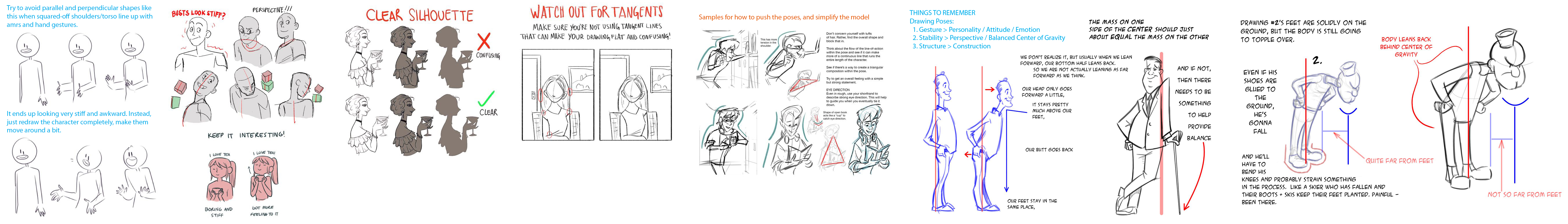
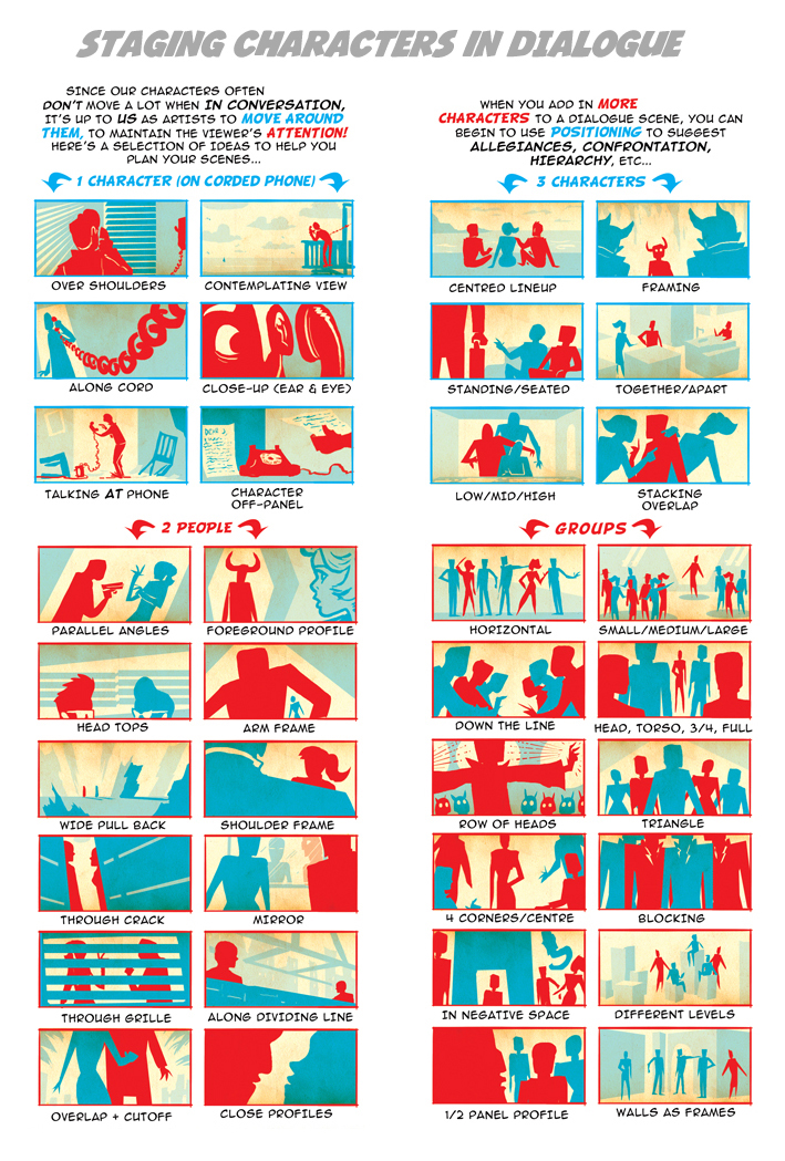
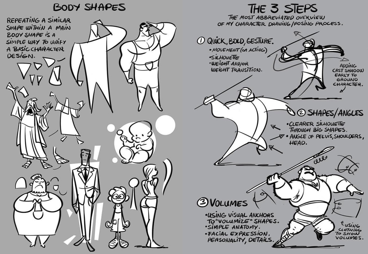
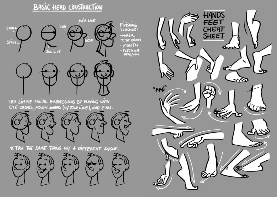
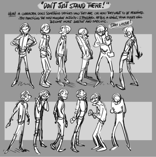
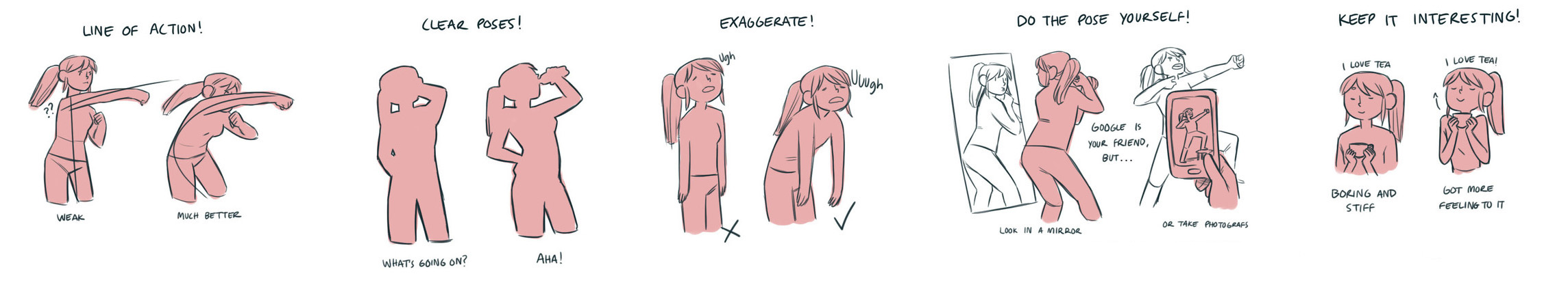
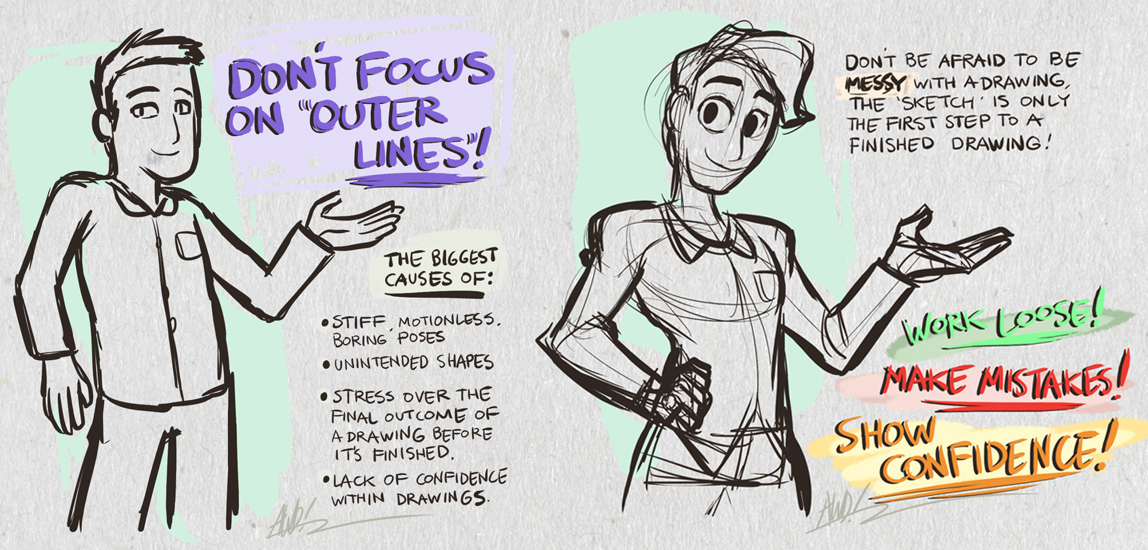
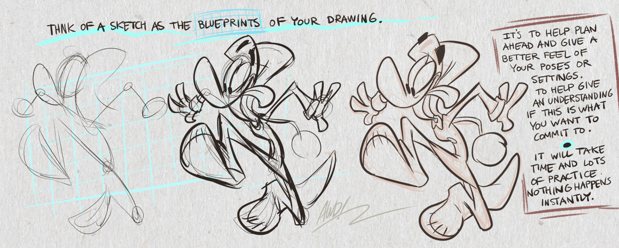
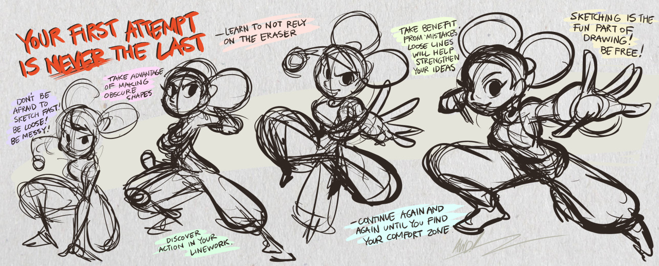
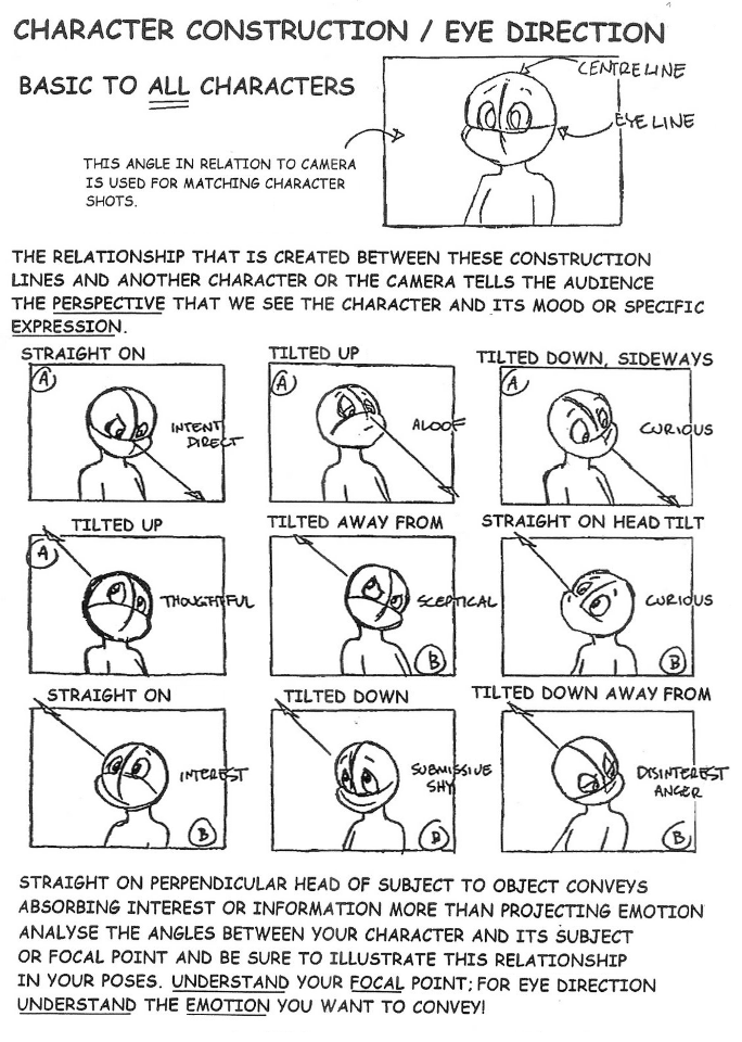
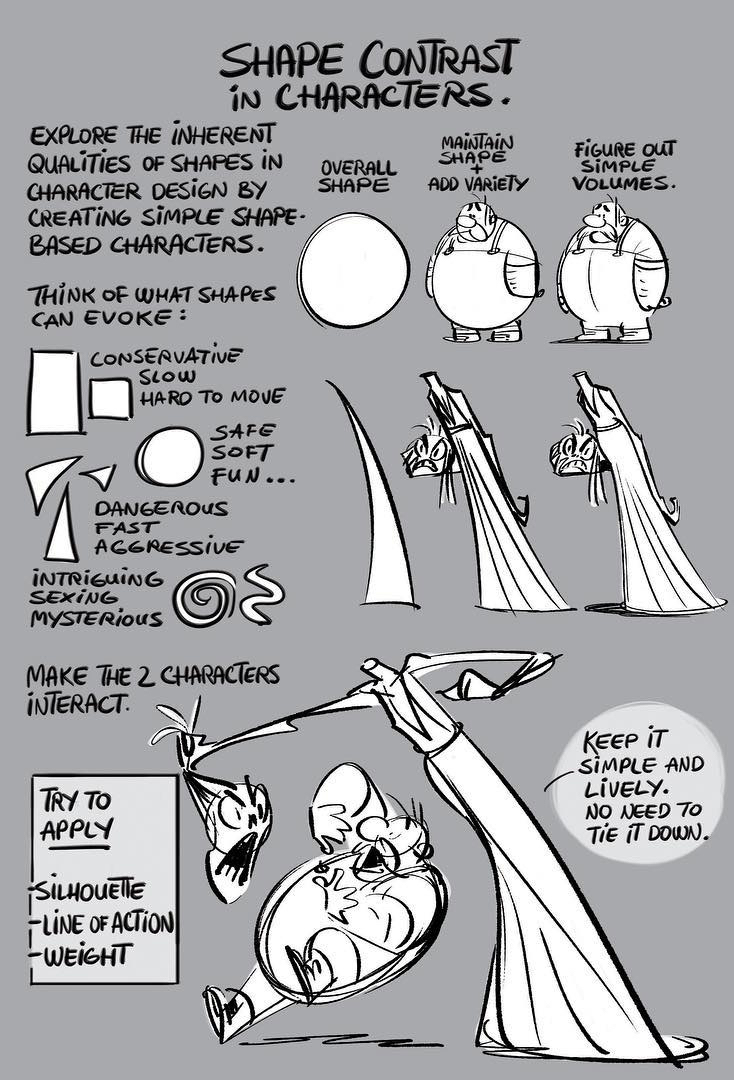
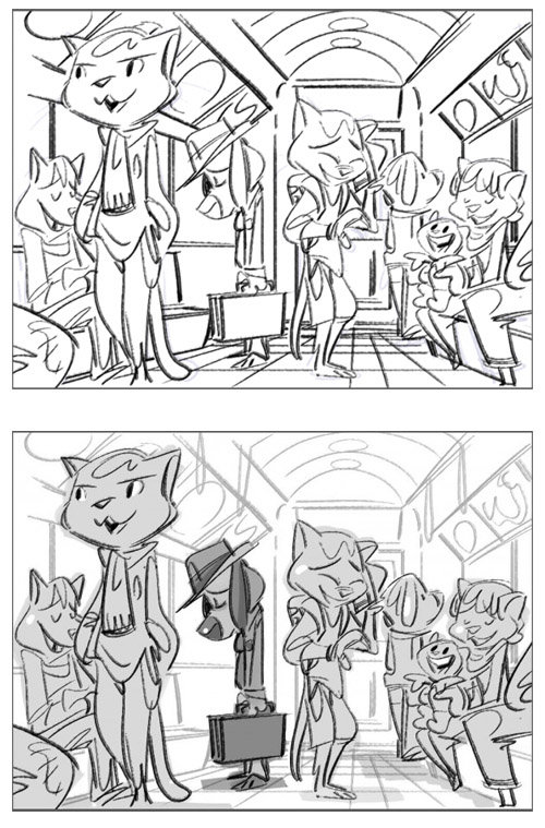
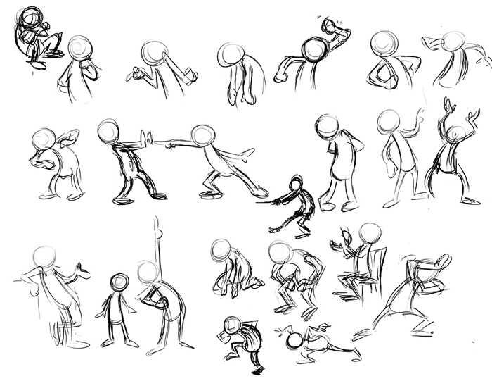
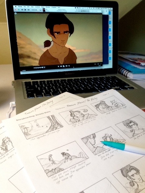


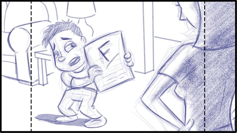

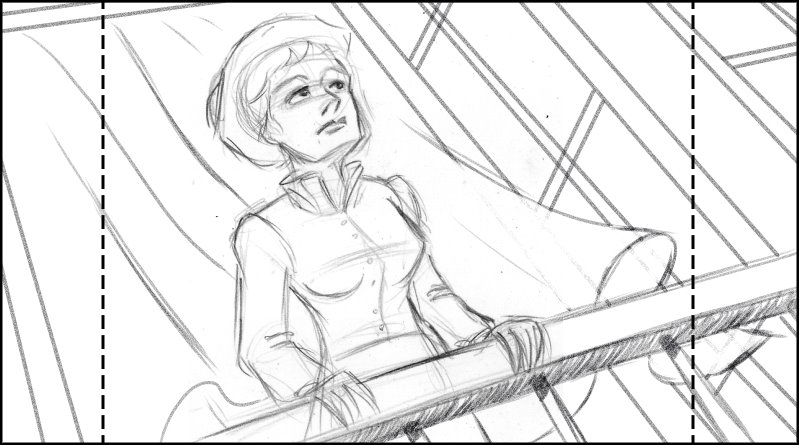
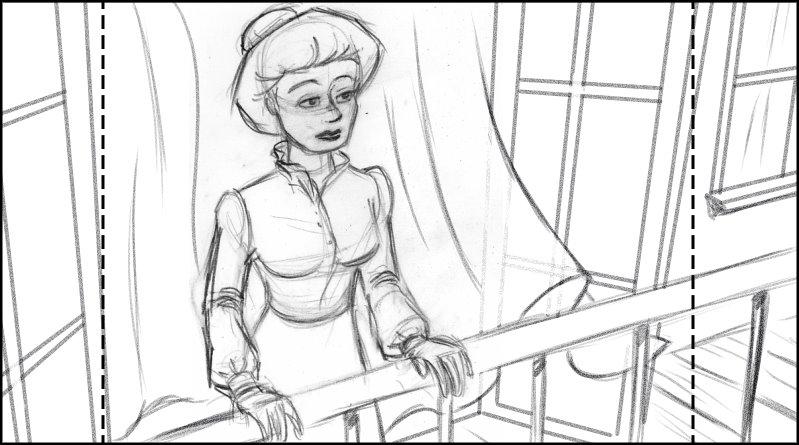

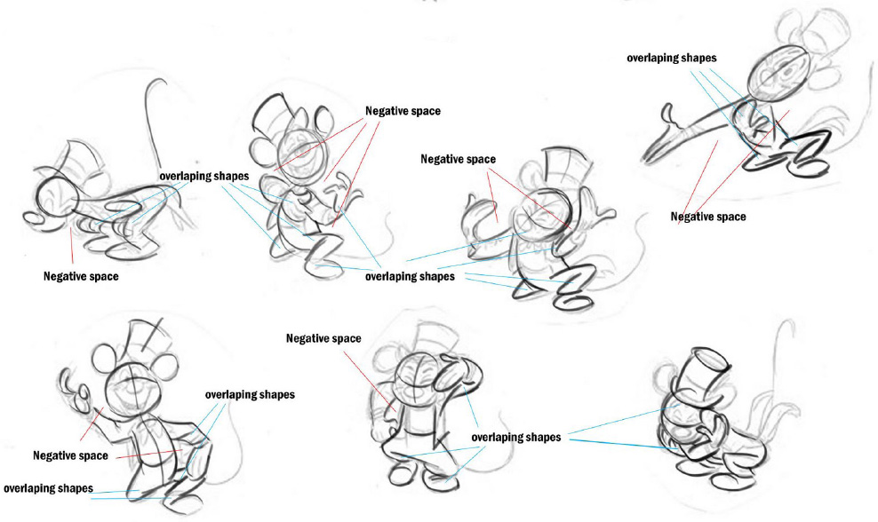
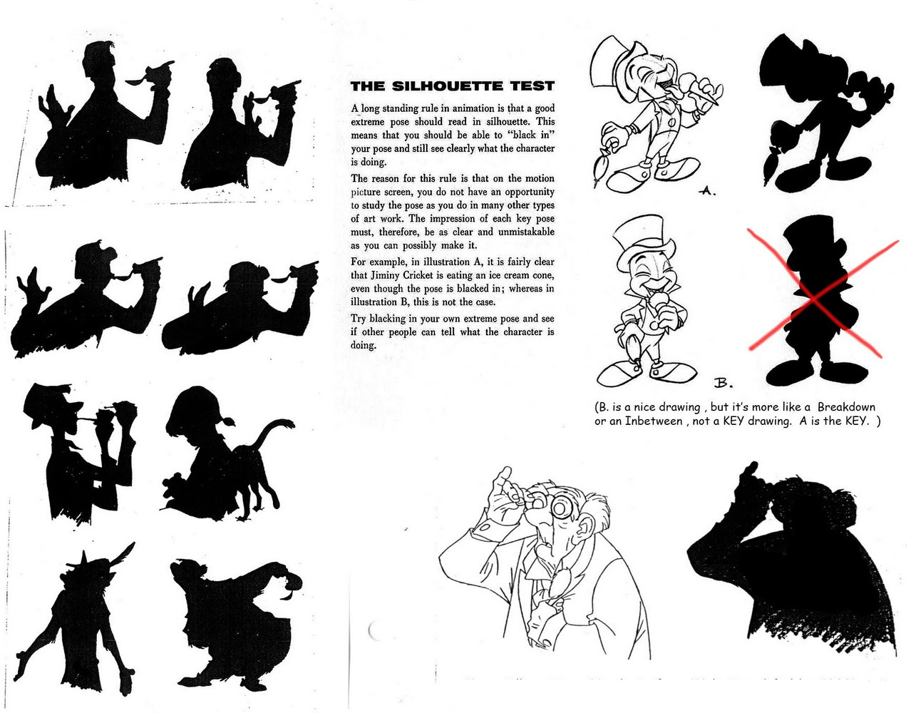
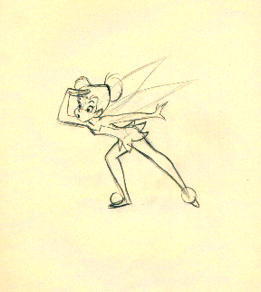
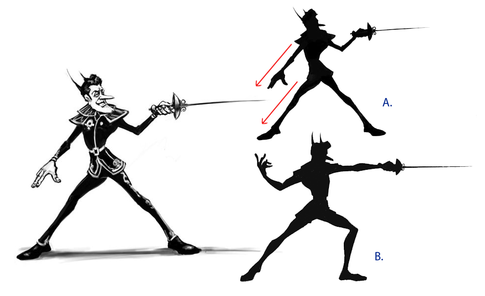
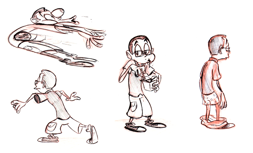
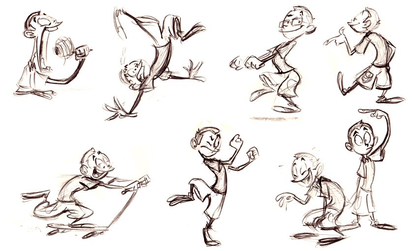


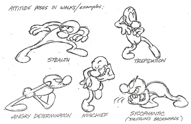

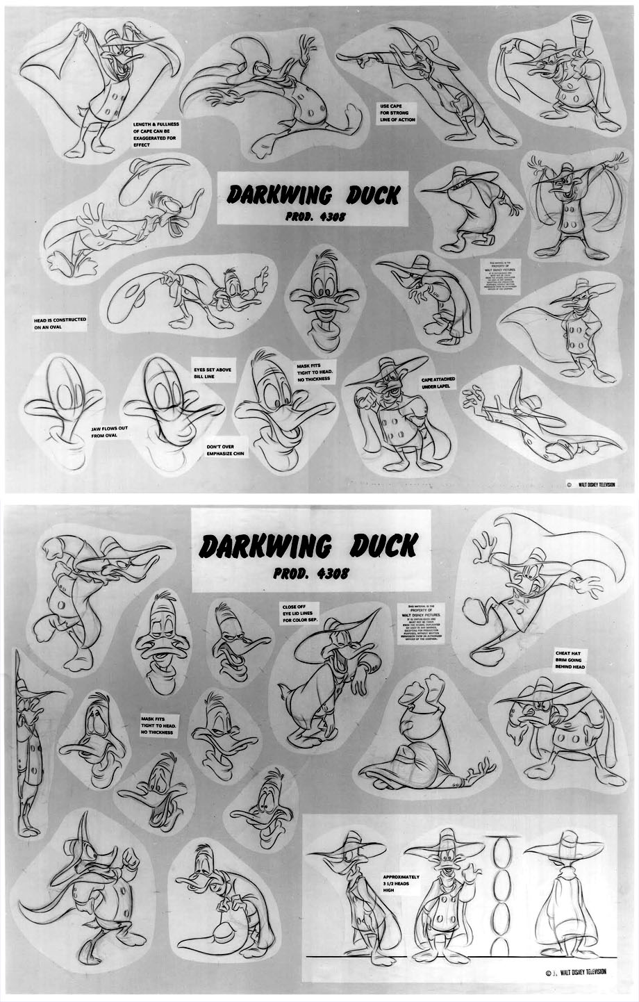
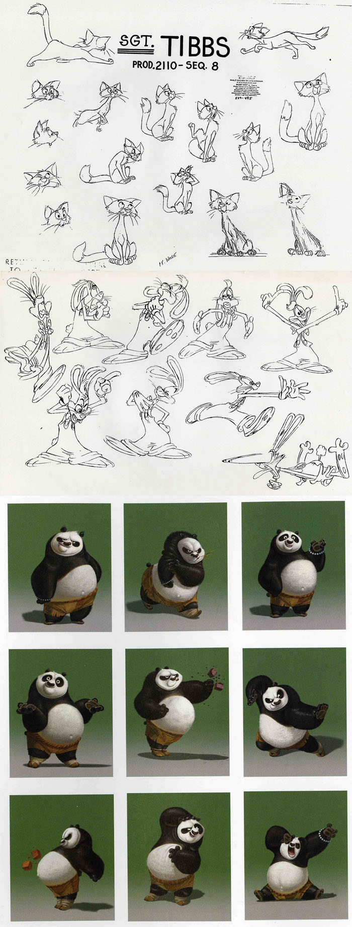
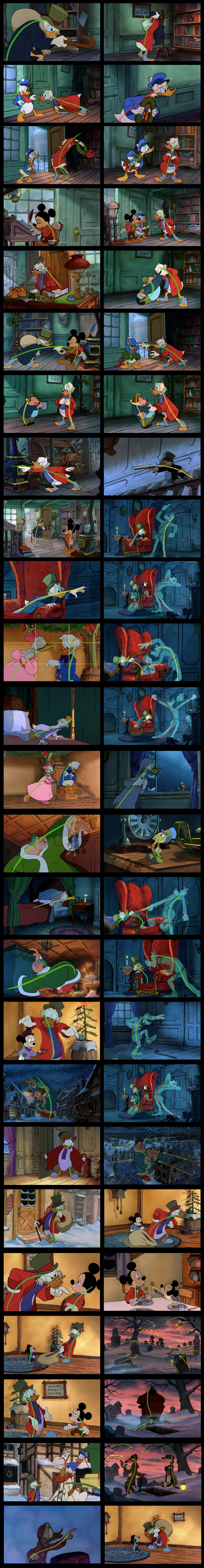
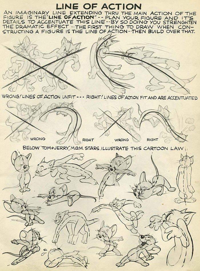


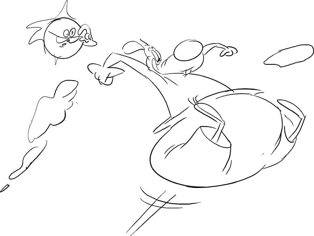


 This also has to do with pacing... it's best to save those high-impact shots were the moments in the story that have the greatest impact. If a storyboard artist were to fill their board from start to finish with lots of crazy angles, fancy camera moves and extreme close-ups, it would leave no room for the artist to show any real impact when it's really needed. It's all about contrast.
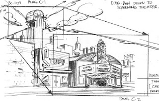


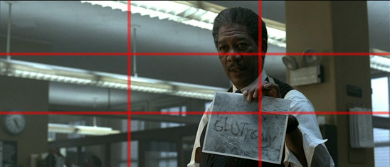
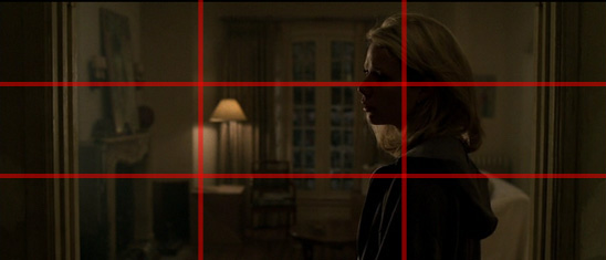
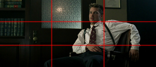
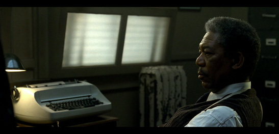
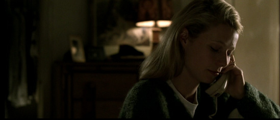
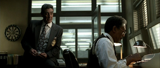

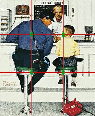
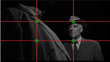
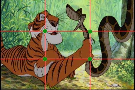
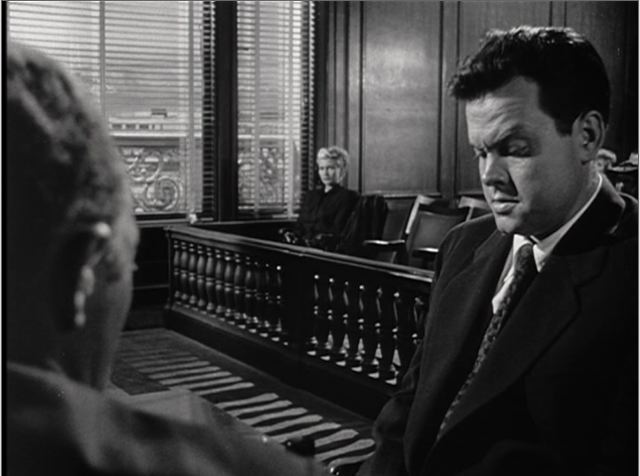
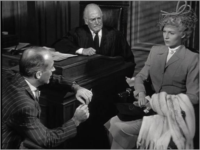
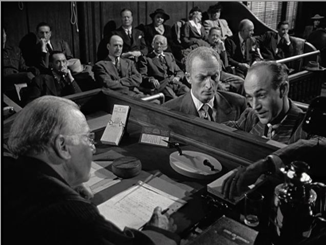
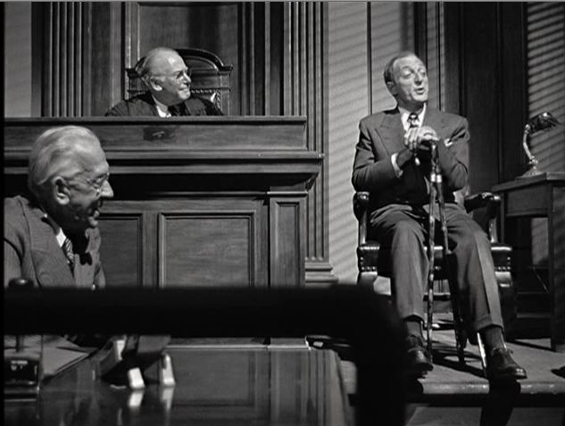
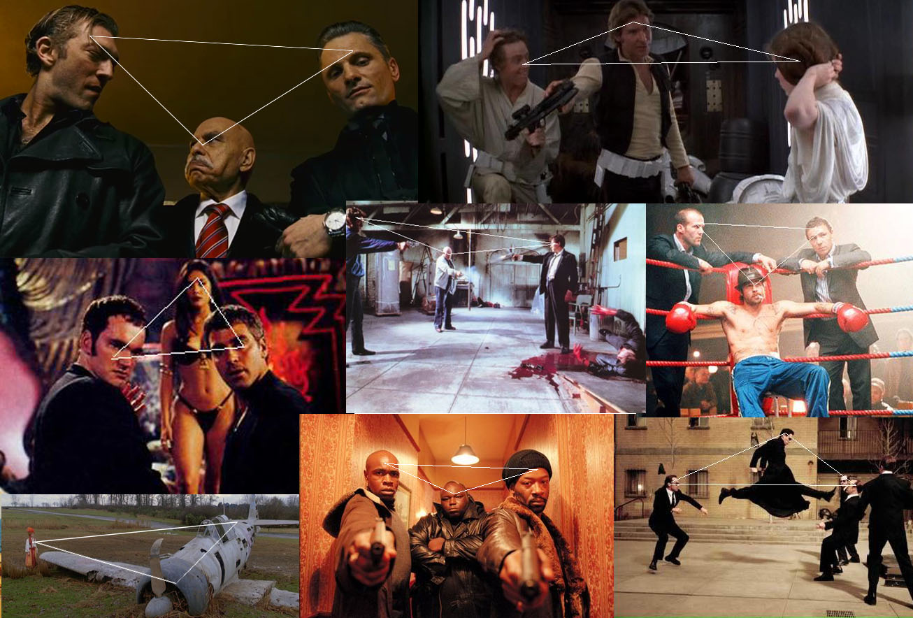
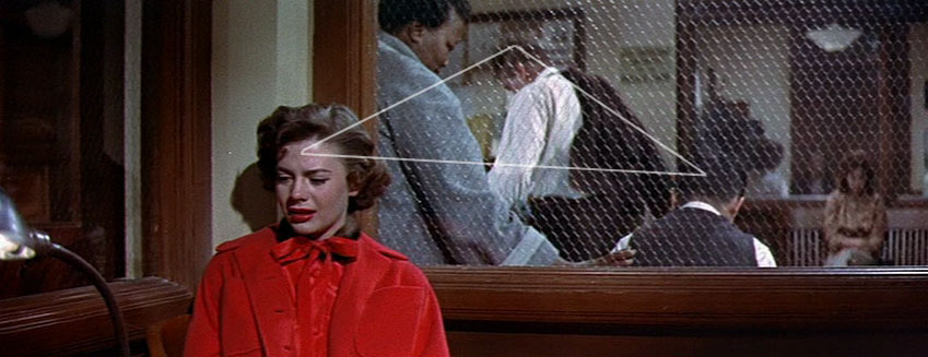
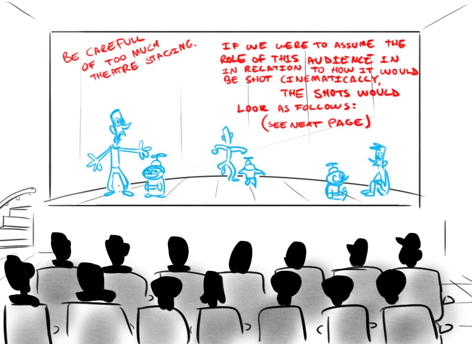
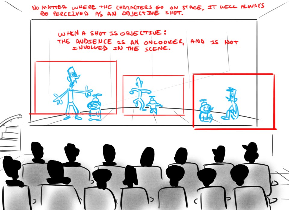
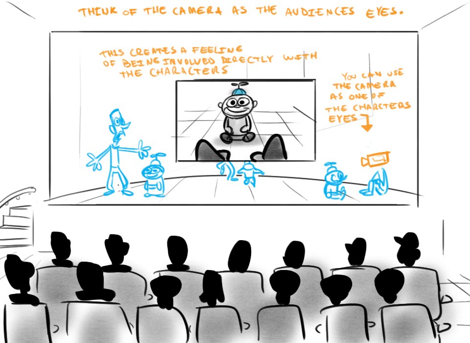
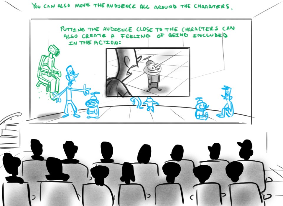
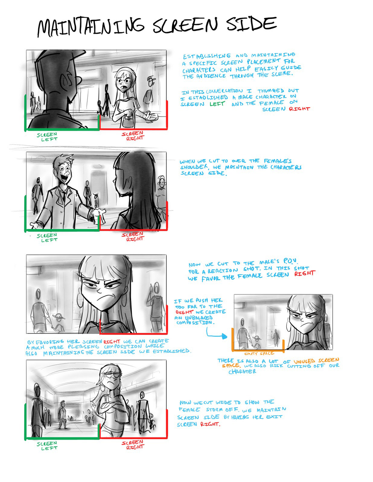
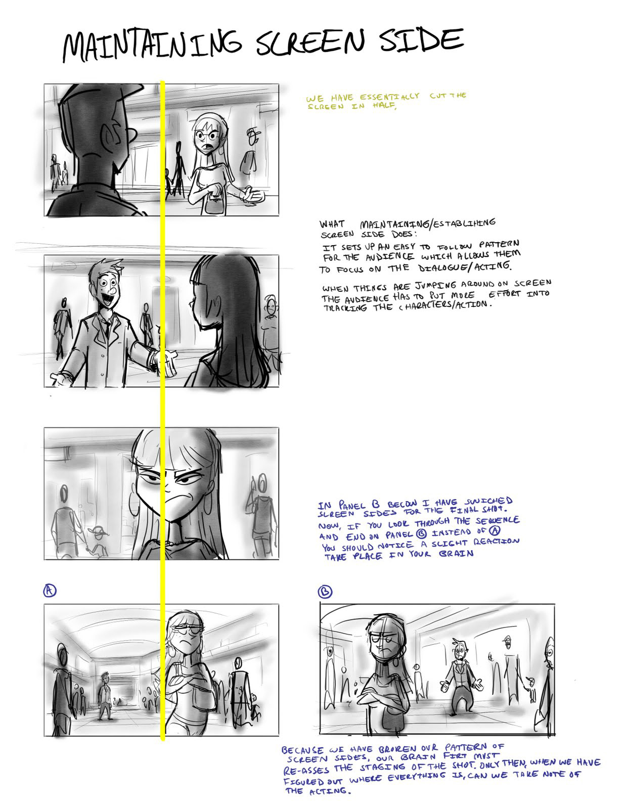
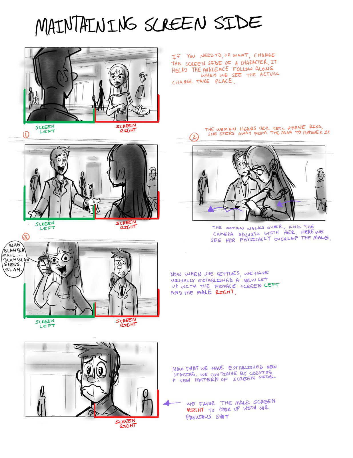
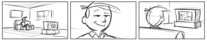
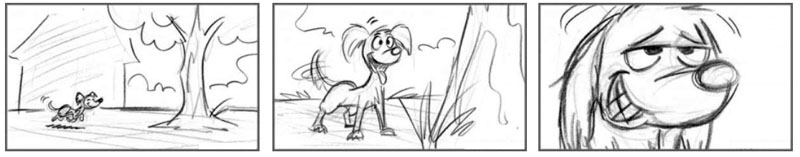
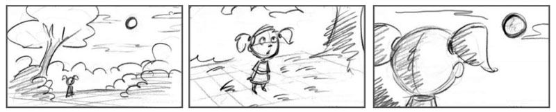
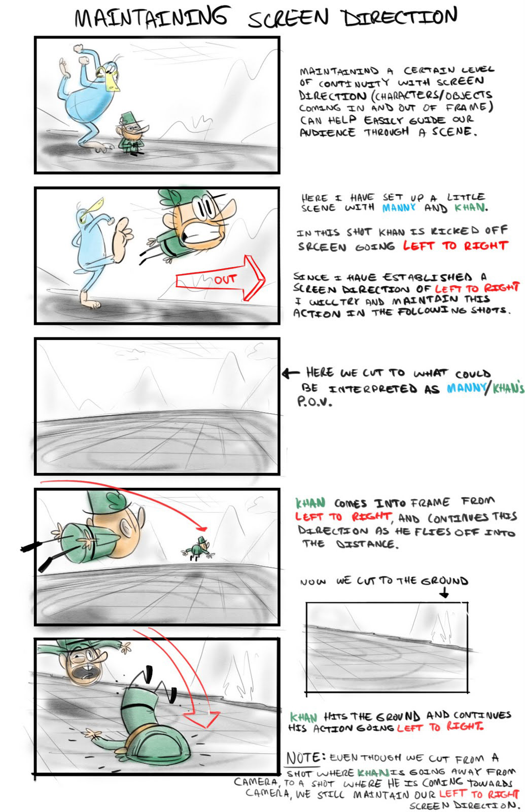
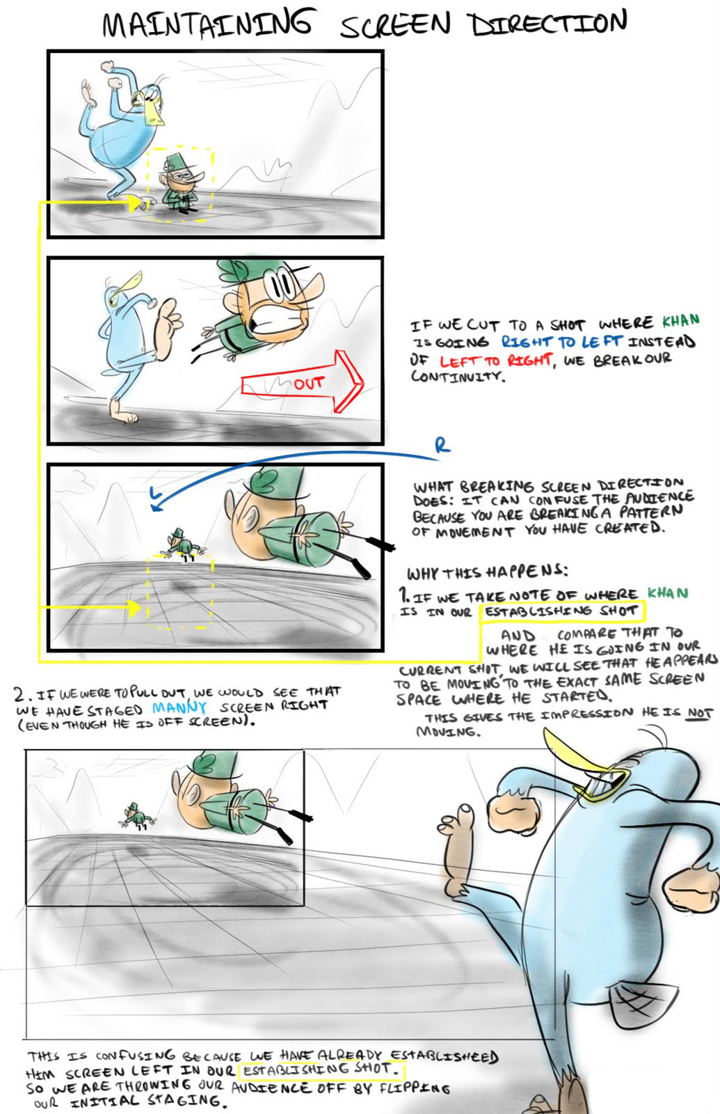
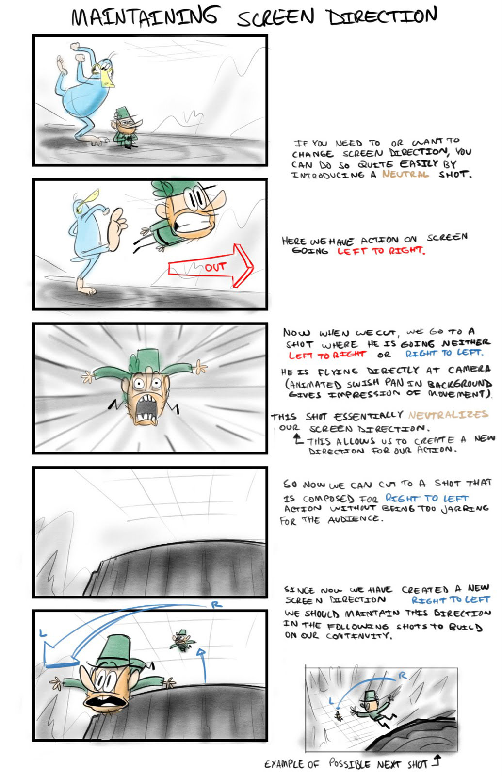

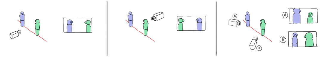

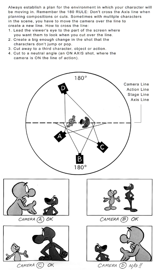
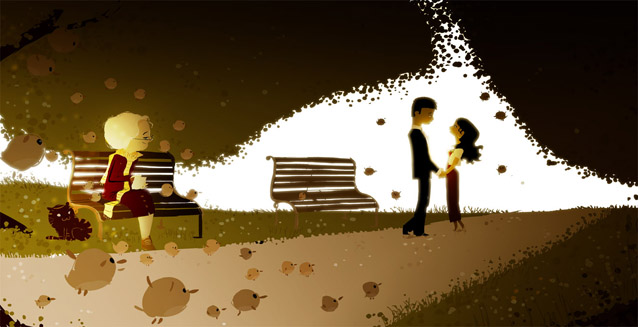
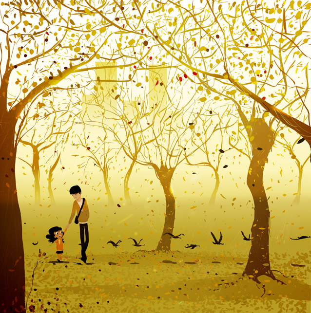


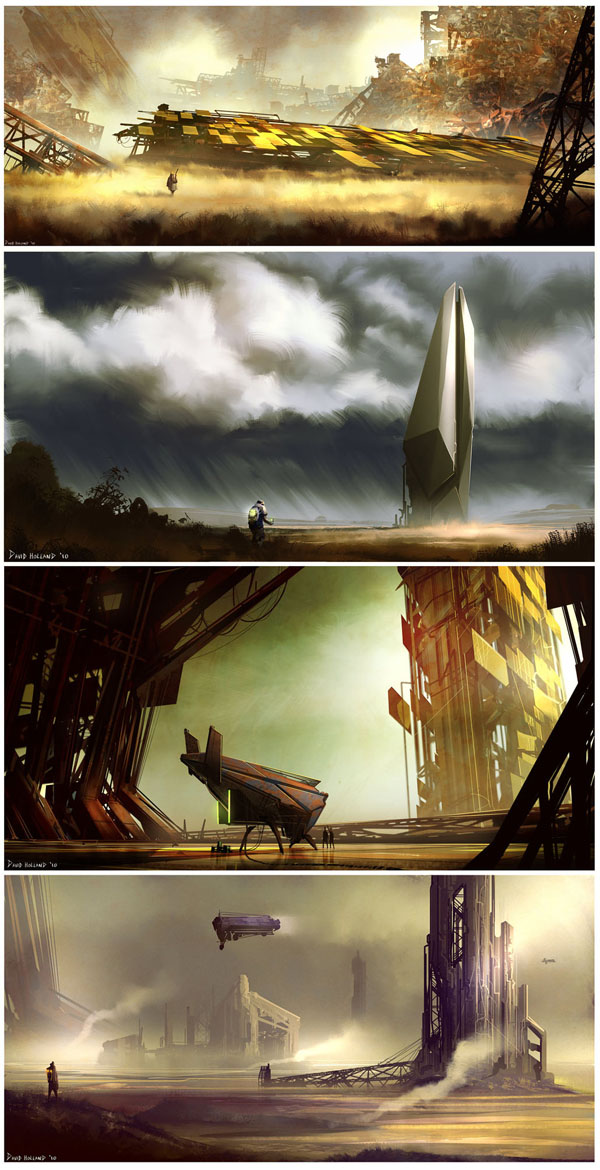
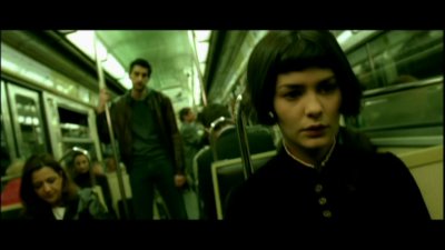
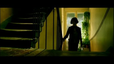
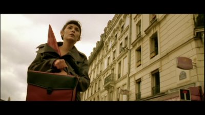
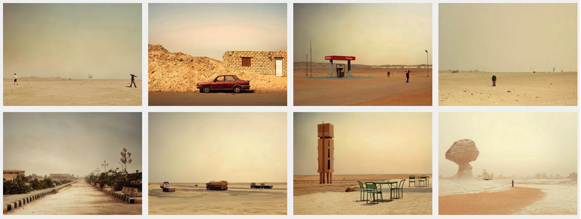
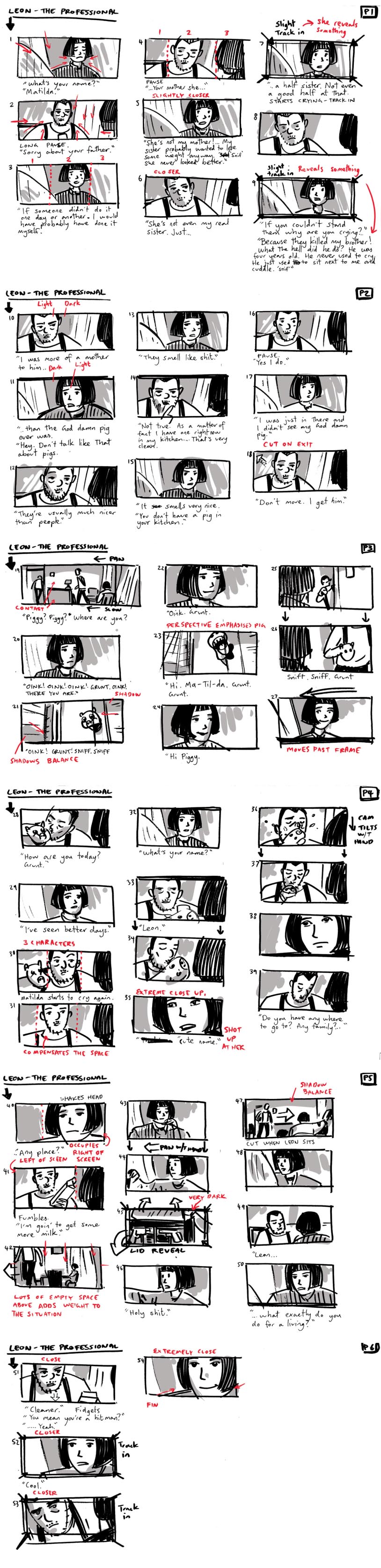
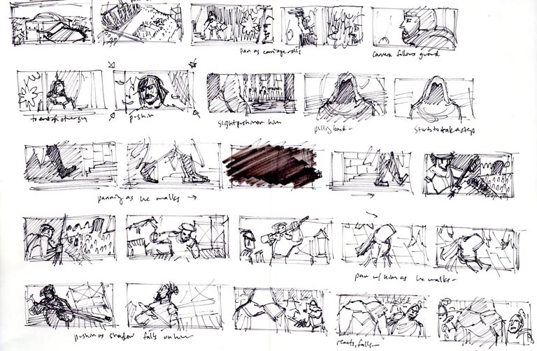
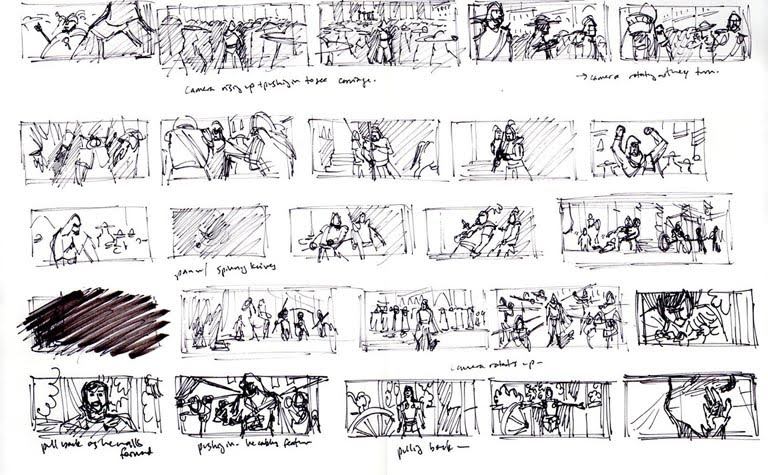
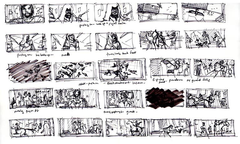
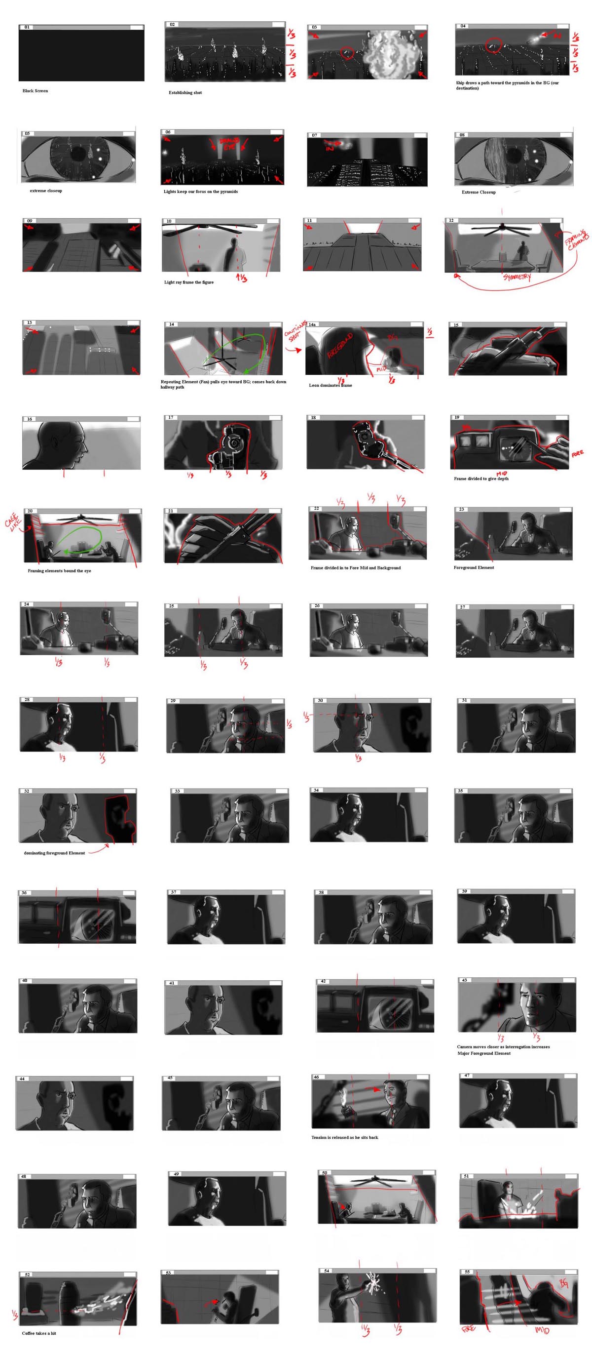
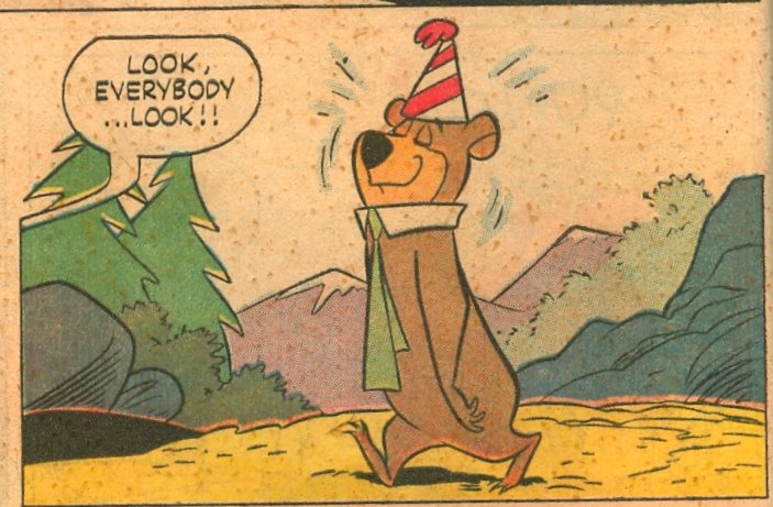
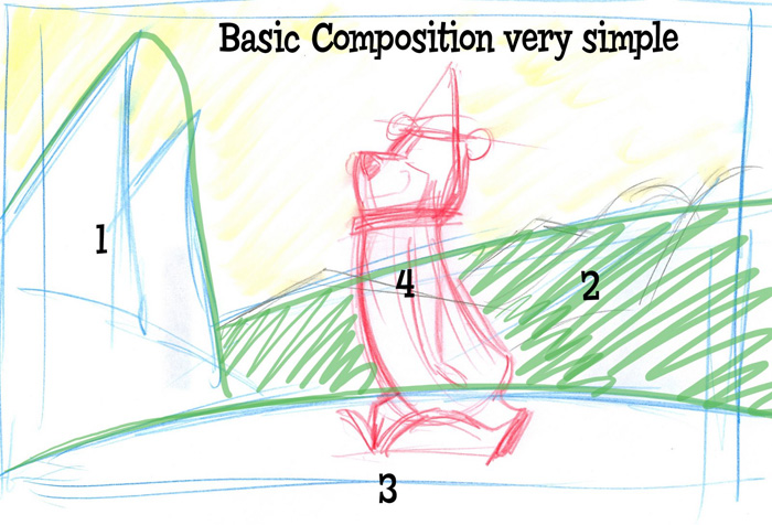
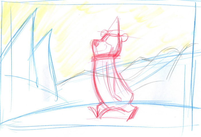
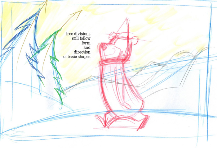
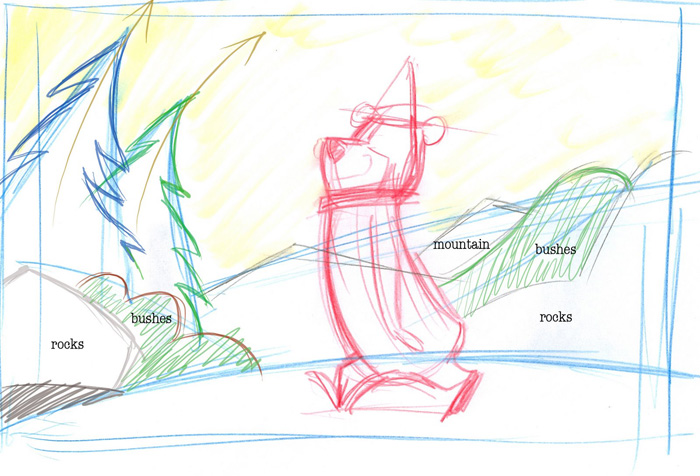
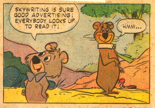
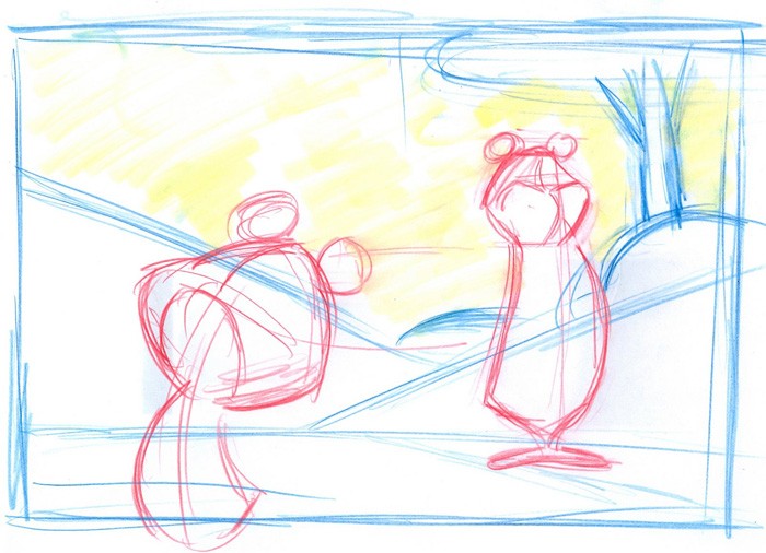
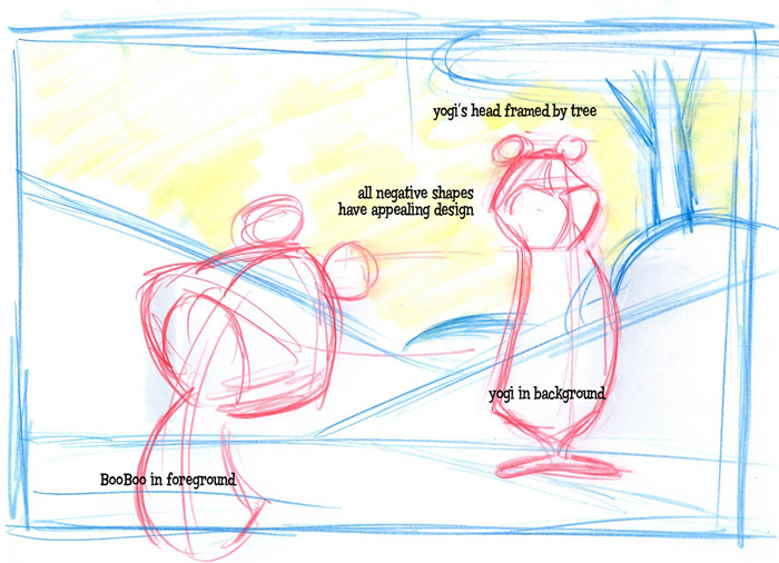
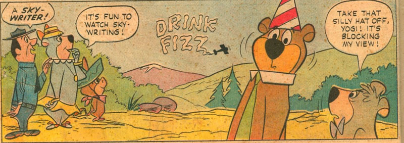
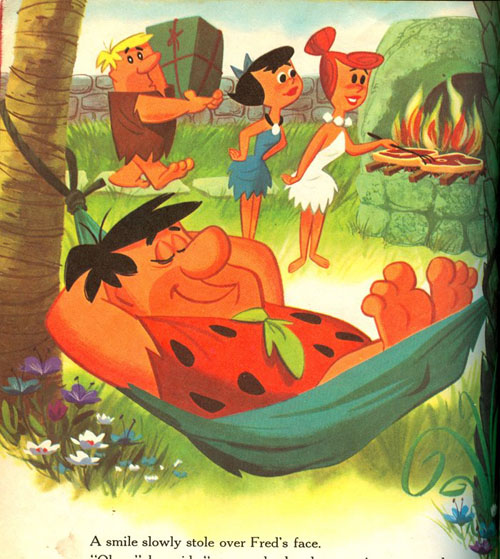
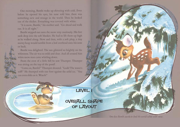
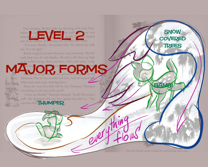
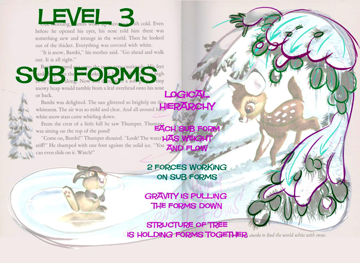
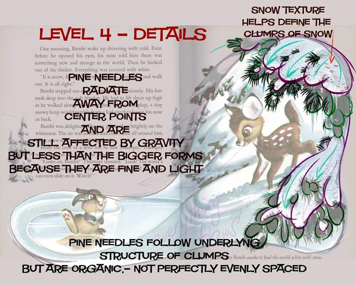
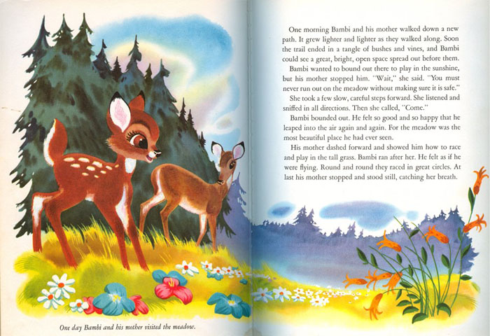
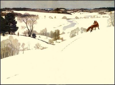
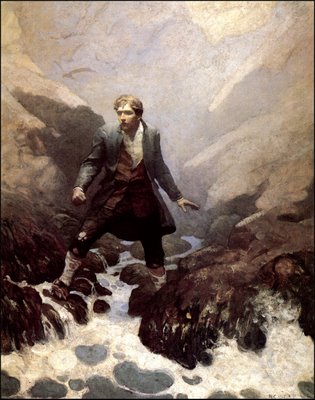
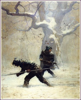
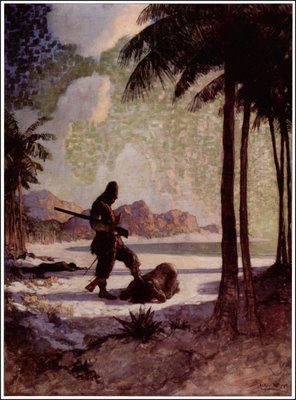
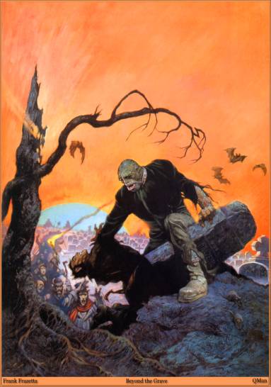
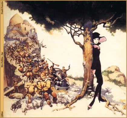
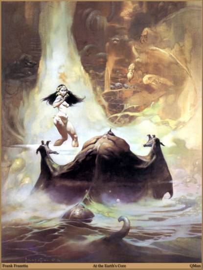
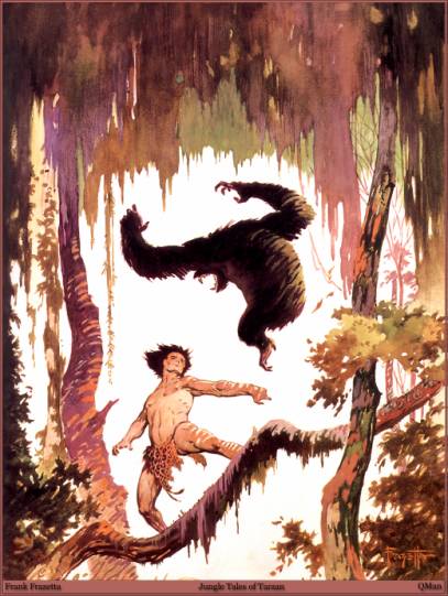
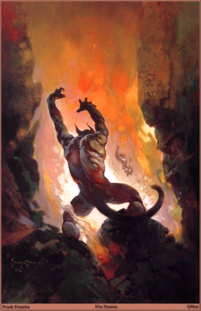

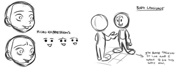

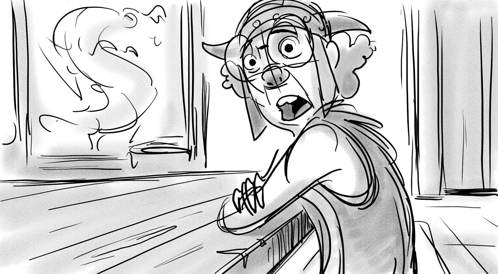
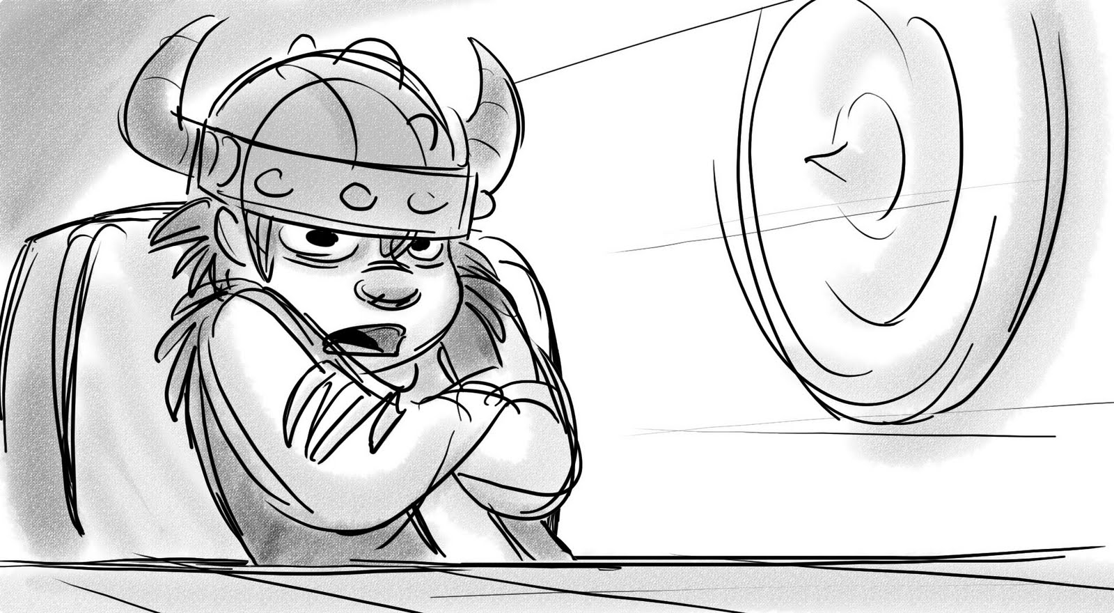


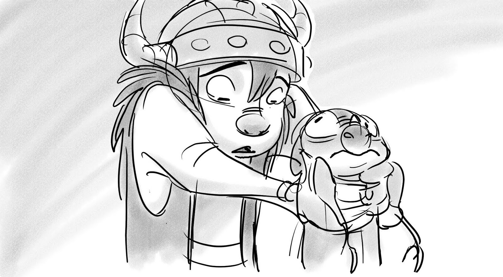
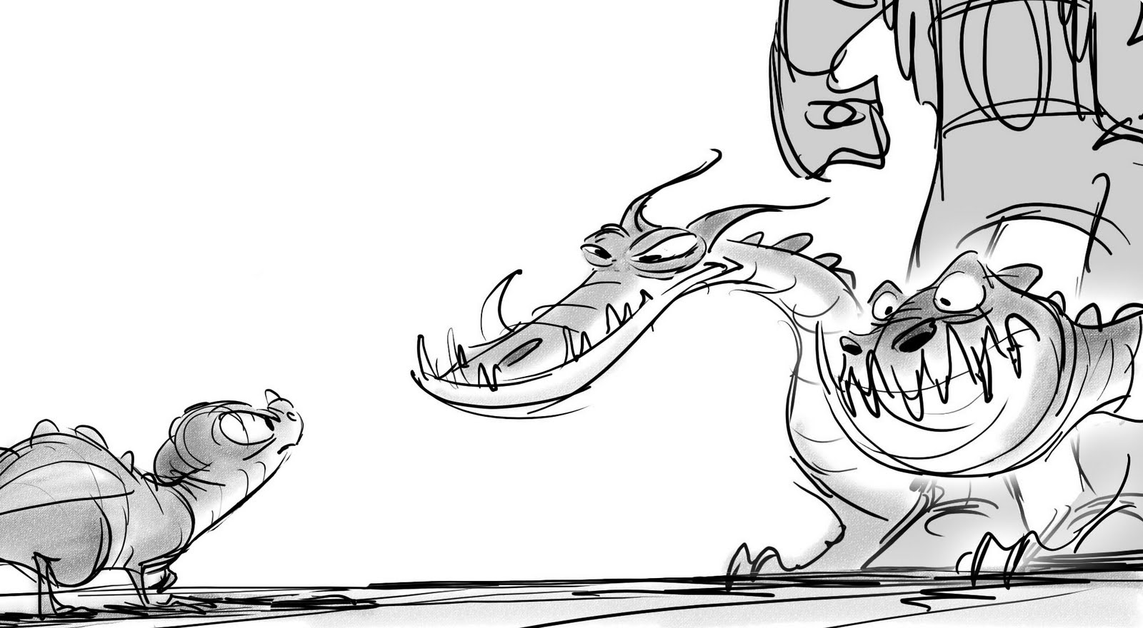
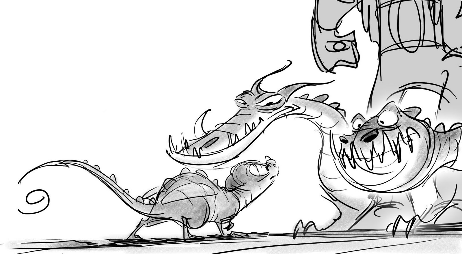


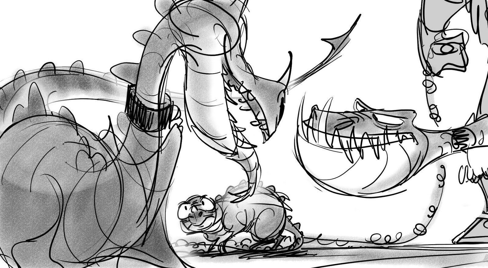
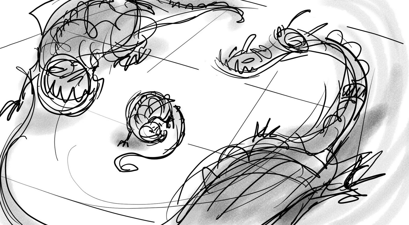

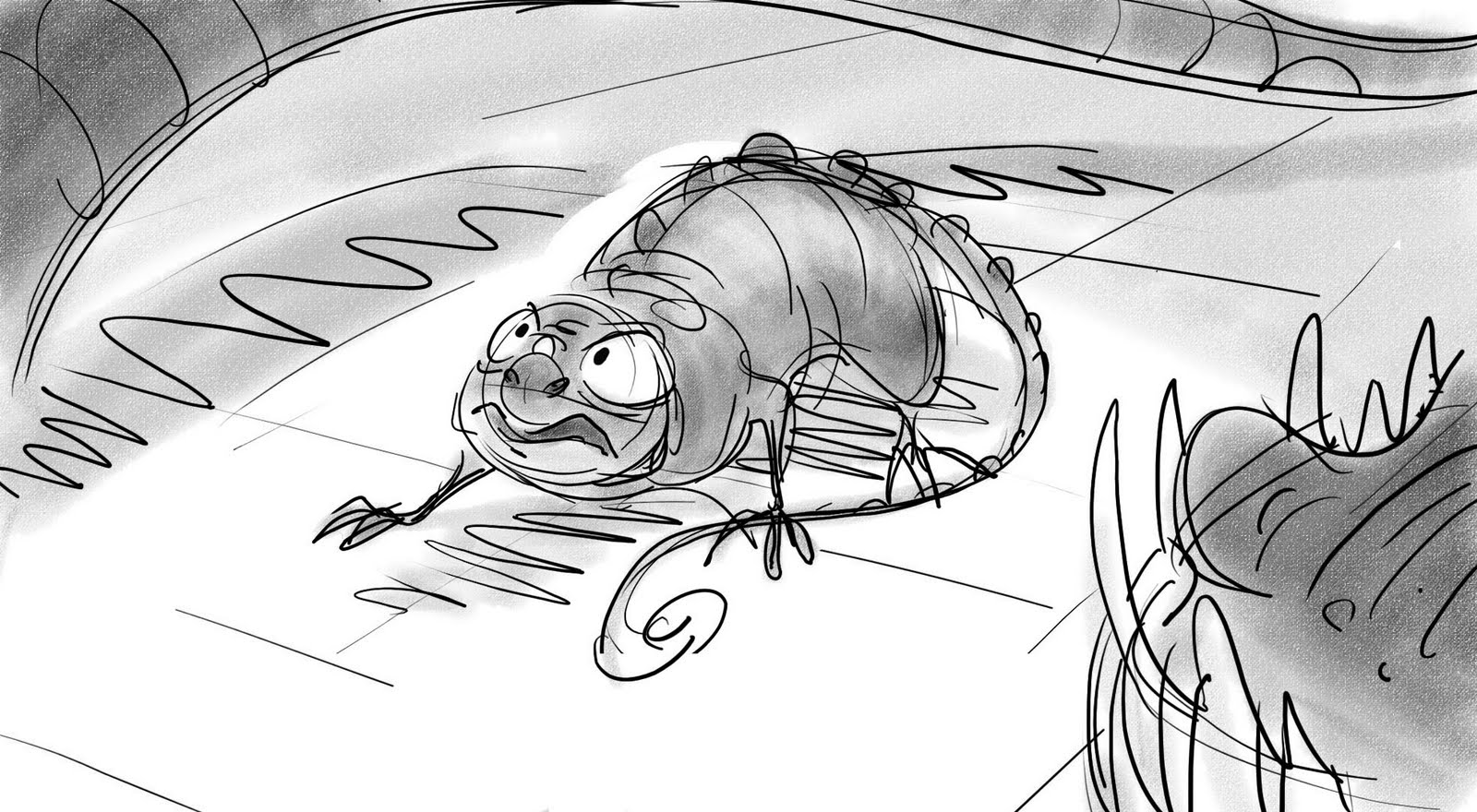
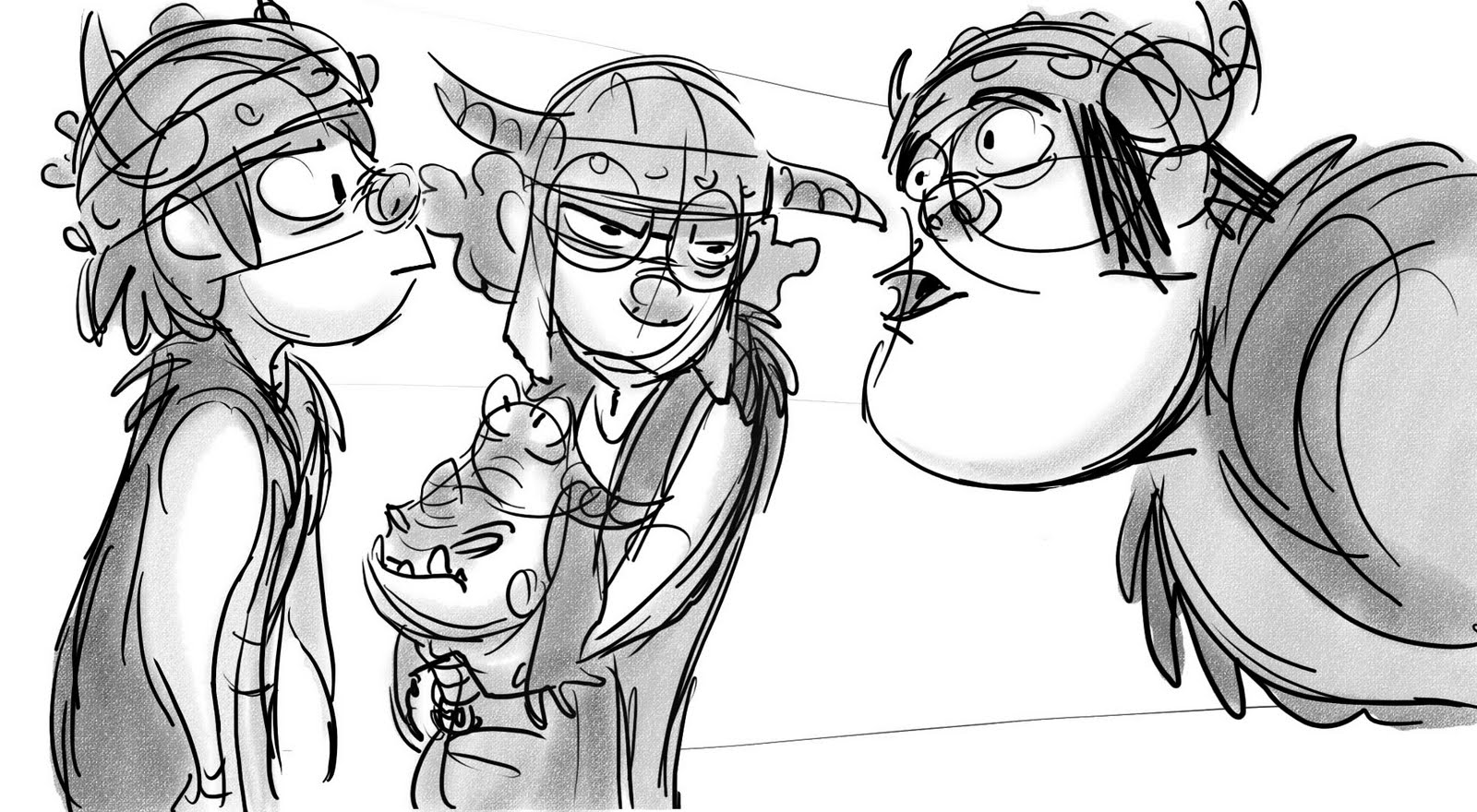


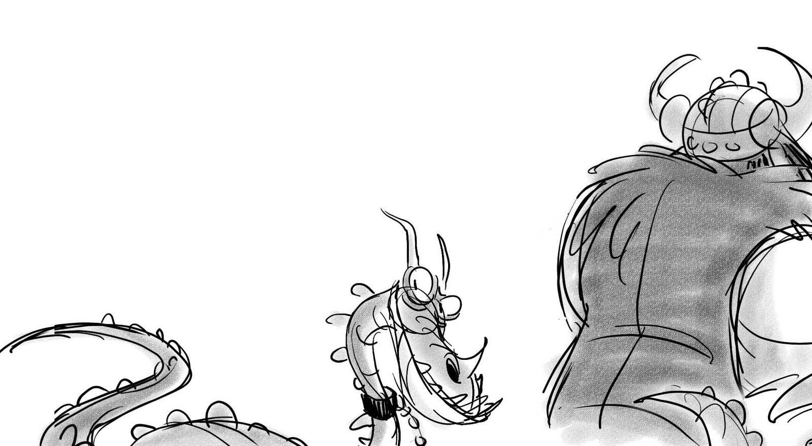
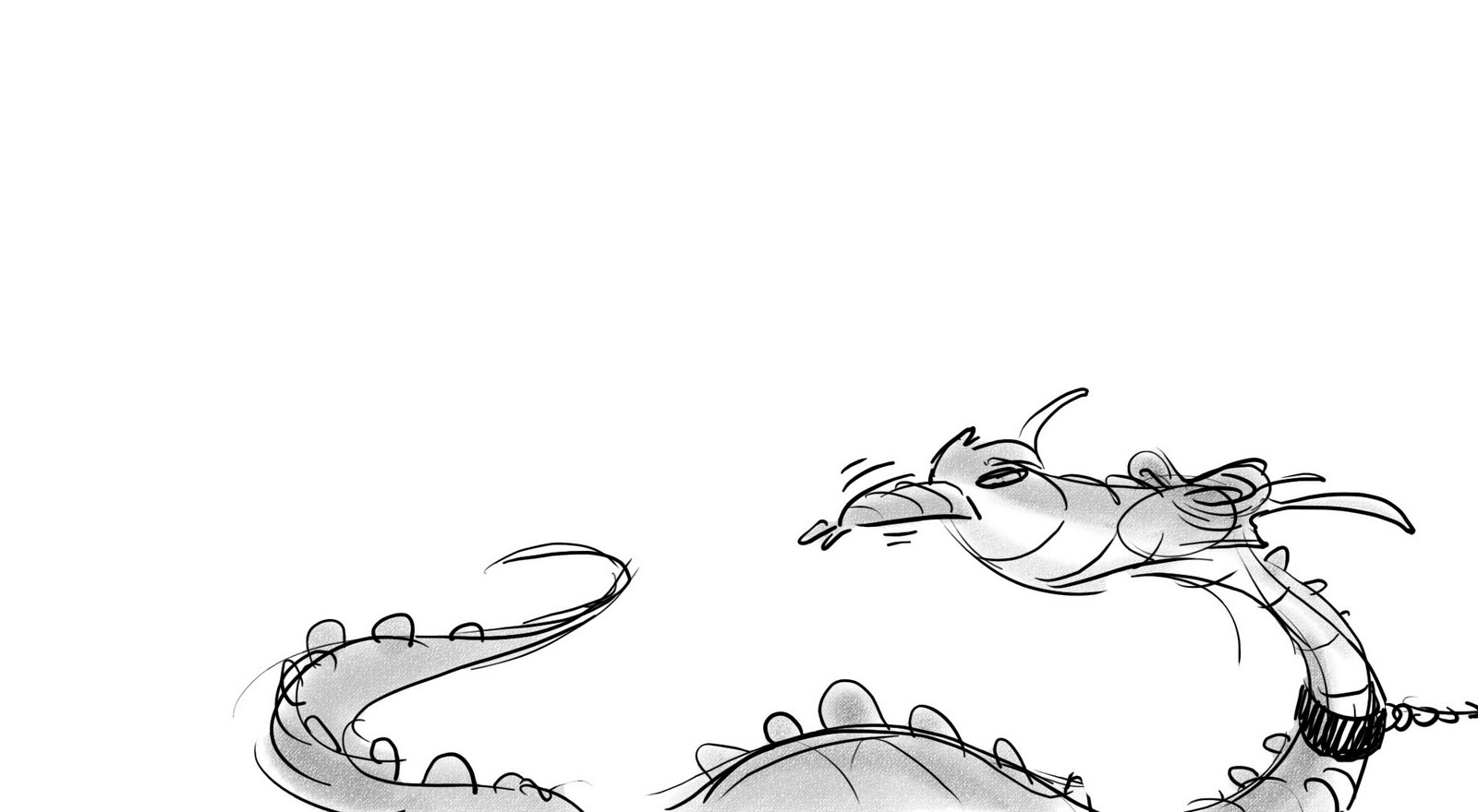


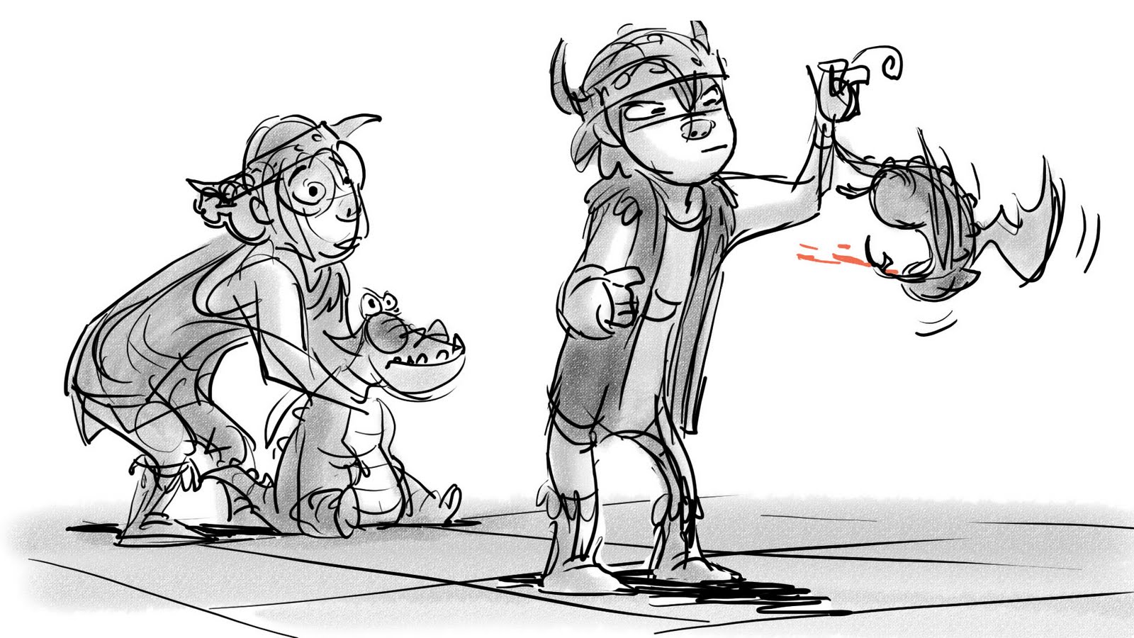


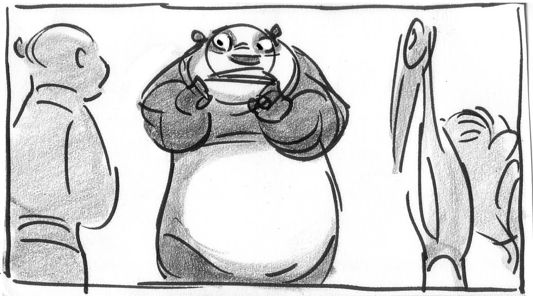
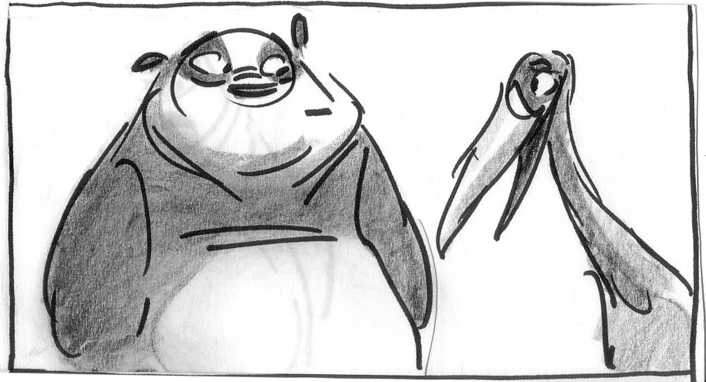


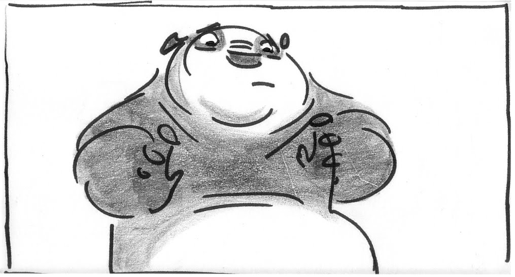
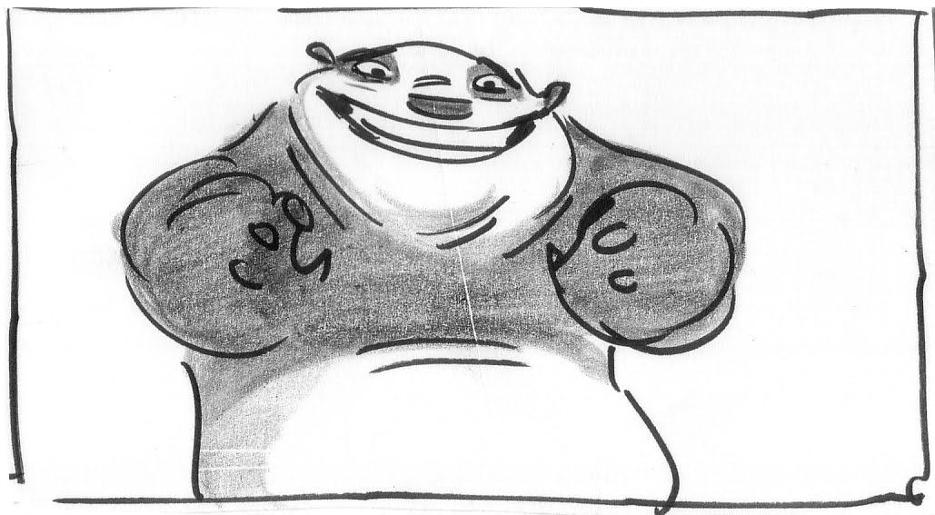
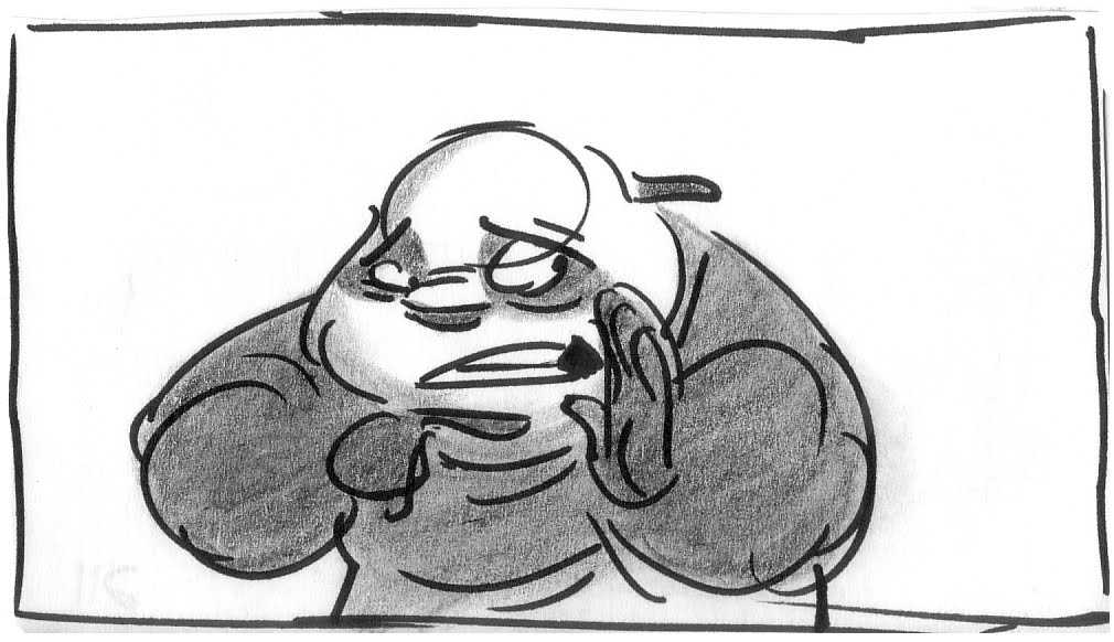

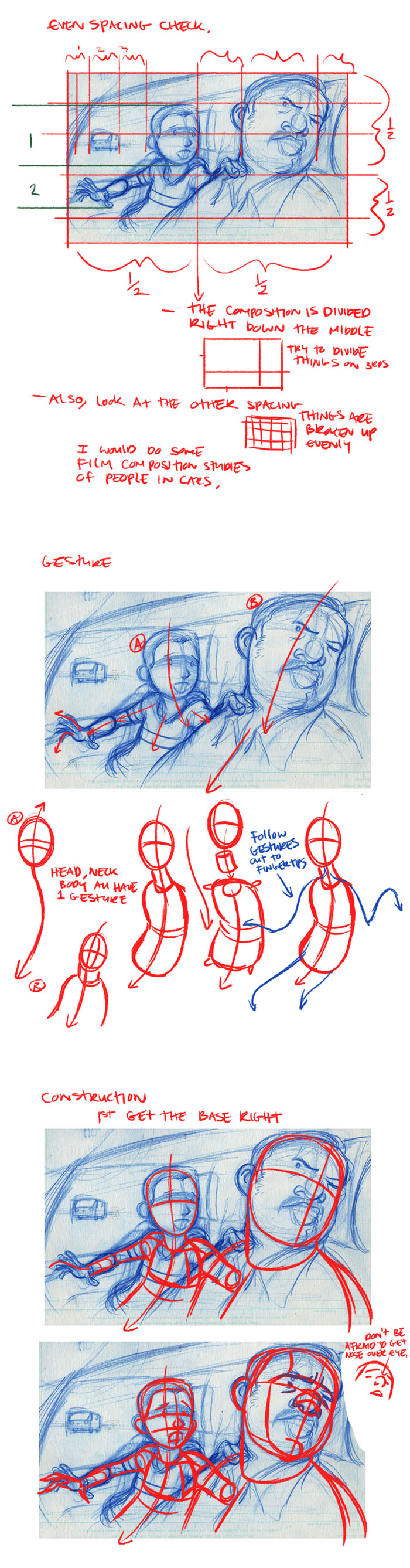
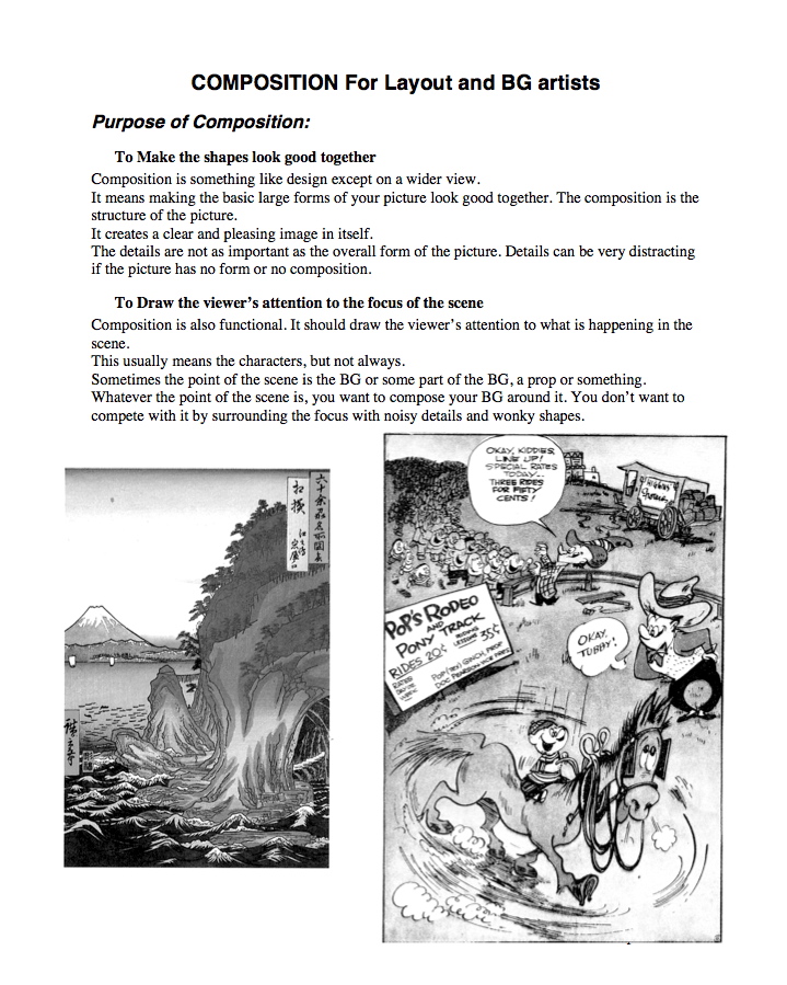
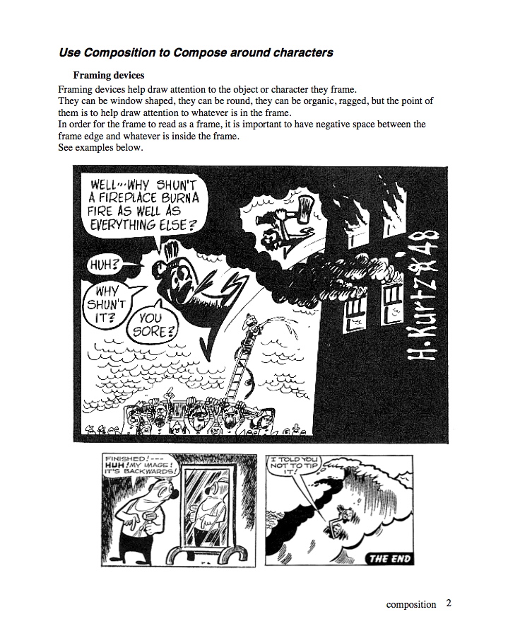
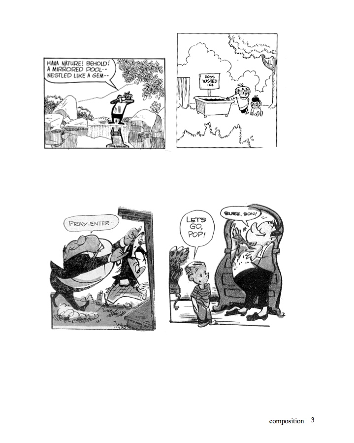
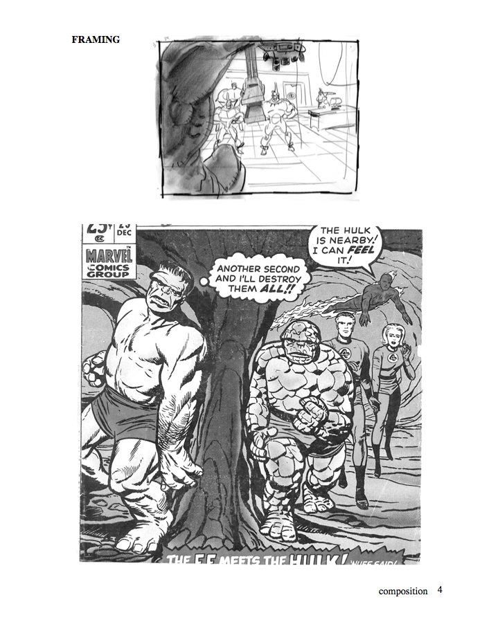
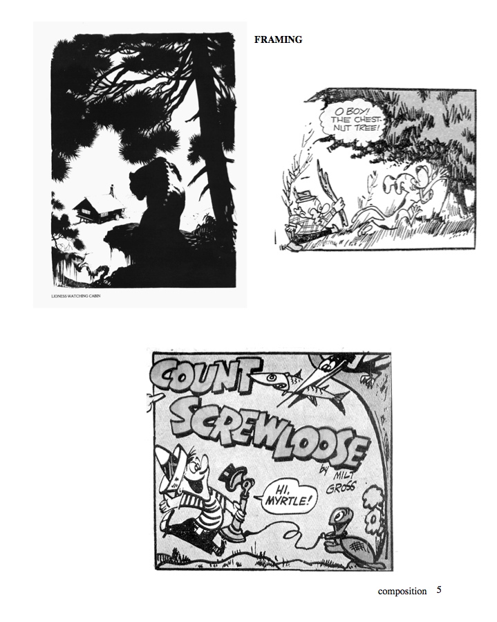
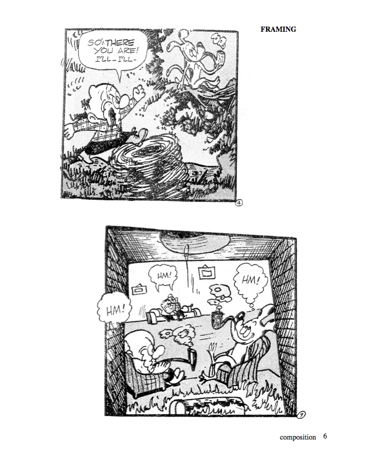
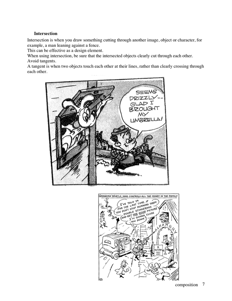
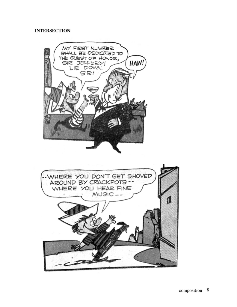
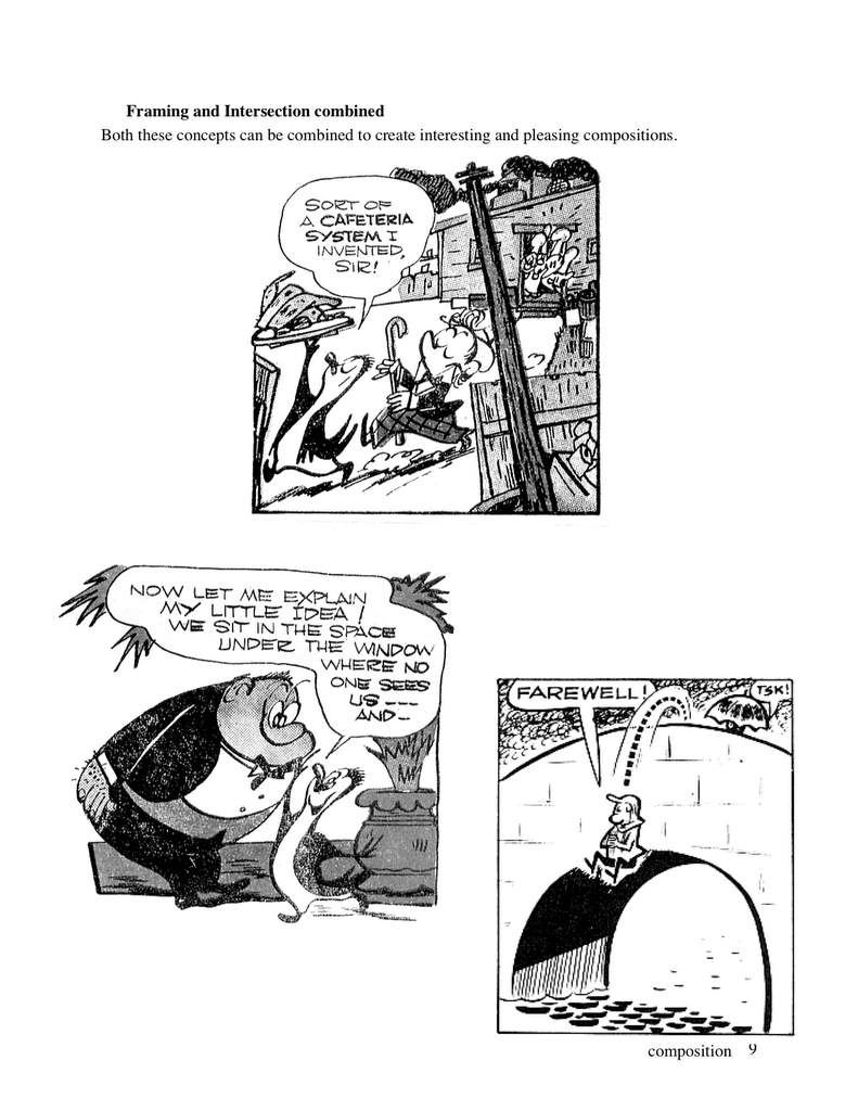
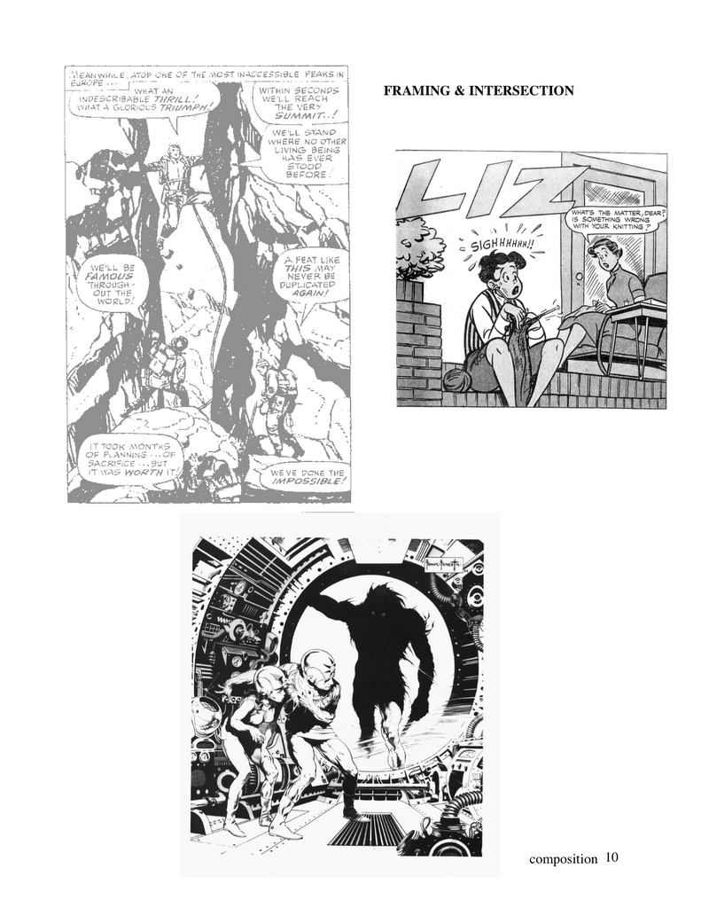
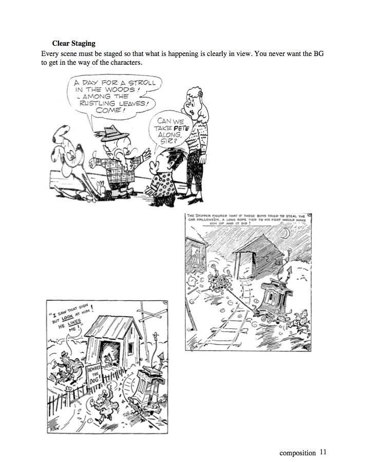
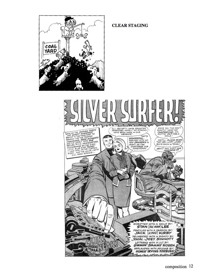
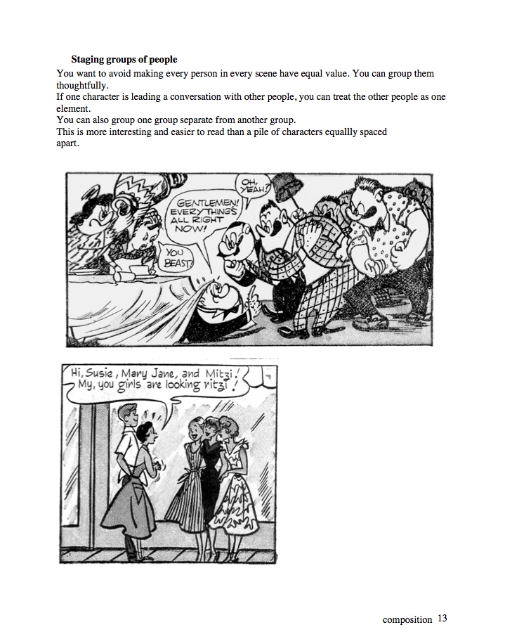
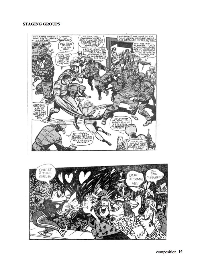
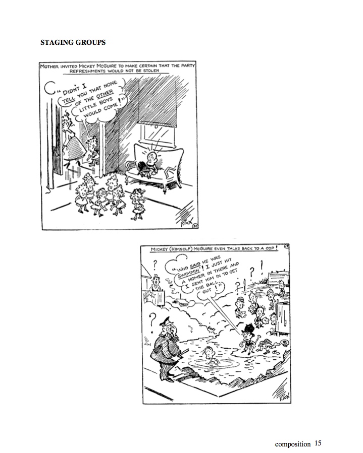
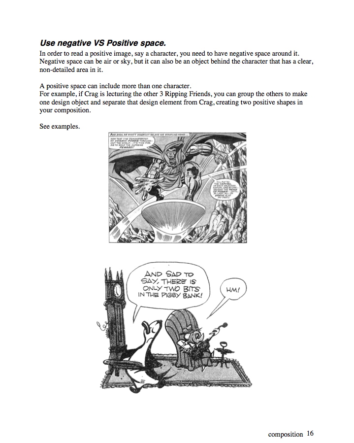
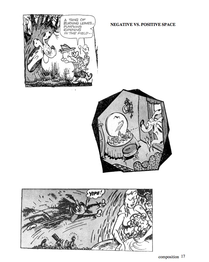
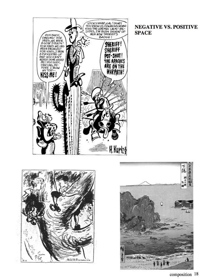
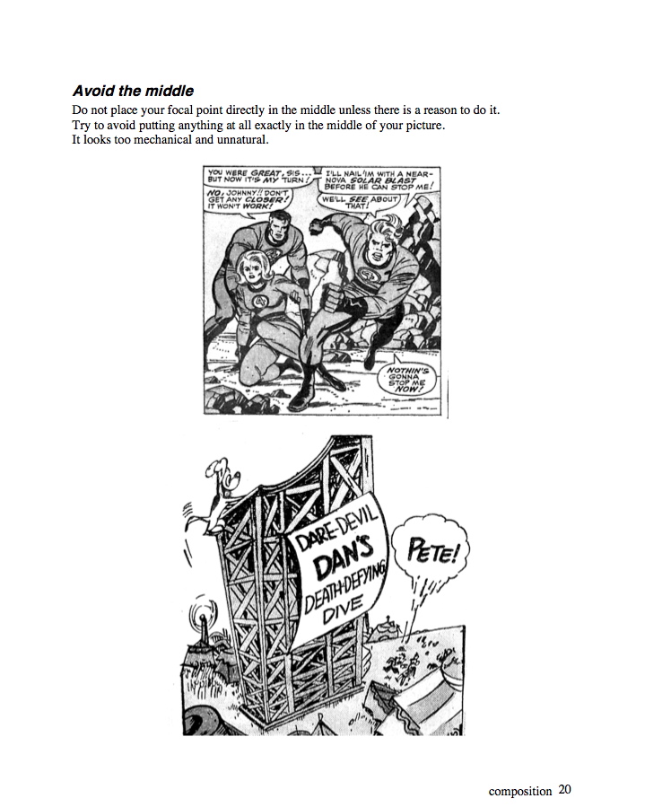
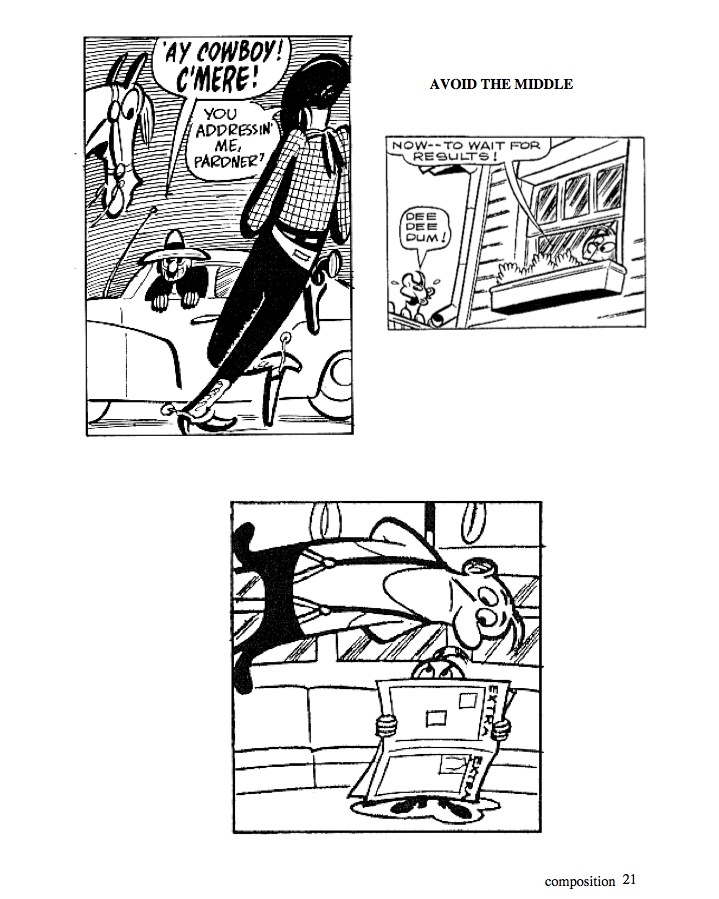
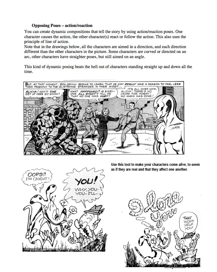
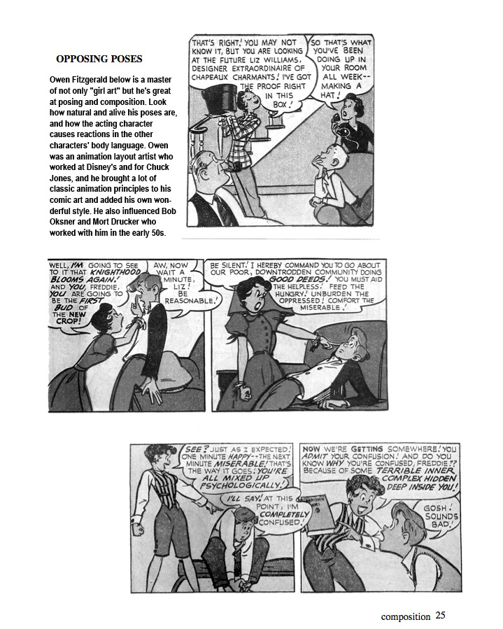
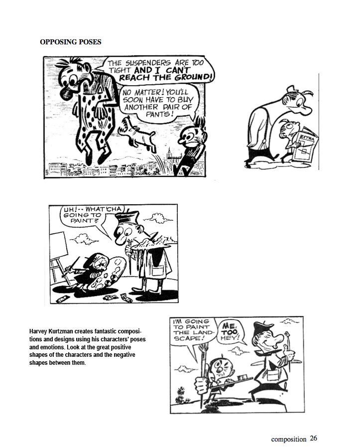
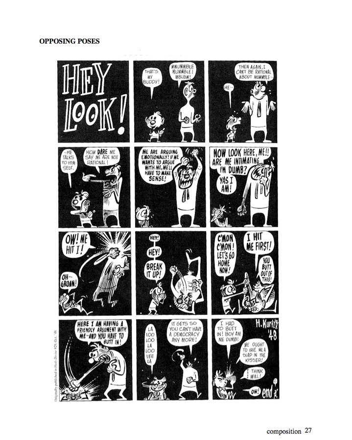
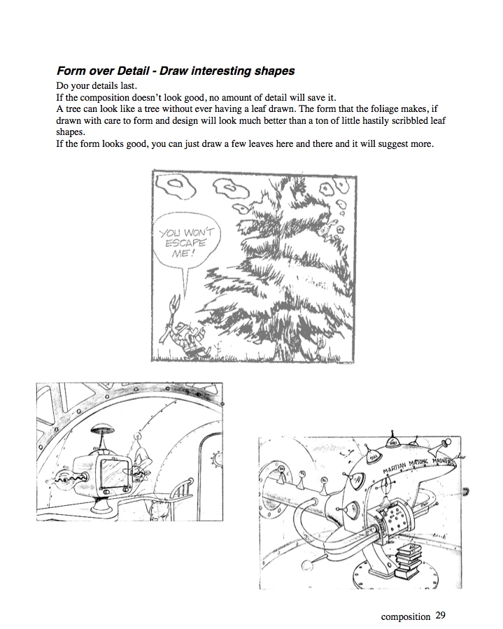
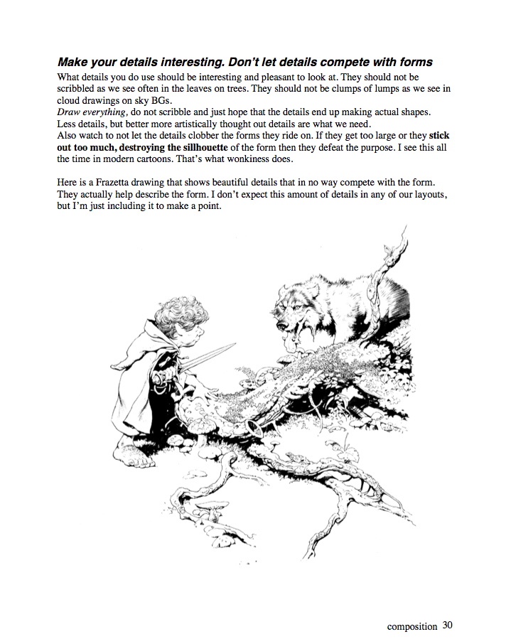
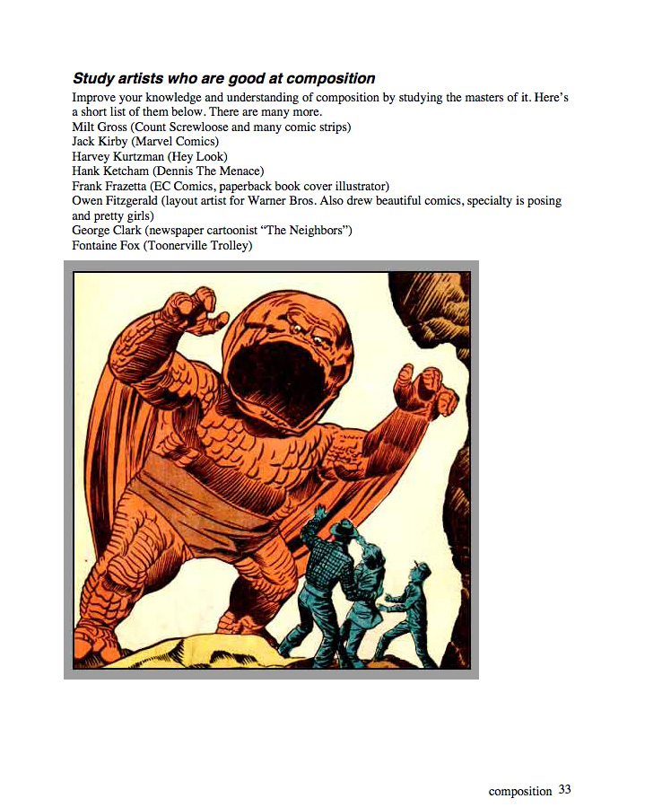
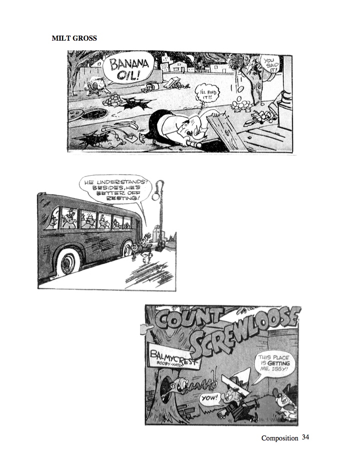
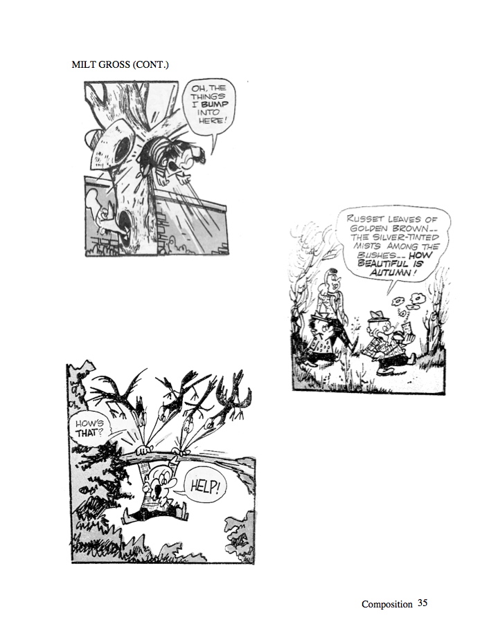
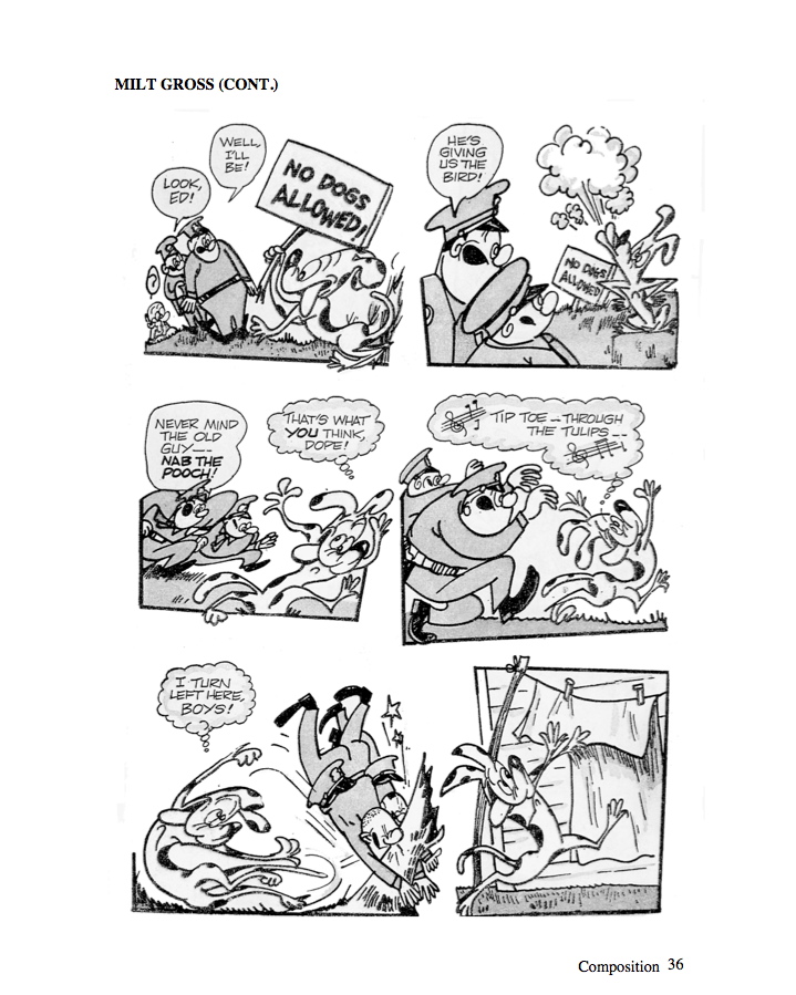
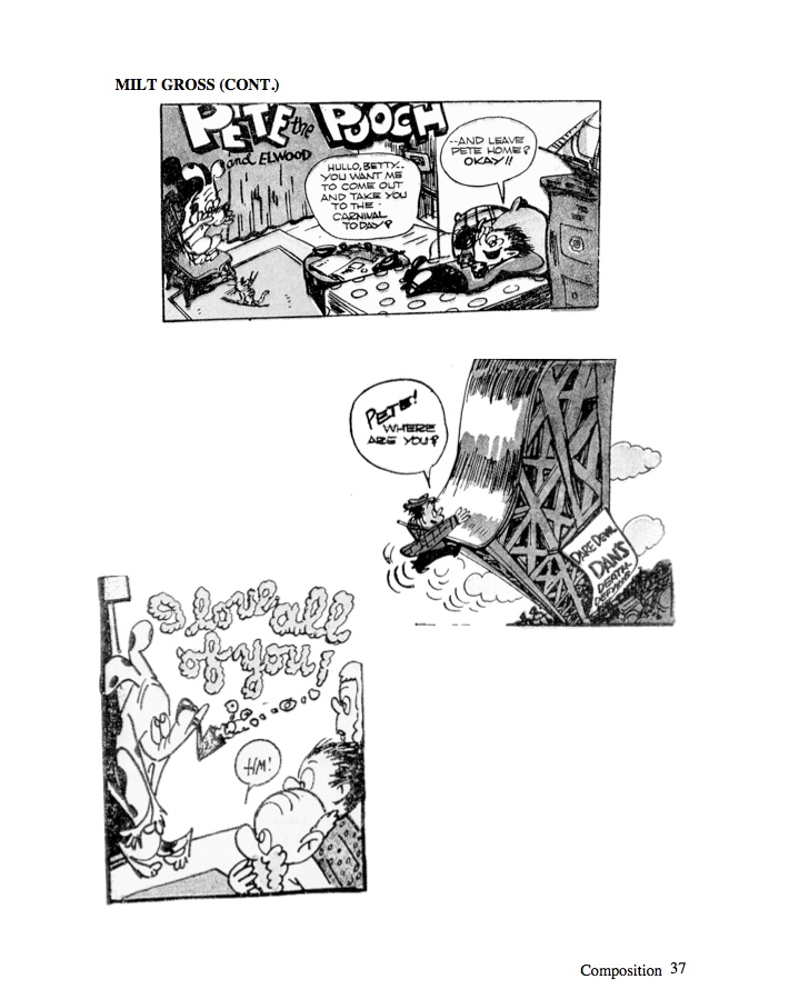
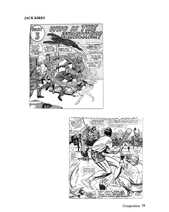
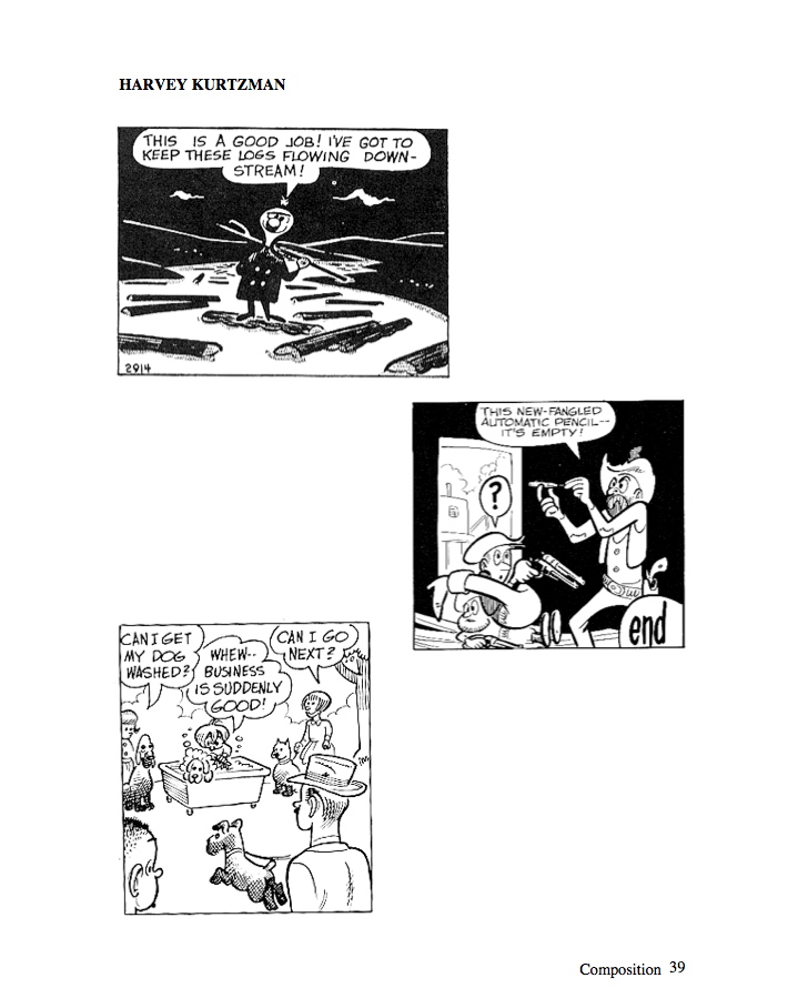
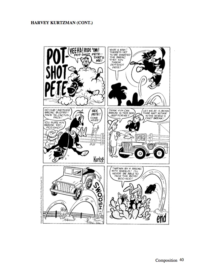
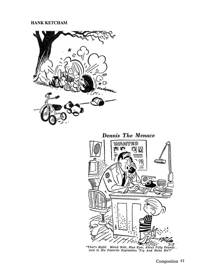
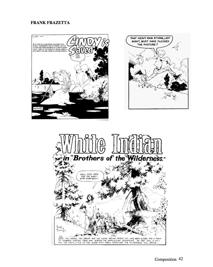
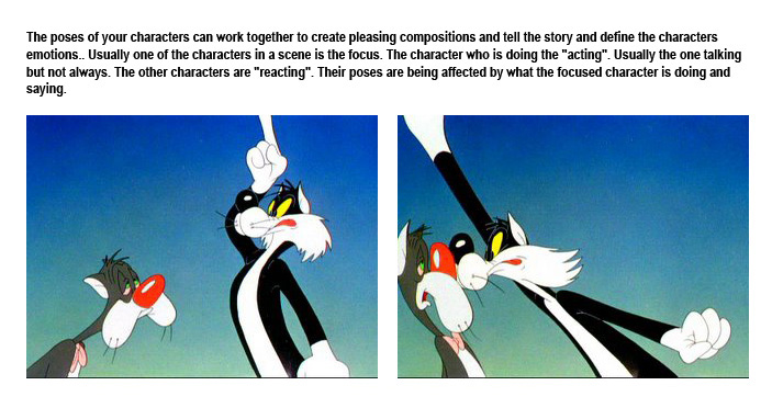
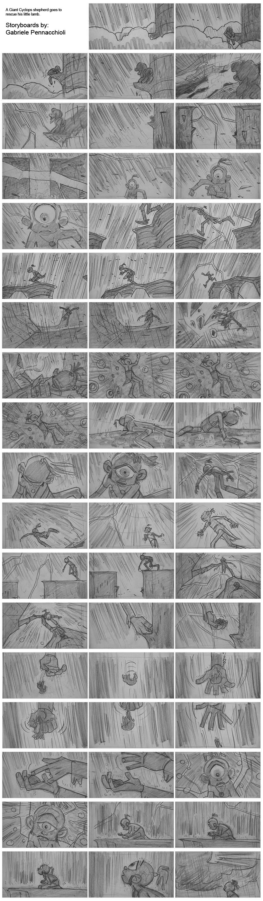
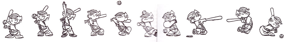
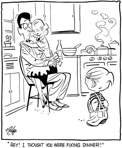
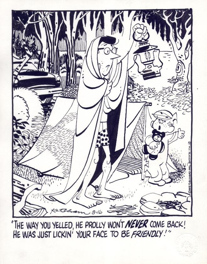
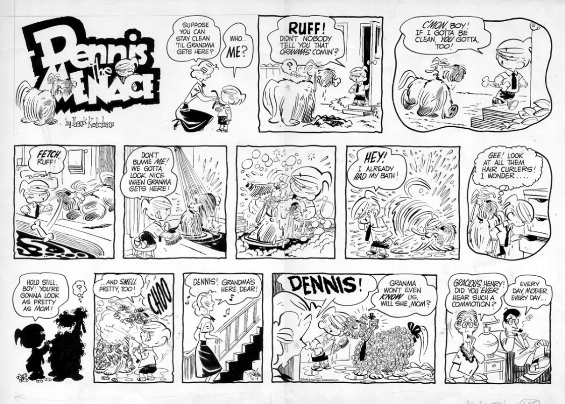
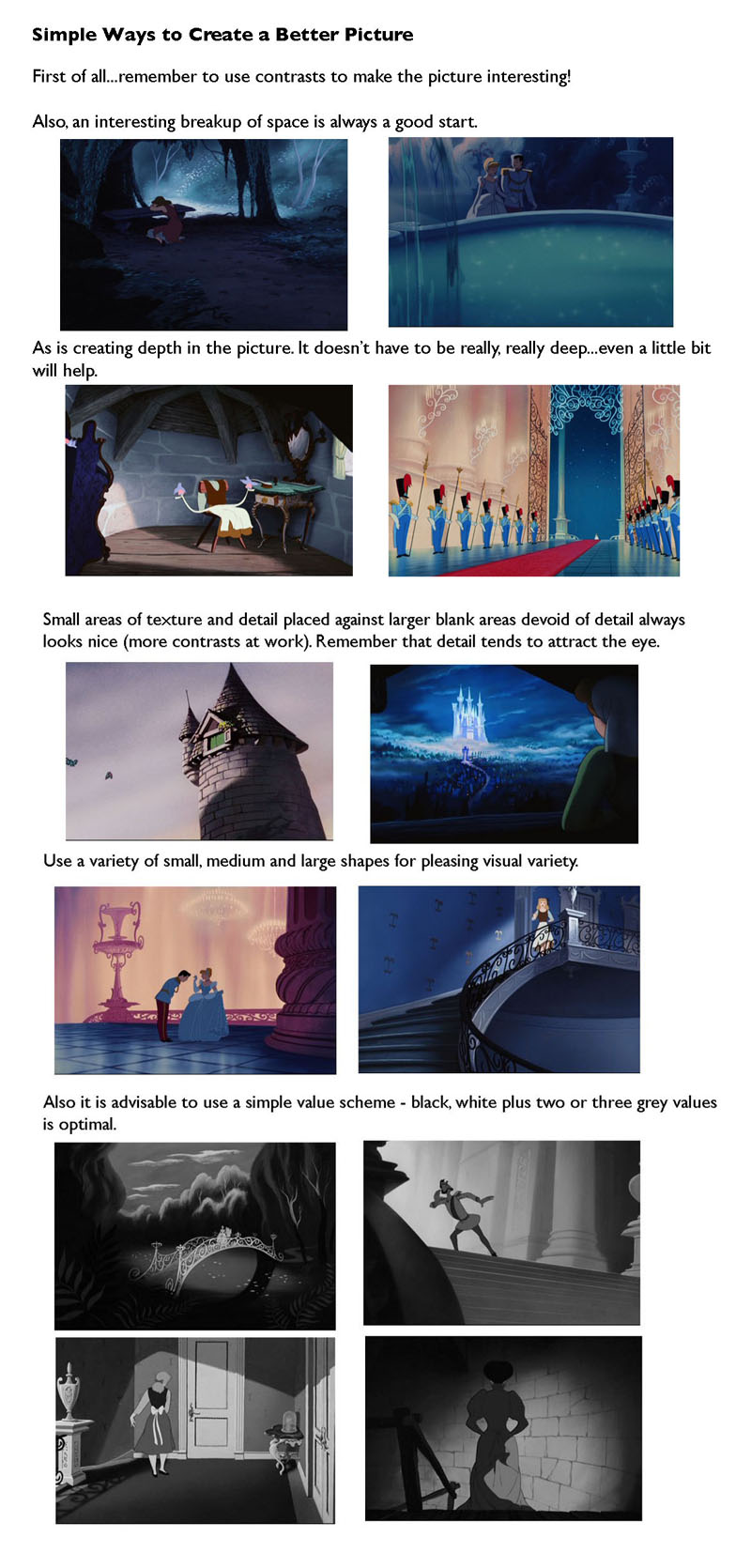


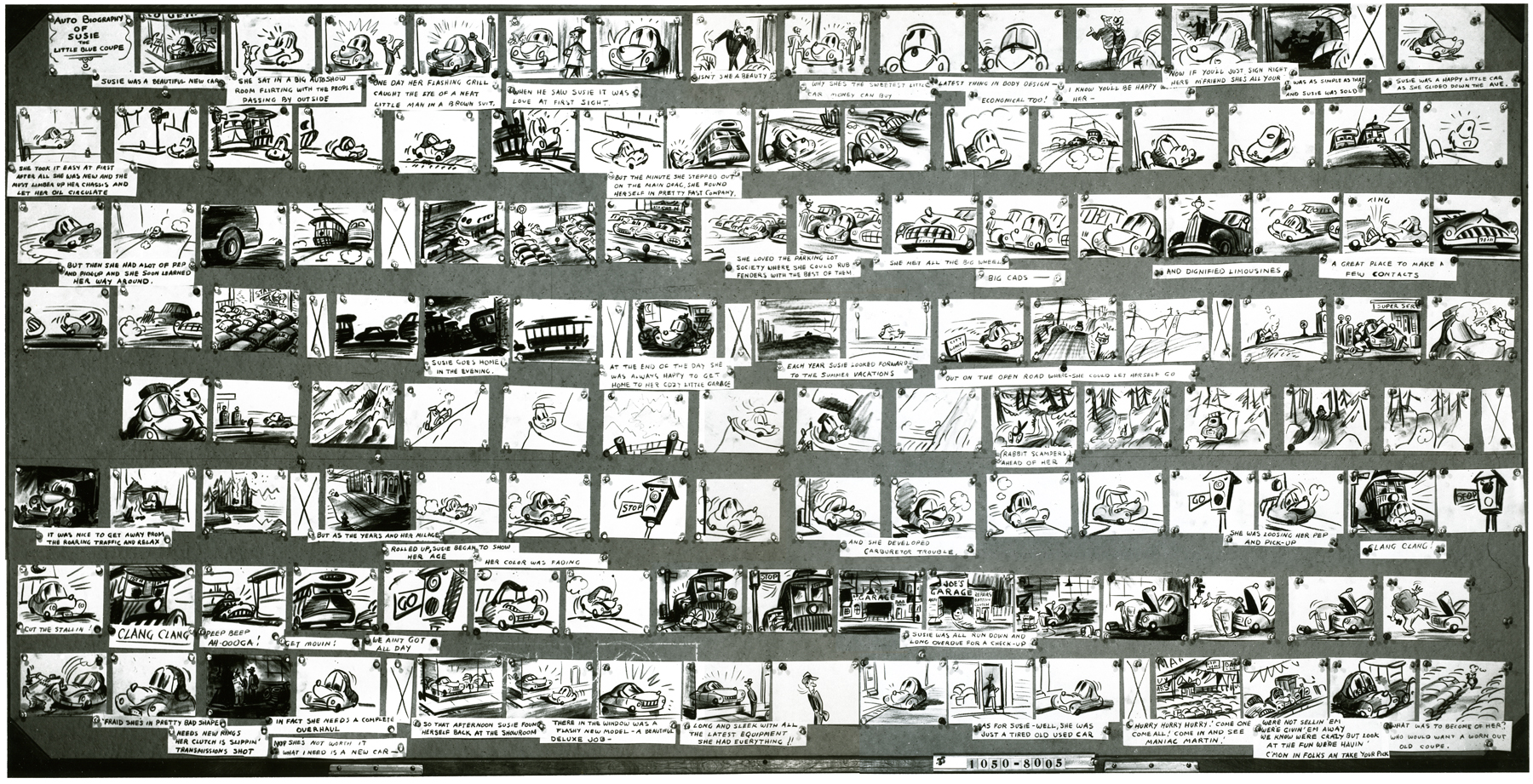
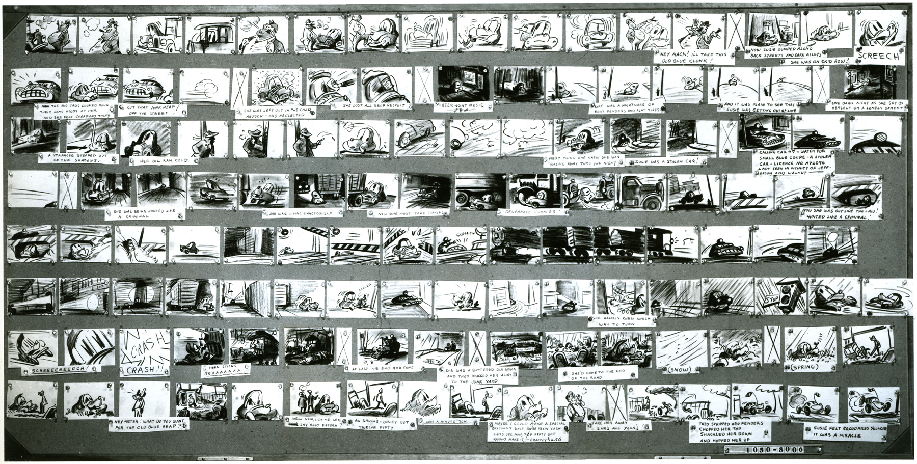
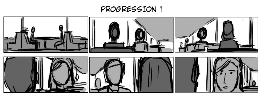
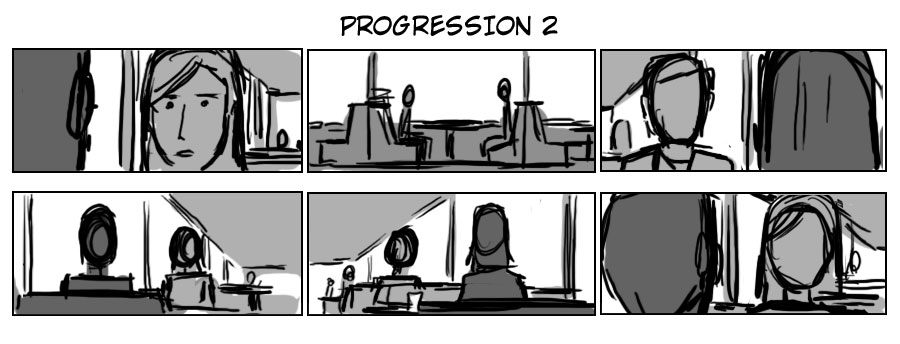

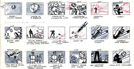
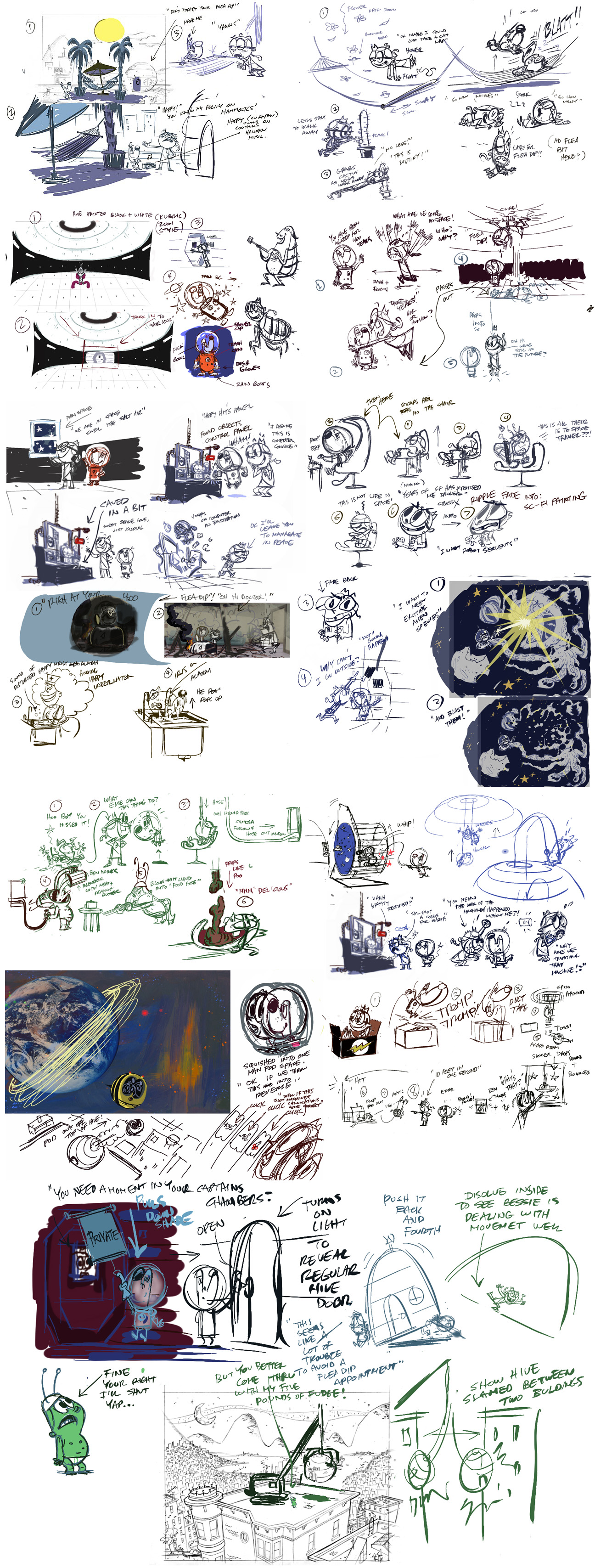
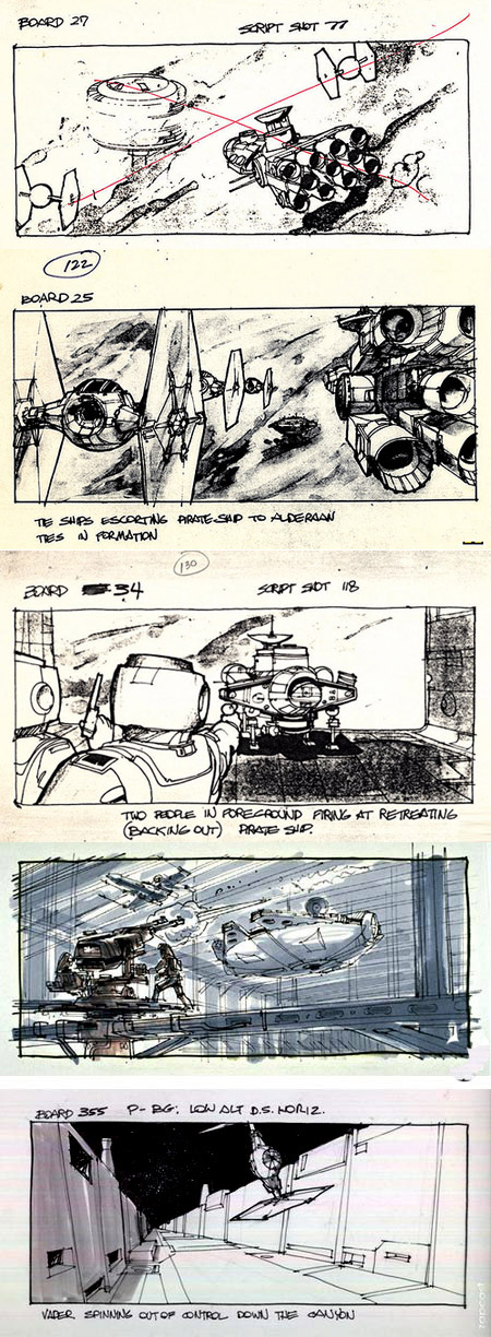
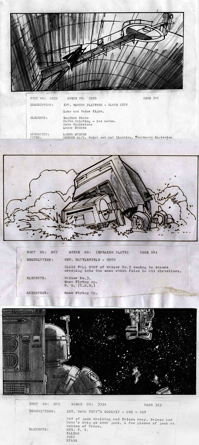
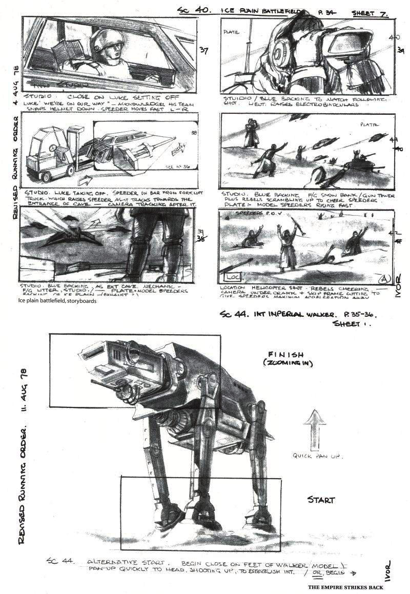
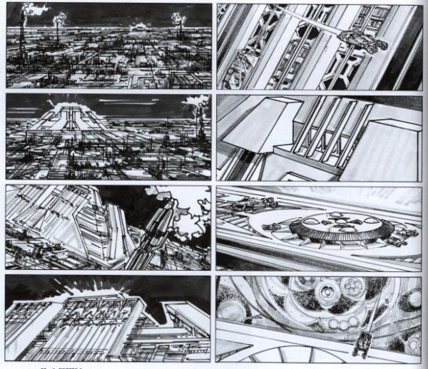
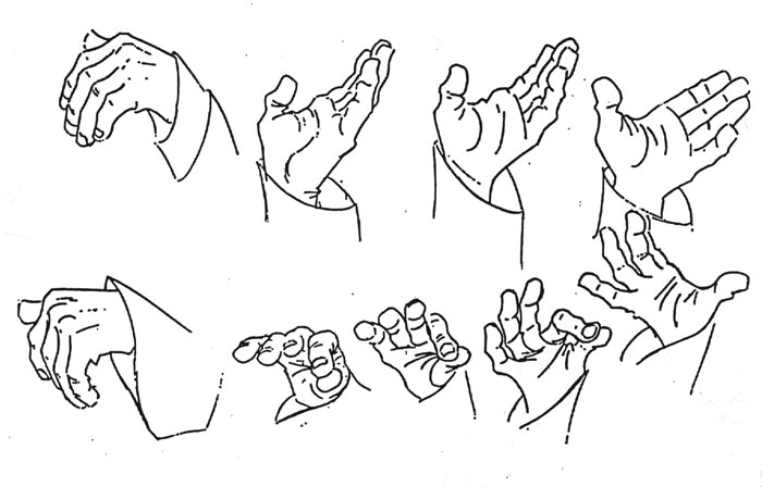
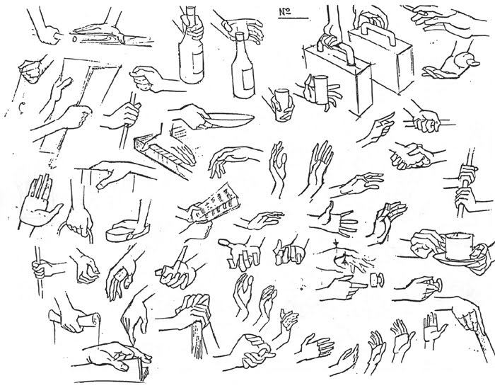
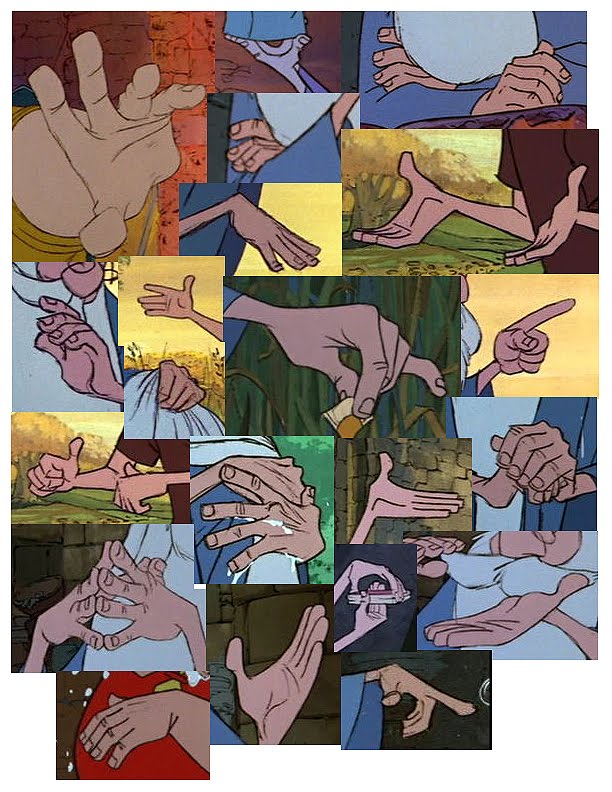
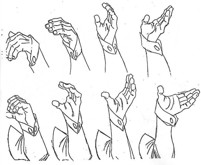
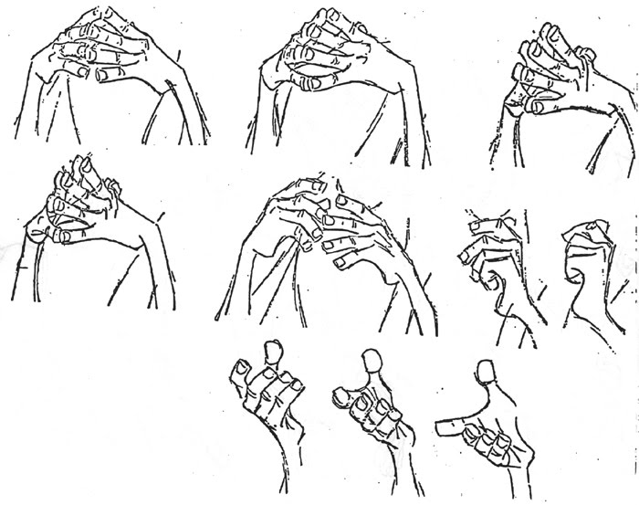
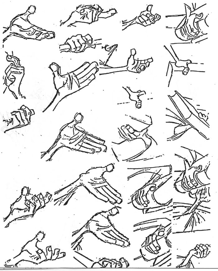
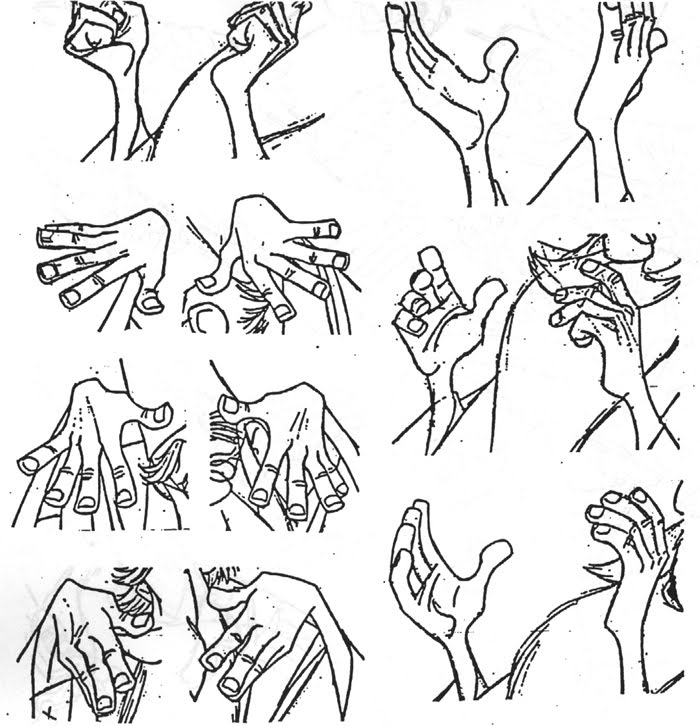
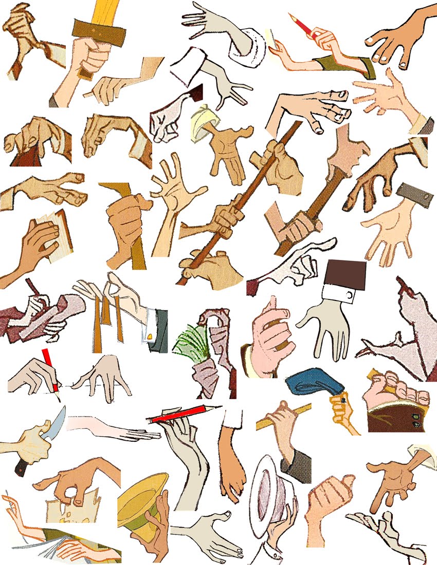
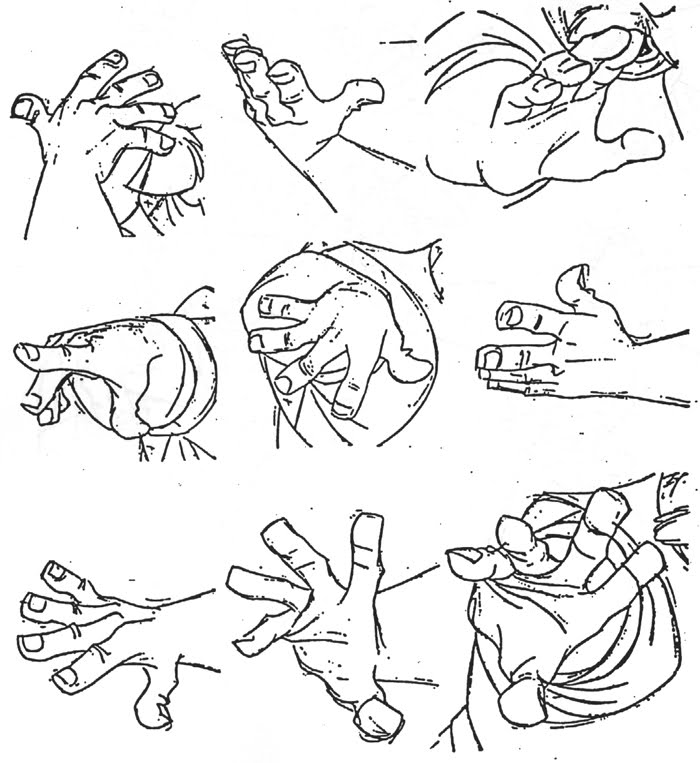
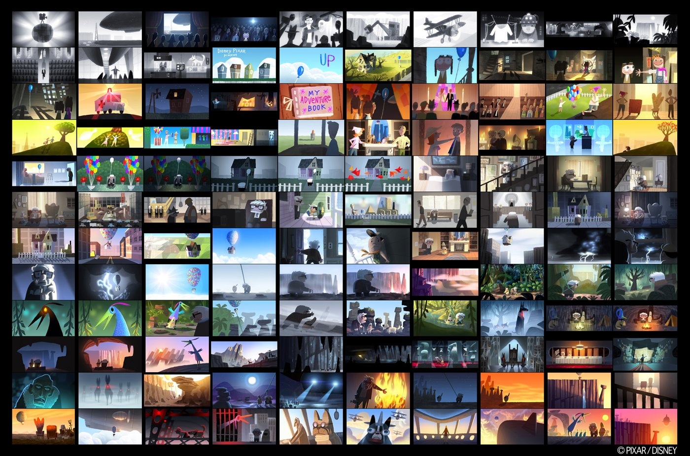
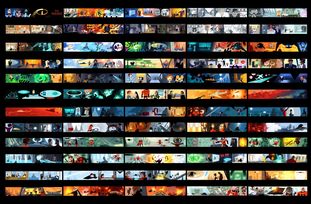
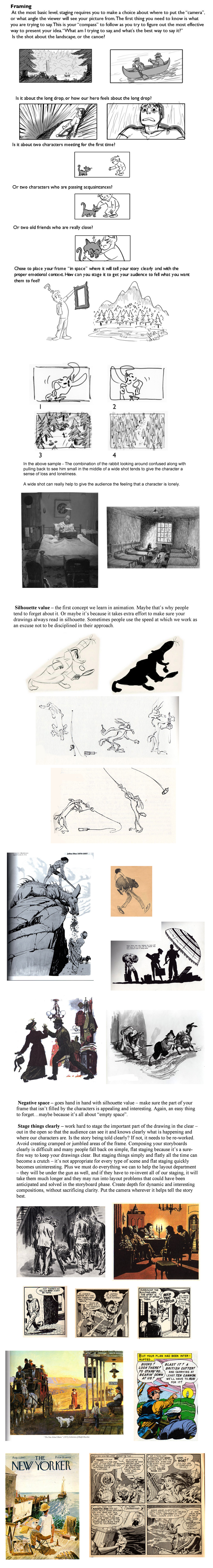


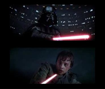
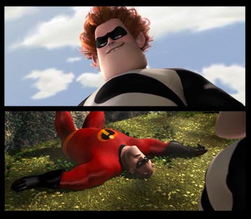
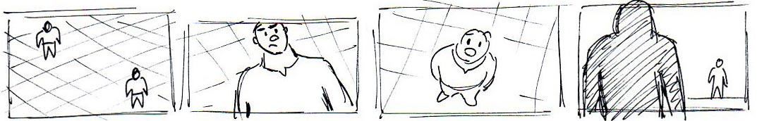
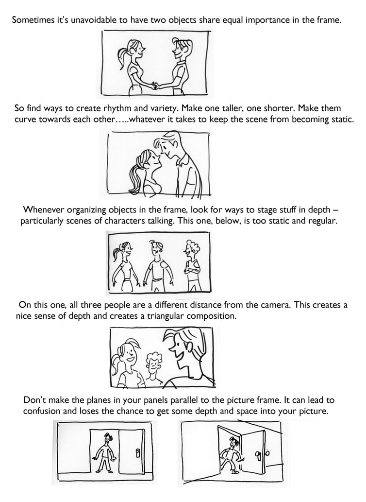
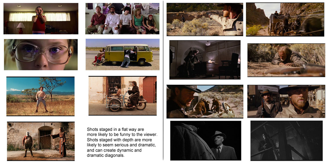
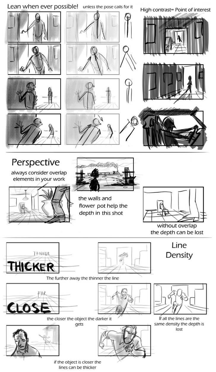


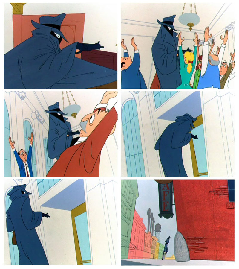
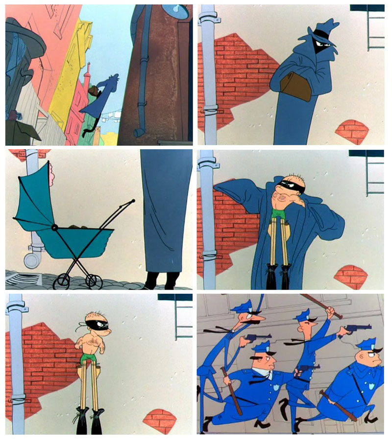

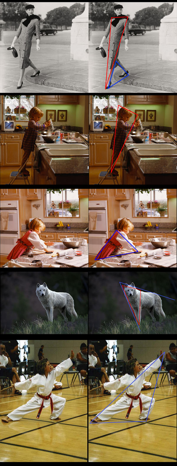
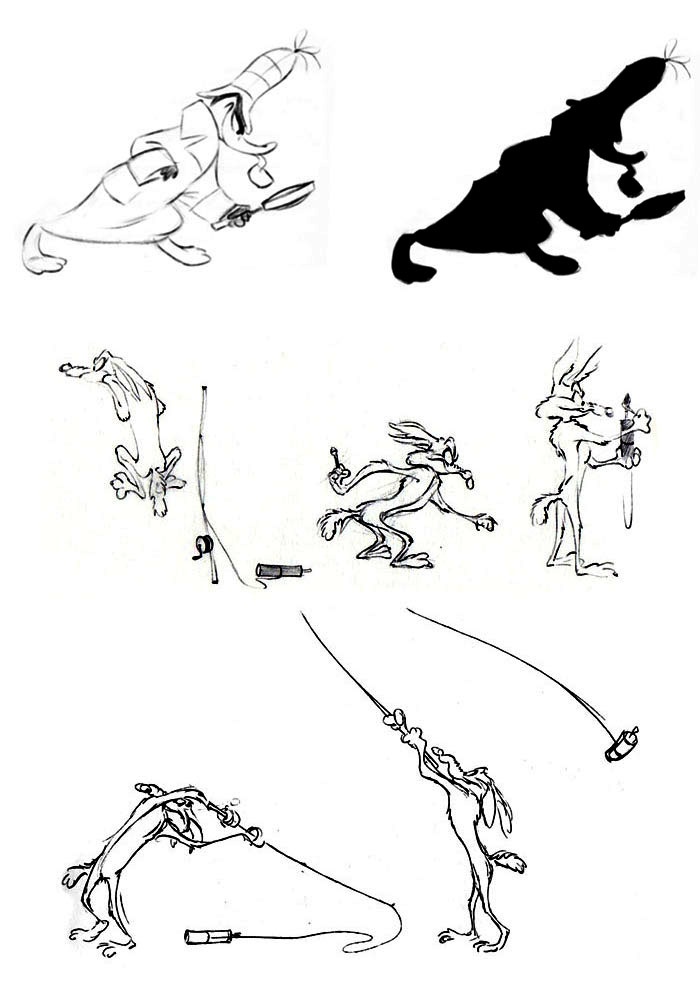


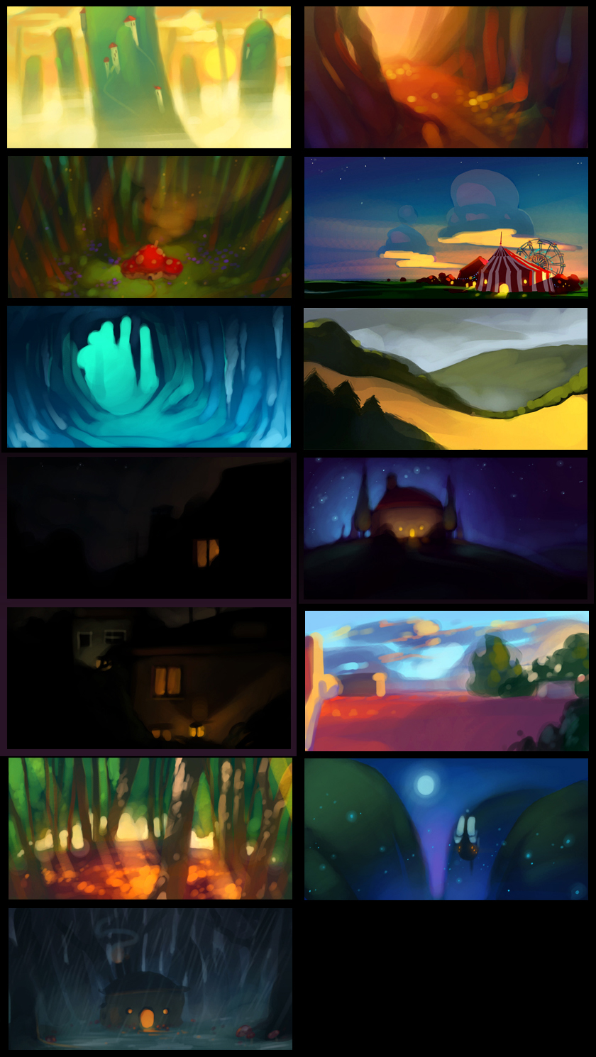


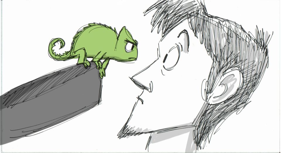


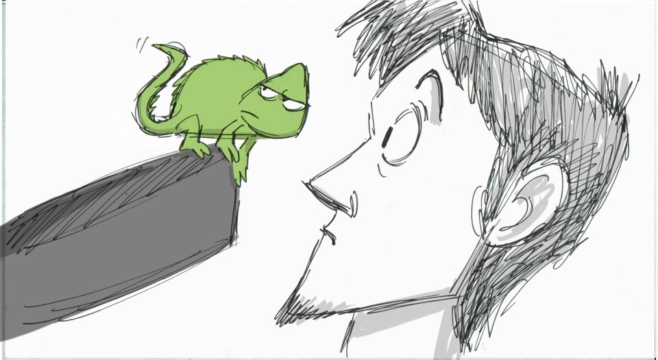


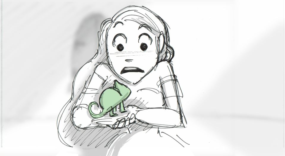

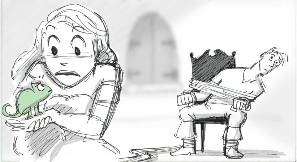

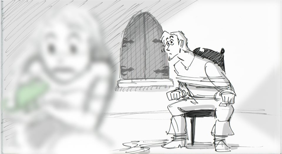
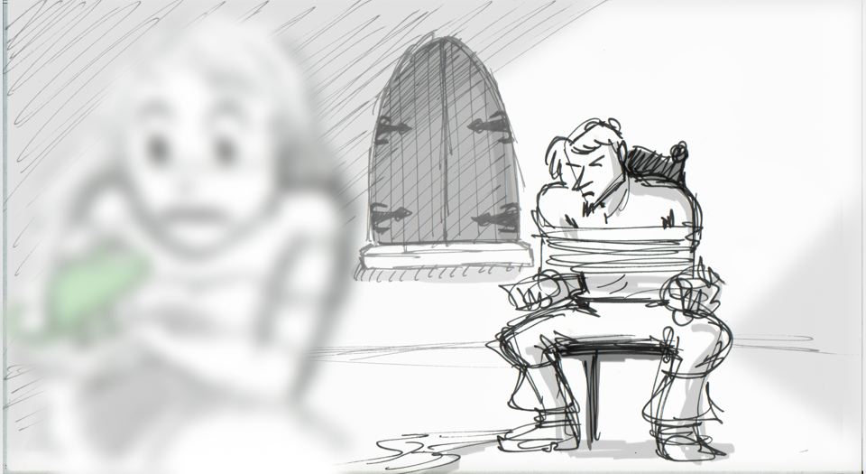


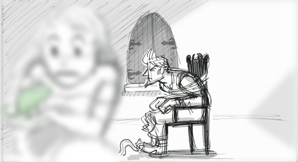
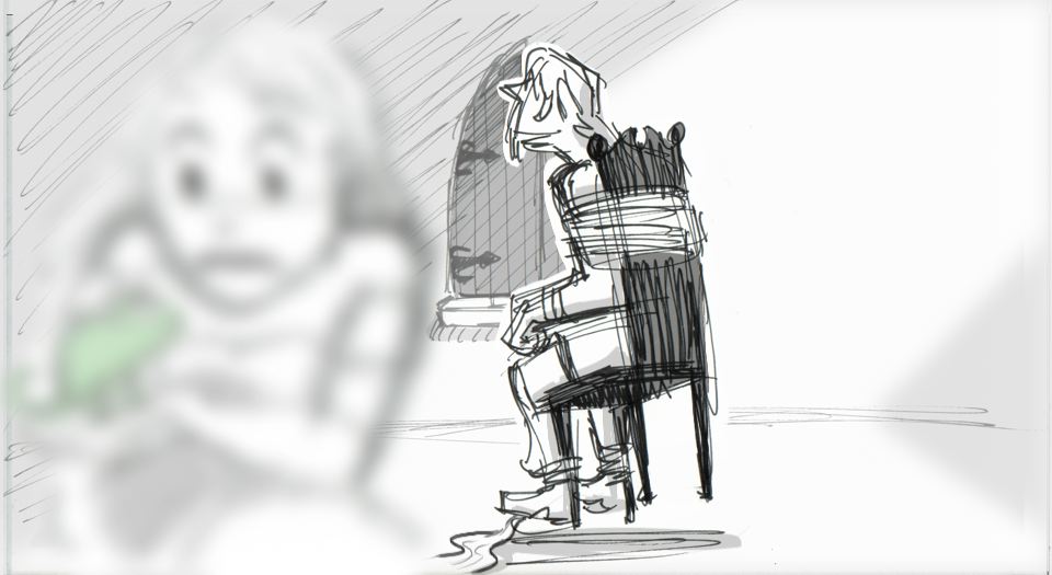


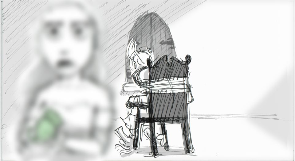

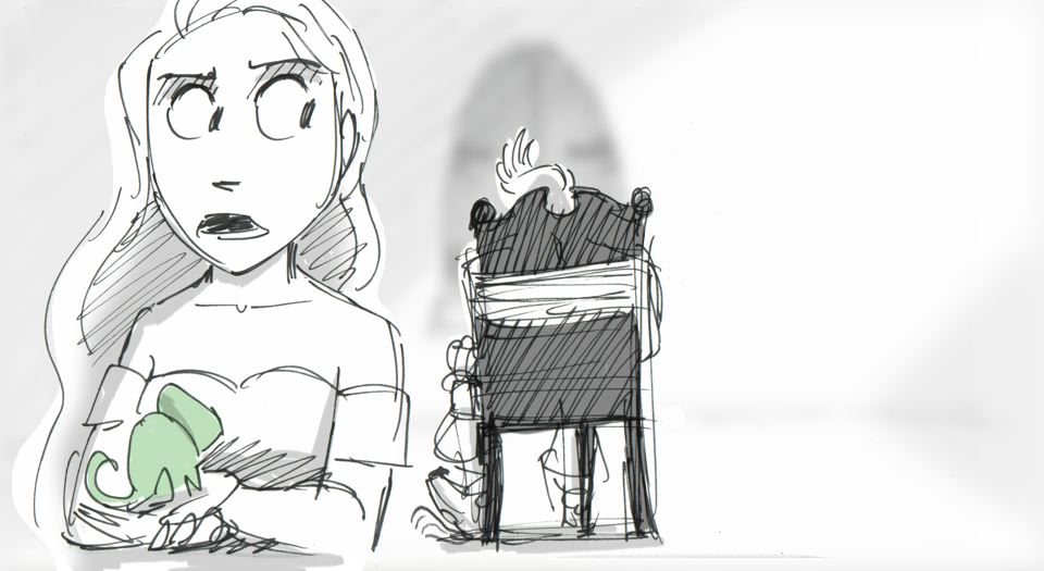
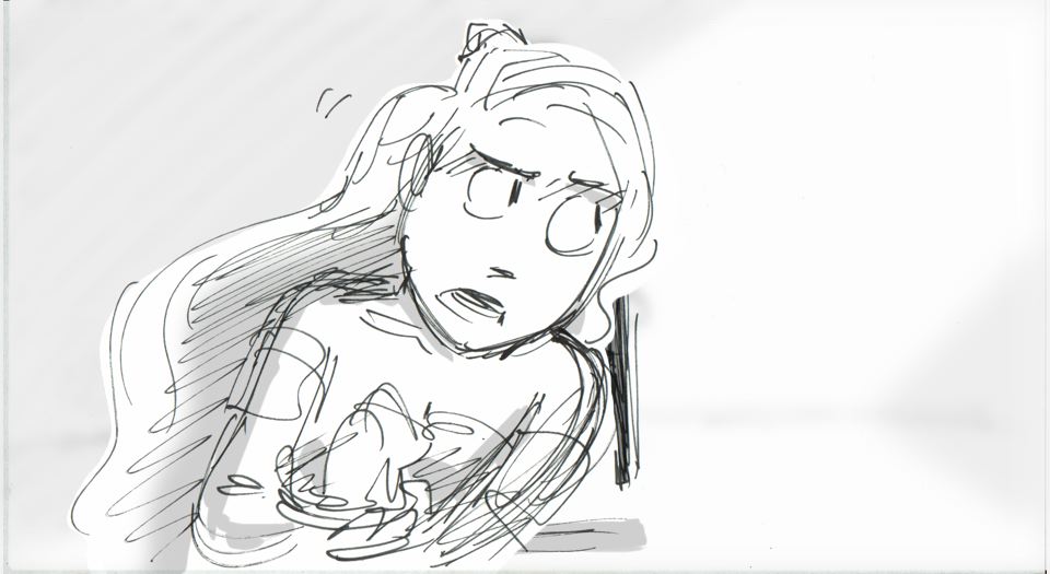

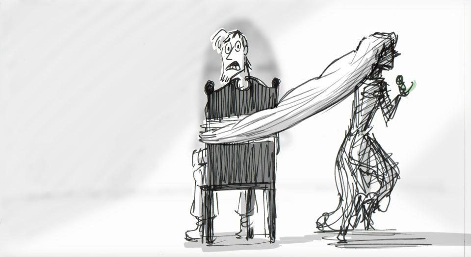
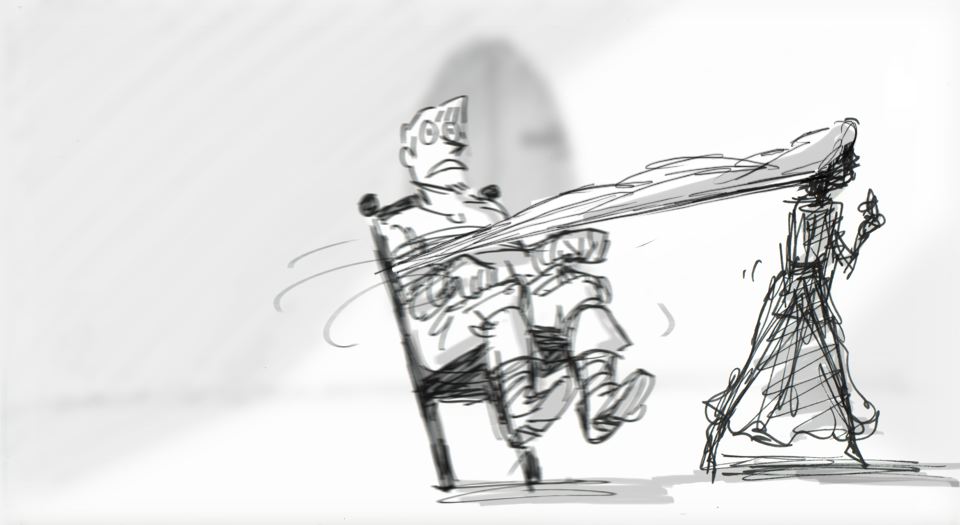
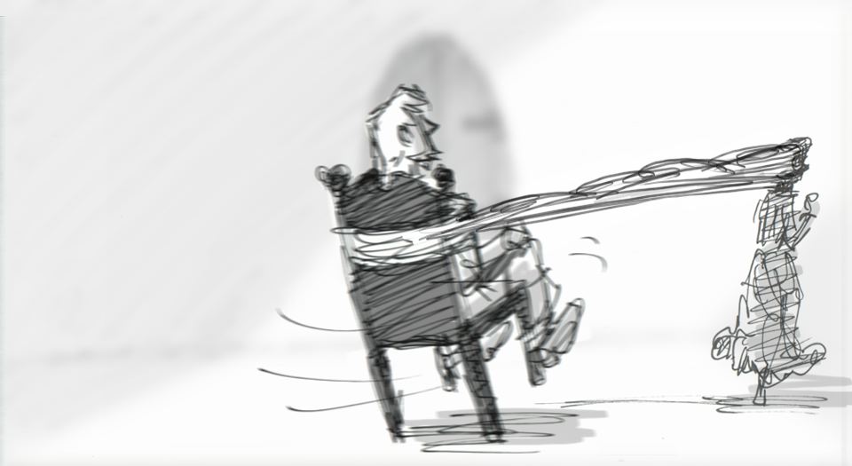


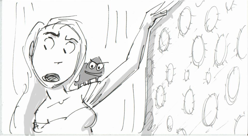

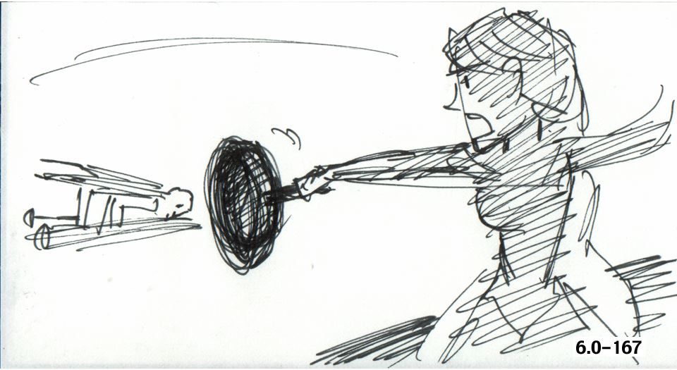


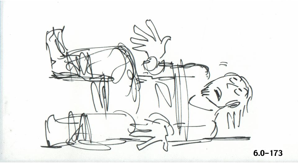
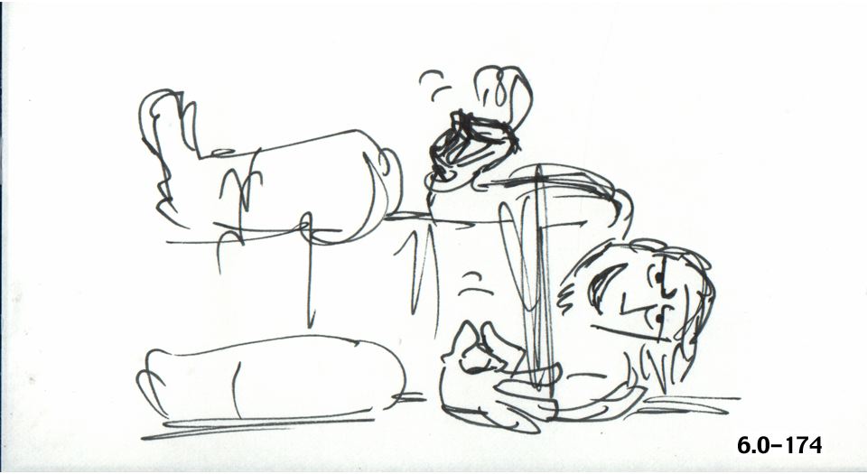


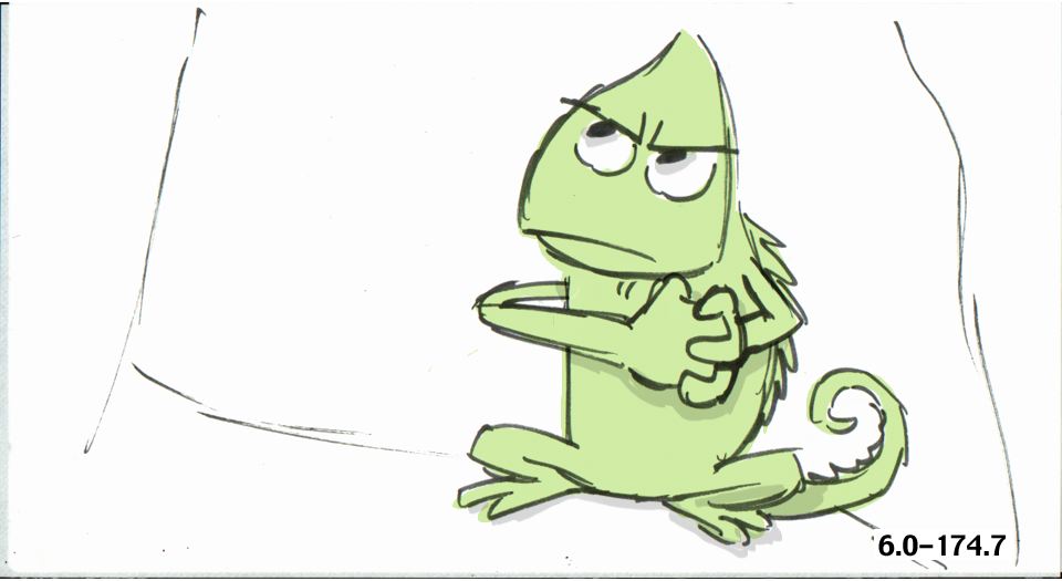
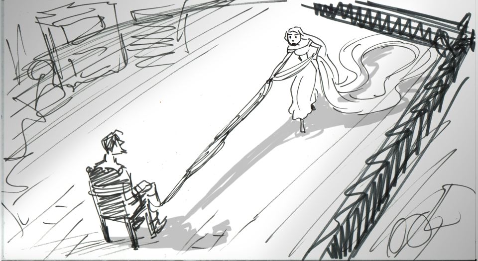
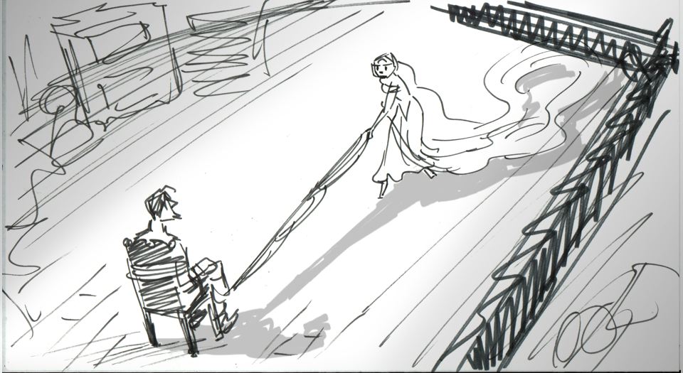
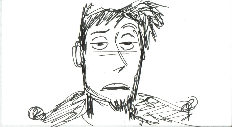

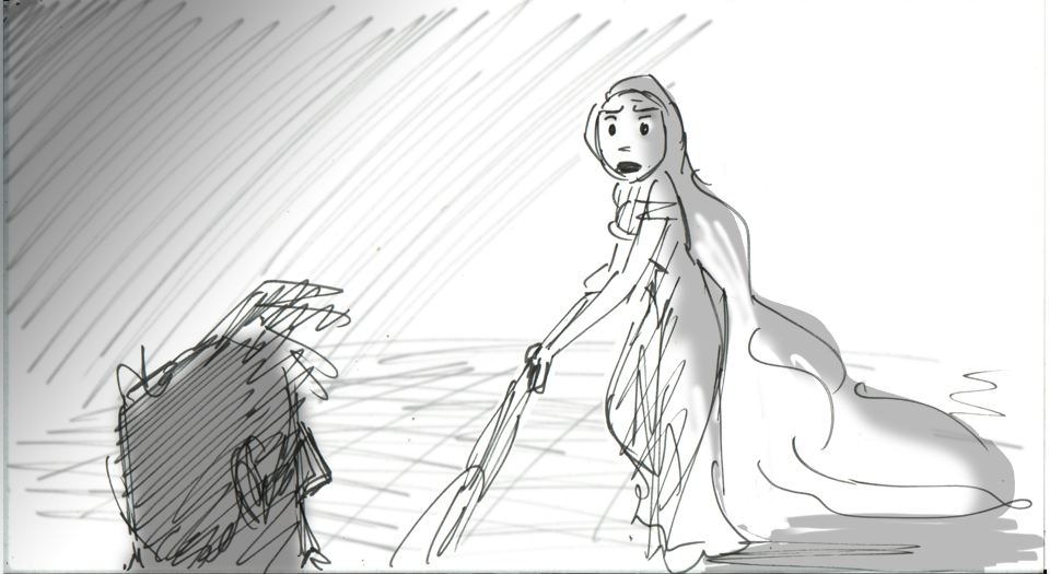
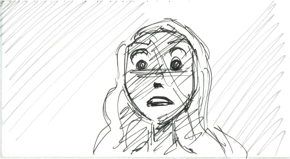


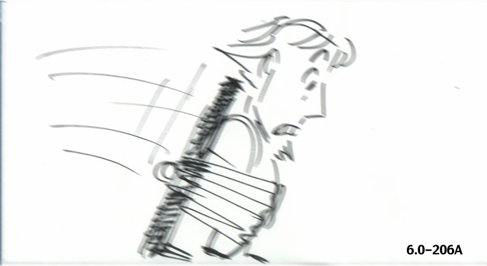
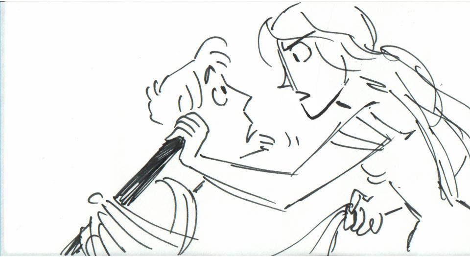


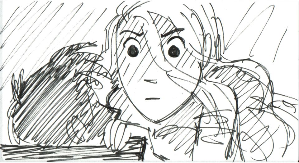
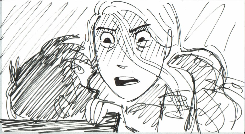


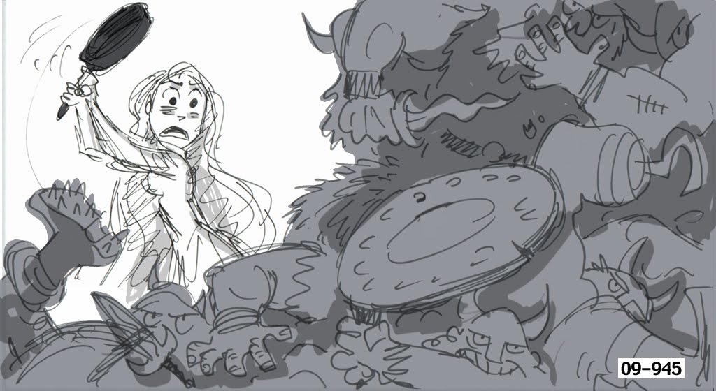
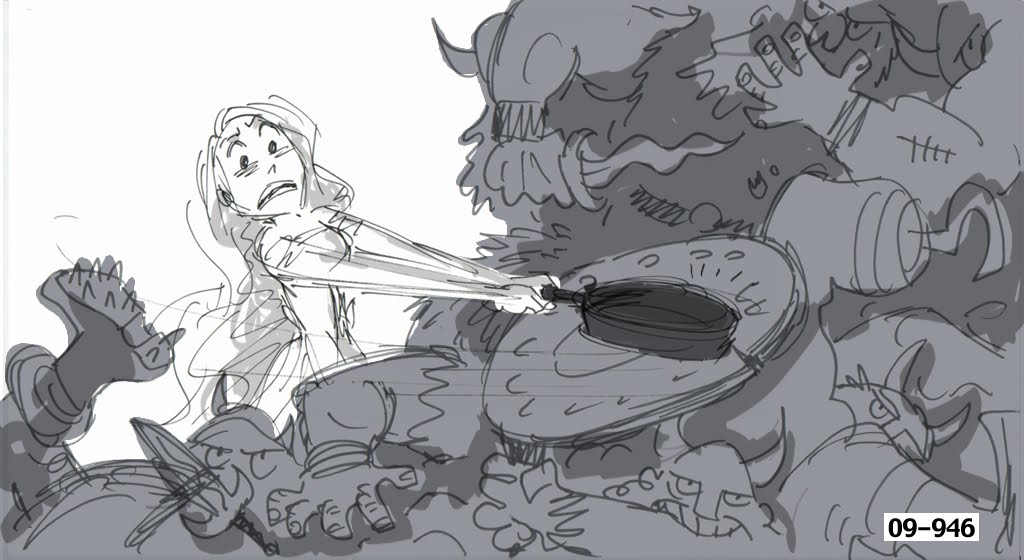


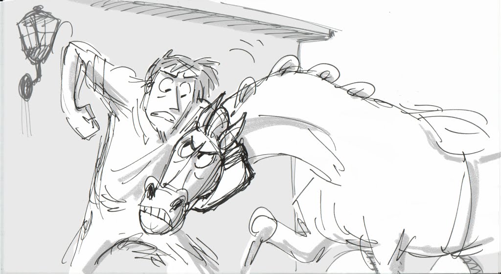


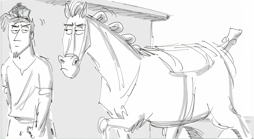
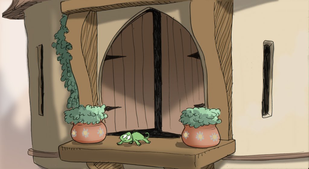


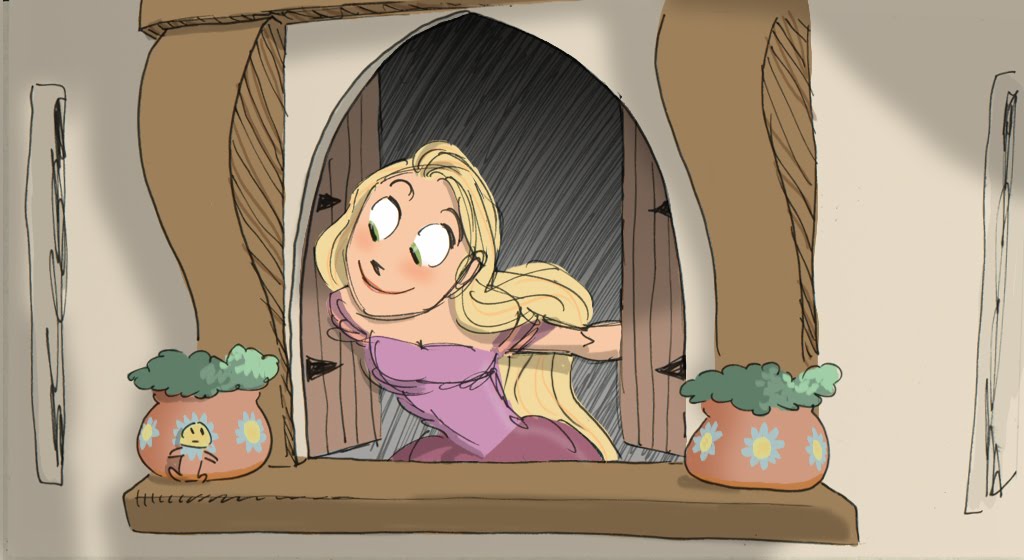


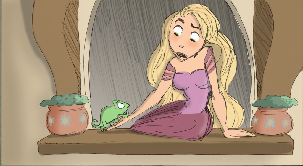
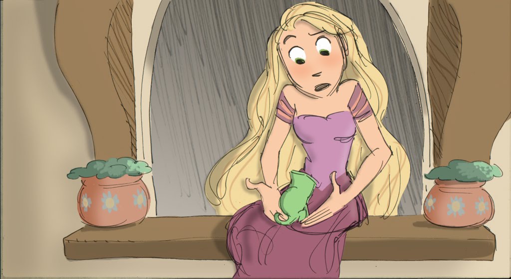

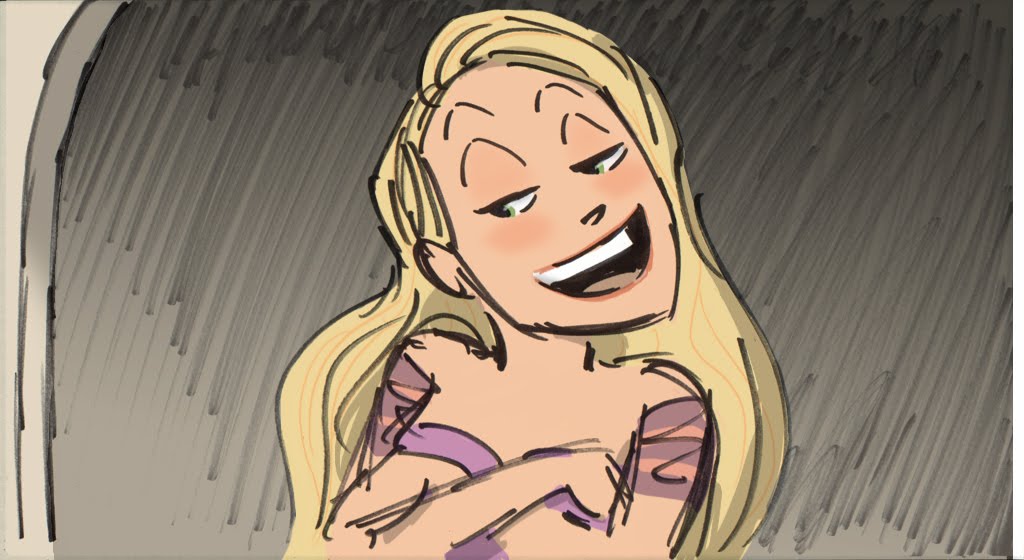
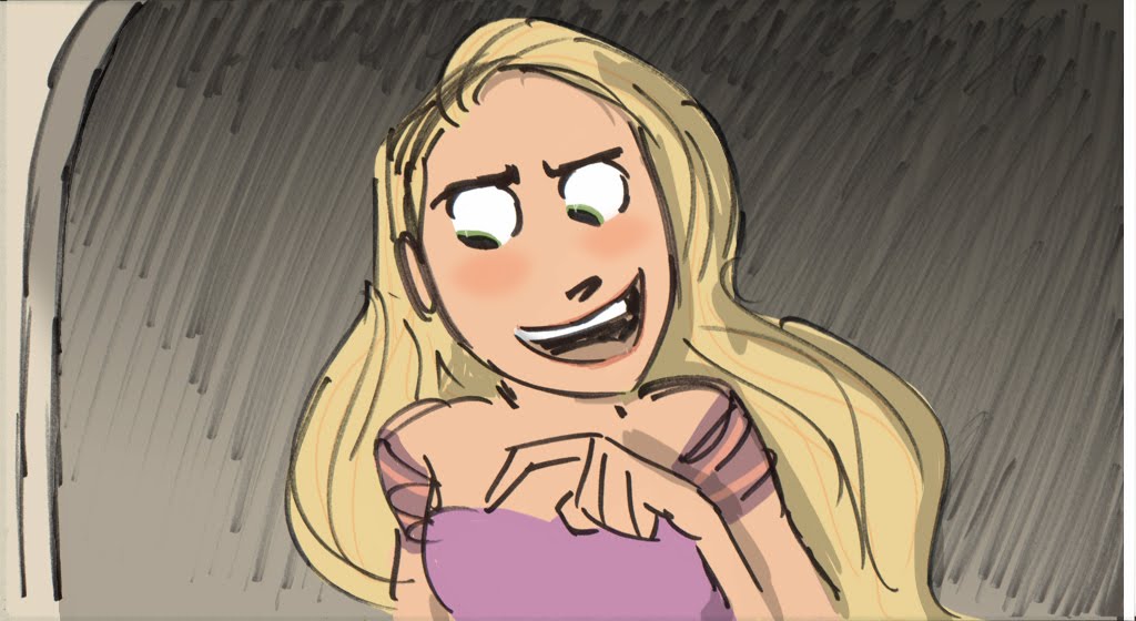


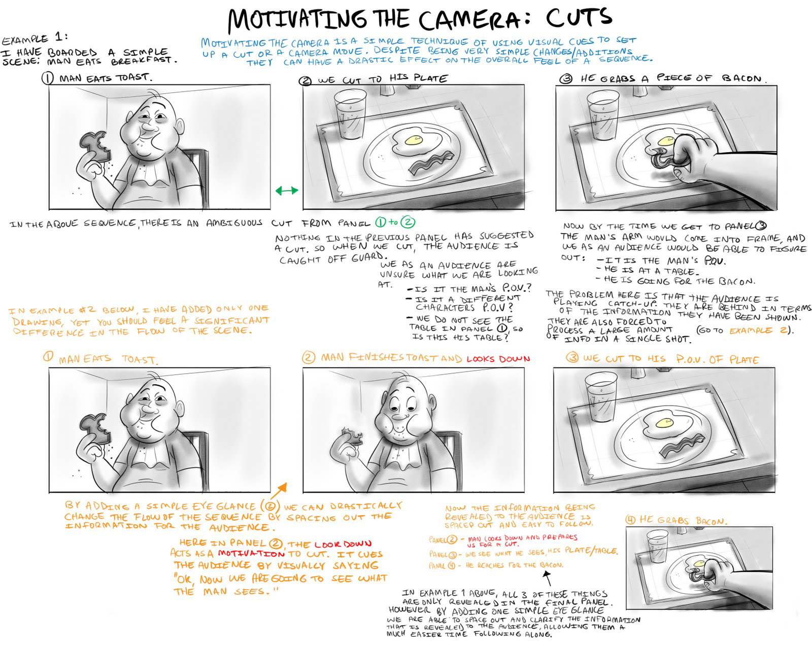
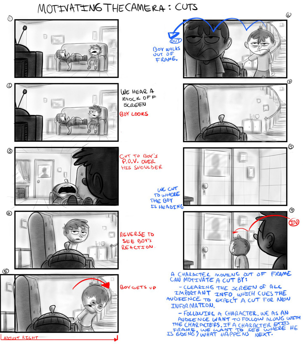
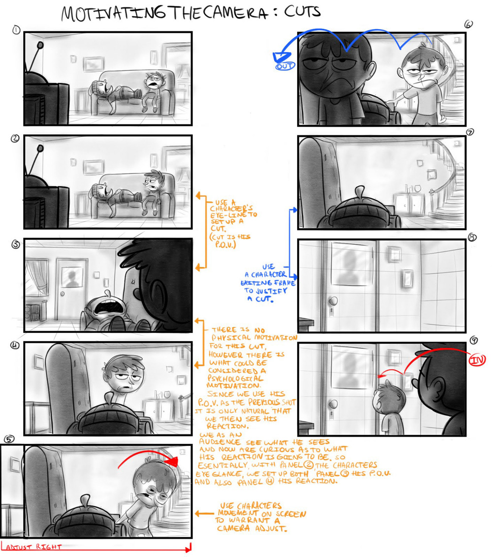
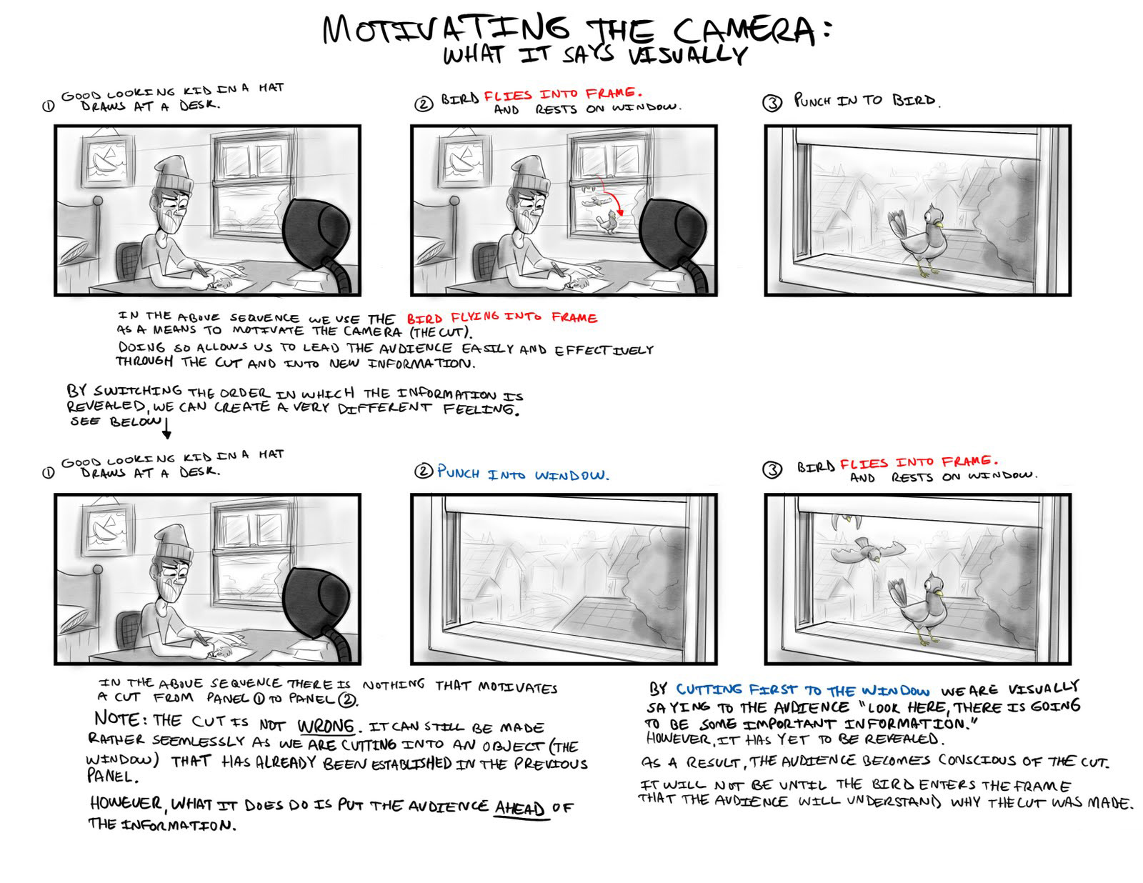
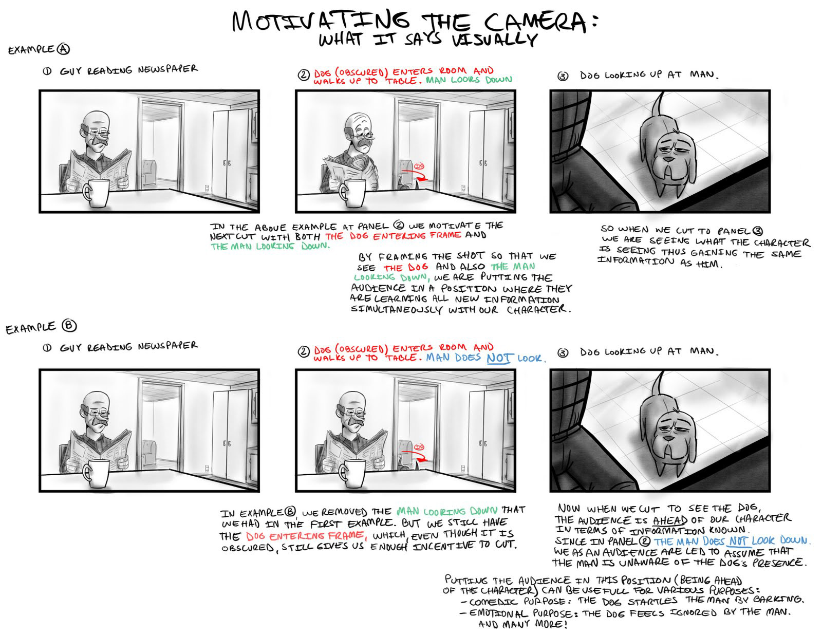
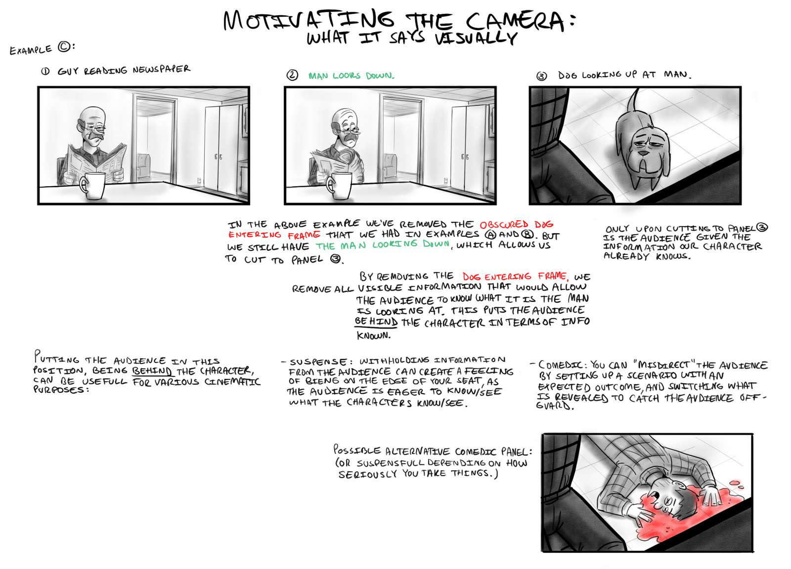


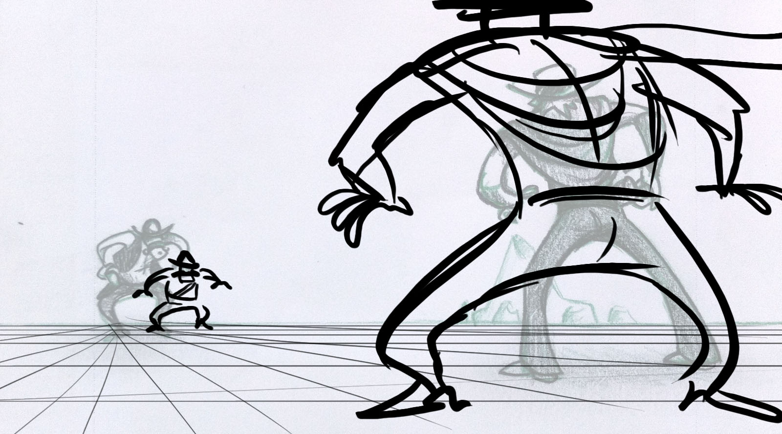


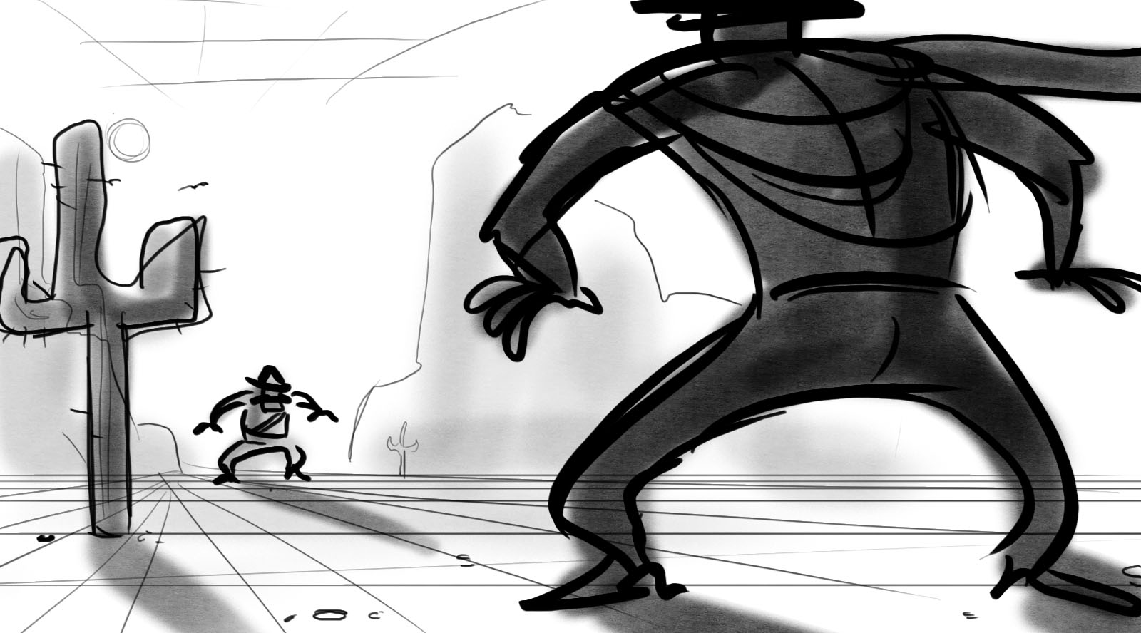
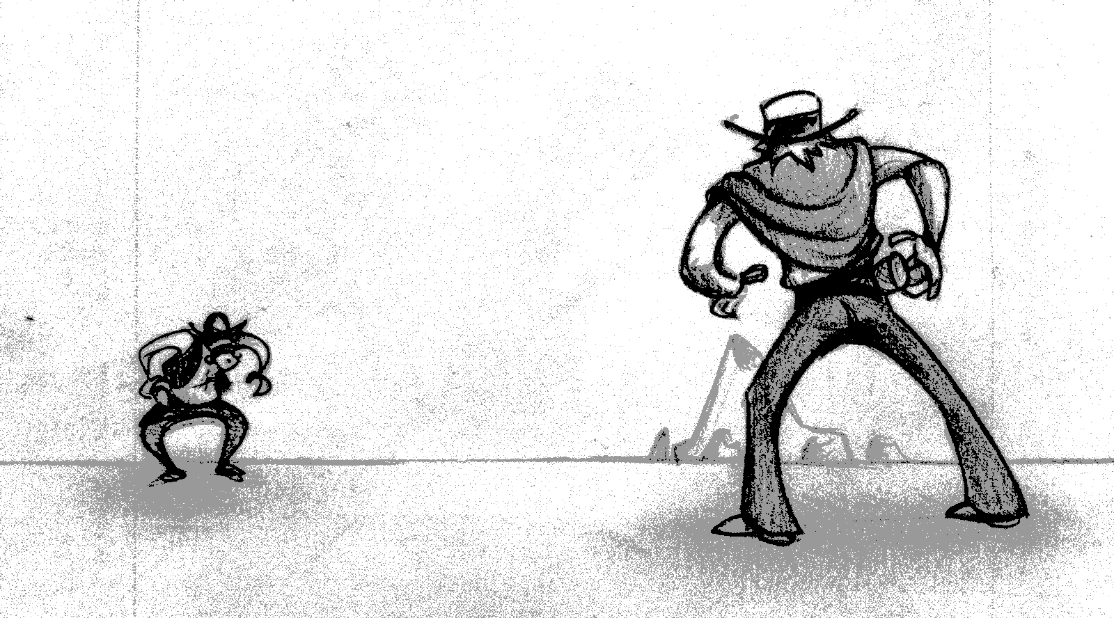
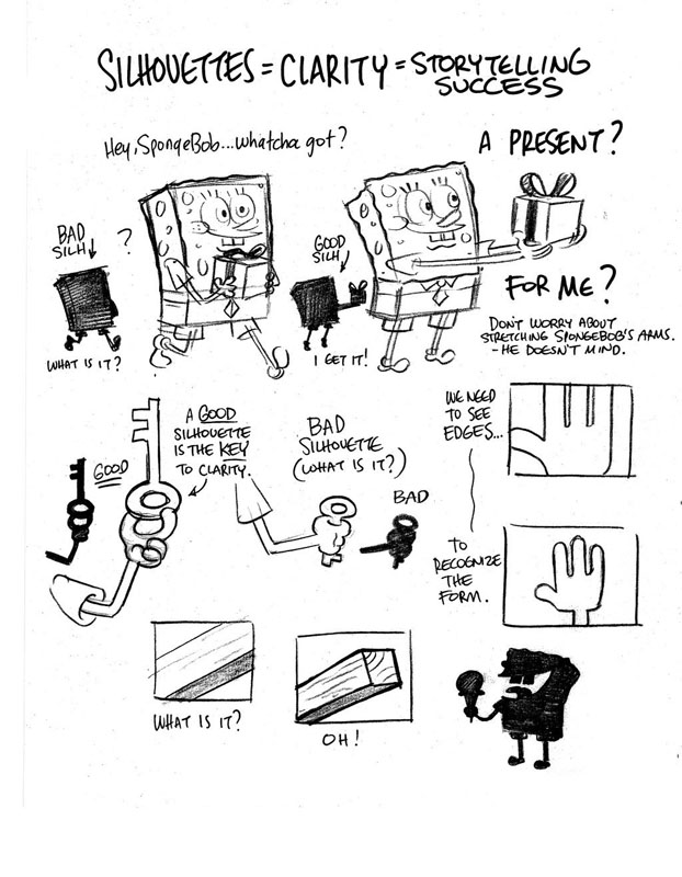
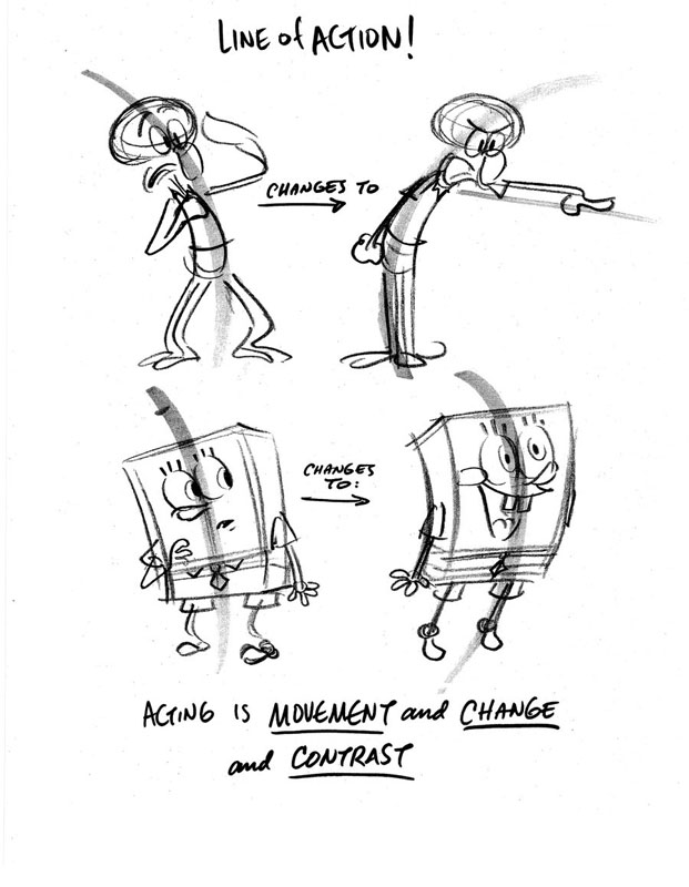
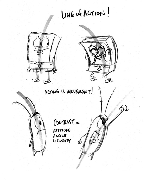
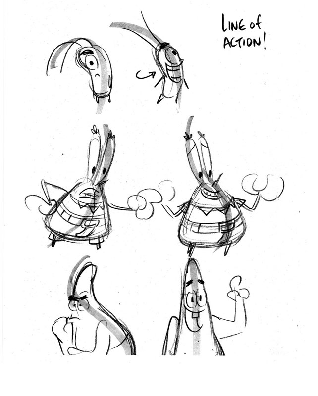
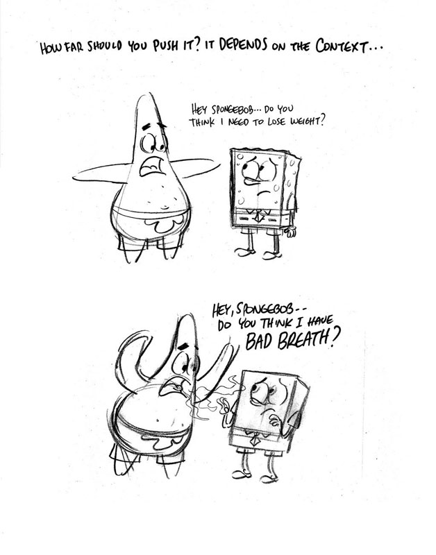
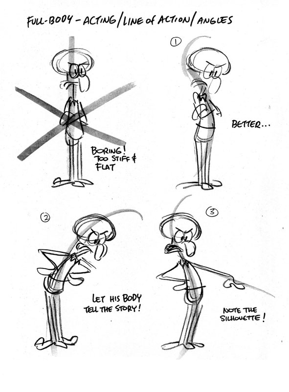
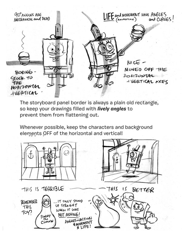
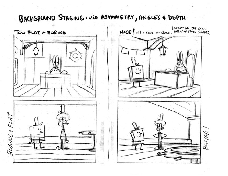
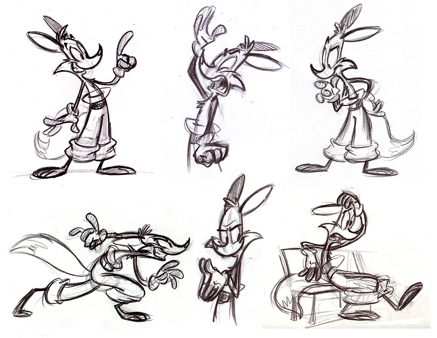
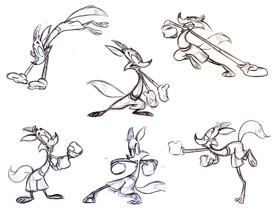
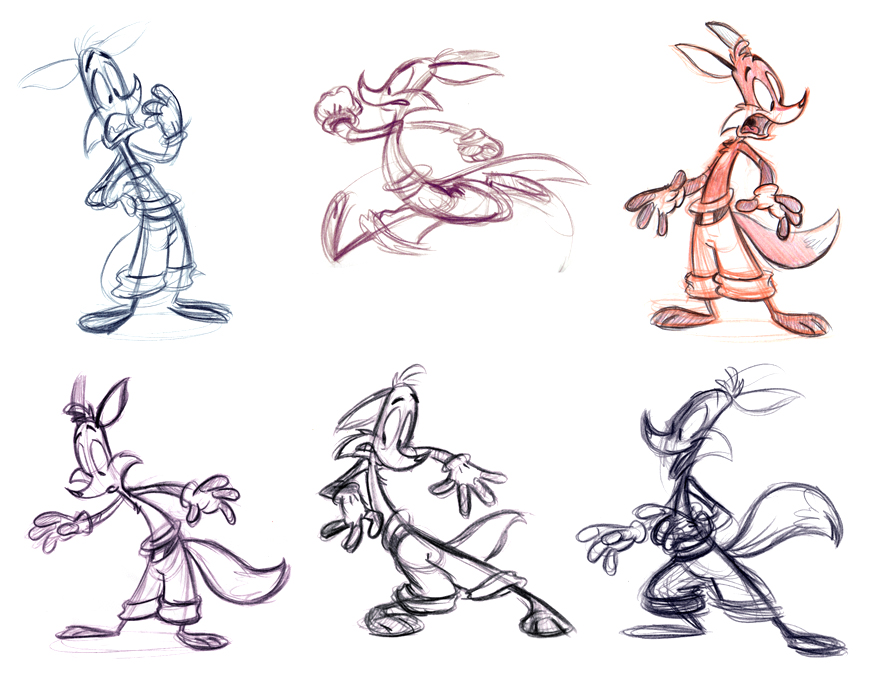
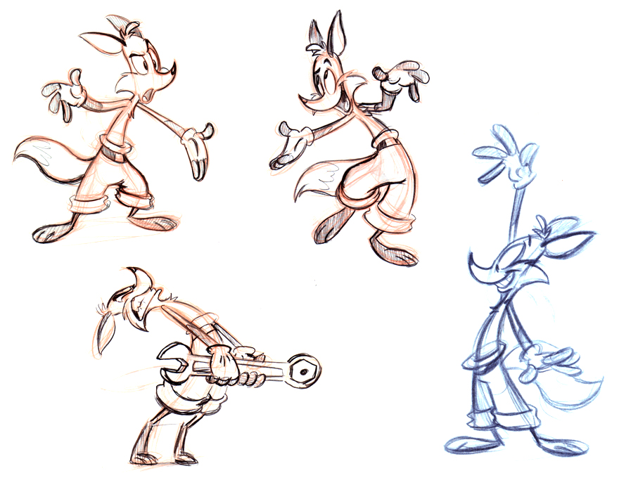
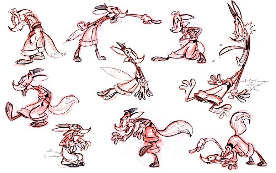


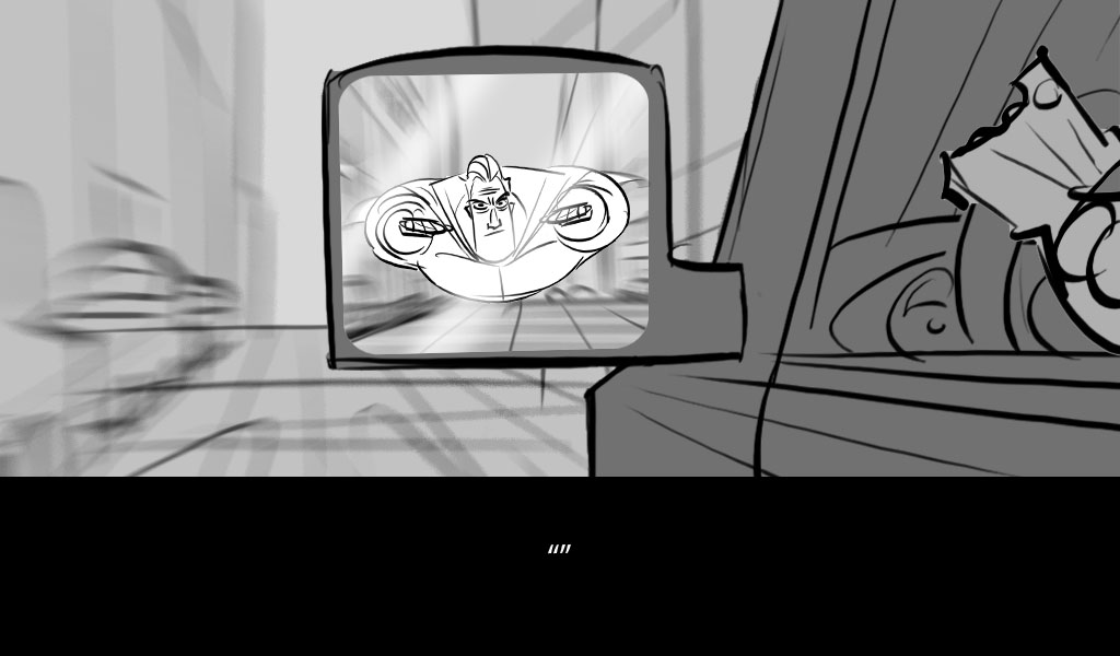


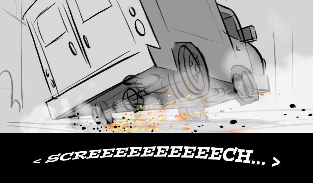


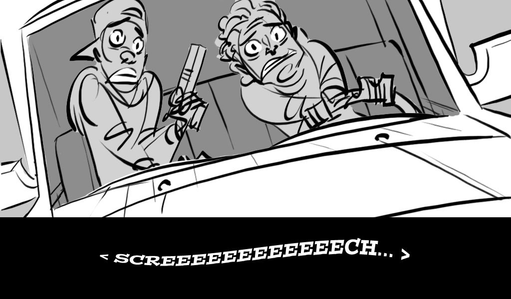


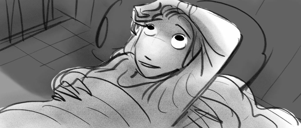


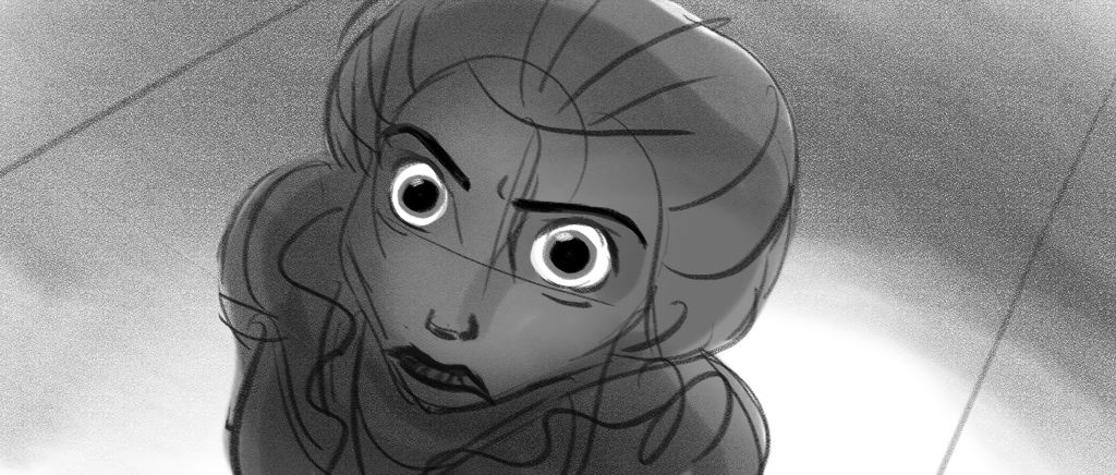
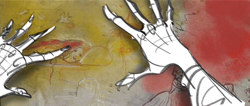
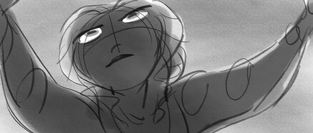


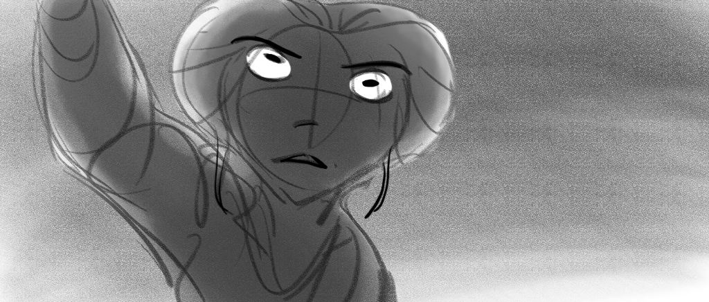


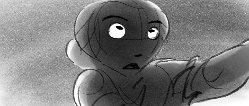


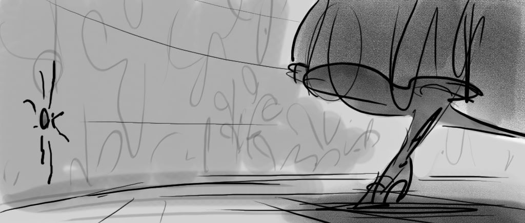
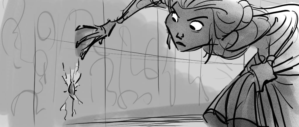

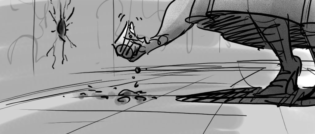
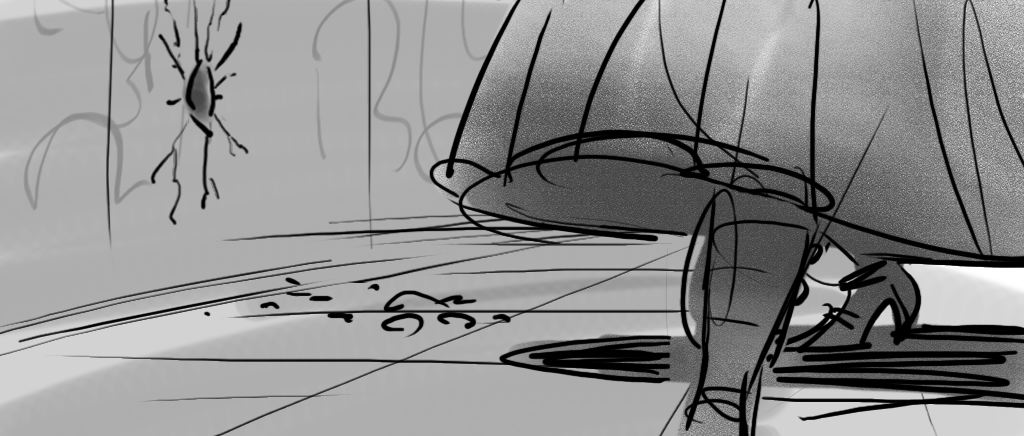
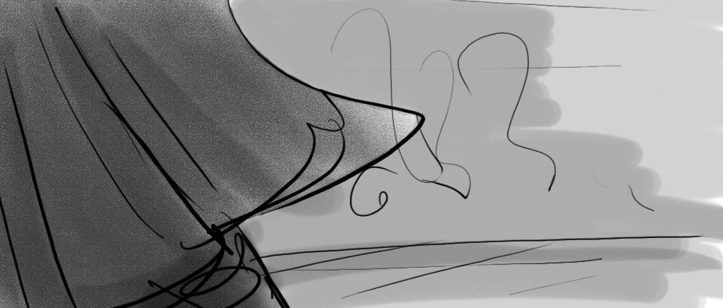


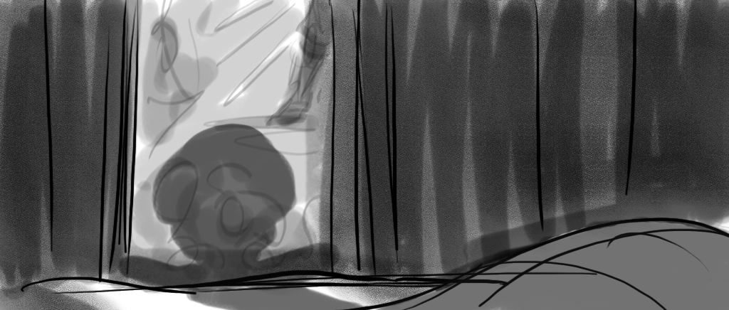

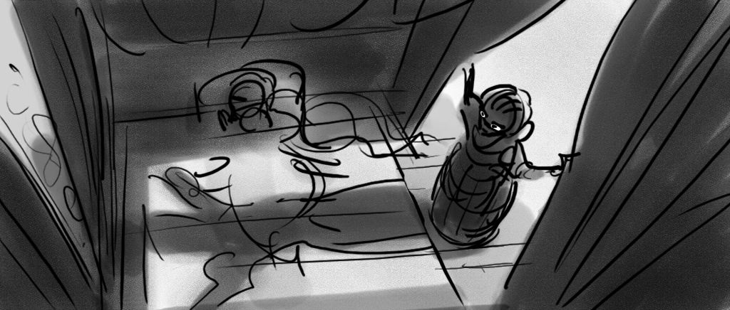
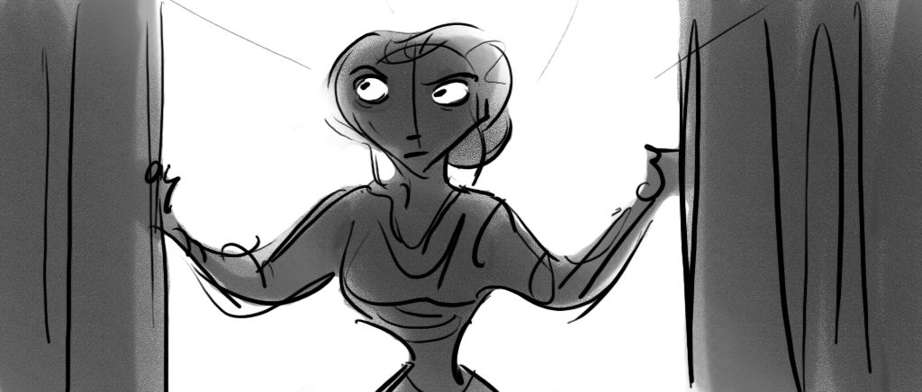

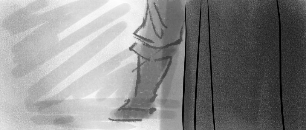


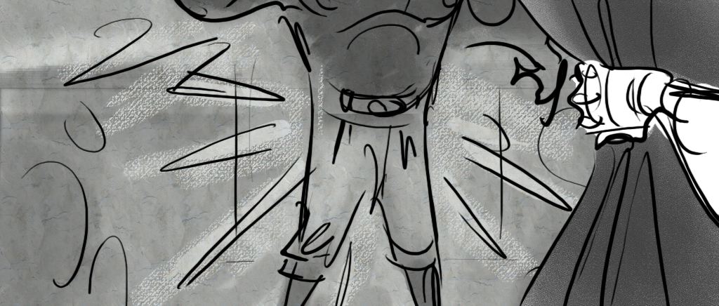


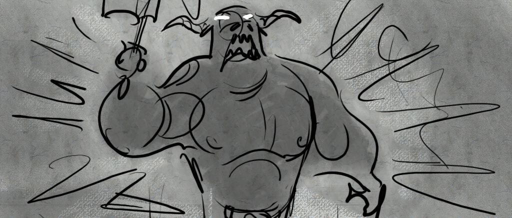

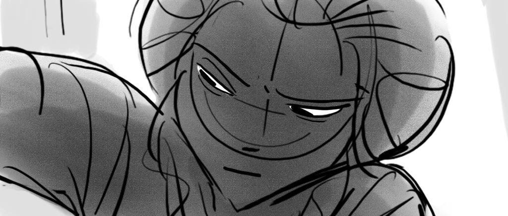


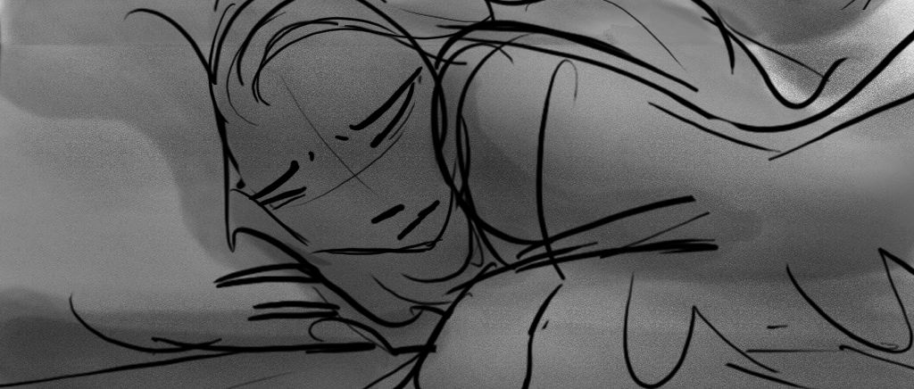
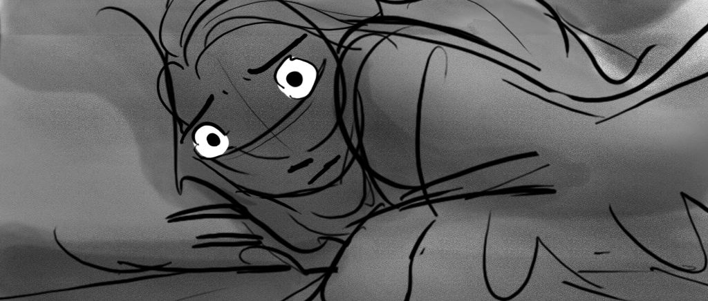
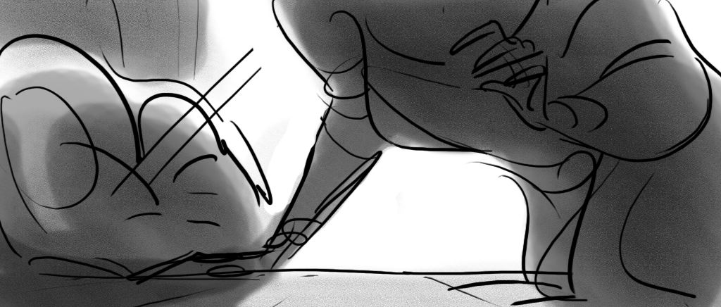


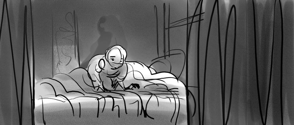


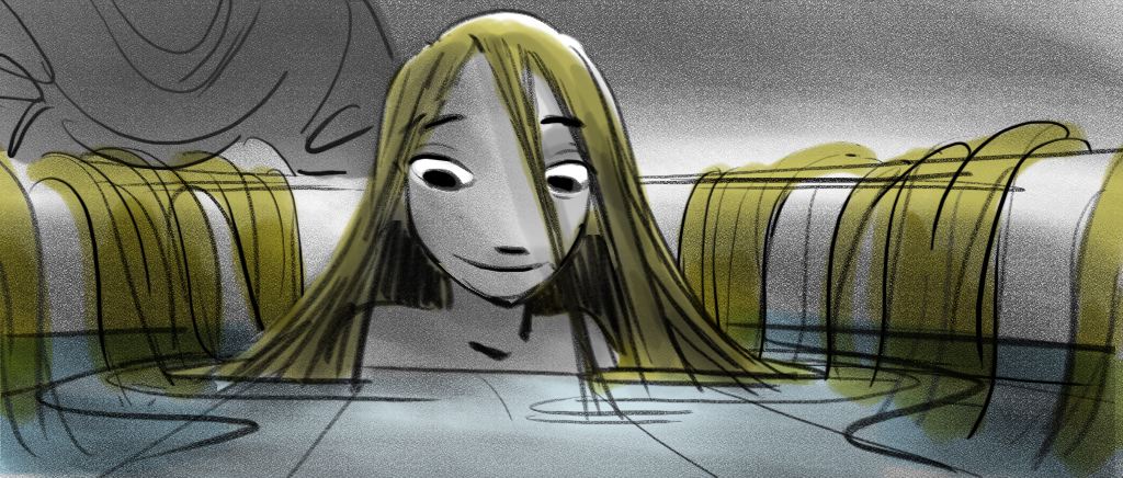


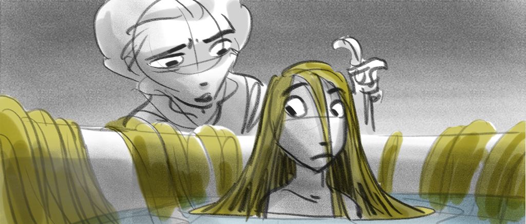


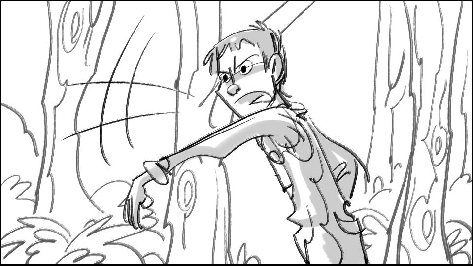
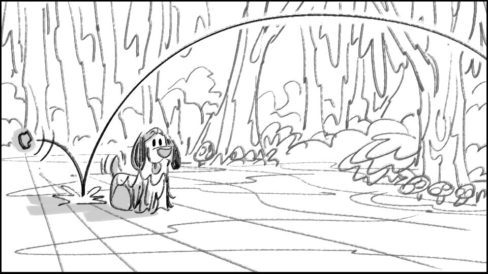
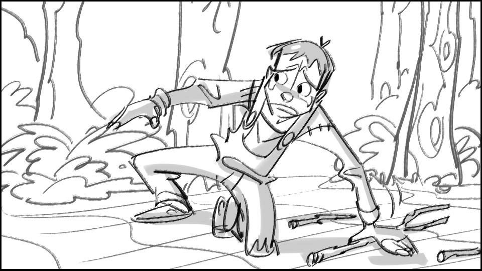

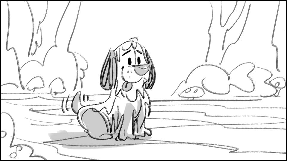


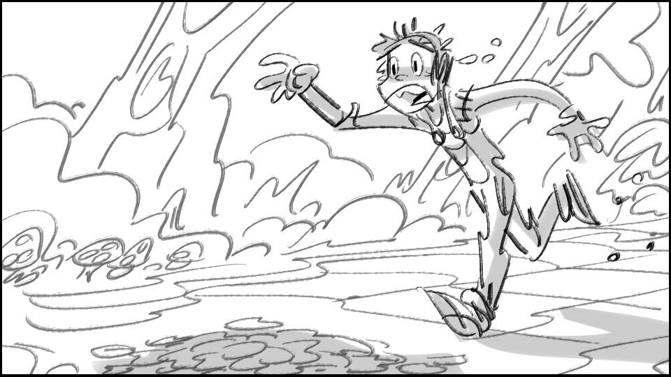
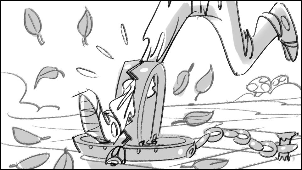
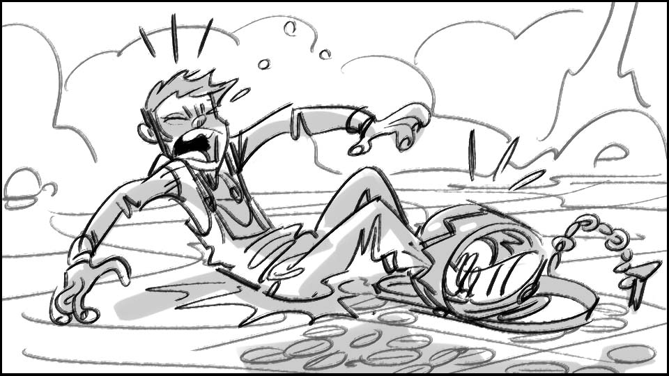
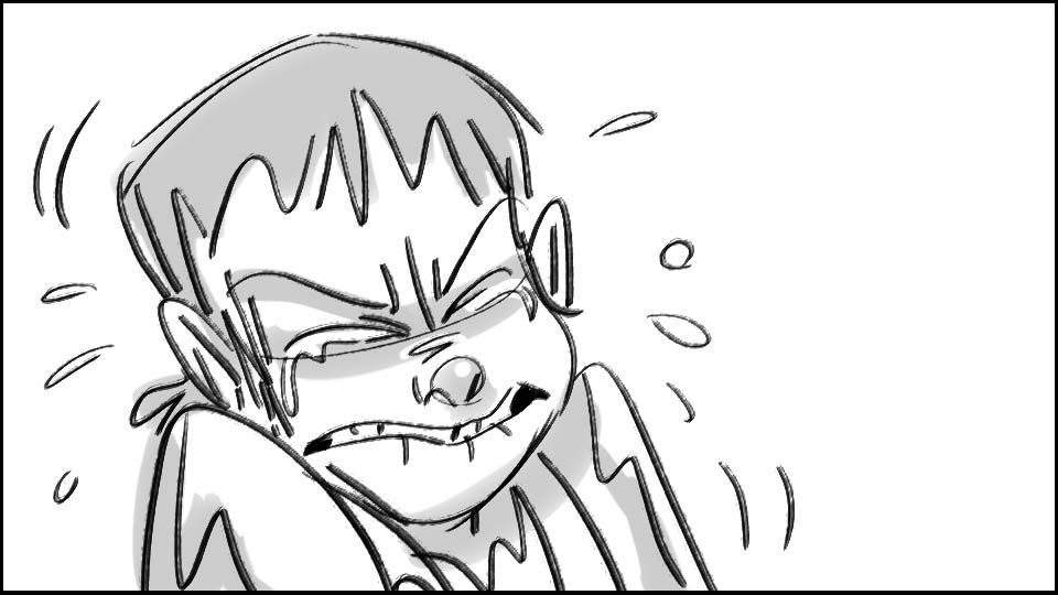
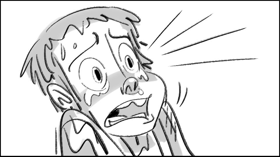

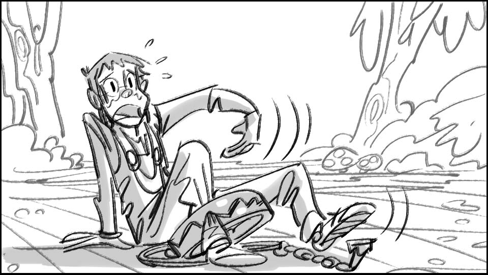
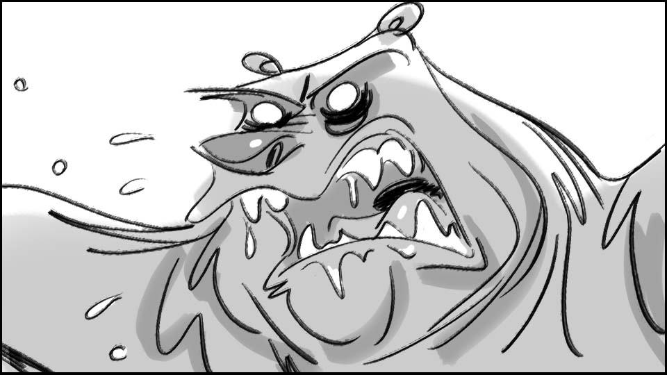


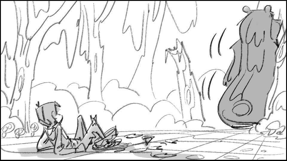


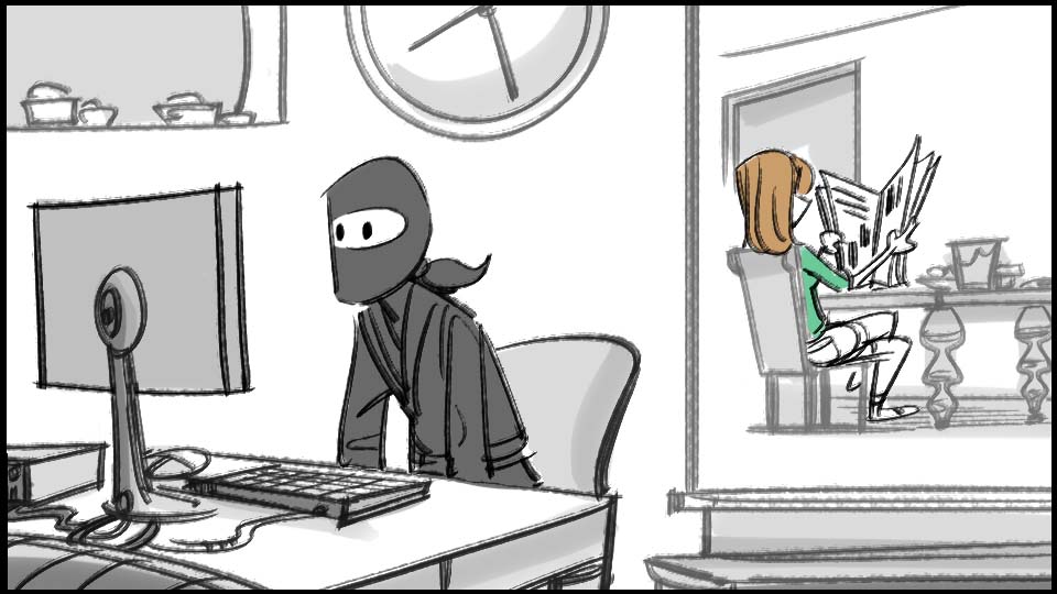


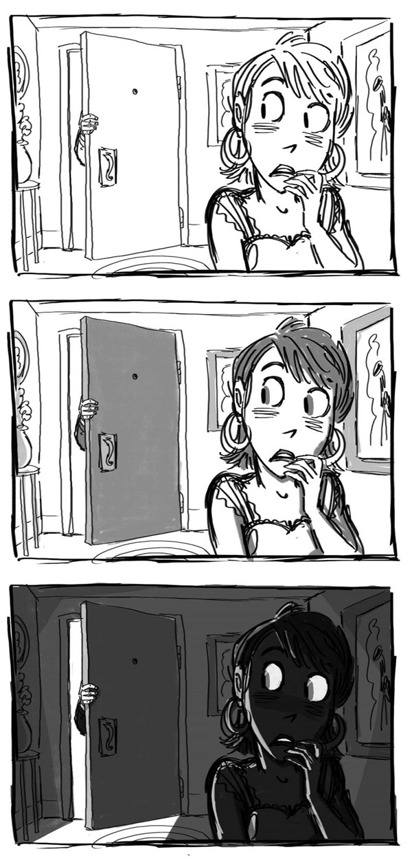
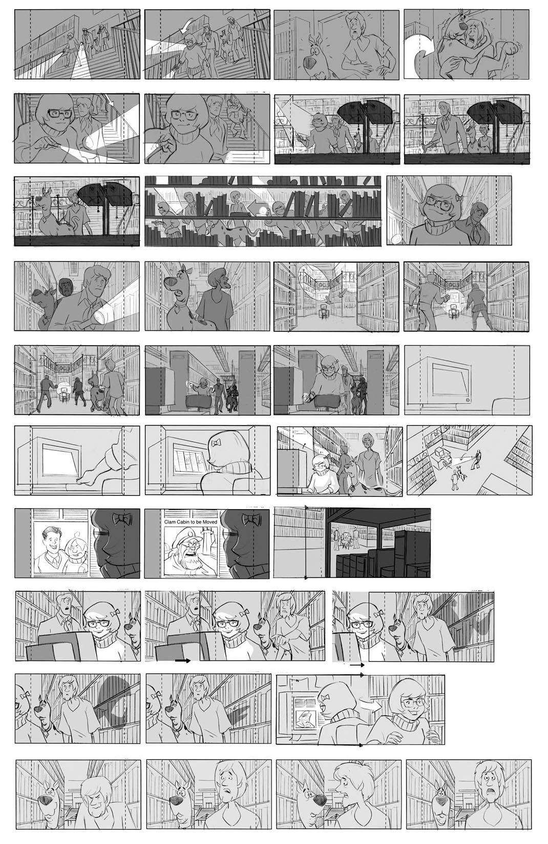

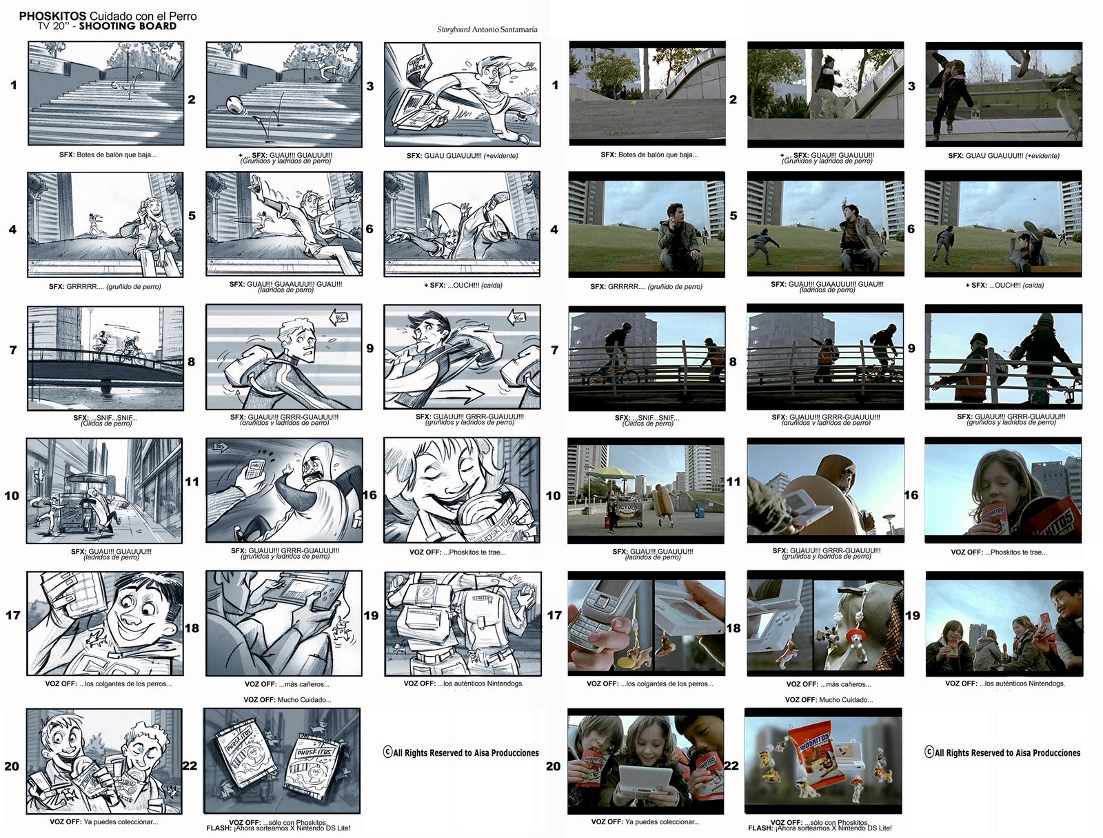
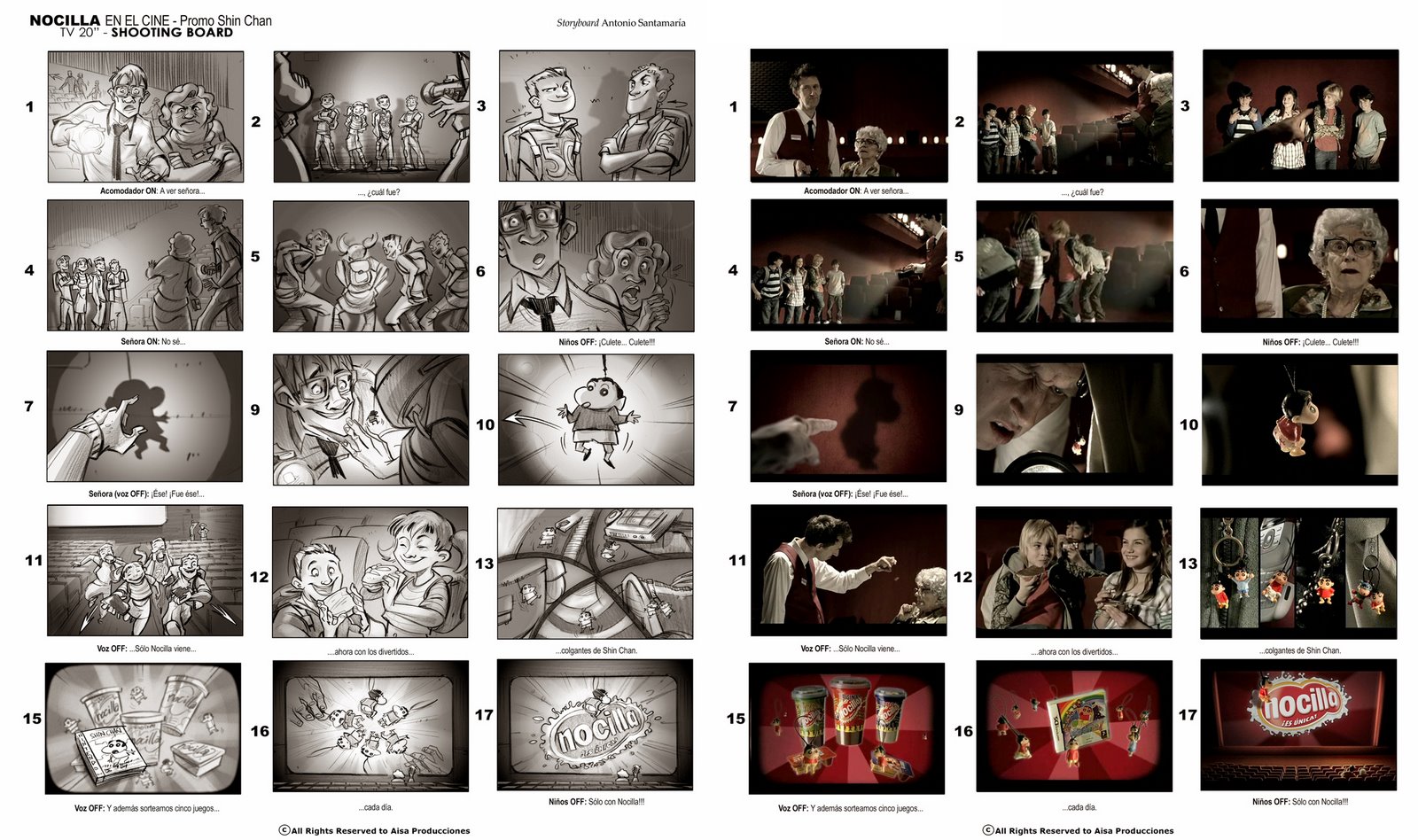
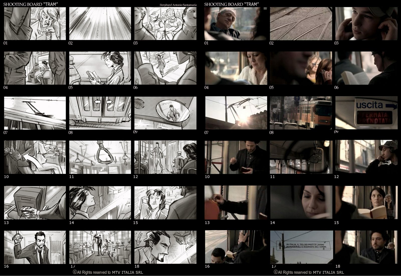
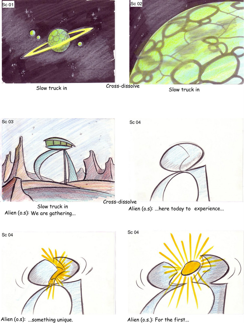
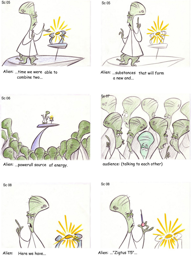
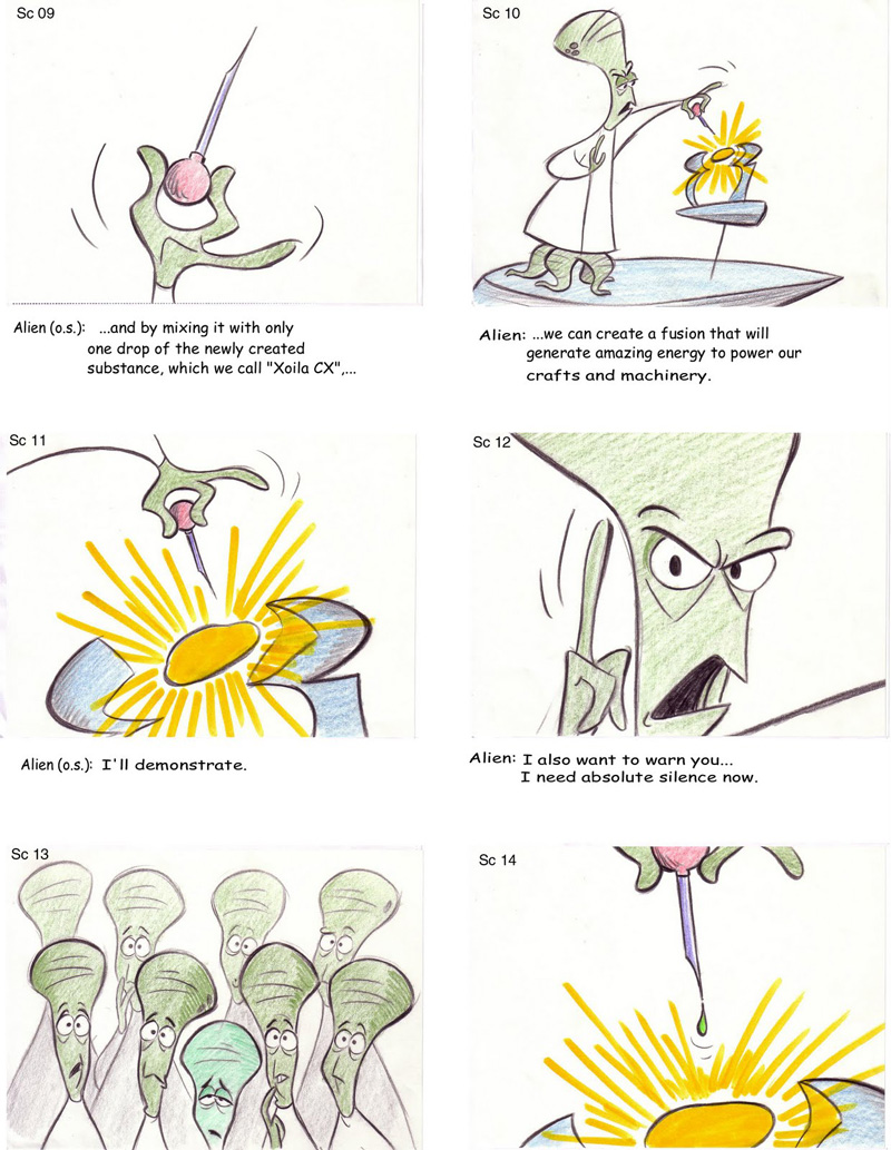
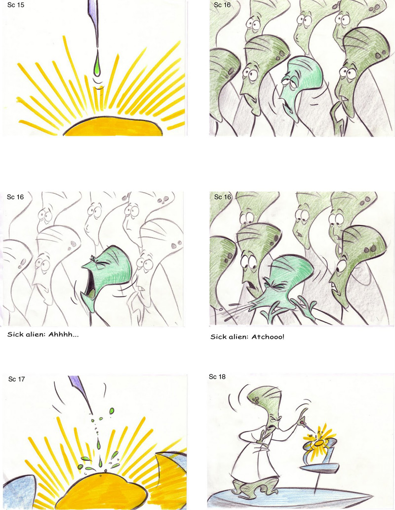
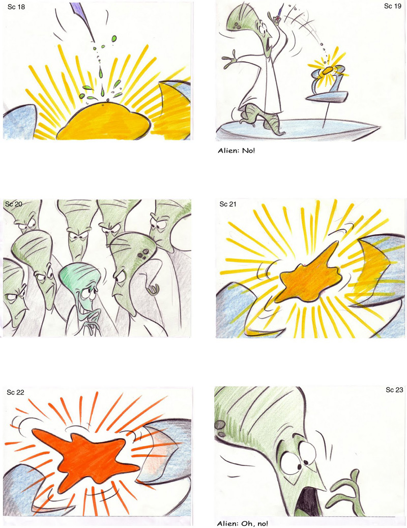
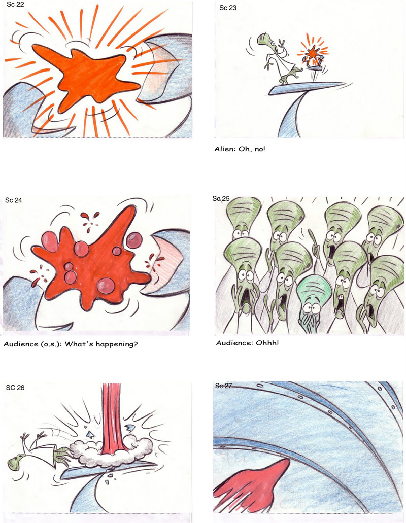
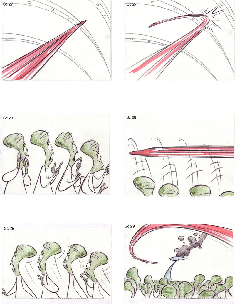
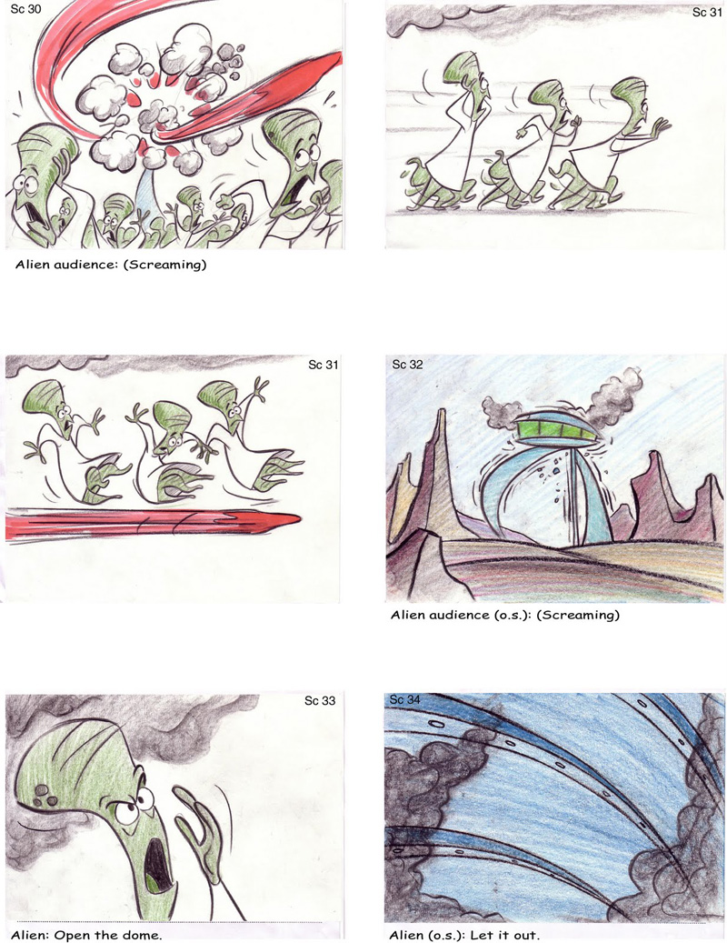
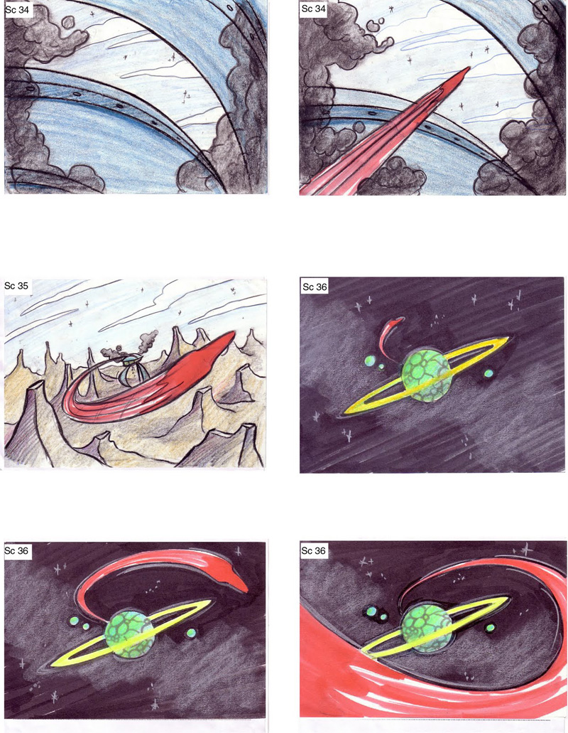
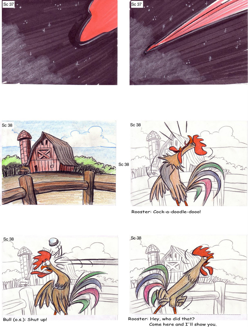
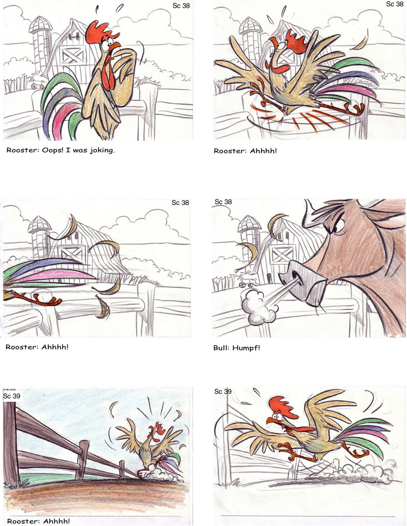
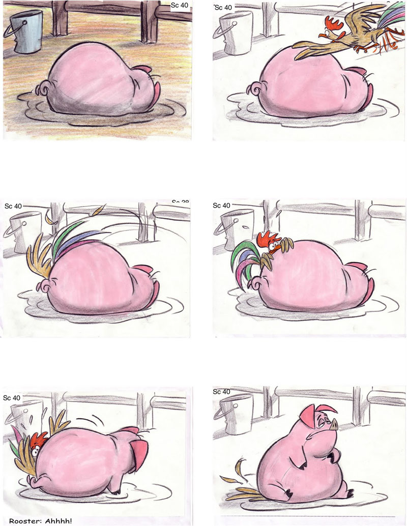
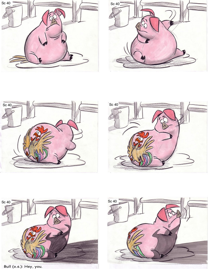
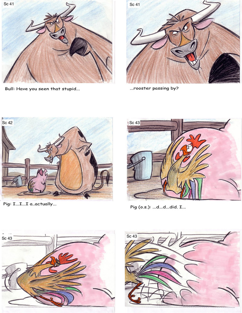

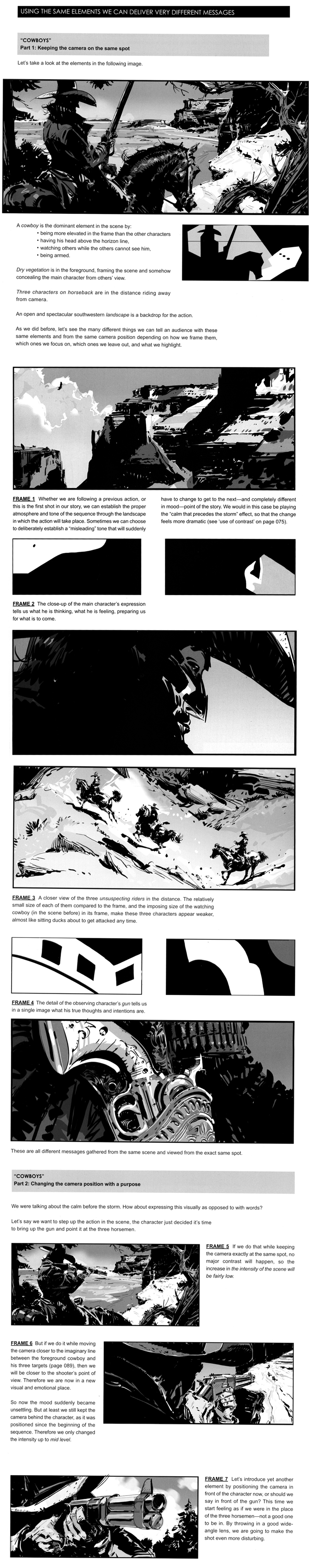


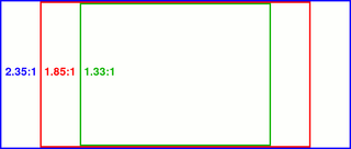


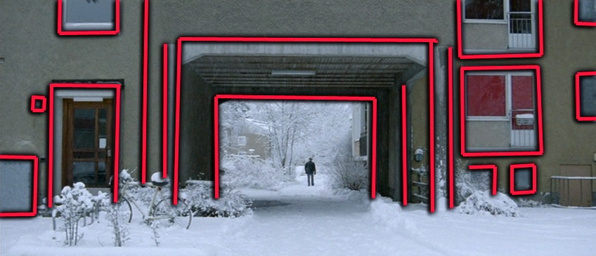


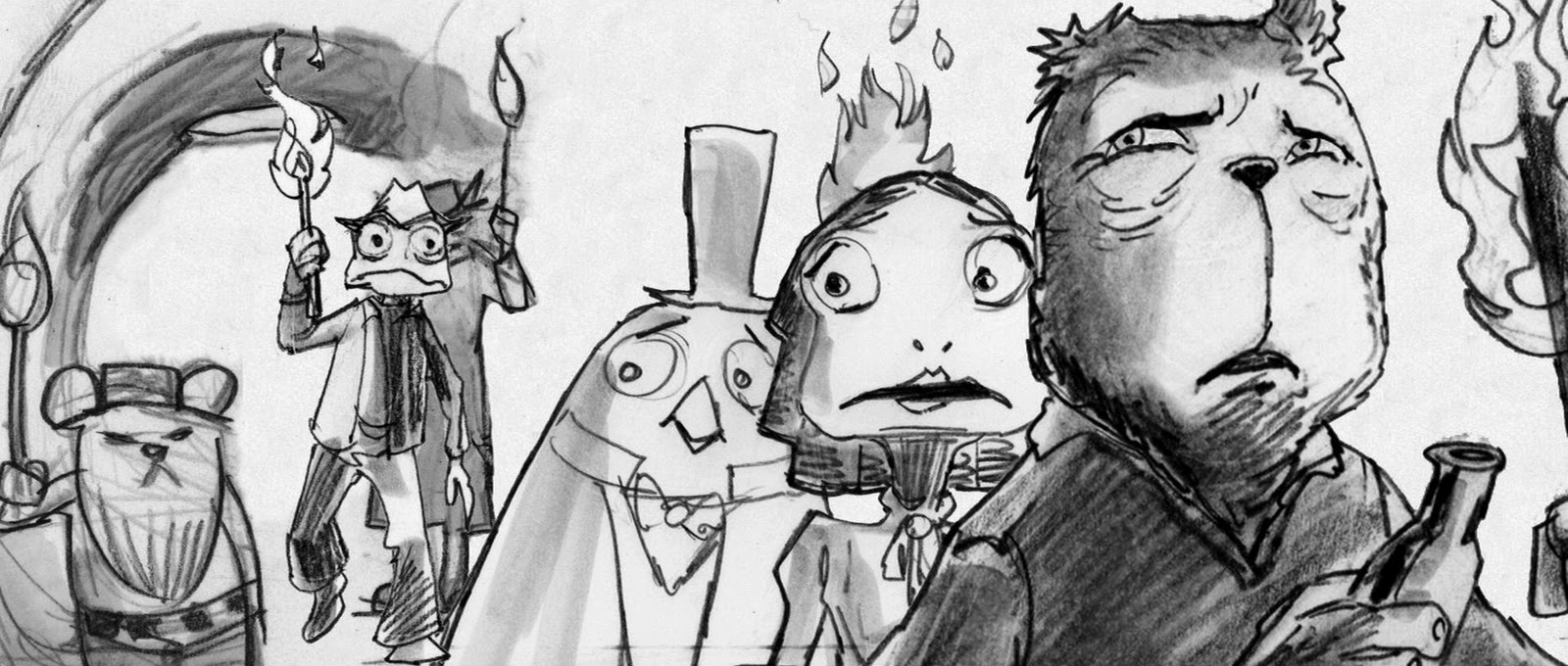


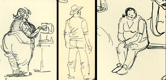
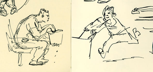
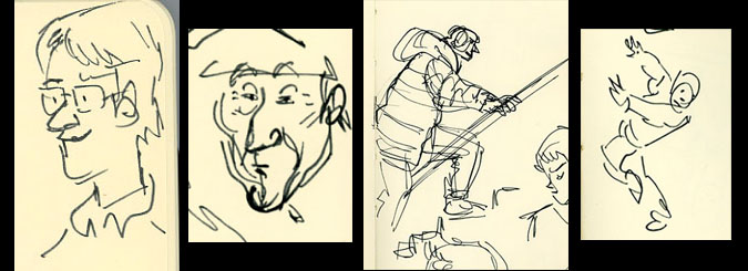
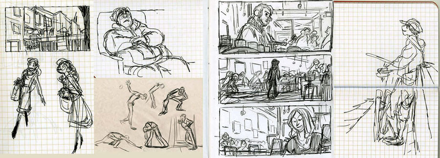
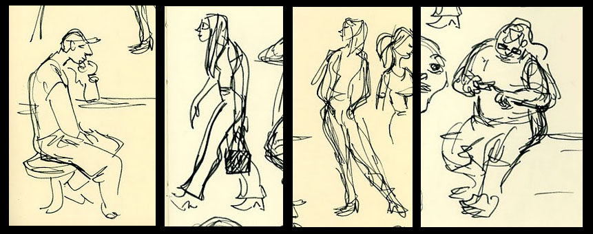
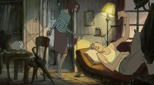
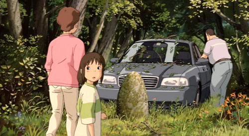
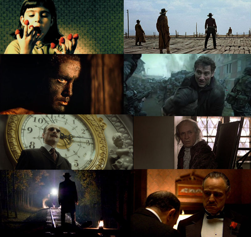